What I Bought in 2018: Inks

Platinum Blue-Black ink bottle

I like to do an annual accounting every year of the inks I bought. In 2018, it was 18 bottles.

Now, that seems like an awful lot. But, if you take the long view, I improved. Because in 2015 I bought 30 bottles of ink; and in 2016 I bought 20 bottles of ink and three boxes of cartridges.

Now, a strict accounting also would uncover that in 2017 I bought only 10 bottles of ink. But then strict accounting seems to be for unhappy people. Let’s forget that and take the long view. I improved!

(click Page 2 below to continue)

Ink Dips: Diamine Blaze Orange

Diamine Blaze Orange

Ink Dips is a more casual, and potentially unsettling, ink evaluation than is normal here at Fountain Pen Follies. Instead of carefully evaluating an ink I’m interested in, the point of Ink Dips is to blindly pick an ink sample from a box of the sadly not loved and not blue. Then I fill that sample into a pen and see what I think. It’s an ink experiment that’s a bit dippy.

Diamine Blaze Orange. This is just a magnificent orange ink, at a great price. It’s hard to think of an orange ink that is easier to recommend. If I may, the ink may be orange, but Ink Dips has struck gold. (Thank you, I’ll be here all week.)

(click Page 2 below to continue)

Ink Dips: Diamine Apple Glory

Diamine Apple Glory writing samples

Ink Dips is a more casual, and potentially disagreeable, ink evaluation than is normal here at Fountain Pen Follies. Instead of carefully evaluating an ink I’m interested in, the point of Ink Dips is to blindly pick an ink sample from a box of the unwanted or uninteresting. Then I fill that sample into one pen and see what I think. An inky experiment that’s a bit dippy.

Diamine Apple Glory. It’s not that anyone in the world needed another green ink, but this one is charming, and hard to resist. Apple Glory is a happy, cheery green, the perfect match for my Lamy Apple Green Safari. It’s bright enough for editing or fun little notes, but never obnoxious or eye-searing. Never neon. Possibly even office appropriate. Apple Green turned out to be an unexpected pleasure.

(click Page 2 below to continue)

More Sailor Kobe No. 37 Island Blue

Sailor Kobe No. 37 Island Blue writing sample

Here’s a sneak peek at how Sailor Kobe No. 37 Island Blue looks in a broader nib. We’ve already seen it in a Kaweco extra-fine. But I’ve got it in second pen now, a Lamy Safari with 1.1 mm stub nib.

Long story short: it’s a very nice ink, no matter the pen.

Here’s Island Blue from the Safari stub on Tomoe River paper, with the Kaweco extra-fine below.

Sailor Kobe No. 37 Island Blue writing sample

And this is Island Blue on Rhodia paper, with the extra-fine nib first, then the wider stub.

Sailor Kobe No. 37 Island Blue writing sample

It wasn’t until I saw a wider swath of Island Blue that I realized something cool. Even more than the lovely Diamine Blue Velvet, Kobe Island Blue reminds me of the equally lovely, but criminally underappreciated Visconti Blue.

I haven’t blogged about Visconti Blue, despite really liking it. Visconti Blue is a lower-maintenance blue ink that’s more vivacious than older standards like Waterman Serenity Blue, but without the ultra-brightness of some of the newer inks like Blue Velvet.

So here are swabs of Island Blue with the two inks it reminds me of.

Sailor Kobe No. 37 Island Blue swab comparisons

Bear in mind that photos of the swabs alone can deceive. Blue Velvet is brighter than the other two, which you can see in person but not in the photo. And I think I remember that Visconti Blue shades more than Island Blue. Then of course there are important issues of sheen, water resistance, cleanup and the like, which we’ll delve into in the longer, official review.

I actually have comparisons of Island Blue to other inks, too. Because Island Blue is a very nice ink. That also will be in the review. (Because, time.) But just for fun, you can look at this older post, if you like. Or this one. Island Blue is a very nice ink.

First Look: Diamine Shimmering Inks

Diamine Shimmering Inks writing sample

Here is a quick look at some of the newer Diamine shimmer inks. A friend very nicely sent me these, and I’ve been using them with broader nibs. That’s Blue Flame with a broad architect’s nib ground by Dan Smith, Moon Dust from a 1.1 mm stub, and Firestorm Red and Inferno Orange in regular broad nibs.

These are nice enough inks, but they don’t strike me as “must haves,” at least for my normal fountain pen use. I’ll talk about why, after the jump.

(click Page 2 below to continue)

More Montblanc Golden Yellow Ink: Comparisons

Montblanc Golden Yellow ink swab comparisons

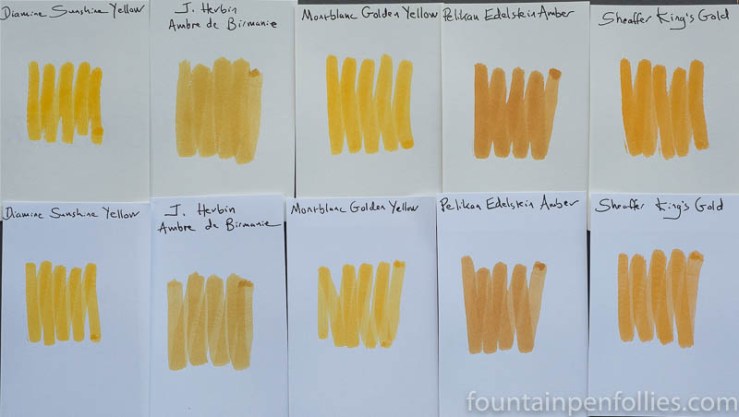
Here’s a golden array of inks, with Montblanc Golden Yellow shining right in the middle.

We all know that colors look different depending on surrounding colors. And this is a perfect illustration. Look how unattractive the two amber inks seem when they flank Montblanc Golden Yellow.

In fact, J. Herbin Ambre de Birmanie and Pelikan Edelstein Amber are both lovely. In fact, they are favorites of mine. When they aren’t next to Montblanc Golden Yellow, the ambers are attractive golden brown inks with nice shading. So I should apologize for them looking so awful here.

Golden Yellow is so lively and so yellow-orange, that it deadens these amber inks. Not every ink looks good with every other. So here’s a link that shows how Ambre de Birmanie really looks, next to more congenial colors, and here’s one showing  Pelikan Edelstein Amber.

Now, I really like Golden Yellow, which is why it’s interesting that one of the inks in this array is an ink I intensely dislike. The ink that sets my teeth on edge is on the far right: Sheaffer King’s Gold. The King’s Gold is no longer in production, for which I applaud Sheaffer. But King’s Gold almost looks like a more orange, more brown Golden Yellow here, doesn’t it? Yet, to me, one is yay and one is nay.

It’s a reminder in (bright yellow) Broadway lights, that nothing beats testing an ink to see if it works for you.

Finally, it’s interesting how Diamine Sunshine Yellow is fairly close to Montblanc Golden Yellow.

Montblanc Golden Yellow ink swab comparisons

When you write with them, Montblanc Golden Yellow is darker (more orange) and more legible than Diamine Sunshine Yellow. That’s nearly impossible to see from the swabs. But you can tell from the swabs that there’s a lot of similarity.

And now I have one final twist, worthy of Hollywood: there is another.

Remember that Diamine operates on the principle that “if one ink is great, three nearly identical inks will be fantastic.” (That happens to be my motto, as well.) So you won’t be surprised to hear that Diamine has another ink, Diamine Amber, which is very close to Diamine Sunshine Yellow, and thus to Montblanc Golden Yellow, albeit browner.

I did not include a photo of Diamine Amber, because my photo array is full, the two Diamines are very close to each other, and I’ve already got two better amber inks in there. But I find it interesting. Inks. Even the yellow ones are interesting.

Date, Marry, Kill: My Least Eligible Ink Bottles

ink bottles

Ink bottles were on my mind last month. Two bottles came into my possession that were extra attractive: a Graf von Faber-Castell and a J. Herbin 1670. At the same time I got three new Sailor inks, reminding me that Sailor bottles could make a saint curse. I needed no reminding that I am not a saint.

I’ve never been one to prioritize the aesthetics of an ink bottle. For me the main point is the ink inside. However, I try to use up my inks, so I do care how useful and practical a bottle is.

So, I’m going to play “date, marry or kill” with a few ink bottles. The first is a bottle everyone hates, except me. The next two are bottles everyone loves, but I am on the fence about. The last is a bottle that I loathe.

Join me, then, as I play ink bottle bachelorette. But it’s just for fun. No ink bottle design seems to stop me from buying the ink. It just lets me perfect my cursing.

(click Page 2 below to continue)

A Rose by Any Other Name: Comparing Montblanc Shakespeare Ink to Diamine Carnival

Diamine Carnival and Montblanc Shakespeare ink writing sample comparison

“What’s in a name? that which we call a rose / By any other name would smell as sweet”

-Romeo and Juliet

Blog readers, you know my love for William Shakespeare, the playwright and the ink. And while Montblanc Shakespeare is new, I think it’s already popular. It’s hard to find online. But do you know what ink is quite easy to find? Diamine Carnival.

And Diamine Carnival looks close enough to Montblanc Shakespeare that I wonder if Diamine Carnival might make a decent substitute.

(click Page 2 below to continue)

Ink Review: Diamine Gerbera

Diamine Gerbera writing samples

Diamine Gerbera. This is an interesting and attractive orange ink from Diamine’s Flower Set, which looked so different in the two pens I tested it in that I am tempted to dramatically subhead this review A Tale of Two Pens.

Admittedly Diamine Gerbera isn’t really “it was the best of times, it was the worst of times.” It’s too nice an ink for that. And I’m from the Midwestern US, which is like being from Canada; we’re not that dramatic

But A Tale of Two Cities is slightly more exciting than the average ink review, what with the Reign of Terror going on, tumbrils rolling through the cobbled streets of Paris, and heads rolling into baskets. Heck, that’s the sort of atmosphere and tone that would liven up any ink discussion.

(click Page 2 below to continue)

Pen of the Day: Pelikan 400nn with Diamine Gerbera

Pelikan 400nn with Diamine Gerbera ink

Pelikan 400nn with medium nib. Again? I just had this pen on about a month ago. Sadly, I only have so many pens. At least until my Aurora gets here.

But the 400nn is worth another look: it’s a great pen. I really like its shape.  Here it is with the classic and better-known 400, for comparison.

Pelikan 400nn compared to Pelikan 400

I know I showed a lot of Diamine Gerbera yesterday. But at least it’s not blue. And I wanted to highlight one interesting quality of this ink. The shading goes from a soft yellow-orange, in the dashed lines, to a deeper, redder orange, but despite that it’s still fairly toned down.

I always like it when an ink has more going on than you expect.

Diamine Gerbera writing sample