It is time for the Venvstas 77 “Chicago” to leave Fountain Pen Follies for the Chicago Pen Show and its new owner. I’ll miss the 77.
(click Page 2 below to continue)


That’s the first day of the Chicago Pen Show up there. It started yesterday, and I’m helping out with it, which explains why I’ve been absent so much from here in the past few weeks. And I’ll be “there” instead of “here” for the next three days. I’ll be posting mostly on Instagram (fountainpenfollies) and Twitter (@FPfollies), because no wifi.
I’ve got a lot of photos on Instagram, but I wanted to put a few here, too.
(click Page 2 below to continue)

Lamy Dark Lilac. Along with my Dark Lilac Lamy Safari I ordered a box of cartridges of the accompanying ink. In the Safari with medium nib, Dark Lilac ink is a nice dark purple, fairly saturated, and without much shading. It really flows well, too.

Here is Dark Lilac ink compared to two purple inks I own and then to a standard blue ink and black ink for reference.
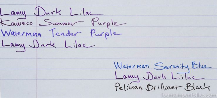
Dark Lilac is dark enough that you could possibly get away with it at work. Depending, of course, on how fabulous your work setting is, and on how cool, or near-sighted, your boss is.
It’s a Sign o’ the Times that this purple also makes me think of the recently departed Prince. Would the Purple One himself like this ink? Oh yeah: it totally reminds me of the cover of 1999.


My Dark Lilac Lamy Safari just arrived, and it’s really excellent. This is the nicest Safari in years, in my opinion. And not just because it’s neither neon nor green. It just looks great.
I have heard that purple pens aren’t big sellers, which may be why Lamy waited so long to add one to the Safari lineup, but this is very smartly done. It’s less tween, more grownup. The textured plastic, which is also found on the Charcoal Safari, helps with that. There’s also the black clip and nib, and the dark boysenberry color of the pen.
I also bought cartridges of the Dark Lilac ink, which is similarly dark and actually very attractive.
Here is the Dark Lilac next to the Charcoal, to give a better sense of the color.

Thank you to Appelboom, who sent this very quickly.
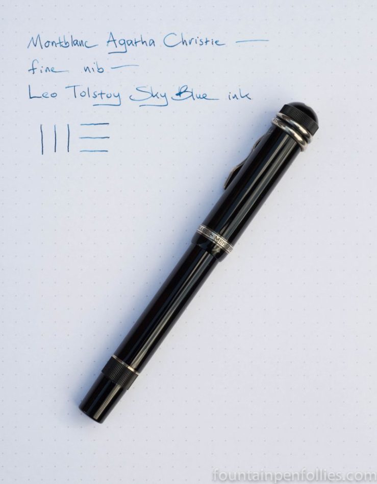
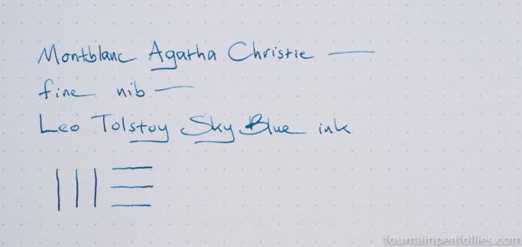
Montblanc Agatha Christie with fine nib. The Chicago Pen Show starts in just a few days, so I inked my Christie in hopes it will armor me against any impulse to buy. I’m going with: “What could be better than this one?”
And if that doesn’t work, scary snake eyes might. Except they aren’t so scary, darn it.

With a really nice blue ink in Montblanc Tolstoy.
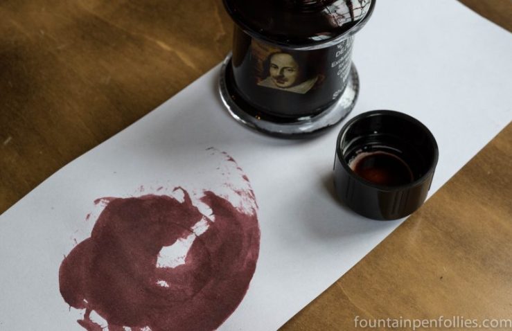
De Atramentis William Shakespeare. The 400th anniversary of Shakespeare’s death makes it a great day to mention this lovely ink. De Atramentis has paid tribute to the Bard of Avon with a beautiful mahogany ink with gorgeous shading. I really like it. And the name does not hurt.
An everyday ink? Oh yes.

If you like this ink, two other to look at are Diamine Mozart and Diamine Bach.

Today is the 400th anniversary of William Shakespeare’s death. Sonnet 18 seems especially apt:
Shall I compare thee to a summer’s day?
Thou art more lovely and more temperate:
Rough winds do shake the darling buds of May,
And summer’s lease hath all too short a date;
Sometime too hot the eye of heaven shines,
And often is his gold complexion dimm’d;
And every fair from fair sometime declines,
By chance or nature’s changing course untrimm’d;
But thy eternal summer shall not fade,
Nor lose possession of that fair thou ow’st;
Nor shall death brag thou wander’st in his shade,
When in eternal lines to time thou grow’st:
So long as men can breathe or eyes can see,
So long lives this, and this gives life to thee.
————
Image in the public domain via Wikimedia Commons
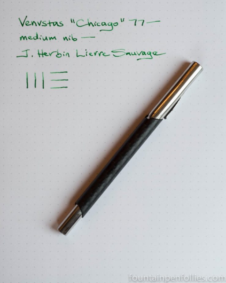
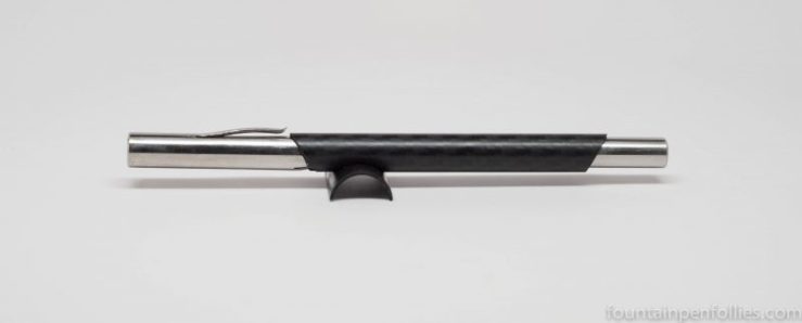
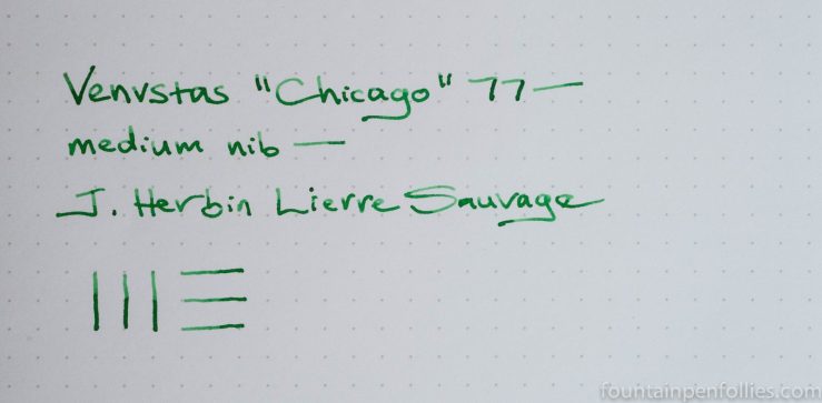
Venvstas 77 “Chicago” with medium nib. Sadly, this Venvstas isn’t mine. But happily, Venvstas has made this special edition 77 just for next week’s Chicago Pen Show. The Chicago 77 will be available as a demo at the show, and one lucky person will win it.
This 77 has a two-dimensional glossy carbon fiber body and polished stainless steel trim. I’ll put together a review soon, but spoiler alert, I like it. The medium nib is especially nice.

It’s spring here, but unseasonably cold and blustery. Nonetheless, it was the green grass of spring that inspired me to ink the Chicago 77 with J. Herbin Lierre Sauvage. And it’s perfect. It reminds me of Wrigley Field, the most Chicago place of all.

I’ve really been enjoying the Venvstas Carbon T, a carbon fiber fountain pen with a minimalist-inspired modern design.
Venvstas is pronounced “Venustas.” That’s because in the classical Latin alphabet, “v” served as not only a consonant, but also as a vowel pronounced “u.”
Venvstas pens are designed and made in Paris, and I bought mine from the Venvstas website. Because Venvstas new on the scene, I’m going to write a little about the company and its origins before talking about the Carbon T itself.
(click Page 2 below to continue)
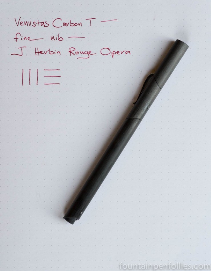
Venvstas Carbon T with fine nib. Yes, I just got this, and yes, I already shared some photos, and yes, I am working on a longer review. But it can also be Pen of the Day. Because today is a day, and the Carbon T is the pen I’m using.

Also, this lets me show J. Herbin Rouge Opera ink.
There are three J. Herbin inks with the first name Rouge — the Rouges Bourgogne, Caroubier and Opera. Each offers something lovely. Bourgogne is the pinkest, Caroubier is the most unusual, and Opera is the reddest. But Rouge Opera is from J. Herbin, so it’s a stylish sort of red.

