Fountain Pen Favorites for September 2015

5374200948_539b10fb1c_b

It is hard to believe that this is already the last day of September. But I guess it’s sinking in. Chicago’s weather just turned from summery to frosty, too. To console myself about summer’s end, here are a few pen and ink favorites from this month

1. The Pink Pelikan. I still can’t help marveling at my luck. Pelikan made a pink M600 fountain pen. And I have one.

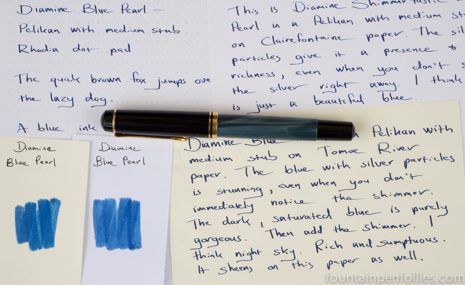
2. All of the Shimmer Inks. I am so impressed by every one of the ten Diamine Shimmertastic inks, all of which I tried in September. And those came right on the heels of J. Herbin’s 1670 Emerald of Chivor, another new favorite. I never would have thought I’d like these so much.

3. Postcards! That vintage postcard of the old Chicago Stadium really made my day. I wish I had time to learn more about vintage postcards. With the photography, the history and the occasional kitschy appeal, these are right up my alley.

4. The Never-Ending Story. Try this. Take a pen with a Japanese extra-fine nib, insert a large ink cartridge, and see how long it takes you to empty. I inked my Platinium Carbon Desk Pen with Carbon Black ink before Labor Day, and it still looks three-quarters full. I won’t be shocked if I am still writing with it on Halloween. Oh heck, I won’t be shocked if I’m writing my Christmas list with it.

—————–

Photo by Dafne Cholet, Flickr, used under Creative Commons license.

Monday Morning Quarterback, September 28, 2015

football

Looking back on the previous week, having learned a few things.

1. Biggest Challenge. I am not the world’s biggest fan of the color purple. So deciding to make last week “purple ink week” was daunting. Did I even own more than two purple inks? Would I start to loathe purple? Could anyone last seven days using purple ink every single day?

2. Biggest Relief. Using purple ink turned out to be not just doable, but very nice. Purple ink was good for editing and cheery in letters. My daughters liked it. Both iron gall Gummiberry and Sailor Kobe Tamon Purple Grey were dark enough to be perfectly acceptable for work. I liked using these inks.

3. Biggest Reminder. It’s good to to keep trying new things. Life’s more fun that way.

4. Biggest Lesson. Nothing to do with pens or inks. Did anyone see Pope Francis stopping to bless and embrace a boy with cerebral palsy in Philadelphia? I happened to see this, and I hope I always remember it.

Pen of the Day: Lamy Vista

DSC_3641

Lamy Vista with extra-fine nib. This is the demonstrator version of the Safari. I use an extra-fine nib by far the most of any nib on my Lamy pens. It’s the best size for my cramped writing.

DSC_3458

Despite my love for Safari pens, I resisted the Vista for years. Having a converter in a demonstrator pen seemed to defeat the purpose. But the minute I actually saw one, my opinion turned around. The converter only enhances the industrial syle of the pen, and I really like seeing it in there. Bonus points for the red knob.

DSC_3447

The ink is Waterman Purple, since this is, after all, purple week. It’s a nice, easy-to-read purple color. I’ve actually used it a lot this week to mark up documents, and the combination of pen and ink has been perfect for that. Purple has been good luck, as promised.

An Old Chicago Postcard

DSC_3499

A friend sent me this vintage postcard depicting the old Chicago Stadium.

I love seeing the old stadium. The stadium was opened in 1929 for the Chicago Blackhawks hockey team, who would later share it with the Chicago Bulls.  The stadium was known as the “Madhouse on Madison” because there were three close-in tiers of seats full of cheering fans, with a large organ providing sound effects.  It was the loudest, most exciting stadium I’ve ever experienced.

We call it the old stadium now, because it was demolished in 1995 and replaced with a newer building just across the street, the United Center, with an exterior modeled on its predecessor.

The old stadium hosted more than just sports, and it was one of those events that prompted the sending of this postcard.  In July of 1940, the 1940 Democratic National Convention was held at the Chicago Stadium, and President Franklin Roosevelt was nominated to run for his third term. The situation in Europe was dark: the Nazis had marched into Paris in June and were preparing for the imminent launch of the Battle of Britain.

Here’s the reverse of the postcard.

DSC_3500

“Greeting from the Convention,” from Arthur P. Schalick. The postmark is July 19, 1949, the day after the convention ended. Arthur P. Schalick turns out to be a local official from New Jersey who would later have a high school named after him.  I like the green ink he used.  I also like the trick of writing big when you have less to say.  That got me through a few exams in my student days, so I recognize a kindred spirit. I imagine he sent a stack of these to supporters and contacts back home.

It’s very nice to meet Arthur P. Schalick. I’m glad to have his postcard.  It makes me think of those days, and that great old building.

Pen of the Day: Lamy Al-Star Purple

DSC_3440

Lamy Al-Star Purple with fine nib. I’m still focusing on purple. This is Lamy’s idea of a purple pen, which is more my idea of a deep burgundy, but it’s a nice color. Sometimes we just have to roll with it.

I think the aluminum body of this Al-Star looks great with the silver clip.

DSC_3472

The ink is Sailor Kobe #32 Tamon Purple Grey. I really love this ink. Does it match the pen? Maybe not exactly. But sometimes we just have to roll with it.

DSC_3445