My Favorite 2017 Inks

favorite 2017 inks

Here are my five favorite inks from 2017:

KWZ Baltic Memories, Walk Over Vistula and Warsaw Dreaming

KWZ Chicago Blue

Papier Plume Bayou Nightfall

This was a very easy list to compile. I looked through everything I’d tried this year, and these were the obvious standouts. These five inks made the biggest impression on me. On a scale of one-to-ten, these go to 11. One became one of the inks I use most.

KWZ Warsaw Dreaming and Papier Plume Bayou Nightfall are in some ways at opposite ends of a continuum, with one being the darkest (the black Warsaw Dreaming) and one being the lightest (the green-blue-gray Bayou Nightfall). But they are similar in other ways. Both are quiet, but have depth. These inks don’t shout for attention, but they repay your attention.

Baltic Memories, in contrast … this ink does grab your attention. It walks onstage and starts singing. It is super sheeny. It is dynamic. You will notice it.

Walk Over Vistula sort of snuck onto this list, because it seemed inseparable from the other two KWZ inks released at the same time. I think of the KWZ trio together. But Walk Over Vistula deserves its spot. It’s a bridge between the quieter inks on this list, and the bravura Baltic Memories.

Chicago Blue is a super-solid everyday blue ink. Which isn’t to suggest that it’s dull, just that it’s so good you may not notice how good. It’s the Tom Hanks of ink. Oh, it’s got sheen, if you like that, and saturation. But it’s also easy-to-clean and behaves in all my pens. It was my most-used ink this year, along with old standby Pelikan Brilliant Black.

All of the inks on my favorites list came out in 2017. But there were other 2017 inks I loved, as well as older inks I didn’t try until 2017. Here are ten that were also particularly good, in my view — my 2017 Honorable Mentions:

Graf von Faber-Castell Midnight Blue

KWZ Honey

Papier Plume Mardi Gras Indians

Papier Plume Moss Green

Papier Plume Pecan

Papier Plume Red Beans and Rice

Papier Plume Streetcar Green

Platinum Classic iron gall inks

Robert Oster Bondi Blue

Robert Oster Rubine

Yes, the Platinum Classic line comprises six different inks. That’s not cheating; it’s creative accounting.

I’d love to hear other people’s favorites. Maybe I can try them in 2018.

What I Bought in 2017: Inks

2017 inks purchased

I bought 10 different bottles of ink in 2017 — one is not pictured, because I forgot it.

Buying only 10 bottles is pretty good for me. If I can be immodest, I slayed. Okay, sure, if I cast a critical eye, I could have done without four of them. Unsurprisingly, all four of those were inks I bought without sampling first. But you can’t be too strict, or you’ll never have any fun. Leave room for serendipity and surprise. Also, cut yourself some slack, because no one else will.

I did much better than in 2016, when I bought 20 bottles, and 2015, when I bought 30 bottles. If this trend continues, I will buy zero bottles in 2018. Now, that may be because I’ve been hit by a bus, but nothing lasts forever.

Here are the inks I purchased in 2017, by brand.

KWZ: (2) I bought both Chicago Blue, the 2017 Chicago Pen Show ink, and Confederation Brown, the 2017 Toronto Pen Show (Scriptus) ink. I have very limited interests, obviously.

I really love Chicago Blue, and I use it constantly.

Now, Confederation Brown in an ink I haven’t used myself, but I have seen a lot of photos online. It’s a green-brown sort of color. Everyone I know likes it. I trust it will behave, because it’s a KWZ Ink.

You know, though, ink color is a personal thing. Many people apparently can’t get enough green-brown. But I’ve realized, as I stare at my bottle of Confederation Brown, that I feel pretty “set” when it comes to green-brown inks. And I think I would have been just as happy with a sample of this.

I’m quite sure, however, that I’ll eventually sell or trade this bottle to someone who loves it, so I don’t totally regret the expenditure. Also, supporting KWZ Ink and Scriptus is good. As is supporting the Chicago Pen Show, by the way.

Lamy: (1) I actually forgot that I had this one — Lamy Petrol. I bought it months ago, and I guess the ink wan’t very memorable. It’s not even in the photo.

I do like it. Lamy Petrol is a very dark teal, a perfectly good ink. But I like it for a reason that will not resonate with many people: I like because it’s not spectacular. It is business-like and easy-to-read. It’s a nice blue- or black-ink substitute.

Lamy Petrol was very hard to get in the US. I bought my bottle from a European dealer, just to make sure I had it for our Chicago Pen Show Ink Testing Station. That was wise, since Petrol didn’t arrive at US retailers until after our show, and then only in small quantities. US buyers didn’t really get a fair crack at Lamy Petrol. Artificial scarcity like that irks me.

I bought four inks this year without sampling first — Lamy Petrol is the only one where I’d still have bought the bottle if I’d sampled it.

However, I didn’t like it enough to pop for a second bottle at regular retail, when I could have. Therefore, I did a double-take, a few hours ago, when I read that this ink is selling for multiples of the original price on the US secondary market. Guffaw.

Seriously, don’t.

Papier Plume: (5) The ones I bought were Pecan, Oyster Grey and Moss Green. Plus the limited edition Chicago Pen Show inks Lake Michigan Summer and Ivy 108, because, you’ll remember, I have very limited interests.

These are excellent inks, well-behaved, easy-to-clean, in beautiful, sophisticated colors, from a small boutique with wonderful customer service, run by great people. They are reasonably priced. I use these inks frequently. I will buy more when they run out.

Pelikan: (1) Pelikan Edelstein Smoky Quartz. I use, like and recommend Pelikan inks. If you like this one, go for it.

Now, for me, this one is …. Well, it’s brown. I enjoy brown inks as much as the next person, but I don’t use brown inks as much as blue or black inks. And this one costs $28 a bottle, and I, well, I…. Um.

I guess the best thing to say in this situation is, Wow, that’s something.

Smoky Quartz is an ink I bought without sampling first. In retrospect, that was a mistake. Especially because, as luck would have it, Pelikan very generously gave Pelikan Hubs attendees a free bottle of Smoky Quartz. So I now have two bottles.

Wow, that’s something.

Robert Oster: (1). Robert Oster Tranquility is an ink I bought at the Chicago Pen Show. I just took a stab, and bought a bottle I’d never tried.

In retrospect, this was a mistake on one level, because Robert Oster makes so many other colors that I had tried, and already knew I liked. However, everyone loves Robert Oster inks, so I’ve nearly emptied the bottle giving samples to others. Whereas, if I’d bought an Oster I loved, that bottle would still be 95% full, nearly wasted on my shelf. So, this has turned out to be a very successful purchase. It hopefully brought pleasure to many.

All’s well that ends well.

Happy Holidays

IMG_8889

I’m not sure how to start this. Purple ribbons are up in our yard, all around my neighborhood and down the main street of my town. We went to a funeral yesterday for a 16-year-old friend of my children who died suddenly and unexpectedly.

The purple ribbons are a symbol of how she touched our lives, and a way to show her family that the community shares their loss. Purple was her favorite color, and purple is the color of Advent.

Any time a life is cut short at such a young age, it’s heartbreaking. At this time of year, it’s especially difficult. But this young person meant so much to so many. She was the most cheerful person, full of laughter, always smiling. She made an impression on everyone who met her. She radiated joy and passed it along. She had special needs, and the real challenges that come with that, and her life, short as it was, was one of the most affirming and positive I’ve ever seen. She was a far better person than most. She was a gift.

She wasn’t mean, she wasn’t greedy, she wasn’t selfish, she wasn’t rude, she didn’t sow discord or division, she didn’t exclude others, she didn’t hurt others, she didn’t take from others so she could have more. She saw good in everything and welcomed everyone as a friend. She beamed with joy. She was alight with it. She was full of affection. Her character, her demeanor, her smile — all were gifts.

In some ways, this is the season of gifts. But I’m reminded that the real gifts have been given to all of us already, and we can share those freely every day. That is something to celebrate. I wish everyone a healthy holiday season, filled with love, peace, warmth, light, and comfort and joy.

More on the New KWZ Inks: Baltic Memories, Walk Over Vistula and Warsaw Dreaming

KWZ Warsaw Dreaming, Baltic Memories, Walk Over Vistula writing samples

These past few weeks have been cray-cray, but I came home the other day to a lovely gift: bottles of the three new KWZ inks. This was the perfect excuse to top off the pens, and shoot a new set of photos, this time with the correct names for the two blue inks. When shopping for inks, I find it helpful to know their names; perhaps you will, too.

(click Page 2 below to continue)

New KWZ Inks: Warsaw Dreaming, Walk Over Vistula and Baltic Memories

KWZ Warsaw Dreaming, Baltic Memories, Walk Over Vistula writing samples

Just in time for holiday shopping, there are three new inks from KWZ Ink: Warsaw Dreaming, Walk Over Vistula and Baltic Memories. A black, a blue and a teal. I had a chance to sample these, and I love the colors.

One slight (okay, huge) problem, though: I reviewed pre-production samples, and I managed to mix up the names of the blue and the teal. The colors in the photos are accurate; however, the names written for the blue and teal inks, in the photos, are not. Confused? Me, too! But this problem has a simple solution: buy both. No, buy all three. You will thank me later.

All three inks are sheeny, in different ways. The teal and blue boast dramatic red sheen, while the black has a blue tint and the sort of sheen that doesn’t show up in a different color, but rather, in an almost slick quality.

(click Page 2 below to continue)

Pelikan M605 White Transparent: It’s No Candy Cane

Pelikan M605 White Transparent with Pelikan Edelstein Ruby

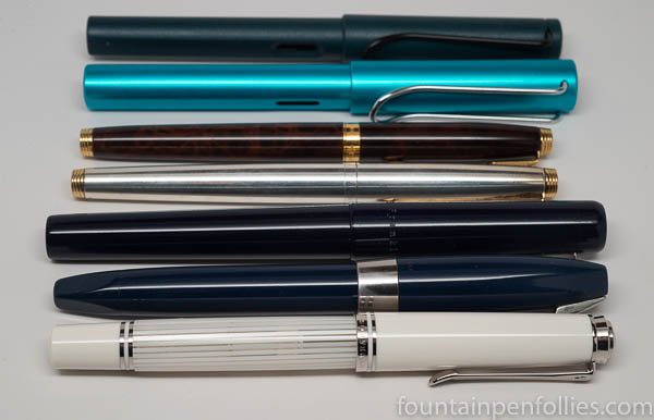
Here’s the thing about the Pelikan M605 White Transparent: it’s elegant and glamorous. It just is. It’s Lara in Doctor Zhivago; it’s Daenerys Targaryen in her coatdress north of the Wall. It’s Fred Astaire, and Cary Grant. Whatever the circumstances, this pen will remain stylish.

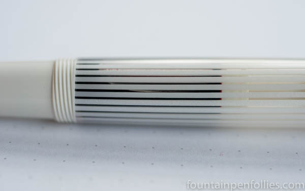
Not even red ink can tart up the White Transparent. Oh, I tried. Up there is the pen filled with Pelikan Edelstein Ruby. It’s no candy cane.

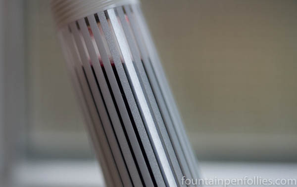
Okay, if you hold the pen up to the light, you can make out the red, but even then, it’s not prominent.

Pelikan M605 White Transparent with Pelikan Edelstein Ruby

That’s the barrel placed against a sunny window and blown up much larger than life. As one does in real life …. Right, never.

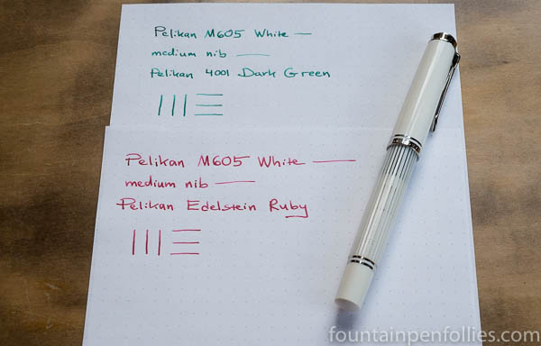
Well, I kept trying. Next came a green ink. This is Pelikan Dark Green in the White Transparent.

Pelikan M605 White Transparent with Pelikan 4001 Dark Green

The barrel doesn’t really look much different than with the red ink.

If you really want this pen to look wild and crazy, I’m thinking it will take orange, or maybe turquoise. And even then, maybe not.

I am not going there, in any case. This pen has its own style. Why fight it?

Nonetheless, for posterity, here’s a seasonal ink display. Jingle Bells and Ho Ho Ho and happy holidays to all. Otherwise, doesn’t this seem wrong?

Pelikan M605 White Transparent with Pelikan 4001 Dark Green & Pelikan Edelstein Ruby

I’m running back to the gray and blue inks now.

Pelikan M605 White Transparent: Easy Clean?

Pelikan M605 White Transparent detail

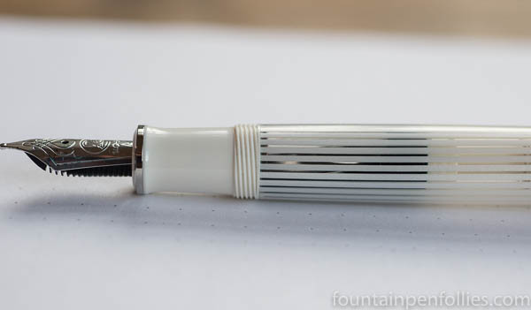
Yes. It cleaned up just fine. That was a question we all had, looking at Pelikan M605 White Transparent. The pen is totally white, except where it’s actually transparent. Incredible looking, but a little concerning, too.

I filled the pen on November 13 with Papier Plume Bayou Nightfall, a lovely ink that’s a grayish blue with a green tint. Bayou Nightfall is not a bright pink or purple, but I did keep it inked for more than two weeks before cleaning it out.

Cleanup was easy and fast, and, as you can see above, there was no staining. The white piston still looks perfect, even up close.

Pelikan M605 White Transparent detail

I can’t say I was seriously worried. It’s a Pelikan, and I have confidence in the brand. I also have confidence in Papier Plume inks, and I know Bayou Nightfall is easy-to-clean. But this pen’s white piston was new to me, and it’s still good to see.

Now that the White Transparent passed its first test, I have a test of my own: figuring out what ink to use next. I’ve been thinking about Pelikan Edelstein Ruby — a favorite red ink and a nice holiday color. My hesitation? Will Edelstein Ruby make the pen look like a candy cane? And if it does, will that be a bad thing?

Decisions, decisions.