Pen of the Day: Sheaffer PFM Green with Caran d’Ache Idyllic Blue

Sheaffer PFM I fountain pen with Caran d'Ache Idyllic Blue ink

Sheaffer PFM I Green with medium nib. The PFM, once again, because we have gone out of the green and into the blue. At least in terms of ink. With apologies to Neil Young: hey hey, my my; a PFM should never die.

My first stab at a blue ink for the PFM is Caran d’Ache Idyllic Blue, which is a normal standard blue ink. This is what it looks like, more or less.

Caran d'Ache Idyllic Blue writing sample

Idyllic Blue is very close to Waterman Serenity Blue in color and behavior, but smoother feeling, I think, and I like it a tiny bit more. Not that I don’t love Serenity Blue. I probably just wanted a slight change.

No pen changes, though. Boring as that is, I know. I feel so set.

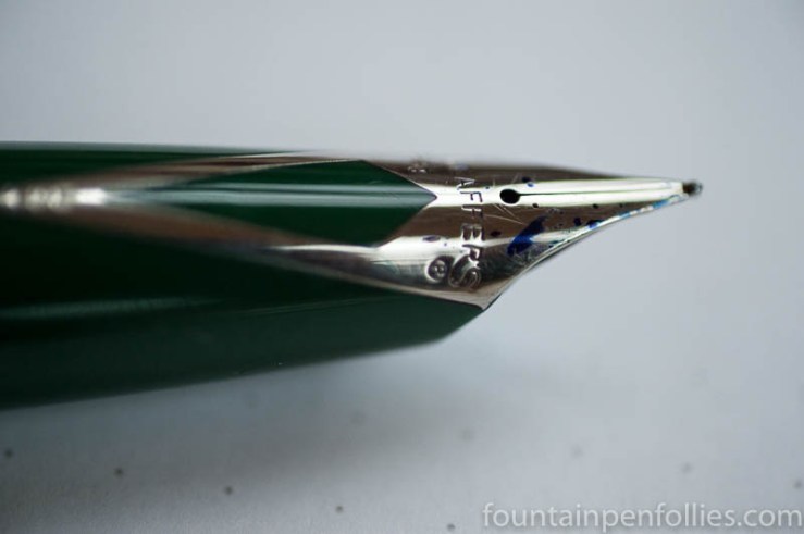
We’ve had a lot of really valuable discussion about the PFM’s inlaid nib. So here it is, in the dark of a late winter afternoon. I like the shape, I like the “R,” I like the “apostrophe S” that connects to the “R.” I certainly like blue ink drops. I like it all.

Sheaffer PFM I fountain pen nib closeup

Ink Dips: Pelikan Edelstein Onyx

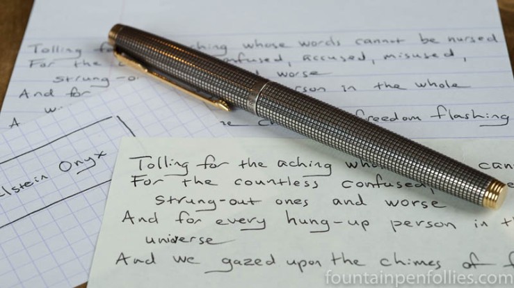
Pelikan Edelstein Onyx and Parker 75 Silver

Ink Dips is a more casual, and potentially evil, ink evaluation than is normal here at Fountain Pen Follies. Instead of carefully evaluating an ink I’m interested in, the point of Ink Dips is instead to blindly pick an ink sample from a box of dullards and discards. Then I ink up that sample in one pen and see what I think. It’s sort of like the feeling you get when you leave for the airport during a snowstorm: you don’t know what’s going to happen, but you’re prepared for it to be painful.

Pelikan Edelstein Onyx. I’m pleased to say that Pelikan Edelstein Onyx turns out to be an awesome performer. It’s a black ink, on the lighter side, and although it is premium-priced, the more I use it, the more I think it’s worth it.

(click Page 2 below to continue)

Question I’m Pondering: Is It Impossible to Clean All the Ink from a Sheaffer PFM?

Sheaffer PFM ink residue in water

That is a photo of my Sheaffer PFM, soaking in water. See how the water is tinted green? That’s residue from Kaweco Palm Green soaking out of the feed, after I cleaned and flushed the pen. But that’s not what’s noteworthy.

The noteworthy part is that this photo was taken after five straight days of soaking. I cleaned and flushed the pen five days ago, then started continual cycles of occasional flushing and constant soaking. Every once in a while I’ll press a paper towel against the feed, to check if there’s still ink in there.

Sheaffer PFM ink residue

Yes, there is. So the pen is still soaking, on, as I write this, day six.

Kaweco Palm Green is an easy-to-clean ink, and what was in the sac flushed out easily. But there is still ink in the feed. The downside of the PFM’s Snorkel-tube filling system, clearly, is that normal pen cleaning doesn’t completely flush out the feed. So, this isn’t a pen for switching between different ink colors. Anyone considering a PFM should note that.

Since I bought this PFM, I’ve been using different green inks, for the unimaginative reason that it’s a green pen. But the PFM is a great everyday pen for me, and I want to keep it in my daily rotation. So I’m going to switch to a blue ink, my favorite color.

That will give me three pens in permanent rotation: a Parker 51, a Lamy Safari, and the PFM. I did briefly wonder: Am I still a hobbyist? Or just a plain old pen user? Then I remembered my pen with pink ink. Phew.

It’s a Long Way to Tipperary

mary_tyler_moore_show_title_card

Mary Tyler Moore died yesterday, at the age of 80. Which is hard to believe, on both fronts. I still think of her as Mary Richards, the 1970s career woman who wondered if she could make it on her own.

A lot of girls and women who were around in 1970s America look back on the Mary Tyler Moore show with gratitude and fondness. It was funny and warm, well-written and well-acted, but not just that. The very premise of the show was quietly inspirational. In 1970, it presented as normal the possibility that single women could be both independent and happy, for the whole run of the show.

Women could have fulfilling jobs — careers, even. Women could have a circle of good friends, but could live contentedly alone in a cute apartment. Women could date just for fun — not seriously, not looking for a husband. Women didn’t have to be perfect. They didn’t have to be good cooks and hostesses — it was a running joke that Mary’s dinner parties were awful. Women could stammer, could be uncertain and could make mistakes. And still be happy.

That was relevatory, for girls as young as I. Mary Richards was a role model, and an inspiration. As was Mary Tyler Moore. Thanks, Mary Tyler Moore.

But the show was also so funny. There may never be a half hour of television as funny and true for me as the Chuckles the Clown episode. Chuckles, the local television station’s clown, met an untimely death, which led other coworkers to make nervous, tasteless jokes that horrified Mary. But it was Mary, usually so well-mannered and appropriate, who found herself unable to stop laughing during the solemn funeral service. Mary was met with shocked stares, as you’d imagine, until the clergyman officiating at the service tried to make her feel better by telling everyone that, no, she should laugh, because Chuckles lived to make people laugh, and her laughter was exactly what the late clown would have wanted. At which point she started sobbing.

When the show went off the air, the last episode ended with the characters, most of whom had just been fired, walking out of the office, arms around each other, singing It’s a Long Way to Tipperary. Because that always was the message of the Mary Tyler More Show. Despite the title song, you don’t just make it on your own — you make it with the help of colleagues, friends and family.

Thanks for that, too, Mary Tyler Moore.


Pen of the Day: Montblanc Heritage 1912 with Sailor Sakura-Mori

Montblanc Heritage 1912 with Sailor Sakura-Mori

Montblanc Heritage 1912 with broad nib. This is one of my favorite pens, with its updated safety-filler design and its pleasantly bouncy nib. But today I’m really doing a disguised Ink of the Day.

I read that the first cherry blossoms begin blooming in Okinawa right about now, which made me take out the Sailor Sakura-Mori. Warm weather envy can be a beautiful thing.

Montblanc Heritage 1912 with Sailor Sakura-Mori

I really enjoy the gentle pink of Sakura-Mori. A few drops of ink clinging to the nib show the peach tint that makes this ink so interesting.

Montblanc Heritage 1912 nib

Ink Dips: Sailor Oku-Yama

Sailor Oku-Yama

This post kicks off a new adventure for Fountain Pen Follies. Instead of carefully evaluating inks that I’m interested in, I’m going to do the opposite. I’m going to blindly pick an ink sample from my “miscellaneous samples” box, load it in a pen, and then see what I think of  it.

I considered calling this experience Ink Roulette, or Random Inks, or even reclaiming the title Mystery Ink. But I’ve decided on Ink Dips. For two reasons. One, I’m just barely dipping into the ink. I won’t necessarily use it much, especially if I don’t like it. Two: it’s kind of a dippy idea. The reason these samples ended up in the box is because I either didn’t want to use them or didn’t like them.

But what the heck: it’s winter; try something new. Ink Dips begins.

Sailor Oku-Yama. This is an ink I’ve tried before and just didn’t like. So I was a little worried when I plucked it out of the box. But what a success for the first Ink Dip. I really enjoyed it this time.

(click Page 2 below to continue)

Pen of the Day: Pelikan M600 Green o’Green and KWZ Iron Gall Green #4

Pelikan M600 Green o' Green with KWZ Iron Gall Green #4

Pelikan M600 Green o’Green with extra-fine nib. Loyal blog readers probably feel like they own this pen themselves, so often does it appear in these pages. It’s a favorite of mine, a limited edition from a few years ago.

I love a Pelikan gold nib. This is a Pelikan extra-fine, which usually means “not really fine,” except this ink really does help tighten the line.

Pelikan M600 Green o' Green with KWZ Iron Gall Green #4

The ink is KWZ Iron Gall Green #4. Here’s a closer look.

KWZ Iron Gall Green #4 writing sample

I’ll be doing a review, but you’ll note that the color of Iron Gall Green #4 looks a little darker in the first two photos. Sometimes it does: it depends on the pen and the ambient light. The third photo is what Iron Gall Green #4 usually looks like.

If you’d like to compare some other KWZ green inks, I’ve, ahem, used a few. Two dye-based inks, KWZ Rotten Green , and KWZ Foggy Green. Also two iron gall inks: KWZ Iron Gall Green Gold here and here, and KWZ Iron Gall Green #1, here.