Bits and Pieces and Lamys and Pilots

So how are we all doing? All good? I hope so. I’m good, too, just super busy doing other things. As a result, I feel like I’ve been more inattentive than usual to my fountain pen blogger responsibilities.

Except, of course, the whole reason I took the job of fountain pen blogger in the first place is that it comes with absolutely no responsibilities. Excellent!

Except the pay? Same.

Still, I do like to check in with everyone, at least every once in a while, if for no other reason than to signal that I’m not dead or anything. So here’s what’s going on here, in pens and other follies.

1. Pilot Kakuno.

Last Sunday someone showed me a Pilot Kakuno in clear plastic. I was taken by it. It seems like a nice starter pen: it’s small but not tiny, with a comfortable grip. And I love a clear pen. Yes, it’s for children. But I don’t hold that against pens. I’m a Safari fan (like all right-thinking people).

2. Almost mine.

I liked the Kakuno in clear plastic so much that I actually put one, with a converter, into my Jetpens cart. Come for washi tape, leave with a pen. It’s that $25-free-shipping offer. It gets me every time.

In the end, though, I didn’t get it. As nice as the Kakuno is, I realized I wouldn’t use it beyond the first “Isn’t this fun!” stage.

3. Great news, Lamy.

You may remember that at the Ohio Pen Show someone took off with my beloved Lamy Pico in Laser Orange. That was a bummer. But this week Fontoplumo announced that Lamy is adding the Laser Orange as a regular Pico color.

The Laser Orange Pico was possibly my favorite pen purchase of 2016, and I’ll buy another for sure.

(There are some other new Lamy colors, too, including a very nice purple Lamy Nexx, for purple fans.)

4. Lamy, Lamy, Lamy.

Speaking of new Lamy colors, it hasn’t been officially announced, but it has been reliably rumored that the new 2018 Safari is going to be a textured black color.

Honestly, my first thought was “blah.” A textured black would be the third not-fun Safari in a row. Is this one necessary? There are three Safari or Al-Star pens in black or charcoal in the regular line already. In fact, a Charcoal Safari is the one pen I always keep inked.

But the idea has grown on me. It may be Stockholm Syndrome, but if the not-fun Safari is going to remain Lamy’s thing, they could do worse than textured black. I like black; probably everyone likes black.

Plus, well, I don’t know how to say this, but … I’d never really looked closely at the Charcoal, despite using it daily. And, now that I have, I think Lamy may have a point. The Charcoal is kind of an odd shade of gray. A textured black Safari might be more appealing.

So I’m mildly looking forward to this new not-fun Safari. Add that to the Laser Orange Pico and the 2018 Vibrant Pink Al-Star. That’s three Lamy purchases on the horizon for me, and I’m feeling positive about all three. Good vibes, Lamy.

5. The Best Lamy.

My favorite Lamy is on its way back to me as we speak — the Dialog 3. Thanks to the intervention of a good pen dealer (the Nibsmith), my pen is in the mail, with its clip apparently all fixed.

And just in the nick of time, too. I missed that pen so much I was debating between nailing Christmas lights to the wall to try to communicate with it, or firing up the shrine to Jobu and sacrificing a Platinum Preppy.

I think the lesson here is that having a good pen dealer is important.

6. Better than Lamy.

Virginia Woolf’s birthday was this past week. We are not worthy. Looking for a reading suggestion? Pick up Mrs Dalloway, or To The Lighthouse, available at fine bookstores and libraries everywhere. I’m going to pick up my copy of The Waves again, and this time, I swear, I’ll finish.

7. Actually.

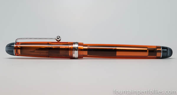
Actually I have a Virginia Woolf pen. It’s beautiful.

I mean, it’s not Virginia Woolf’s pen. Of course. Fun fact: fountain pens were a new-fangled invention to her. I seem to remember a passage in her letters or diary where she totally dragged this buggy new technology. Yet to us, fountain pens are old-fashioned. I find that delightful. Also a little trippy.

How to Resist Temptation

It’s not even the end of January, and I’ve already been tempted with a slew of new or upcoming pens, dangled in front of me, metaphorically, via the internet. And I don’t want pens, darn it. But the weather is terrible, and I’ve been inside a lot. Also, I’m weak.

On the other hand, because I have zero willpower, over the years I have developed some excellent coping mechanisms of my own, and jealously catalogued others. And I am going to share some of those here, in hopes of inspiring myself. Or, more realistically, in hopes of keeping my attention otherwise occupied, so I don’t buy anything. (See Number 4, below.)

1. The Fifties Popular Culture Method. This is my most-used, and most recommended, method of resisting temptation. It’s simple and effective, and can be summed up in one word: “Don’t.” Don’t resist at all. Give in, immediately. The key is to do so wholeheartedly. You don’t beat yourself up; instead, you congratulate yourself. You aren’t an undisciplined profligate; oh no. You are madcap, fun-filled and aglow with the love of life. You “seize the day.” You embody the mantra that “we only live once.” You never forget that “life is a banquet!”

Your spiritual home is a bar in the French Quarter of New Orleans. Your song is “Que Sera, Sera.”

2. Reason, Maturity and Proportion. This is where you stop yourself, take a deep breath, and really contemplate “why” you “need” this thing. Why, in a world so beautiful, in a lifetime that’s so short, where every breath you take could be seen as a miracle, where every sparrow’s fall is consequential — and where you already have more pens and inks than a person can use up in a lifetime — does acquiring another “thing” matter?

Your spiritual home is a gorgeous, mountain-side monastery, and your song is “Every Grain of Sand.” (This is not my usual method, but I do love that song.)

3. Delay. This is pretty easy, and especially suitable for those, like me, with a short attention span. Now what was I saying? Oh yes, delay.

Here’s how it works: something is announced and you see it on some social network site or other. Your perfectly normal reaction is, “Ooooh, shiny. Want!” You should absolutely feel free to start looking for it immediately. But I want you to attack that task with determination; I want you to give it your all. Spend a lot of time. Figure out who has it, what the price is, how much shipping would be, what nib size you want, what your friends think, what your “not really friends because they are mean to you about your choices” friends think, what other people (complete strangers using anonymous handles like “LuvFurPens”) think about it, what other stores have it, then whether the nib size you thought you wanted is really the right one, then whether there’s a converter that fits, then rethink the nib size and maybe reconsider the ideal color a few more times.

And then — and this is critical — next you have check how much it is at a store abroad. Keeping in mind that, wherever you happen to live, it will always be cheaper somewhere else.

At which point, you absolutely need to do some more sleuthing, but this time, at online merchants in other countries. Translate some words from languages you do not speak, do the currency conversion, figure out international shipping costs, do the currency conversion on that, too, then figure out if you can add a few things to justify the international shipping, then figure out if you can add a few more things beyond that, so you have enough to qualify for free international shipping. Now, with your cart full of $150, or €75 or £50 worth of items — now, and only now — you can pause. In fact, you must. This is now not just buying some small item that caught your fancy. It is now a Bigger Deal. You need to give yourself time to think. You started out looking for a $20 pen or a $15 bottle of ink; now you’ve got €150 in your cart.

Better start all over again. At a minimum, is it really cheaper when I buy everything? Maybe some of those things are cheaper elsewhere, so the whole basket would be cheaper from another merchant. Or, maybe I should just buy it in my own country and pay the slightly more expensive $20 price, but only get that one item. And maybe I need to compare a few stores right here.

But then, once you’ve settled on a source in your own country, and you’ve got it in your cart — well, of course, now, once again, you should pause.

If it all worked properly, you now have at least two carts full, with merchants in at least two different countries. And, by this point, the minutes have ticked past, perhaps bled into hours. Uh oh. You probably have to do some real work, or make dinner or do chores, or maybe you’re slated to have some actual in-person interaction pretty soon. And maybe, if everything took a good long time, you now feel disenchanted with the stupid item anyway. It cost you all that time, after all, and you still don’t have it. Stupid pen/ink/notebook. Now you’re behind on everything, just because of that stupid thing. And wait, do you really like the color burnt orange? Or a medium nib? Who wants a medium nib? Just forget it. You can go back tomorrow.

And probably, the next day, you won’t even remember that you had to have that thing. Or, if you do remember, you’ll think, meh, it’s not such a big deal anyway. I’m pretty sure I hate the color burnt orange. Maybe I’ll see it in my next club meeting/pen show/trip out of the house. And then I can decide.

Your spiritual home is the internet, and your song is “Lost in the Supermarket.”

4. Deflect and Distract. You can’t buy something if you do something else. Clean your desk (ugh, me lately, and okay this stinks — forget I mentioned it). Better is to read a book. Listen to music. Open the Poetry Foundation’s website: start with the poem of the day, then explore. Talk to a friend. Email an old friend. Find a new recipe to make for dinner tomorrow. Figure out the movie schedules this weekend. Invite a nearby friend over, or out for coffee. Turn on the tv (maybe the Blackhawks are playing). Do laundry. Clean the basement or a closet. Go to the library. Take a walk. Read a blog. Write a blog. Write a comment on a blog! Ah, that’s excellent. Life is beautiful.

Your spiritual home is a seashore at sunset, and your song is (Sittin’ On) the Dock of the Bay.

5. Self-Discipline. In which you look at all the pens and inks you already own, and realize you should just use those instead of buying something new.

Your spiritual home is a cabin somewhere off the grid, not connected to the internet, and you have no song, because that would require electricity. I find you inhuman.

Ink Dips: Callifolio Violet

Callifolio Violet writing samples

Ink Dips is a more casual, laid-back ink evaluation than is normal here at Fountain Pen Follies. Instead of evaluating an ink I’m actually interested in, the point of Ink Dips is to blindly pick an ink sample from a box of the pooh-poohed and, more than likely, the purple. Then I dip a toe in the water, by trying that sample in only one pen. It’s an ink experiment that’s a bit dippy.

Callifolio Violet. This is nice standard purple ink, at a nice price. It writes a nice narrow line. It is also the second purple ink in a row to become an Ink Dip. I’ll be honest, I think they won. I’m a shadow of my former self, which should scare us all.

(click Page 2 below to continue)

Ink Snippet: Montblanc Racing Green

Montblanc Racing Green writing samples

Montblanc Racing Green. Montblanc Racing Green is nearly unobtainium, unless you’re really spendy or obsessed. Montblanc discontinued Racing Green years ago, and it’s since become quite the thing. Everyone talks about it, everyone seeks it, or at least seeks an ink that looks like it. Every time a new olive-green ink is released, an ink fan somewhere wonders, “Is this like Racing Green?”

I’d never used Montblanc Racing Green before last week. When it was available, it didn’t interest me, and when it stopped being available, the price shot sky high. But I’ve been using it lately, thanks to a sample from a kind friend.

I have good news, and bad news.

The good news (at least for me) is that I don’t really get it, the mania. Yes, the ink is attractive. It’s very nice. But it’s not going to change anyone’s life. It’s not the greatest ink ever made, in my opinion. It’s not even the greatest green I’ve ever seen.

The bad news is that I don’t know another ink that’s a good doppelgänger. Normally I can point out nice inks that are pretty close. Here, however, the closest alternative is, in my opinion, not nearly so appealing.

But it’s okay. Yes, Montblanc Racing Green was a nice ink, and it’s now gone, for all intents and purposes. But don’t think twice, it’s alright.

(click Page 2 below to continue)

Ink Dips: Caran d’Ache Ultra Violet

Caran d'Ache Ultra Violet writing samples

Ink Dips is a more casual, laid-back ink evaluation than is normal here at Fountain Pen Follies. Instead of choosing an ink I’m interested in, the point of Ink Dips is to blindly pick an ink sample from a box of the slighted or set-aside. Then I dip a toe in the water by trying that sample in only one pen. It’s an ink experiment that’s a bit dippy.

Caran d’Ache Ultra Violet. This is a very nice purple ink, in an interesting hue, with good behavior in the pen, and good performance on poor paper. It is, however, very expensive, at least in the United States.

(click Page 2 below to continue)

Why We Can’t Always Judge an Ink by Its Name, or Even Its Picture: A Tale of KWZ Confederation Brown

KWZ Confederation Brown Montblanc Racing Green swabs comparison

Someone asked me to compare KWZ Confederation Brown with Montblanc Racing Green, thinking the two inks might be similar.

As you can see, that’s a firm “no.”

KWZ Confederation Brown is the limited edition ink made for the 2017 Scriptus Pen Show in Toronto. Montblanc Racing Green was a regular Montblanc ink, but it was discontinued years ago and now trades at very high prices because it’s got a certain mystique.

I snapped a comparison shot of the two swabs and texted it to the friend who had asked about it. His reaction? Puzzlement. He said something like, “That’s weird: my Confederation Brown looks more green, and yours looks more brown.”

Was my ink faded or from a different batch than his? Was something wrong with my ink, or his? Because his looks greener than mine, supposedly.

No, not at all.

That’s a very common reaction. Let’s talk about why.

Our perception of a color is influenced by many factors, one of which is how the color we are looking at interacts with other colors. We perceive a color differently based on the colors nearby.

So in the top photo, Confederation Brown looks browner and less green.

But now look at this photo of Confederation Brown.

KWZ Confederation Brown Sheaffer Skrip Red swabs comparison

And this photo.

KWZ Confederation Brown Montblanc Seasons Greetings swabs comparison

In those two photos, Confederation Brown looks not brown, but green, albeit a yellow-brown-green sort of green.

Confederation Brown has not changed. The only change is the surrounding colors. That makes all the difference in one’s perception of the color of Confederation Brown. (Let me add that when you see Confederation Brown in isolation, it looks fairly green.)

It is highly unlikely — nearly impossible, I’d wager — that anyone’s bottle of KWZ Confederation Brown strays significantly from the standard. That’s because KWZ would have made this special edition ink in one batch. Also because KWZ takes pains to ensure KWZ inks are consistent, even from batch to batch. And it’s very recently made, not likely to have changed color in the bottle.

There’s another issue here: ink names.

So much goes into an ink name. Marketing appeal, the sound of the words, how the name translates into different languages and, of course, the need to describe the color. This ink would have been named by the organizers of Scriptus, the Toronto pen show. The Confederation part of the name refers to the creation of the Dominion of Canada. And the Brown part is for the color.

I think with this ink, reasonable people can differ whether it’s more brown, or more green. As I said, when I see Confederation Brown, it looks green to me — although a yellow-brown type of green. But I think either brown or green is perfectly fair. Also, I’m quite certain that if they had named it “Confederation Green,” some buyers would have felt it was too brown to be named green.

The truth is, there are infinite varieties of any color, be it blue, red, green or brown. That’s part of what makes fountain pen inks so interesting.

Here are the inks I have that I find closest to Confederation Brown in feel. One is more of a brown, one is more of a green.

KWZ Confederation Brown swabs comparison

Stipula Verde Muschiato happens to be one of my all-time favorite inks, and I love how golden it looks here. To me, the slightly browner one is is Verde Muschiato (named green) and the greener one is Confederation Brown (named brown). But they are both green-browns or brown-greens.

Here is Confederation Brown with one of my favorite KWZ greens.

KWZ Confederation Brown KWZ Iron Gall Green Gold swabs comparison

Despite me thinking Confederation Brown is pretty green, KWZ Iron Gall Green Gold is greener. Put another way, next to Iron Gall Green Gold, Confederation Brown surely looks brown. (As it does next to Montblanc Racing Green, in the first photo.) Another reason the Brown name makes sense.

In any case, whatever the name, these are all interesting colors, with many dimensions, and a lot to enjoy. Even a mere glimpse of the swabs shows how different these inks look on white versus cream paper. They also will vary depending on the pen used.

That malleability is a feature of many green-brown, or brown-green, inks. It’s one reason those colors are so interesting. And also why these inks tend to fool our eyes the most.

Pen Review: Pilot Custom 74

Pilot Custom 74 Orange

I was lucky enough recently to borrow an orange Pilot Custom 74 with fine nib.

I’ve had my eye on the Custom 74 for years; and every once in a while I think, “Should I?” The lure is the nib: I think the Pilot fine nib is perfection. But I haven’t yet found the perfect Pilot fountain pen. Could the Custom 74 be the answer?

(click Page 2 below to continue)

A Peek at the Pen Cup: New Year, New Me Edition

pen cup

You know how some people love New Year’s resolutions? Yeah, not me. But you know how some people love pen-cleaning? Okay, also not me. But, you know how some people are procrastinators, and they will do anything to avoid a disagreeable task? Me!

So over the last few days I’ve avoided cleaning off my desk by cleaning out my two pen cups instead. Instead of the long, hard slog that desk-cleaning would entail, I’ve chosen to redo my roster of inked pens. Fun.

“New Year, New Me.” Or, at least, New Year, new pens and inks. Plus, I’m down to one pen cup now. Wow.

pens in pen cup

I know, all this excellence and accomplishment is probably intimidating. But I did keep some holdover pens. And not even out of laziness, but out of “I still like these.”

Here’s what has stayed inked: Lamy Safari with Pelikan Brilliant Black (as always); Pelikan M710 Toledo with Papier Plume Pecan; Pelikan M200 with Papier Plume Bayou Nightfall; Pelikan M600 with KWZ Warsaw Dreaming; Parker 75 with Waterman blue; and Parker 75 with Waterman blue black.

Also in there are two Parker Jotter ballpoints. I like them, and they give me something to hand to those people who look at my desk, look at my pens, and desperately ask, “Is there anything I can use to sign this form?” (Those people are relatives, which is why I cater to their whims. Occasionally they feed me.)

For the new pen, I decide to do another ink from Ink Dips, an occasional series where I randomly pick an ink sample from a bag of leftovers. Fun.

So I stick my hand in a bag of leftover ink samples, close my eyes and pull out … Caran d’Ache Ultra Violet. The first Ink Dip of 2018. Ta da.

Now, here’s the thing: I very much like Caran d’Ache inks, but that one is a purple sort of color. I am an honorable person. But this is the first Ink Dip of 2018, and I don’t think purple is a nice thing to do to people (at least, not to me). Especially early in the year, before I’ve had enough coffee. So I cheat, and pick again.

And this time, I pull out … Callifolio Violet. Also purple.

2018 is trying to kill me, and it’s only Day Two.

I say a word, which happens to be a swear word, and I pick again. This time it’s Callifolio Inti. That one is golden yellow, not purple, and looks very nice. Though if this were Russian Roulette I’d already be doubly dead. Not fun.

But I am an honorable person, and don’t have many pens inked, so I find three Pelikans, enough for all these inks, even the purples. I tell myself, “I can do this. The Pelikans will pull me through.”

But can I do this? Two purples in a row?

I don’t know that I can. At least, not without resorting to huffing.

So I go back in the ink area and spend another half hour searching through many other ink samples, to find a special ink. The one I have in mind is ink that’s no longer made, that people seem to love, but I’ve never tried. My friend sent me a small sample of this ink, just so I could try it.

And I put it somewhere really safe. “Somewhere safe” means “I have no idea where.” Duh. But, finally I find it. I pick a beautiful Pelikan for this special ink, too.

Pelikan M620 Stockholm and Montblanc Racing Green swabs

Montblanc Racing Green, finally. In my Pelikan M620 Stockholm.

I’m up to four new pens. Also, I’m not huffing yet. So, a modestly successful New Year, so far.

Inks Chris Bought in 2017

Inks I bought 2017_0002

My friend Chrissy, the indomitable ink goddess, is always kind enough to give us a list of the inks she bought each year. Her 2017 roster is awesome, as ever. She and I bought almost entirely different inks this year, too — our only common purchase was Lamy Petrol. Note, however, that Chrissy is the sort of person who not only lives through a terrible hurricane far from home, but actually emerges triumphant, with free Montblanc ink in hand. A Robinson Crusoe for our time. Here, in her own words, are Chrissy’s ink purchases from 2017:

For 2017 I’m pleased to report that I kept my New Year resolution and wrote records of my pen and ink purchases. I decided to start two separate pages in my Seven Seas Writer Journal, titled “Inks I Bought,” and “Pens I Bought.” I kept them accurately and feel almost saintly. 🙂

Yes, I admit the inks page has more entries, but I spent more on pens because I made one expensive purchase.

(click Page 2 below to continue)