

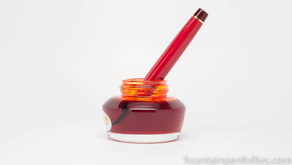
Here’s a bottle I will quixotically defend: the Diamine 30 ml bottle.
A plastic, rectangular prism, relatively tall and slender. Many people seem to dislike this one. And it does not induce a swoon. It’s just a functional container.
But this bottle is easy to live with. It’s inexpensive. It’s lightweight. It takes very little room. Those are very nice qualities when one likes to buy a lot of different inks.
Yes, the bottle opening is narrow. But it is as wide as a sample vial. Yes, the bottle seems tippy for filing. But just place it between two heavier objects, or inside a small cup — it’s amenable.
That height at least means you can fill a pen even when there is very little ink left.
The Diamine 30 ml plastic bottle will never make you say, “hello, gorgeous,” but it’s reliable and works just fine.When you spend time with it, you realize that the Diamine 30 ml bottle has a lot of good qualities for the long haul. That means I give it a “marry.”
Let’s compare a different Diamine bottle. Here’s the triangular 40 ml bottle Diamine uses for its more expensive 150th anniversary inks.

The 150th anniversary ink bottle shape is distinctive and attractive. Made of glass, the bottle is nice and steady. But such a wide bottle takes up a lot of room. And that nice packaging is costly: this bottle only holds 40 ml, but costs twice the price in the US as a 30 ml Diamine bottle.
And functionally, the beautiful 40 ml bottle has at least one flaw: filling a pen is easy when the ink level is high, but not so easy when you use up more of the ink.

It’s not terrible. It’s more like someone who looks great at first, but is expensive to hang around with, and as time goes on, you discover some shortcomings. But you enjoy most of your time together. It’s a good one to date.

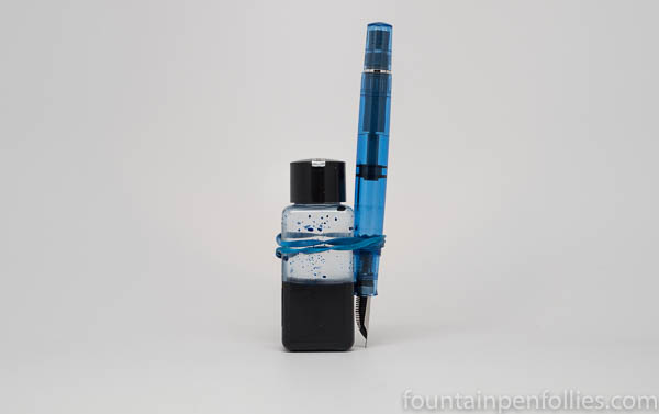
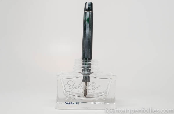
Worse, for me, is the Pelikan Edelstein bottle.
This is another attractive bottle shape. Nicely heavy, with a stable base. Swoonworthy curves. But the ink chamber is really short.
Here’s an Omas Paragon. With any pen with a larger nib, even Pelikan’s own M800 and M1000, you don’t have to use up that much ink before you can no longer fill from this bottle.
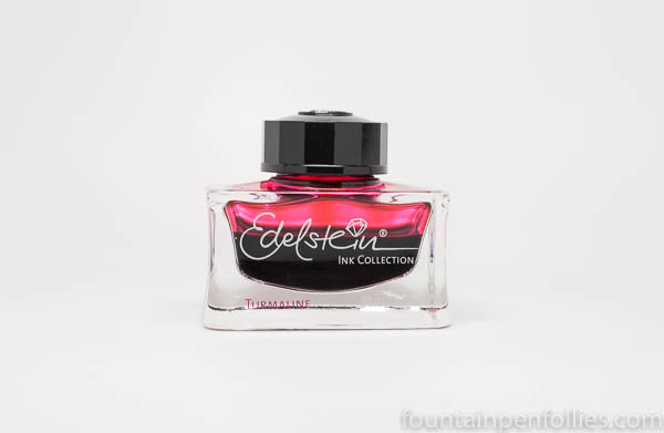
Pelikan charges more for the premium Edelstein line, in part because of the heavy, attractive bottle. So let’s compare the Edelstein bottle to a few other premium bottles.

Pilot Iroshizuku and Caran d’Ache Chromatics bottles stand tall, and you can fill from them very easily. The shortest is the Graf von Faber-Castell bottle, but look how much more roomy it is.
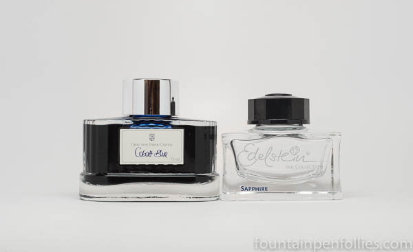
And a Graf von Faber-Castell bottle gives a buyer 75 ml of ink, versus only 50 ml for the Edelstein.
The Edelstein bottle reminds me of the tiny square bottle Montblanc uses for some of its limited edition inks.

I don’t like either of these bottles, for filling purposes, but the Montblanc bottle holds just 30 ml of ink. A 30 ml bottle has to be small. Why squash the Edelstein bottle when you don’t have to?
For me, the Edelstein bottle is a pretty face, but a pricey companion, who quickly becomes hard to live with. I see its good looks, and I think “ooh, marry.” But over time, I end up at muttering at it under my breath.
Now for the bottle I really want to kill.

Sailor Jentle ink bottles look nice. They are thick and feel strong. In their square boxes they are easy to store and stack. But they still fall short in functionality for me.
You can’t see it, because I have removed it from this bottle, but each Sailor Jentle ink bottle contains a plastic insert, in the shape of a goblet, that is presumably designed to make filling a pen easier.
The reason I removed it is that the plastic insert is too small for larger nibs. So I usually have to pry and pull out that insert, and throw it away, before the first fill. You’ll get ink all over your fingers, but at least you’ll make room for bigger pens.
Still, even without the insert, there’s only so much room. You can remove the insert, but you can’t do anything about the short and squat shape of the bottle. Here is a Sailor Professional Gear in the bottle with the insert removed.
That bottle is nearly full. If you angle this Sailor pen as far as possible in that nearly full Sailor ink bottle, you can indeed submerge the entire nib to fill the pen. But you can see it won’t take long for the ink level to drop too far below the top of the nib.
At that point, you have to hold, or prop, a Sailor bottle at an angle, and therefore expose more ink surface area. But beware: the bottle mouth is very wide, so the bottle can’t stand up on its own at an angle, without the risk of ink spilling out, until the bottle is pretty empty.

I do hold the Sailor bottle at an angle to fill. But looming over my consciousness the entire time is the nightmare image of 45 ml of bright Sailor ink spilling forth from that giant bottle opening, should my hand ever slip.
An attractive bottle, yes. But I don’t care for it. I don’t want to date it; I would never marry it. It is a bad boyfriend.
But, yeah, I still buy all these inks. Because I like what’s inside.

I have about ten empty ink bottles, some of which I “used up” all of the ink and some that I bought as “empty ink bottles.” I have them all filled with different “food coloring” and have them placed in a really wide window seal in our back room. Beautiful! —– And, I have some of my inks that I am using now over on that window seal too, being careful not to have the sun shine directly on them. C. Skinner
LikeLiked by 1 person
I think those plastic vials were made with sailor pens in mind. For my pro gear at least, the entire nib doesn’t need to be submerged for it to fill. The same goes for Pilot Custom heritage, some Montblancs and even an Esterbrook I have had the hole in the feed by the nib tip so you don’t have to submerge half the pen.
I rather enjoy this and find it much easier to fill if it’s one of those pens. If not I took some art clay and made a little filling chair that holds the bottle at an angle while I fill it.
That said Sailors faceted vase bottles are my favorite for beauty, form and function. I haven’t tried Akkerman’s yet though.
LikeLiked by 1 person
Sailor bottles, or rather jars as I consider them: more suited to cold cream. Aesthetically pleasing but useless.
I do like the 30ml Diamine bottles. You can store a lot of them in a small space, and the name of the ink is on the cap.
There’s a reason to keep empty bottles like Pelikan, or especially Waterman: the latter is in my opinion the most practical with its many facets, and looks nice on the desk. But as said above, the Akkerman bottle is of course the ne plus ultra of ink containers.
LikeLiked by 2 people
Thanks for raising a smile. One can only assume that whoever designed these bottles doesn’t actually use a fountain pen and has no concept of what is required. Nothing like the triumph of style over substance!
LikeLiked by 2 people
That’s a hilarious topic, Laura. I’m only recently branching out into other makes of ink. While I agree the Sailor bottles are a chore, I decant a bit into a sample vial. For me it’s all about the ink… but the bottle design can be a niggle.
LikeLiked by 2 people
Great post, Laura! That was a fun read, with your always excellent pictures.
I like the Edelstein bottles but dislike the ink.
I hate the Sailor bottles but love the ink.
The best part about the Diamine Anniversary bottles (beside the ink inside) is that the set of 8 makes a great display.
If I were looking for an ink bottle with which I could happily share the rest of my life, it would certainly be the Akkerman bottle,
LikeLiked by 3 people
I really enjoyed your thoughts about ink bottles! Thanks
LikeLiked by 2 people