I had to drop off a photo for someone today. I grabbed a standard number 10 envelope and scrawled the recipient’s name and then my name.
This ink even looks great on basic business envelope paper.


I had to drop off a photo for someone today. I grabbed a standard number 10 envelope and scrawled the recipient’s name and then my name.
This ink even looks great on basic business envelope paper.

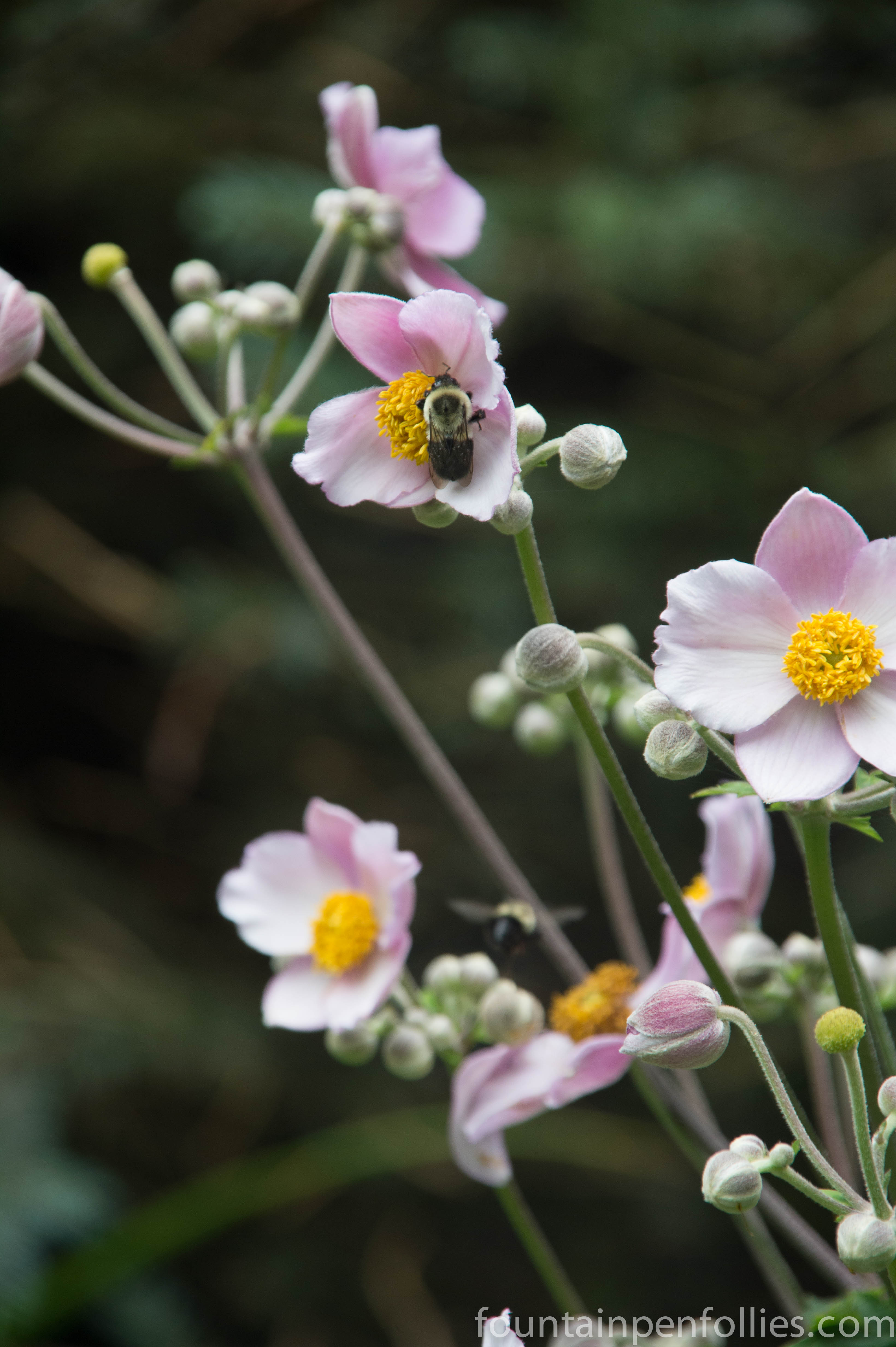
The Japanese Anemone is in bloom.

And it draws the bumblebees.
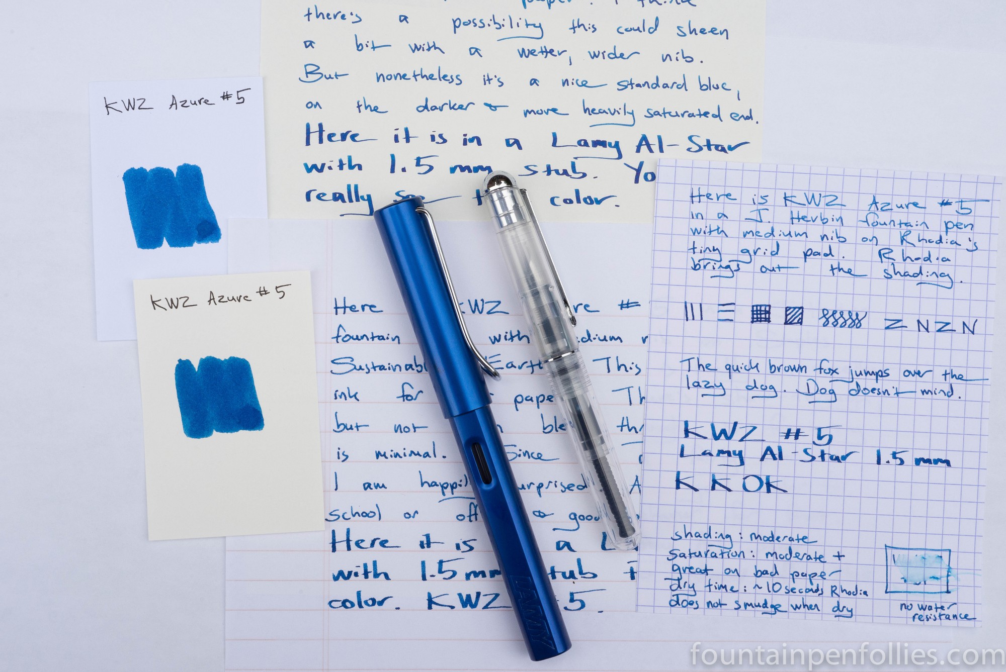
KWZ Azure #5. This is a sprightly blue ink that does very well on poor quality paper. I have been using this in a Lamy Al-Star with various nibs and in a J. Herbin fountain pen with a medium nib. It has worked well in both pens, which is notable, because the Safari tends to write dry and the J. Herbin has a wet flow.
(click Page 2 below to continue)
![]()
This is the Pelikan Souverän M600 that Pelikan will be releasing next month. It’s pink. Two things I love are Pelikan fountain pens and pink.
Still, I have some other great Pelikans. So I don’t actually need it. I was trying to be sensible.
And then I saw this.

No more being sensible. Wild pink stripes?! Of course I need it.
And I know there’s a lot of “yuck” feeling about this color scheme, and some of the early marketing. As there should be. This one is definitely love it or hate it.
What I love most is that there’s only one more month to wait for it.
__________________
Photos of the pen are from this blog post by the very nice people at Iguana Sell, who have kindly given me permission to share the photos.
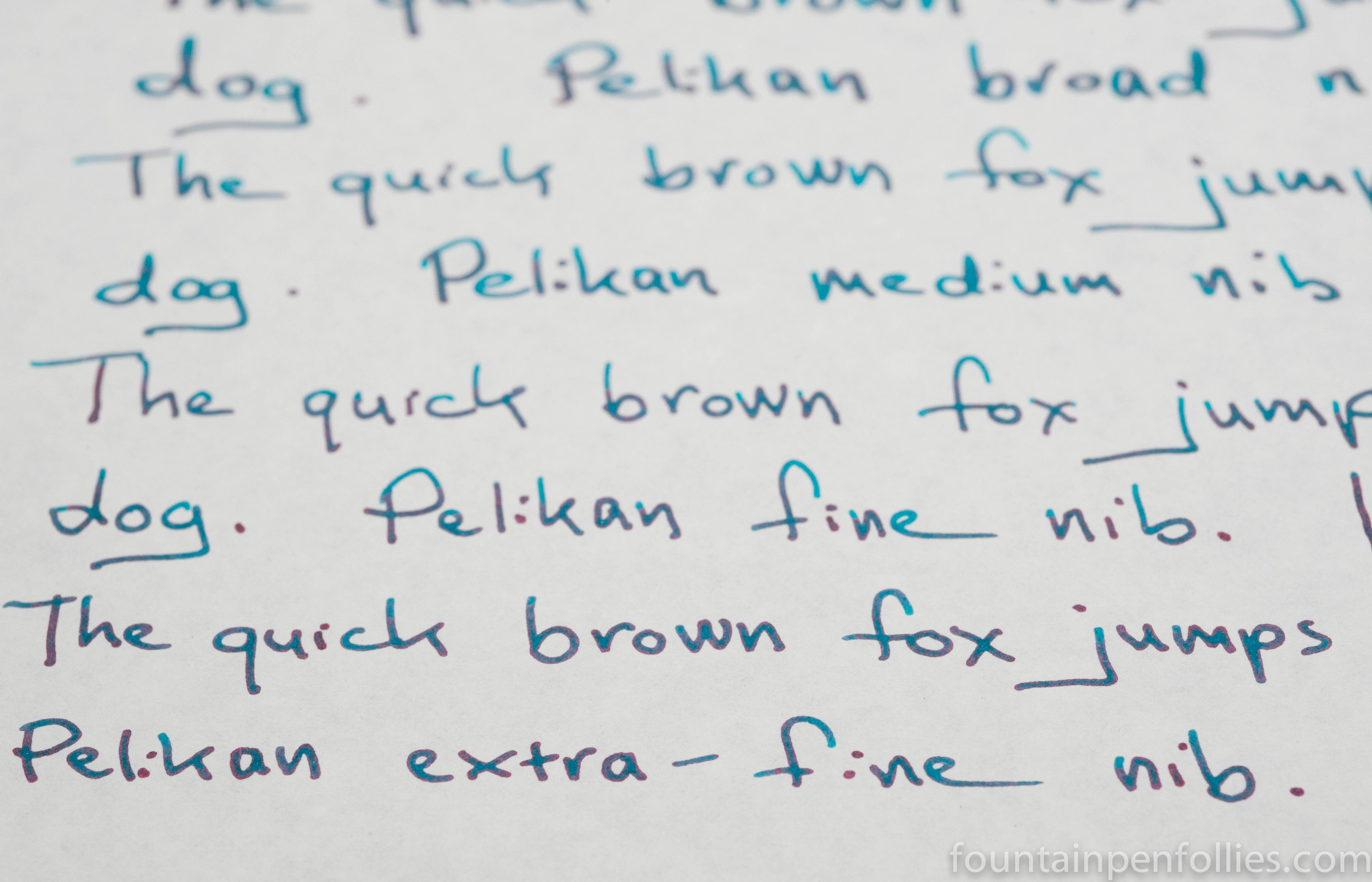
I have been playing with my sample of the new Emerald of Chivor. I had already pored over a great review, and I had even seen a writing sample in person, so I knew it looked spectacular. But writing with it has confirmed that this is really an awesome ink. As you can see in the photo above, the sheen and shimmer come through even with fine and extra-fine nibs.
(click Page 2 below to continue)

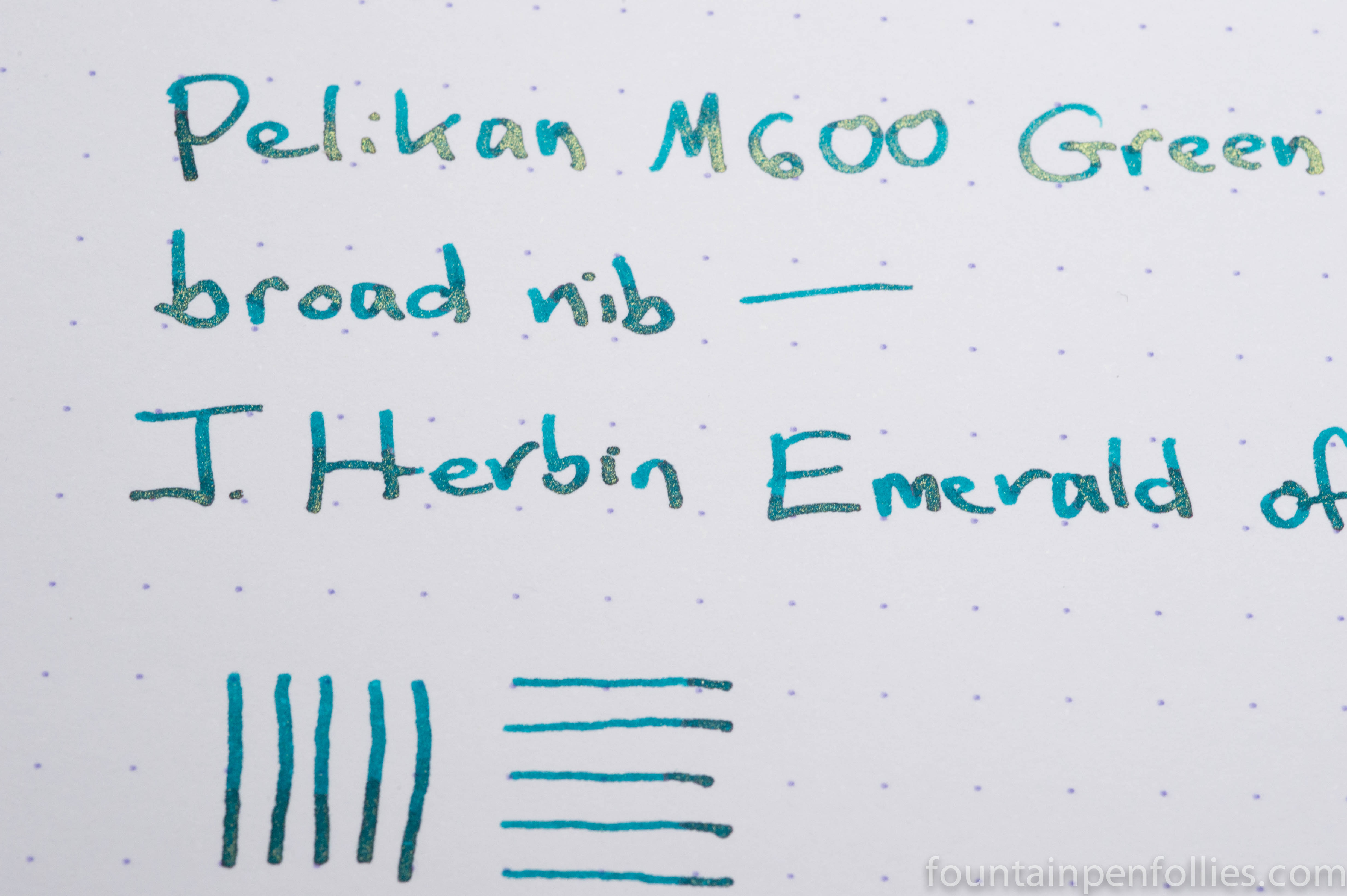
Pelikan M600 Green o’ Green with broad nib. A good friend sent me a sample of the new J. Herbin Emerald of Chivor, so I brought out my big gun, nib-wise. A Pelikan broad. That’s as big as things generally get for me. I’m more of an extra-fine person.
The pen is beautiful. But I’ll save that for another day, because the ink is new, and we have all been eagerly anticipating it. It’s a “wow” ink, it really is. A teal green, with gold flakes, that shades beautifully and sheens on the right paper.

On a Rhodia dot pad, the shading is gorgeous, and the gold flakes really stand out.
Tomoe River paper really brings out the phenomenal sheen.
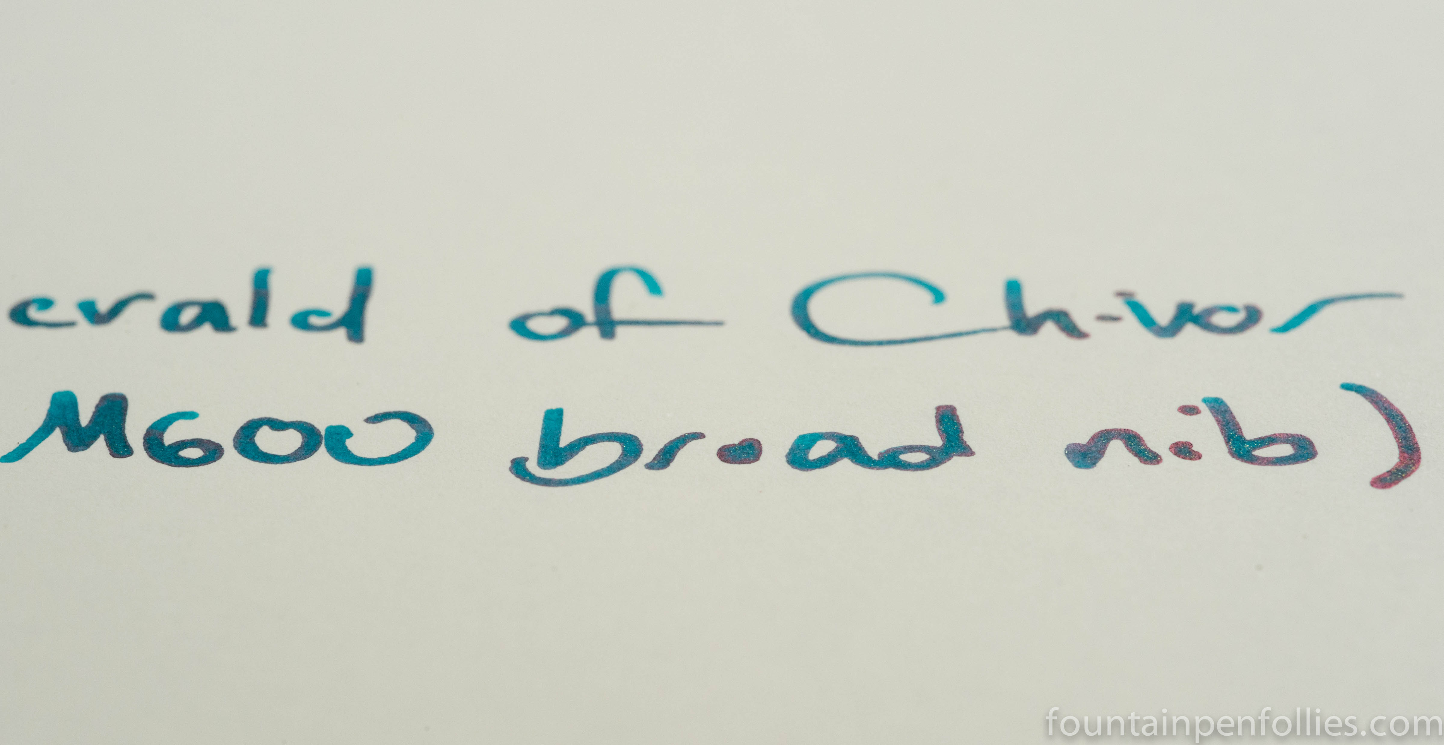
In this photo, you can see that the period sheens so much it looks entirely red. That’s not a trick of angle or lighting, either; it looks like that in real life, in normal light and with the page entirely flat.


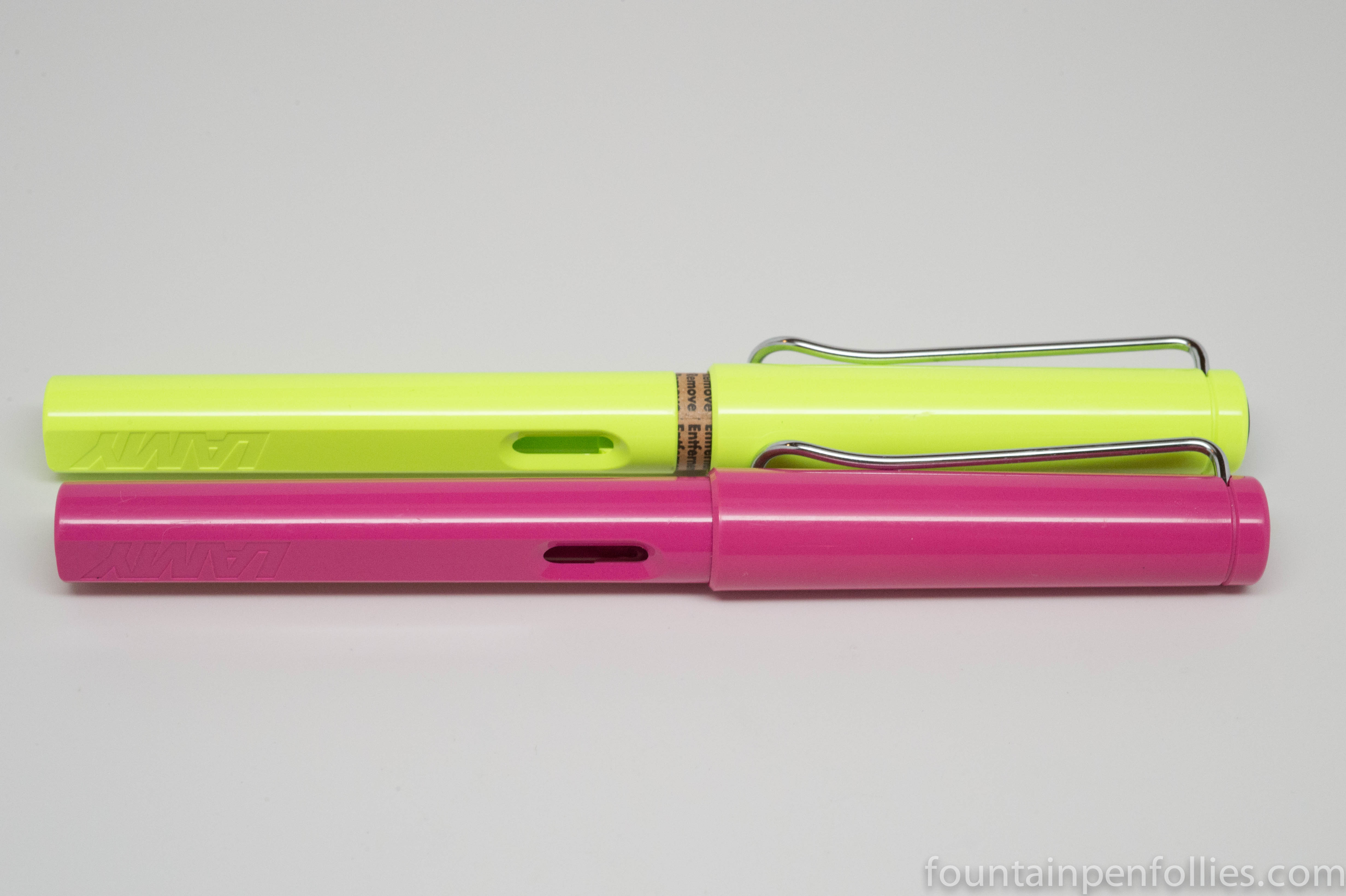
This is the only Safari I really dislike. This is the 2015 Neon Lime. While I know it has its fervent fans, I’m sorry to say that I personally am over my limit with both green Safaris and neon Safaris.
I see that I’ve kept the cardboard spacer in place. No other Safari of mine wears that cardboard collar. It’s almost a sign of rejection, or silent protest. I’m saying, It is never going to be inked. Oh yeah, I bought it, but I won’t use it. Take that, Lamy person who keeps making everything green.
I think I did mention earlier in the week that the Safari was made for middle schoolers? That level of maturity may ring a bell here.
But then, I decided to do a Lamy Safari Week. And, while I was photographing the Safaris, I accidentally realized something. That awful Neon Lime Safari actually looks very nice next to the Pink Safari. And I love my pink one. So is it possible that Neon Lime is not that bad after all?
Darn you, Lamy. There is truly nothing about the Safari I can’t grow to appreciate — not even neon lime.