I Go to the DC Pen Show: the World’s Worst Pen Show Photo Essay

I was just in Philadelphia, Baltimore and Washington DC for a week, which means I was in DC during the world famous DC Supershow. Though I was there to see family and friends, I did manage to sneak away to the show for a short time Saturday afternoon.

Like a real blogger, I shall now share my impressions of the show. Huge, and packed.

It was quite an experience. Amazing crowds. Of course I knew that DC was the biggest show. And I’m not a novice: I’ve been to pen shows for years; I help run a big pen show. But the DC Show in person still surprised me. Now, I was there only about ninety minutes on a public day, but it was mind-boggling.

I confess, however, that I am a total pen show failure: I took no photos. Honestly, it didn’t even occur to me to take photos. I was just trying to experience the show, find people I knew, and take it all in.

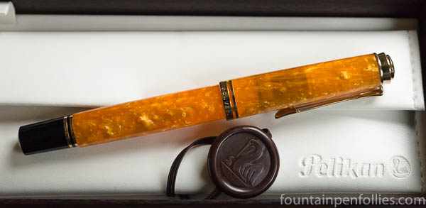
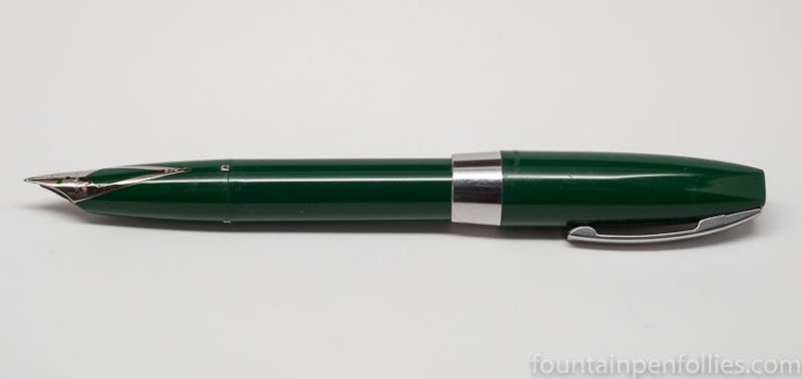
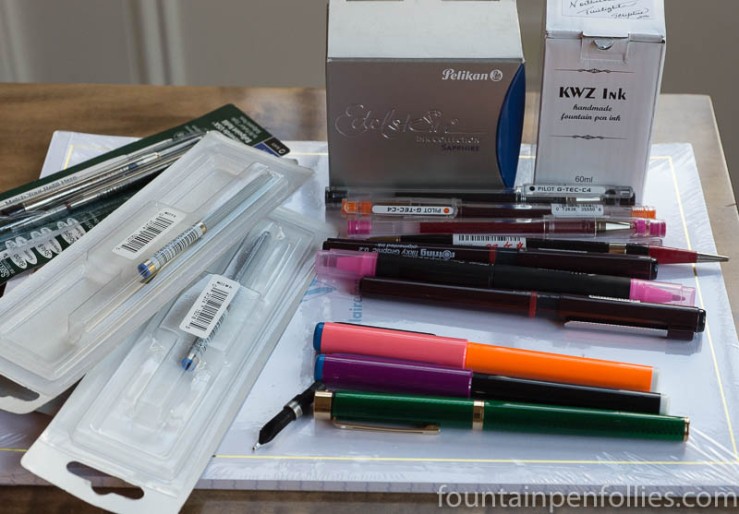
But here is a pen show photo that we can pretend was taken in DC:
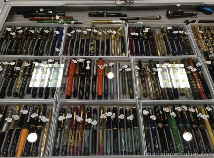
2016 Chicago Pen Show fountain pens for sale

Look, pens.

So what did I see at the show besides a sea of humanity? I saw people I knew, which was great. And the usual pens, inks, cases and paper. I saw Kanilea, who won an impressive-looking award from the readers of Pen World magazine. They had only a handful of Hanauma Bay pens left for sale by late Saturday afternoon. Hugh’s going to be busy before San Francisco.

I saw Dan Smith, and he had a tray of Sailor Professional Gear Oceans, which drew many admirers, including me. I also saw a Sailor Professional Gear in a woody sort of finish at the Andersons table, which I also really like. Those were the two I would have bought, if I could have.

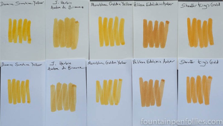
My one quest to purchase something ended in failure because neither Vanness nor Dromgoole’s had the new J. Herbin ink. I think I forgot to check at Andersons because I was talking, and I was looking at Sailors. The pens.

Jonathon Brooks continues to make really creative and beautiful urushi pens. His other pens had almost fully sold out by the time I got there. I should have photographed the urushi pens.

Oh, I saw the new metal black-and-silver-stripe Pelikan M805. It was a little … unexciting, perhaps? Another large black-and-silver-stripe Pelikan, except with thinner stripes. It’s business-like, though.

Well, in lieu of the pen photos I didn’t take, how about some vacation snaps? Everyone loves those! (said no one, ever).

So this is a statue in Philadelphia.

IMG_0844

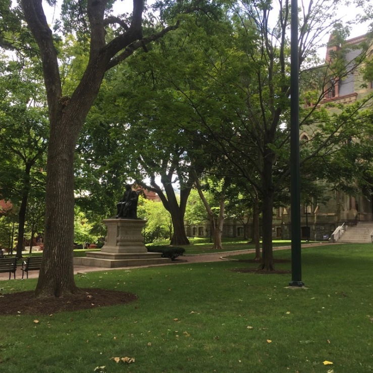
I have no idea why I took this. I think the statue is Benjamin Franklin. Honestly, I was standing fairly far away. There was a thin ribbon of shade where I was, and I wasn’t giving up that shade to walk 200 feet in the blazing sun just to read a name on a statue.

Assume it’s Franklin. He’s all over Philadelphia. Along with heat stroke, probably. The temperature while we were there was in the high 80s or low 90s. But at least the humidity was, too.

Ah well, despite its terrible summer weather, Philadelphia is a fun city and I had a great time visiting. Philly gets an A. We saw some historical things. We saw the Liberty Bell — in passing, though a window, because there was a long line for it, in the hot sun. I did go into Congress Hall, the home of the US Congress from 1790 to 1800. And I lingered there. The former American History major in me absolutely loved it. Also, it was air-conditioned.

In the 30 hours we spent in Philly, we had dinner with my best friend from grade school, and I had coffee with a wonderful pen pal, who had two pens, which I did not think to photograph for you. And I had a wonderful dinner at a tiny ramen restaurant, which I now think about every day, which is perfectly normal, I’m sure.

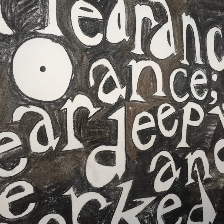
I also spent a happy hour in a small museum called the ICA Philadelphia, which had delicious pastries, air-conditioning, and art. My favorite work was an installation by a British artist named Jade Montserrat, hand-drawn in charcoal along a very long, two-story hallway. Here’s a tiny piece of it.

Jade Montserrat installation ICA University of Pennsylvania

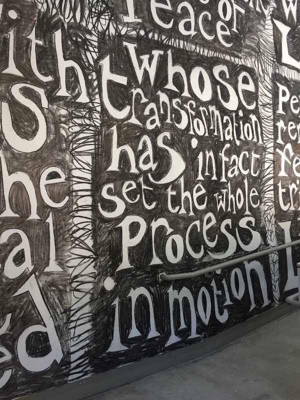
And a closeup of an even tinier piece.

Jade Montserrat installation ICA University of Pennsylvania

Then we went to Baltimore, where we had lunch with another old friend, which was lovely. Baltimore’s Inner Harbor was very nice. There were no pens to not photograph.

We got to spent more than three days in DC, where we had lunch with one of my closest friends in life, who happened to be there with his family. Such a great time. (Ballpoints only.)

DC is very hot in August, too. Like, eleventy million degrees hot. Like, Philadelphia hot. Although Lisa Vanness told me that it is nothing compared to Arkansas hot. So this trip I realized that I can no longer complain about Chicago weather.

No matter the weather, I always love DC. There’s so much to do, and very nice people and good restaurants. Unfortunately, we ate a lot of vacation food — things like fancy cupcakes from a cupcake store and fancy ice cream from a “milk bar.” I am not exactly complaining. But I now need new pants.

I took one photo in DC. Here it is:

P-Funk Mothershpi

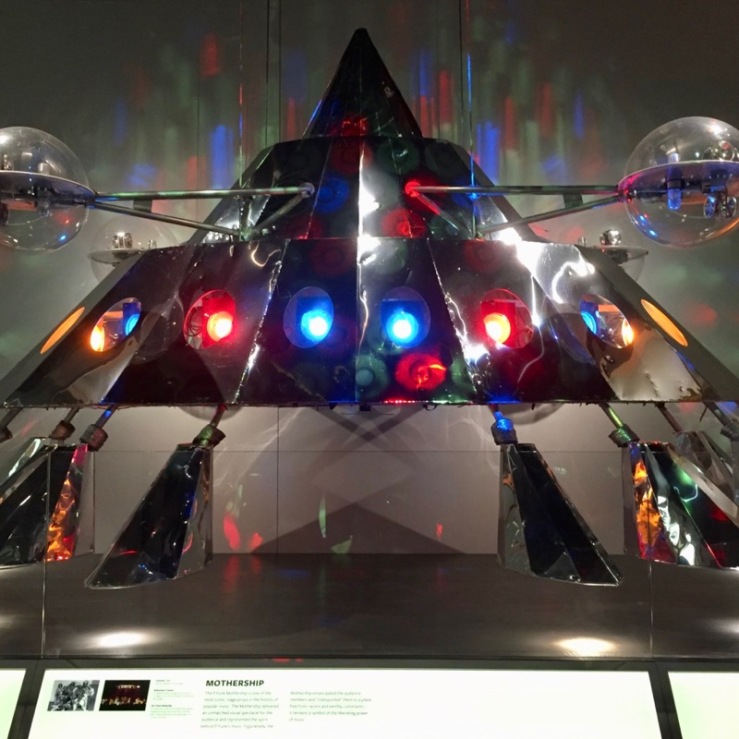
That, of course, is the Mothership, from George Clinton’s Parliament-Funkadelic. I was delighted to see this in the Smithsonian’s tremendous National Museum of African American History and Culture. The music wing was joyous. The history wing was wonderful and wrenching. “The past is never dead, it’s not even past.”

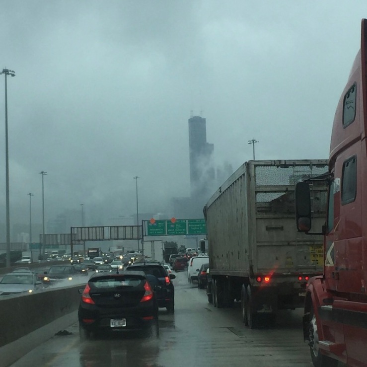
Then we came back home. It was pouring, and had been for hours. The freeway through the city was jammed. Flash flood warnings were going off on all our phones. But it’s always a beautiful sight. Home.

Chicago traffic

Technical Difficulties

Ooh, there was a really weird issue with the blog — my last post totally disappeared when I used the phone app yesterday to correct a small mistake. Then the post turned into a much earlier draft. Wild. I think it’s up again in proper form, but that was very exciting for a while.

And I’ve learned two important lessons: don’t use my phone for anything, and don’t ever correct anything. Which, when you think about it, are actually broadly applicable lessons for life. For example, add “never ask him out,” and it’s basically the dating advice from The Rules.

Another, more felicitous and intriguing, thought … what if I’ve been hacked? What if non-state actors are trying to get at my secret pen files? What if they’ve discovered that my little blog is not really about pens at all, but is clever cover for an international espionage ring? When you think about it, “resin” must be code for something else? And what about ink? Or, wait a minute, iron gall ink? This kind of stuff couldn’t really occupy someone’s serious attention for years, right?

Pen of the Day: Pelikan M600 Green o’Green and KWZ Iron Gall Green #4

Pelikan M600 Green o' Green with KWZ Iron Gall Green #4

Pelikan M600 Green o’Green with extra-fine nib. Loyal blog readers probably feel like they own this pen themselves, so often does it appear in these pages. It’s a favorite of mine, a limited edition from a few years ago.

I love a Pelikan gold nib. This is a Pelikan extra-fine, which usually means “not really fine,” except this ink really does help tighten the line.

Pelikan M600 Green o' Green with KWZ Iron Gall Green #4

The ink is KWZ Iron Gall Green #4. Here’s a closer look.

KWZ Iron Gall Green #4 writing sample

I’ll be doing a review, but you’ll note that the color of Iron Gall Green #4 looks a little darker in the first two photos. Sometimes it does: it depends on the pen and the ambient light. The third photo is what Iron Gall Green #4 usually looks like.

If you’d like to compare some other KWZ green inks, I’ve, ahem, used a few. Two dye-based inks, KWZ Rotten Green , and KWZ Foggy Green. Also two iron gall inks: KWZ Iron Gall Green Gold here and here, and KWZ Iron Gall Green #1, here.

Pen of the Day: Sheaffer PFM I in Green with Caran d’Ache Delicate Green

Sheaffer PFM I green

Sheaffer PFM I with medium nib. For my friend Jon, here’s my second PFM I, and first working one. It’s green, because, apparently all my pens now must be green. When I got this one, the nib wasn’t really writing well. It was a little misaligned, a little out of whack.

No worries. Because it’s a Sheaffer inlaid nib — which means, not like other nibs — and because I was going to the Ohio Pen Show, I took it to Ron Zorn. Ron did a little of this and a little of that (I was chatting), and boom, all fixed. He’s the Sheaffer master.

Sheaffer PFM I green

Probably it’s heretical, but I like the PFM I’s stainless-steel colored trim and plastic cap best of all the models. And the green. The PFM green is an unusual color. It’s not a forest green, but more a dark medium green. It usually looks lighter than in that photo.

Believe it or not, I don’t love the color green. And the PFM green isn’t conventionally attractive (to me). In fact it feels dated (to me). Paradoxically, that’s why this is my favorite. The blue, maroon and black PFMs are conventional colors, and more conventionally attractive. But the green is a little odd, and a little retro. It fits the pen.

So basically, I think the green PFM I is the coolest PFM, because it’s the most PFM.

And right now, it’s filled with my favorite green ink, Caran d’Ache Delicate Green. Which is really too pretty for this pen. But, hey, it’s almost the holiday season. It gets to dress up for a bit.

Sheaffer PFM I green with Caran d'Ache Delicate Green


I Came, I Saw, I Bought a Little: My Mostly Measly Ohio Pen Show Purchases

2016 Ohio Pen Show purchases

Okay, it’s a slim haul, but I’m sure you’ll identify with me saying that I still spent more than I intended at the Ohio Pen Show. I didn’t really intend to buy anything. And, yes, feel free to be aghast: there aren’t a lot of fountain pen things in the pile.

That’s because I went to the show with my 16-year-old daughter, and there is no way she could have spent two days shopping for fountain pens. Which is fine. I actually like other pens and pencils, too.

(click Page 2 below to continue)

More Montblanc Golden Yellow Ink: Comparisons

Montblanc Golden Yellow ink swab comparisons

Here’s a golden array of inks, with Montblanc Golden Yellow shining right in the middle.

We all know that colors look different depending on surrounding colors. And this is a perfect illustration. Look how unattractive the two amber inks seem when they flank Montblanc Golden Yellow.

In fact, J. Herbin Ambre de Birmanie and Pelikan Edelstein Amber are both lovely. In fact, they are favorites of mine. When they aren’t next to Montblanc Golden Yellow, the ambers are attractive golden brown inks with nice shading. So I should apologize for them looking so awful here.

Golden Yellow is so lively and so yellow-orange, that it deadens these amber inks. Not every ink looks good with every other. So here’s a link that shows how Ambre de Birmanie really looks, next to more congenial colors, and here’s one showing  Pelikan Edelstein Amber.

Now, I really like Golden Yellow, which is why it’s interesting that one of the inks in this array is an ink I intensely dislike. The ink that sets my teeth on edge is on the far right: Sheaffer King’s Gold. The King’s Gold is no longer in production, for which I applaud Sheaffer. But King’s Gold almost looks like a more orange, more brown Golden Yellow here, doesn’t it? Yet, to me, one is yay and one is nay.

It’s a reminder in (bright yellow) Broadway lights, that nothing beats testing an ink to see if it works for you.

Finally, it’s interesting how Diamine Sunshine Yellow is fairly close to Montblanc Golden Yellow.

Montblanc Golden Yellow ink swab comparisons

When you write with them, Montblanc Golden Yellow is darker (more orange) and more legible than Diamine Sunshine Yellow. That’s nearly impossible to see from the swabs. But you can tell from the swabs that there’s a lot of similarity.

And now I have one final twist, worthy of Hollywood: there is another.

Remember that Diamine operates on the principle that “if one ink is great, three nearly identical inks will be fantastic.” (That happens to be my motto, as well.) So you won’t be surprised to hear that Diamine has another ink, Diamine Amber, which is very close to Diamine Sunshine Yellow, and thus to Montblanc Golden Yellow, albeit browner.

I did not include a photo of Diamine Amber, because my photo array is full, the two Diamines are very close to each other, and I’ve already got two better amber inks in there. But I find it interesting. Inks. Even the yellow ones are interesting.

Pen of the Day: Nemosine Singularity with Sailor Jentle Tokiwa-Matsu

Nemosine Singularity with Sailor Tokiwa-Matsu

Nemosine Singularity with stub nib. It feels like forever since I’ve done a Pen of the Day, so here’s a reasonably-priced pen that’s new-to-me, the Nemosine Singularity.

I bought one with a stub nib, and I’m happy with it so far. The nib has a bit of feedback, which I like, but it’s a smooth writer with nice line variation and moderate to wet ink flow. It’s a medium stub, comparable to a Safari 1.1 mm nib, so good for everyday writing.

The nib itself is very large in size and has attractive stamping.

Nemosine Singularity with Sailor Tokiwa-Matsu

I’ve got my Nemosine Singularity inked with Sailor Jentle Four Seasons Tokiwa-Matsu, a nice evergreen ink with shading and sheen.

The Singularity design is pretty utilitarian, but the pen is a good size. The weight is light, but balanced, and the section is comfortable. The Singularity works for me unposted or posted. It comes with a converter, or you can use standard international cartridges. It also can be used as an eye-dropper. I think it’s a nice deal for under $20.

For a better idea of size, here are a Kaweco Classic Sport, a Lamy Vista, the Nemosine Singularity and a J. Herbin fountain pen.

Nemosine Singularity size comparison