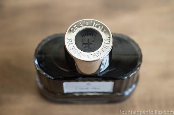
I think of myself as a person who doesn’t care about ink bottles that much. A great ink bottle is always appreciated, and might tip the scales towards purchase if I like the ink, but an unappealing ink bottle won’t stop me from buying an ink.
But I just got this ink, in a trade: Graf von Faber-Castell Cobalt Blue. And, wow. This is a beautiful ink bottle. This bottle, alone, makes me want to buy more Faber-Castell inks.
I haven’t even tried the Cobalt Blue ink yet. They had me at the bottle.

You can’t really tell from photos how nice it is. The bottle is made of thick glass, and feels nicely heavy, with a stable base. The main part of the bottle is attractively ridged, and there’s a wavy undulation at the bottom. The label is lovely. And I don’t think I’ve seen a nicer cap on an ink bottle.

Even the box is nice.
So, apparently I am besotted by an ink bottle.
I’m sure Faber-Castell focused on the bottle design. A great bottle can make an ink brand stand out. But I still expect it to be good ink. I really liked both Graf von Faber-Castell Carbon Black and Garnet Red. I have confidence in the Cobalt Blue.
I just wouldn’t have thought that I would ever be tempted to buy more inks solely because of the bottle. But if I were ever going to do that, it would be this one.


This bottle looks like the colonnade on one of those really grand old public buildings that seem a little stuffy and over-the-top when you first see them but then they really grow on you and their presence and bulk becomes friendly and reassuring. Lovely!
LikeLiked by 1 person
You are so right abut that. I think the glass, the silver cap and the label (and writing) all help lighten it up — because it feels serious but not stuffy.
I wonder if the fluted glass is a nod to their pen bodies, some of which have that same look.
LikeLike
I’ve found myself collecting inks, more specifically bottles, and I definitely need one of these for my shelf.
LikeLiked by 1 person
I’ve managed to fix this problem, by rarely having an ink bottle that’s mostly empty. 🙂
LikeLiked by 2 people
I got their Royal Blue. 🙂 And yes, I also fell for the bottle a little. It’s very… displayable 🙂 It also feels very solid. That makes me more comfortable when filling my pen, since I don’t think it’ll topple over any second.
Only thing I’m afraid of is if I can fill my pen comfortably from it when it’s mostly empty. But I guess I’ll see 🙂
LikeLiked by 1 person
So true — I feel like every ink bottle becomes hard to use when it’s mostly empty, even Waterman or Caran d’Ache, which are the two best I’ve found. My solution? A Parker 51. Or a syringe. 🙂
LikeLiked by 2 people
I go for the syringe option, too 🙂 Not good for piston fillers (which I prefer), but great for some last-drop cartridges.
LikeLiked by 1 person
This is my all time favourite ink bottle. As soon as I saw it I had to have it. 🙂
LikeLiked by 1 person
Good, I feel more sure of myself now. Because, unlike me, you really know your ink bottles. 🙂
LikeLiked by 1 person