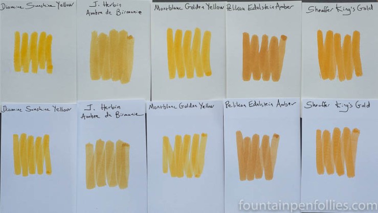
Here’s a golden array of inks, with Montblanc Golden Yellow shining right in the middle.
We all know that colors look different depending on surrounding colors. And this is a perfect illustration. Look how unattractive the two amber inks seem when they flank Montblanc Golden Yellow.
In fact, J. Herbin Ambre de Birmanie and Pelikan Edelstein Amber are both lovely. In fact, they are favorites of mine. When they aren’t next to Montblanc Golden Yellow, the ambers are attractive golden brown inks with nice shading. So I should apologize for them looking so awful here.
Golden Yellow is so lively and so yellow-orange, that it deadens these amber inks. Not every ink looks good with every other. So here’s a link that shows how Ambre de Birmanie really looks, next to more congenial colors, and here’s one showing Pelikan Edelstein Amber.
Now, I really like Golden Yellow, which is why it’s interesting that one of the inks in this array is an ink I intensely dislike. The ink that sets my teeth on edge is on the far right: Sheaffer King’s Gold. The King’s Gold is no longer in production, for which I applaud Sheaffer. But King’s Gold almost looks like a more orange, more brown Golden Yellow here, doesn’t it? Yet, to me, one is yay and one is nay.
It’s a reminder in (bright yellow) Broadway lights, that nothing beats testing an ink to see if it works for you.
Finally, it’s interesting how Diamine Sunshine Yellow is fairly close to Montblanc Golden Yellow.

When you write with them, Montblanc Golden Yellow is darker (more orange) and more legible than Diamine Sunshine Yellow. That’s nearly impossible to see from the swabs. But you can tell from the swabs that there’s a lot of similarity.
And now I have one final twist, worthy of Hollywood: there is another.
Remember that Diamine operates on the principle that “if one ink is great, three nearly identical inks will be fantastic.” (That happens to be my motto, as well.) So you won’t be surprised to hear that Diamine has another ink, Diamine Amber, which is very close to Diamine Sunshine Yellow, and thus to Montblanc Golden Yellow, albeit browner.
I did not include a photo of Diamine Amber, because my photo array is full, the two Diamines are very close to each other, and I’ve already got two better amber inks in there. But I find it interesting. Inks. Even the yellow ones are interesting.

Very informative approach to the comparisons. Thanks for providing such a thoughtful look at these inks.
LikeLiked by 1 person