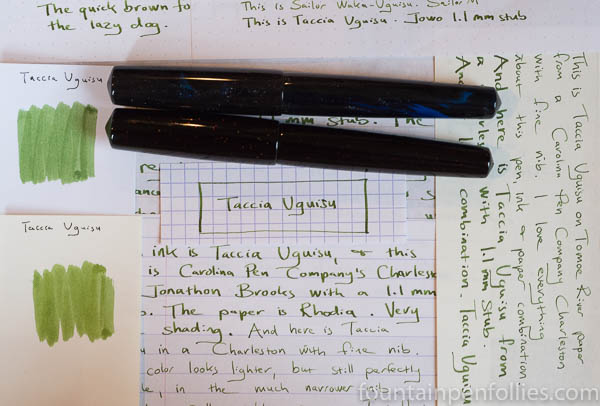
Taccia Uguisu. One of Taccia’s new inks, Uguisu is a yellow-green with very nice color and behavior. It’s easily the equal of excellent inks from more long-standing brands.
(click Page 2 below to continue)


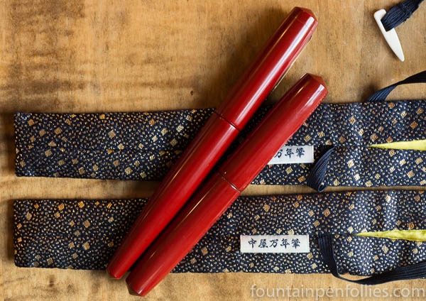
A Tale of Three Nakayas.
It was the best of times. It was the worst of times. It was the end of the summer. It was the beginning of fall. It was when I had the chance to use three Nakayas.
Nakaya Number One was a devastatingly attractive Decapod I got at DC, almost on a lark. It had only one issue: the nib. Yes, the nib was wonderful, but it was a very crisp oblique italic, so it was wonderful for someone who wasn’t me.
I sold it at San Francisco to an awesome person with artistic talent and great handwriting. It was meant for him. And I felt good about seeing it go to him. But I did love that pen. So I felt a twinge of … self-sacrifice, maybe? However, I knew that “It is a far, far better thing I do than I have ever done before.”
Then Nakayas Number Two and Three arrived, bringing us to …
(click Page 2 below to continue)
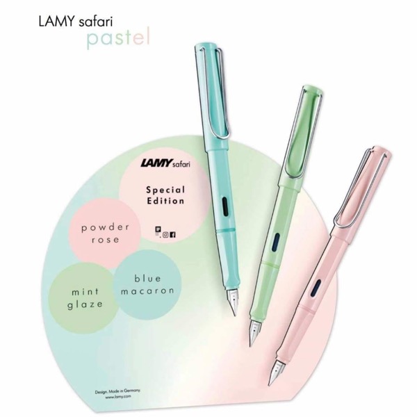
My Lamy Safari-hating friend just sent me this, which, courtesy of the nice folks at Goulet Pens, is apparently what Lamy has cooked up for the 2019 Safari special edition.
😱
It’s taken me a few hours to figure out a nice way of conveying my reaction more subtly than just using “Munch’s The Scream” emoji, above.
If you know the television show The Good Place, you will understand my first reaction to this photo, which was a quote from the show: “Holy mother forking shirtballs.”
It’s fair to say that the Pastels are not my bag. I don’t really like the look, with that pen, because the color scheme doesn’t fit with the design, in my view. But that’s fine. Maybe they are better in person, and at least they are different, and not black. But my disappointment is more general. I’ve been a Lamy Safari fan since the first year of the Safari. And it’s as a fan that I say this, sadly: the annual editions have been more lackluster than not, for a while now.
This is just the capper. It seems like two out of three years I’ve been wondering the same thing: Is this where I stop, and give up collecting Safaris?
There was the tossed-off Neon Trio. Then the “Dark Materials” Trio of Dark Lilac, Petrol and All-Black, an obvious attempt to extend the market with Safaris for those who hate Safaris. Now comes the Pastel trio. I don’t know precisely which group the Pastel is meant to appeal to, but I’d bet that the genesis of those colors is a market study.
And then, not even one Pastel, but three at once. Why limit your bottom-line by putting out only one annual edition, when you can potentially triple revenues by putting out three? Which of course is reversed for consumers, as Slightly Unnerved, in the comment below, politely brings up.
That issue is much worse for those of us in the US, where a Safari, without converter, retails at just under $30 each.
I don’t know if there’s been new ownership or management at Lamy, and that’s what’s behind this — but I suspect so. But it does seem rather obvious that the annual Safari, and probably the Safari as a whole, is now seen as a cash cow. I think that’s understandable from a business perspective. I would never tell a business not to maximize profit. It’s just not the same, from the fan perspective.
The Safari used to be a quirky pen that a few of us loved. And you had to actually love it, to withstand the slings and arrows, because the fountain pen world was full of people who loved to put the Safari down. The Safari appealed to a very small subset of adults — those who liked contemporary design and fountain pens. And I think the Safari reflected what the Lamy company was — a home for risky products, designed products, that didn’t appeal to everyone, but were well-built and well-priced. Modern design plus affordability plus quality.
The new Lamy is obviously different. And the new Lamy is certainly reflected in the last five to seven years of annual Safaris. That’s fine — and I don’t own the company. But, as a fan, I think they’ve essentially lost what made me a fan. Or not so much “lost” as “abandoned.” I think now whoever runs Lamy has pivoted to squeezing out as much profit as possible. Which on an intellectual level I understand. The Golden Goose, and all. I do I wish Lamy well, and hope they don’t end up killing that Golden Goose. But I think, however, that I’m not really a fan any more.
I kept Platinum Carbon Black inked up for more than five months, to see how it would clean out of a pen, and the answer is, nice and easy. This is a pigment ink that is a fairly low-maintenance ink. I’m chuffed.
I had it in a Platinum Plaisir. Here’s the pen’s feed after flushing out Carbon Black with water only. Perfectly clean.

This was one of my extended “torture tests” of an ink. I occasionally do these for the blog to check the limits of certain inks, because I like inks that I’m not afraid to keep in a pen for a while.
I have done extended tests on modern iron gall inks here, here and here — just to prove that modern iron galls from reputable makers are safe for extended time periods in pens with stainless steel nibs. Which they are.
But sometimes, you find yourself inadvertently giving a torture test to an ink that can’t handle it. Whoops.
In this case, I purposely chose to torture-test Platinum Carbon Black. It’s my favorite pigment ink and waterproof ink, and I’d noticed that it seemed to clean out pretty easily. I’m always happy to find low-maintenance inks that are waterproof — like the newer Sailor Souboku. I wanted to be sure about Carbon Black, too.
I decided to keep a cartridge of Carbon Black in a Platinum Plaisir I’d bought in mid-April. I used the Plaisir like normal — writing with it every once in a while, and then putting it back in the pen cup, where it might sit unused for days until the next time. The pen always started up and wrote perfectly: that may owe something to Platinum’s “slip and seal” cap design, but Carbon Black is nicely lubricated, too.
I finished Carbon Black on October 7. After more than five months in the pen, Carbon Black cleaned out perfectly, just flushing with water. It didn’t take much longer than cleaning out Waterman Serenity Blue would have — my standard for a low-maintenance ink.
Another photo, this time of the other side of the feed. The feed is clear of ink and unstained.

I ran the section through a cycle in my ultrasonic cleaner to verify: all the Carbon Black was gone.
Now, I can’t pull this particular nib to check if any ink may be trapped under the nib, but I did the next best thing I could think of. I attached a converter, and filled it with Montblanc Golden Yellow ink, which is the lightest ink I have. And then I wrote with that for a few days. The ink flowed normally, the nib wrote normally and the ink writes in its normal light yellow color, with no smears of leftover black ink.

My conclusion is a happy one. Platinum Carbon Black is a waterproof pigment ink that is low-maintenance. I won’t worry about using it in any cartridge-converter pen.
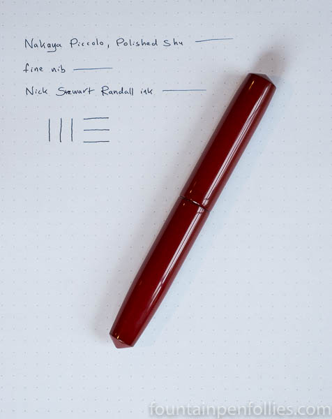
Nakaya Piccolo in Polished Shu with fine nib. We’ve had a rainy and gray fall here, but this little pen has just added a shot of color. It’s a Piccolo in Polished Shu with a fine nib.
I really, really like the Polished Shu finish, and I especially like where you can see the darker underlayer showing through.

This particular fine nib is very fine and it writes on the dry side, so it’s very precise. I chose to get a smoother writing experience, instead of the thinnest possible line, by matching this nib with an ink sample that’s very wet-writing, and very lubricated, and also new-to-me. It’s called “Randall” from Nick Stewart, and it’s made by Diamine. I got this sample from my friend Jon. Thanks, Jon!

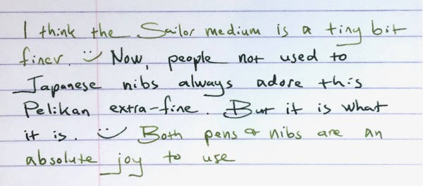
How fine is the Pelikan M600 extra-fine nib? Not very! At least, not “very fine” in the sense of “narrow.” But “very fine” in the sense of “excellent.”
I happen to have a Pelikan M600 with extra-fine nib inked up at the same time as a Sailor 1911L with medium nib. The two pens have different inks, but here’s a comparison writing sample.
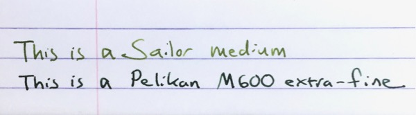
I’m not particularly surprised by this. I often use two modern M600 Pelikans with extra-fine nibs, and I always jokingly call those nibs “alleged extra-fines.”
Partly that’s because I tend to think of nib widths in line with vintage Parkers and Pelikans, and modern Japanese pens — all of which run narrower than modern Pelikan gold nibs. But also because I use a lot of modern Pelikan fine nibs, and I find those pretty darn close to Pelikan extra-fine nibs. In fact, I swear that a few of my Pelikan fines write a narrower line.*
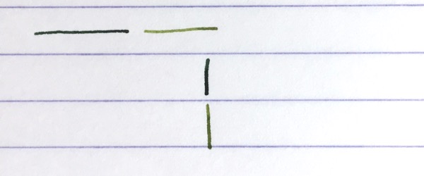
Here’s another writing sample. The Pelikan gold extra-fine uses the dark green of Pelikan Edelstein Olivine, and the Sailor medium is inked with the lighter green of Sailor Waka-Uguisu.
I bring this up now because Pelikan has decided to start charging extra for their extra-fine nibs. They apparently implemented the price increase in Europe earlier this year, and it just reached the US with the M600 Vibrant Orange, which will cost $440 with fine through broad nibs, versus $476 with an extra-fine nib.
I’ve never bought many Pelikan extra-fine nibs. I tend to use vintage fine nibs and modern Japanese fine and extra-fine nibs when I want a finer lines. So my extra-fine nib needs are covered. But I don’t think Pelikan extra-fine gold nibs are bad, just because they may be wider. In fact, I think Pelikan’s gold extra-fine nibs are very good.
To me, what makes Pelikan’s gold extra-fine nibs good, and maybe a little special, is that they are extremely smooth and easy writers. I’ve noticed that people who don’t share my love of very narrow nibs always love my Pelikan extra-fines.
Modern Pelikan gold nibs are beautifully ground to almost float on the page, so you can write very fluidly with them, and they reward a light touch. That’s true for the extra-fine, as well. Sure, it may write wider than many extra-fine nibs, but it also writes wetter and smoother.**
Sailor gold nib also are beautifully ground, but at size medium and below, Sailor nibs feature a characteristic feedback. Instead of floating across the page, a Sailor nib feels more like writing with a pencil — it’s a different kind of smoothness. Or look to the extra-fine nibs of Lamy and Aurora: in those the extra-fine nib tends to have a smaller sweet spot and put less ink down on the paper. All these brands’s extra-fines will generally write finer than Pelikan’s gold extra-fine, but the experience is different.
So I can think of a lot of reasons why many fountain pen users prefer the Pelikan extra-fine.
And even though it’s not particularly narrow, I enjoy using it myself. I’m not sure it’s different enough from the Pelikan gold fine nib for me to buy another, given the price increase, but I’d heartily recommend it to those who don’t already own one, especially those who don’t necessarily seek the narrowest line possible.
————–
*Please note that I’m only talking about modern Pelikan gold nibs here. Modern Pelikan gold nibs differ from (i) the steel nibs found on pens like the M200 line, and (ii) vintage Pelikan nibs.
**There will be sample variations in any nib, so these are generalized statements based on my experience across a range of pens. Some individual extra-fine gold nibs from Pelikan may be narrower or dryer, than normal, or may exhibit other variances.

Look at that: absolute chaos has descended on Fountain Pen Follies.
And. So. Much. Green.
It’s probably obvious just looking at that: these last two months have been insanely busy in real life, leaving no time for writing with pens. At the same time, I’ve been inundated with pens and ink. I’ve got a bunch of new inks, including some nice samples, and also a few new pens, to try out. Then I wanted to ink up testers for my Pelikan Hub. Then there’s the new Sailor 1911L in Key Lime. Everything has piled up. I’ve got close to 30 pens there, crammed in like commuters on an L train at rush hour.
That Sailor 1911L in Key Lime is the pen I notice most in that crowd. In the first photo, it’s the green pen near the top right corner. What makes that photo unusual is something that you might not notice: there was sun outside. See how nice and gleaming the Sailor looks in the sun?
Here’s an extreme closeup.

Pizzazz.
In the sun, the pearlized material of the Key Lime really comes through. On the one I’m using, there are wavy shimmers, for a moire effect.
Here’s another shot, in which you can see the very subtle shimmers on the pen body:

Still in the sun, the Key Lime there is between the Pelikan Stockholm and the Lamy Al-Star Charged Green. That’s closer to what the Key Lime usually looks like. But it’s a smidge yellower in real life, which just doesn’t come through in photos.
I want to do a post on the many looks of the Key Lime, because it’s such a cool color, but also so different, and so hard to get a fix on. It’s fascinating.
What you can’t see is that inside all those pens is a lot of green ink. Too much green ink. I feel like I should be decorating for Christmas. Except, of course, it is only October. And in October we celebrate the biggest holiday season of all. The start of NHL hockey.
I’m sure we all feel “too much” at times. Right now, those crammed pen cups are nagging me, like a pile of laundry you haven’t folded for a week. So this Peek at the Pen Cup was the “no mas” edition. I’m going to spend some time cleaning out the pens I can do without, and getting back on track with the others.