“Always Listen to Your Mother”: I Go to the San Francisco Pen Show

vintage Pelikan fountain pen

That is a pen.

I am starting out with a giant pen — Actual Pen Content — because after my inattention to pens at the DC Show, I vowed to be more on my game at the San Francisco Show.

That sounds so good! So of course it’s totally untrue. I said no such thing. And that pen hasn’t been within 2,000 miles of the San Francisco Pen Show. But it’s a pen.

And I did pick up a smattering of Actual Pen Content from the San Francisco show, which I will put at the very end, for loyal readers or those wasting time at work. Others, feel free to skip ahead.

(click Page 2 below to continue)

My Favorite 2017 Inks

favorite 2017 inks

Here are my five favorite inks from 2017:

KWZ Baltic Memories, Walk Over Vistula and Warsaw Dreaming

KWZ Chicago Blue

Papier Plume Bayou Nightfall

This was a very easy list to compile. I looked through everything I’d tried this year, and these were the obvious standouts. These five inks made the biggest impression on me. On a scale of one-to-ten, these go to 11. One became one of the inks I use most.

KWZ Warsaw Dreaming and Papier Plume Bayou Nightfall are in some ways at opposite ends of a continuum, with one being the darkest (the black Warsaw Dreaming) and one being the lightest (the green-blue-gray Bayou Nightfall). But they are similar in other ways. Both are quiet, but have depth. These inks don’t shout for attention, but they repay your attention.

Baltic Memories, in contrast … this ink does grab your attention. It walks onstage and starts singing. It is super sheeny. It is dynamic. You will notice it.

Walk Over Vistula sort of snuck onto this list, because it seemed inseparable from the other two KWZ inks released at the same time. I think of the KWZ trio together. But Walk Over Vistula deserves its spot. It’s a bridge between the quieter inks on this list, and the bravura Baltic Memories.

Chicago Blue is a super-solid everyday blue ink. Which isn’t to suggest that it’s dull, just that it’s so good you may not notice how good. It’s the Tom Hanks of ink. Oh, it’s got sheen, if you like that, and saturation. But it’s also easy-to-clean and behaves in all my pens. It was my most-used ink this year, along with old standby Pelikan Brilliant Black.

All of the inks on my favorites list came out in 2017. But there were other 2017 inks I loved, as well as older inks I didn’t try until 2017. Here are ten that were also particularly good, in my view — my 2017 Honorable Mentions:

Graf von Faber-Castell Midnight Blue

KWZ Honey

Papier Plume Mardi Gras Indians

Papier Plume Moss Green

Papier Plume Pecan

Papier Plume Red Beans and Rice

Papier Plume Streetcar Green

Platinum Classic iron gall inks

Robert Oster Bondi Blue

Robert Oster Rubine

Yes, the Platinum Classic line comprises six different inks. That’s not cheating; it’s creative accounting.

I’d love to hear other people’s favorites. Maybe I can try them in 2018.

What I Bought in 2017: Inks

2017 inks purchased

I bought 10 different bottles of ink in 2017 — one is not pictured, because I forgot it.

Buying only 10 bottles is pretty good for me. If I can be immodest, I slayed. Okay, sure, if I cast a critical eye, I could have done without four of them. Unsurprisingly, all four of those were inks I bought without sampling first. But you can’t be too strict, or you’ll never have any fun. Leave room for serendipity and surprise. Also, cut yourself some slack, because no one else will.

I did much better than in 2016, when I bought 20 bottles, and 2015, when I bought 30 bottles. If this trend continues, I will buy zero bottles in 2018. Now, that may be because I’ve been hit by a bus, but nothing lasts forever.

Here are the inks I purchased in 2017, by brand.

KWZ: (2) I bought both Chicago Blue, the 2017 Chicago Pen Show ink, and Confederation Brown, the 2017 Toronto Pen Show (Scriptus) ink. I have very limited interests, obviously.

I really love Chicago Blue, and I use it constantly.

Now, Confederation Brown in an ink I haven’t used myself, but I have seen a lot of photos online. It’s a green-brown sort of color. Everyone I know likes it. I trust it will behave, because it’s a KWZ Ink.

You know, though, ink color is a personal thing. Many people apparently can’t get enough green-brown. But I’ve realized, as I stare at my bottle of Confederation Brown, that I feel pretty “set” when it comes to green-brown inks. And I think I would have been just as happy with a sample of this.

I’m quite sure, however, that I’ll eventually sell or trade this bottle to someone who loves it, so I don’t totally regret the expenditure. Also, supporting KWZ Ink and Scriptus is good. As is supporting the Chicago Pen Show, by the way.

Lamy: (1) I actually forgot that I had this one — Lamy Petrol. I bought it months ago, and I guess the ink wan’t very memorable. It’s not even in the photo.

I do like it. Lamy Petrol is a very dark teal, a perfectly good ink. But I like it for a reason that will not resonate with many people: I like because it’s not spectacular. It is business-like and easy-to-read. It’s a nice blue- or black-ink substitute.

Lamy Petrol was very hard to get in the US. I bought my bottle from a European dealer, just to make sure I had it for our Chicago Pen Show Ink Testing Station. That was wise, since Petrol didn’t arrive at US retailers until after our show, and then only in small quantities. US buyers didn’t really get a fair crack at Lamy Petrol. Artificial scarcity like that irks me.

I bought four inks this year without sampling first — Lamy Petrol is the only one where I’d still have bought the bottle if I’d sampled it.

However, I didn’t like it enough to pop for a second bottle at regular retail, when I could have. Therefore, I did a double-take, a few hours ago, when I read that this ink is selling for multiples of the original price on the US secondary market. Guffaw.

Seriously, don’t.

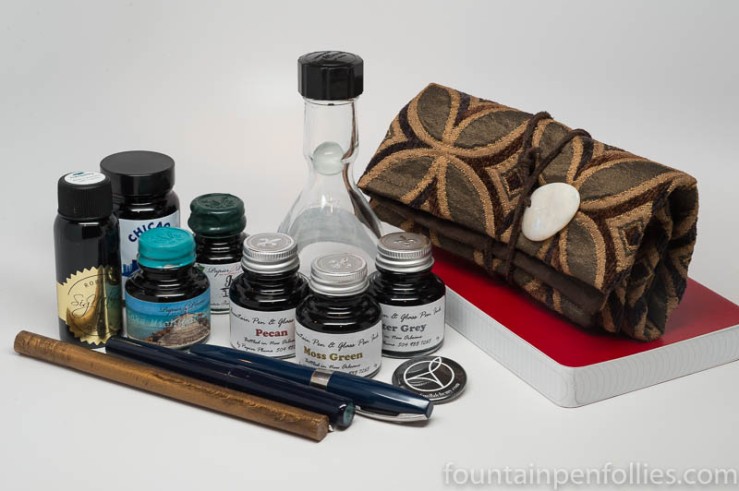
Papier Plume: (5) The ones I bought were Pecan, Oyster Grey and Moss Green. Plus the limited edition Chicago Pen Show inks Lake Michigan Summer and Ivy 108, because, you’ll remember, I have very limited interests.

These are excellent inks, well-behaved, easy-to-clean, in beautiful, sophisticated colors, from a small boutique with wonderful customer service, run by great people. They are reasonably priced. I use these inks frequently. I will buy more when they run out.

Pelikan: (1) Pelikan Edelstein Smoky Quartz. I use, like and recommend Pelikan inks. If you like this one, go for it.

Now, for me, this one is …. Well, it’s brown. I enjoy brown inks as much as the next person, but I don’t use brown inks as much as blue or black inks. And this one costs $28 a bottle, and I, well, I…. Um.

I guess the best thing to say in this situation is, Wow, that’s something.

Smoky Quartz is an ink I bought without sampling first. In retrospect, that was a mistake. Especially because, as luck would have it, Pelikan very generously gave Pelikan Hubs attendees a free bottle of Smoky Quartz. So I now have two bottles.

Wow, that’s something.

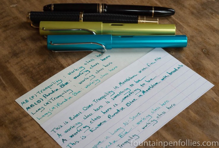
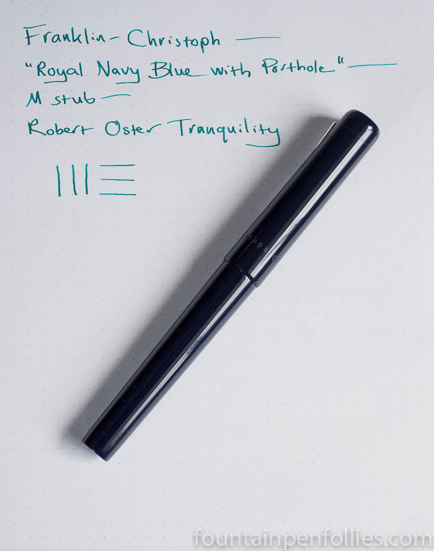
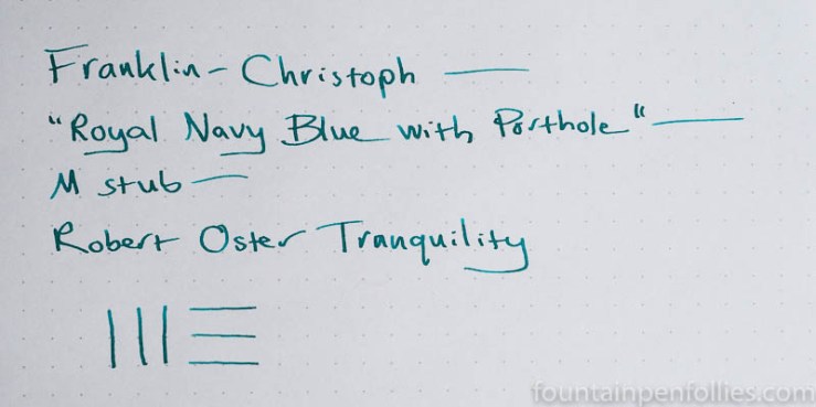
Robert Oster: (1). Robert Oster Tranquility is an ink I bought at the Chicago Pen Show. I just took a stab, and bought a bottle I’d never tried.

In retrospect, this was a mistake on one level, because Robert Oster makes so many other colors that I had tried, and already knew I liked. However, everyone loves Robert Oster inks, so I’ve nearly emptied the bottle giving samples to others. Whereas, if I’d bought an Oster I loved, that bottle would still be 95% full, nearly wasted on my shelf. So, this has turned out to be a very successful purchase. It hopefully brought pleasure to many.

All’s well that ends well.

Comparing Kaweco Paradise Blue and Robert Oster Tranquility

Kaweco Paradise Blue & Robert Oster Tranquility comparisons

The blue-green and green-blue ink space may be stuffed to bursting, but, like my waistline, it seems to keep expanding anyway. In some ways, that makes it an ink fan’s playground. But also Waterloo. In the sense of, prepare for defeat. But also, in the I “couldn’t escape if I wanted to” sense — the good, disco sense.

I got sucked into the latest round of blue-green comparisons by happenstance. I’ve been using a lot of blue-green and green-blue inks lately. It started with some Robert Oster inks, like Fire and Ice and Deep Sea, and others not on the blog — Robert Oster makes a slew. Then came Papier Plume Lake Michigan Summer, another gorgeous green-blue. Followed by Robert Oster Tranquility, a blind buy at the Chicago Pen Show.

All during my dips into the blue-green pool, smarter-than-me readers (redundant, I know) kept bringing up other inks. So I’ve had this color on the brain.

Last night for some reason I decided to put Kaweco Paradise Blue in a Montblanc with broad nib. I already have it in a Lamy Al-Star with medium nib.

Kaweco Paradise Blue is an ink I really like. I’ve compared it to Caran d’Ache Caribbean Sea and Papier Plume Lake Michigan Summer, as well as just enjoyed how nice it looks with Pelikan Turquoise (another underrated ink). Paradise Blue is a blue-green that melds very nicely with other inks in that color space, and that looks bluer or greener depending on the inks you use around it.

At the same time, I decided to give Robert Oster Tranquility another shot. I’d first put it in a Franklin-Christoph, which is an excellent pen, but a poor match for Tranquility (for me), because both pen and ink are wet. I decided to try Tranquility in one of my favorite pens, a Montblanc Virginia Woolf with fine nib.

I quickly wrote with both of my newly inked Montblancs in a notebook. I looked several times at the page, wondering, Did I ink up both pens with Tranquility? I couldn’t believe how similar these two inks now looked. It did appear that Kaweco Paradise Blue was slightly bluer, and Tranquility slightly greener. But still so similar.

But it was night, and electric light can be deceptive. I would wait till morning and write with them under natural light. I also filled an Al-Star with a medium nib with Tranquility, to compare it to Paradise Blue in the other Al-Star….

(click Page 2 below to continue)

Pen of the Day: Franklin-Christoph 03 with Robert Oster Tranquility

Franklin-Christoph 03 Iterum and Robert Oster Tranquility

Franklin-Christoph 03. When you work at a pen show, geography is destiny. Just like a college dorm, you are going to hang out with the people nearby. And my little corner of 2017 Chicago Pen Show was charmed, with Papier Plume behind and Franklin-Christoph to the right. Between Renso, Audrey, Mike and Jim, I had the nicest neighbors.

And as Chicago Pen Show Instagram, I loved documenting the action at both tables. Tracking Papier Plume as they sold out their Chicago Pen Show special inks, and watching the tsunami of customers at Franklin-Christoph. Most fun was when Audrey put out the trays of Franklin-Christoph pens in prototype materials each morning.

So it was probably inevitable that I ended up buying a Franklin-Christoph myself. I chose my 03 because it’s a nice, larger size, it has a comfortable section, and it has a clip. Mine is a prototype, but an understated one, in dark blue with a glassy color medallion in the cap top.

Prototype colors aren’t named, but Jim Rouse dubbed mine “Royal Navy Blue with a Porthole.”

Franklin-Christoph 03 Iterum and Robert Oster Tranquility

I am all over that name, as fellow Aubrey and Maturin fans would understand.

I chose a Masuyama stub nib in medium. I did test their SIG nibs (recommended by my friend). In fact, I tested all their nibs. And I retested. That’s a big advantage to picking out your pen at the show. You can mull.

I inked my pen with Robert Oster Tranquility, another pen show purchase. Tranquility is one of the many Oster blue-green inks. This one is on the greener side. The second and third photos are the best for accurate depiction of the ink color.

Tranquility has nice shading. It also has Oster’s trademark red sheen, slight with this pen, but more noticeable from a wetter pen.

Robert Oster Tranquility writing sample

Chicago Pen Show 2017 “Haul”

Chicago Pen Show 2017 purchases

We’re supposed to post our pen show pickups, so here are mine from last weekend’s Chicago Pen Show.

Seeing it all splayed out there is daunting. But magnificent. It takes a truck.

What did I buy? Two pens. One new, which is my first Franklin-Christoph. And one vintage, which is my second PFM I. Both pens are blue, which is my favorite color. I also bought five bottles of Papier Plume inks (my first). Three bottles of KWZ Chicago Blue. My first bottle of Robert Oster — Tranquility, recommended by blog readers. And a really cool notebook called the Zequenz roll up journal.

Zequenz roll up journal

In terms of gifts, Papier Plume threw in a stick of gold sealing wax, with which I intend to seal my many important proclamations, like “don’t put empty boxes back in the pantry.”

A friend gave me that empty Akkerman bottle. Someone else gave me a leather case (already in use). And I got a pin for a cool fountain pen blog, Of Quill Alchemy, from three amazingly talented students at the University of Chicago who run it.

The best present isn’t up there. It was finally meeting my dear friend Lou. We’ve known each other for years through fountain pens, but only via emails and letters, because we live so far away. Lou was in the area with his wife and brother for a family event, so they hung out with me on Thursday, the show’s first day.

That Thursday also happened to be my birthday. Now, of course turning 29 (once again) doesn’t phase me. I’ve gotten blasé about that, it happens so often. But finally meeting Lou and his family made for the best birthday ever.

pen wrap with opal

Lou made and gave me that gorgeous pen wrap. He knows me, however, so he handed it to me with the caution, “be careful.” The closure is opal. Which … okay, I’m fairly sure I’ll be googling “opal glue” before I turn 29 next year.

Inside, Lou stuck a few bookmarks, to remind me of some very important things. The last was, “remember to write me every once in a while.” He said that with a smile, because we’re both terrible at that. Not that it matters. Friends stay in each other’s hearts.

pen wrap interior

Along those lines, people in the US fountain pen community know that right after the pen show we unexpectedly lost Susan Wirth, a pen show mainstay and a great personality.

We always assume there will be a next time. But of course that’s not always true. So I’m going to try to remember to take more time for myself and other people. Rush around less, hang around more.