
The blue-green and green-blue ink space may be stuffed to bursting, but, like my waistline, it seems to keep expanding anyway. In some ways, that makes it an ink fan’s playground. But also Waterloo. In the sense of, prepare for defeat. But also, in the I “couldn’t escape if I wanted to” sense — the good, disco sense.
I got sucked into the latest round of blue-green comparisons by happenstance. I’ve been using a lot of blue-green and green-blue inks lately. It started with some Robert Oster inks, like Fire and Ice and Deep Sea, and others not on the blog — Robert Oster makes a slew. Then came Papier Plume Lake Michigan Summer, another gorgeous green-blue. Followed by Robert Oster Tranquility, a blind buy at the Chicago Pen Show.
All during my dips into the blue-green pool, smarter-than-me readers (redundant, I know) kept bringing up other inks. So I’ve had this color on the brain.
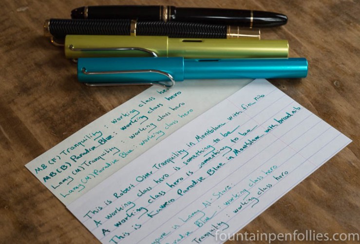
Last night for some reason I decided to put Kaweco Paradise Blue in a Montblanc with broad nib. I already have it in a Lamy Al-Star with medium nib.
Kaweco Paradise Blue is an ink I really like. I’ve compared it to Caran d’Ache Caribbean Sea and Papier Plume Lake Michigan Summer, as well as just enjoyed how nice it looks with Pelikan Turquoise (another underrated ink). Paradise Blue is a blue-green that melds very nicely with other inks in that color space, and that looks bluer or greener depending on the inks you use around it.
At the same time, I decided to give Robert Oster Tranquility another shot. I’d first put it in a Franklin-Christoph, which is an excellent pen, but a poor match for Tranquility (for me), because both pen and ink are wet. I decided to try Tranquility in one of my favorite pens, a Montblanc Virginia Woolf with fine nib.
I quickly wrote with both of my newly inked Montblancs in a notebook. I looked several times at the page, wondering, Did I ink up both pens with Tranquility? I couldn’t believe how similar these two inks now looked. It did appear that Kaweco Paradise Blue was slightly bluer, and Tranquility slightly greener. But still so similar.
But it was night, and electric light can be deceptive. I would wait till morning and write with them under natural light. I also filled an Al-Star with a medium nib with Tranquility, to compare it to Paradise Blue in the other Al-Star….
(click Page 2 below to continue)

I’m a huge fan of blue green inks too! I have so many of them, but not the Paradise Blue (yet…). Tranquility is one of my favorite inks, though. It’s so gorgeous. I just got Lake Michigan Summer too, and I can’t wait to ink it up. So many fun inks to try!
LikeLiked by 1 person
Abba ? Wonderful voices who know singing (without screaming : pity for my ears).
Two of the best singers in the world according to me.
“Thank you for the music” Laura ! 🙂
LikeLiked by 1 person
“Gonna do my very best, and it ain’t no lie!” 😁
LikeLiked by 1 person
You read my mind! I was hoping for this comparison! I have bottles of Lake Michigan Summer (thanks to your heads up!), Tranquility, and Paradise Blue. And have pens inked up with all three. At any given time, In order to tell which is which, I’ll likely have to consult my currently inked page. But in a good way! They do behave slightly different, and do have different levels of shading and sheen on my Leuchtturm paper. I love them all and am super glad to have such a blue-green summer 🙂
LikeLiked by 2 people
Ink
ink
ink
ink
ink
ink
ABBA.
AAAAAAAAAAAAAAAAHHHHHHHHHHHHHH!!!!!!!!!!!!!!!!!!!!!!!
I’ll get you for this. There are so many inks, too.
LikeLiked by 3 people
I love Abba! All the songs! All the members of the band! I can name them — still!
Hey, Jon, it’s okay, though. “You can dance, you can jive, having the time of your life….”
LikeLiked by 2 people
Did I mention AAAAAAAAAAAAAAAAAAAAAAAAAAAHHHHHHHHHHHHHHHHHHHHHHHHHHHHHHH!!!!!!!!!!!!!!!!!!!!!!!!!!!!!!!!!!!!!!!!!!!!!
LikeLiked by 1 person
I have Abba stuck in my head now and I’m not even mad.
LikeLiked by 1 person
I think Marine is closer to Paradise Blue than Tranquility. Tranquility is more greenish. I found Paradise Blue to be a lighter color & more blue than Tranquility. But they are similar. I only had a sample of Tranquility though, and no bottle. The Paradise Blue I have is in cartridge form, and not a bottle. I use it in my Kaweco Sport pen. I also find Diamine-Steel Blue to be in this same wheelhouse. I have decided even though I like both Paradise Blue and Tranquility, I won’t be buying either in bottle form. I already have a bottle of Diamine-Marine, Diamine-Steel Blue, and Deep Sea. (Deep Sea-Robert Oster). I would be hard pressed to say which I like the best! I like Deep Sea better than Tranquility for some reason. These are not the only blue-green colors that I have, but probably closest to what we are talking about.
LikeLiked by 3 people
I think that’s wise. 🙂
I actually may like Deep Sea better, too. But now that I have seen Tranquility in the Lamy, I am happy. It will be super useful for me to have an ink like that.
LikeLiked by 2 people
I sorta feel like we’re in Pee-Wee’s Playhouse and instead of having the word of the day, it’s the ink color of the day! I just dropped Diamine Marine into my new TWSBI 580AL Turquoise and it looks very similar to these two. I was about ready to buy a bottle when I saw this post, so now I must check them out too!
I’ll be sure to send you a picture of the comparison if I end up sampling them 🙂
LikeLiked by 2 people
Diamine Marine, yes! And Steel Blue. And there are others! Diamine is like Oster — both keep adding members to the blue-green, green-blue, team. Also, Diamine inks are Akkerman inks — both regular and Dutch Masters. So it’s like a doubling. 🙂
Sigh. And don’t get me started about the blue-green blue black inks. Which I like! But still.
But I very much look forward to the comparison!
LikeLiked by 1 person