

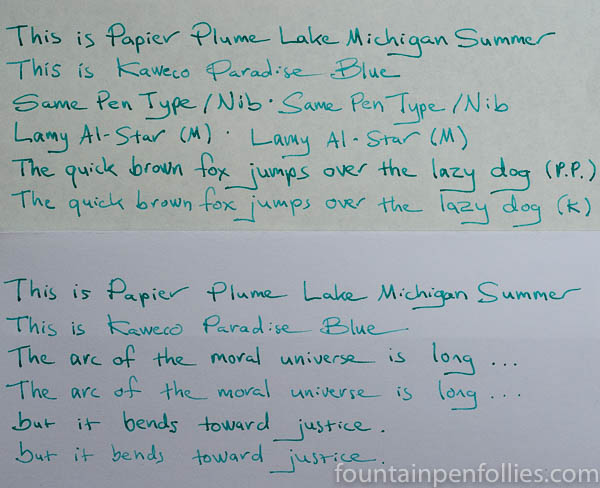
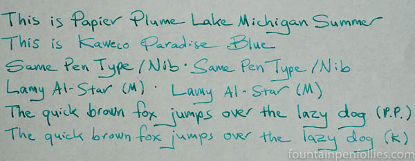
Here is a comparison of Papier Plume Lake Michigan Summer and Kaweco Paradise Blue, both in Lamy Al-Stars with medium nibs.
Lake Michigan Summer is greener, wetter and has more shading. Kaweco Paradise Blue is, as the name would imply, bluer. These lines were written with Lake Michigan Summer first, and Paradise Blue second.
On cream-colored Tomoe River paper.
On white Clairefontaine Triomphe paper.

I love both inks, frankly, and the differences are enough to justify both for myself. (I consider my excessive interest in fountain pen inks to be a little silly, so it’s lovely to be able to use the word “justify” here. Any port in the storm.)
About Lake Michigan Summer, it was one of the two inks made for the recent Chicago Pen Show. But per Instagram, Papier Plume is making another batch of Lake Michigan Summer and Ivy 108, to be released on Thursday, June 15. I have more photos of, and information about, both inks in the posts at those links. For myself, I like them both so much I have kept refilling my own pens since April.
Thanks to blog reader Nicole for the question that prompted me to compare Lake Michigan Summer to Kaweco Paradise Blue. This was also just the excuse I needed to ink up my Pacific Blue Al-Star, Lamy’s 2017 annual Al-Star. The Pacific Blue, in my opinion, may be the absolute best Lamy pen color in recent years — and I mean across the entire Lamy fountain pen line. If you’re on the fence, buy one.

Lovely comparative review. Thank you! I doubt I would use Paradise Blue on its own, but paired with Lake Michigan it’s an enchanting combination. The Papier Plume ink reminds me of Diamine’s Marine, which I also love and I think I read Marine is close to Steel Blue so that makes sense. But I’ve bought 3 inks based on your previous 2 reviews so I must calm down!
LikeLiked by 2 people
Yes Marine might also be very close. It is a wonderful shading ink as well.
LikeLiked by 2 people
Lake Michigan Summer looks an awful lot like de Atramentis Mint Turquoise… or at least it does on the internet uploads I found on Google Images. The bottle I have seems more green, but that may be because of the EF nibs I tend to favor.
LikeLiked by 2 people
Excellent. I’ve never used that one, but the name sounds very descriptive. 🙂
LikeLiked by 1 person
judging from the looks… another typo above
I would like to see a comparison of Lake Michigan Summer and Diamine-Steel Blue. Maybe someone has both, and will post a comparison photo.
LikeLiked by 2 people
Yeah, as I said on the other post, I think there will be a similarity, but (i) my Diamine Steel Blue color may be slightly different and (ii) they aren’t similar enough. Lake Michigan Summer is greener than my Steel Blue.
Also, Diamine Steel Blue, at least mine, like the very similar Pilot-Iroshizuku Ku-jaku, has a very noticeable sort of shading that I personally tired of when I used the ink regularly (i.e., writing several pages at a time).
The shading from Lake Michigan Summer is gorgeous, but not showy like that, and that’s probably another reason I enjoy it so much. Though everyone’s mileage may vary.
LikeLiked by 1 person
I like the Lake Michigan Summer look better than Paradise Blue. I have Paradise Blue in cartridges, and I like it. I got an ink sample of it last year, and really liked the behavior. That Lake Michigan Summer is a home run in my opinion judges from the looks.
LikeLiked by 2 people