
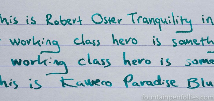
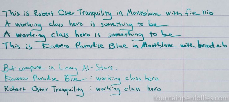
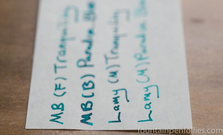
So, now it’s morning. The first two lines are written with Robert Oster Tranquility in a Montblanc with fine nib. The second two lines are written with Kaweco Paradise Blue in a Montblanc with broad nib.
Yes, Kaweco Paradise Blue is different, for sure. But those still are close.
In the Al-Stars, however, not so close. Here is the complete writing sample, with the Montblanc pairs on top, and the Al-Stars on the bottom.
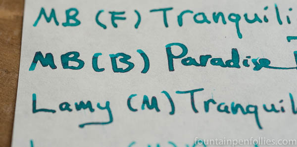
Looking at the Al-Stars with medium nibs, it’s obvious that Kaweco Paradise Blue is considerably less wet than Robert Oster Tranquility.
As I noted above, I could tell in the Franklin-Christoph that Tranquility is a gusher. That happens to make it a great match for an Al-Star or Safari or other dry-writing pen, giving Tranquility a nice role with any Lamy with a nib that’s less than broad.
I actually enjoy the color of Paradise Blue in a dry-writing Safari, and it is nicely lubricated and writes just fine with a Safari. But put both inks in a wet writer, and Paradise Blue turns into superman.
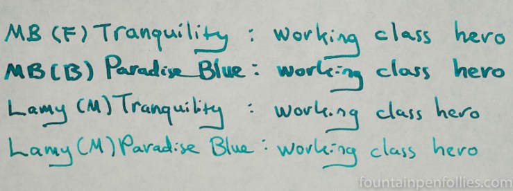
Here are the two inks, in the four pens, on Tomoe River cream-colored paper.
Do you like shading? Both are good shaders.
Do you like sheen? Robert Oster inks are notable for that, and Tranquility sheens nicely, even in the Lamy Al-Star, which is a trick.
But look at the sheen from Paradise Blue in the broad nib Montblanc.
Or here.
So that is Kaweco Paradise Blue. A shape-shifter. A very nice ink. And Robert Oster Tranquility. A very consistent ink, also very nice.
And here is the world’s most wonderful video.

I’m a huge fan of blue green inks too! I have so many of them, but not the Paradise Blue (yet…). Tranquility is one of my favorite inks, though. It’s so gorgeous. I just got Lake Michigan Summer too, and I can’t wait to ink it up. So many fun inks to try!
LikeLiked by 1 person
Abba ? Wonderful voices who know singing (without screaming : pity for my ears).
Two of the best singers in the world according to me.
“Thank you for the music” Laura ! 🙂
LikeLiked by 1 person
“Gonna do my very best, and it ain’t no lie!” 😁
LikeLiked by 1 person
You read my mind! I was hoping for this comparison! I have bottles of Lake Michigan Summer (thanks to your heads up!), Tranquility, and Paradise Blue. And have pens inked up with all three. At any given time, In order to tell which is which, I’ll likely have to consult my currently inked page. But in a good way! They do behave slightly different, and do have different levels of shading and sheen on my Leuchtturm paper. I love them all and am super glad to have such a blue-green summer 🙂
LikeLiked by 2 people
Ink
ink
ink
ink
ink
ink
ABBA.
AAAAAAAAAAAAAAAAHHHHHHHHHHHHHH!!!!!!!!!!!!!!!!!!!!!!!
I’ll get you for this. There are so many inks, too.
LikeLiked by 3 people
I love Abba! All the songs! All the members of the band! I can name them — still!
Hey, Jon, it’s okay, though. “You can dance, you can jive, having the time of your life….”
LikeLiked by 2 people
Did I mention AAAAAAAAAAAAAAAAAAAAAAAAAAAHHHHHHHHHHHHHHHHHHHHHHHHHHHHHHH!!!!!!!!!!!!!!!!!!!!!!!!!!!!!!!!!!!!!!!!!!!!!
LikeLiked by 1 person
I have Abba stuck in my head now and I’m not even mad.
LikeLiked by 1 person
I think Marine is closer to Paradise Blue than Tranquility. Tranquility is more greenish. I found Paradise Blue to be a lighter color & more blue than Tranquility. But they are similar. I only had a sample of Tranquility though, and no bottle. The Paradise Blue I have is in cartridge form, and not a bottle. I use it in my Kaweco Sport pen. I also find Diamine-Steel Blue to be in this same wheelhouse. I have decided even though I like both Paradise Blue and Tranquility, I won’t be buying either in bottle form. I already have a bottle of Diamine-Marine, Diamine-Steel Blue, and Deep Sea. (Deep Sea-Robert Oster). I would be hard pressed to say which I like the best! I like Deep Sea better than Tranquility for some reason. These are not the only blue-green colors that I have, but probably closest to what we are talking about.
LikeLiked by 3 people
I think that’s wise. 🙂
I actually may like Deep Sea better, too. But now that I have seen Tranquility in the Lamy, I am happy. It will be super useful for me to have an ink like that.
LikeLiked by 2 people
I sorta feel like we’re in Pee-Wee’s Playhouse and instead of having the word of the day, it’s the ink color of the day! I just dropped Diamine Marine into my new TWSBI 580AL Turquoise and it looks very similar to these two. I was about ready to buy a bottle when I saw this post, so now I must check them out too!
I’ll be sure to send you a picture of the comparison if I end up sampling them 🙂
LikeLiked by 2 people
Diamine Marine, yes! And Steel Blue. And there are others! Diamine is like Oster — both keep adding members to the blue-green, green-blue, team. Also, Diamine inks are Akkerman inks — both regular and Dutch Masters. So it’s like a doubling. 🙂
Sigh. And don’t get me started about the blue-green blue black inks. Which I like! But still.
But I very much look forward to the comparison!
LikeLiked by 1 person