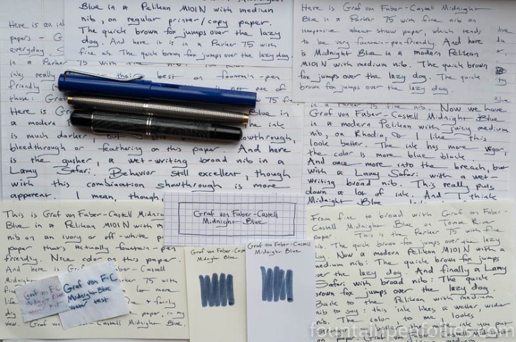
Graf von Faber-Castell Midnight Blue. Midnight Blue is a subtle, gray-leaning blue black that seems especially suited for business use. It’s absolutely excellent on lower-quality paper as well.
(click Page 2 below to continue)
Pages: 1 2

Graf von Faber-Castell Midnight Blue. Midnight Blue is a subtle, gray-leaning blue black that seems especially suited for business use. It’s absolutely excellent on lower-quality paper as well.
(click Page 2 below to continue)

For me it’s an ok ink, nothing more 🙂
LikeLiked by 1 person
Excellent review Laura. I am a big fan of GvFC ink. I am using a sample now of Stone Grey. I like the fact Midnight Blue does well on more absorbent paper. I may have to get a sample of it in the future. I felt the same way about Diamine-Asa Blue and Midnight. The more I used them, they just grew on me. Recently I sampled Red Dragon, and that too grew on me. Like you, I usually know pretty quickly whether I am gonna like something or not. So it is good to hear about one of the ones that grew on you, and why.
I can’t hear the name Midnight Blue, without thinking of the song Midnight Blue by Melissa Manchester. Yes, I know that dates me by saying that, but I don’t care. 🙂
LikeLiked by 3 people
I of course remember Melissa Manchester and that song, too!
We can’t feel bad: last night my younger daughter asked, “Who is Blondie?” I nearly died. What are they teaching in schools these days?! 🙂
LikeLiked by 1 person
Well it isn’t popular music from decades ago. My kids learned a lot about older music from me. My daughter also used to love That 70’s Show. For a while the 70’s were thought of as cool. I have no idea what they are into now. It is funny how music and certain smells can trigger memories. My mother doesn’t write with a fountain pen at all. She distinctly remembers using Peacock Blue, and even said the name of her favorite ink from when she was in school. I bet she hadn’t thought of that, until I brought it up. She loved the turquoise, and so do I. But my problem is I love just about every color. That is one reason reviews, and sampling are so important to me.
LikeLiked by 2 people
Interesting to hear how this one has grown on you over time. It sounds like a useful ink to have, if the colour is similar to Parker Edelstein Tanzanite but without the bleed through. Good to know that the cream papers also suit.
LikeLiked by 2 people
I use that ink for note taking, even on recycled paper, and it works quite well. I don’t like its hue for other writing moments, but, that’s me …
LikeLiked by 2 people
Yes. It is a serious and business-like color. I like it best with the medium nib, where it has more life to it. I do like using it in my journal, not just for work-related things, but I wouldn’t use it for editing, or writing a cheery note.
Now that I think about it, all the inks I’ve used from this brand are fairly serious colors.
LikeLiked by 3 people
Yes, you are absolutely right ! These are great colours made for work, in good German style.
LikeLiked by 1 person