

A kind and generous friend sent me a sample of Bondi Blue, and I used it for a month in two pens, a Lamy Safari with medium nib, and a modern Pelikan with a wet broad nib. The only thing that made me empty it out, really, was the need to write this review.
This ink behaved beautifully in both pens, but I especially loved Bondi Blue in the Safari. Bondi Blue is a wetter, lubricated ink, and just meshes perfectly with the dry-writing Safari. I never had a moment’s hesitation or startup problem with either pen, and didn’t need to prime the Safari’s converter, even though I wrote it dry more than once.
I even, on a lark, swapped in a defective extra-fine Safari nib I have, that essentially writes like a very dry needlepoint. Bondi Blue wrote a lighter line with that needlepoint, but it worked, and I can’t think of too many inks that have. You can see that at the very bottom of the next writing sample, on Tomoe River paper.

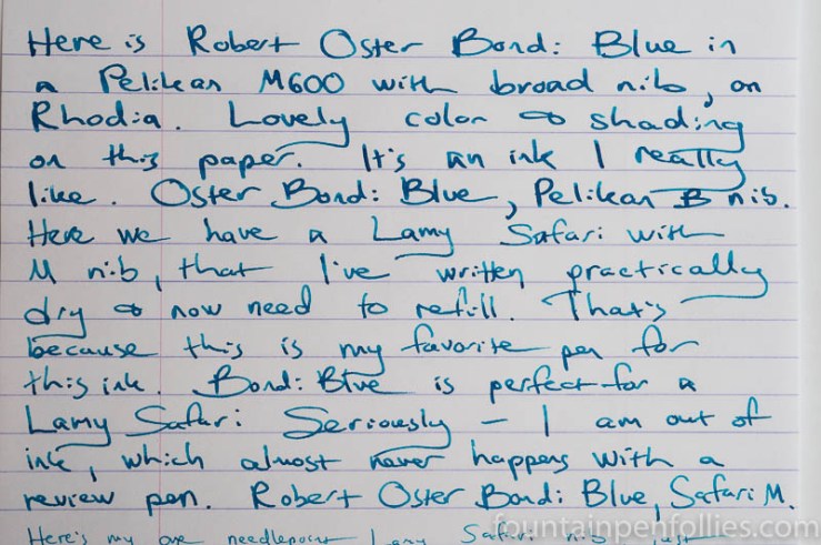
You can see the color and the shading there. It sheens, too, with the Pelikan with broad nib.

The sheen is red.
Here’s Bondi Blue on Rhodia.
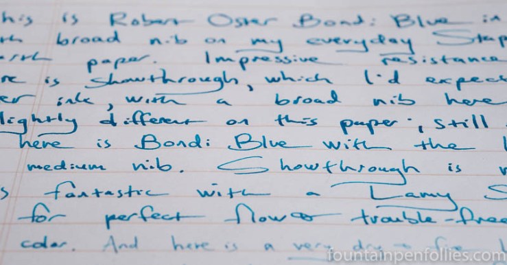
Bondi Blue did very well on low-quality paper. It resisted feathering impressively with both pens on all but my lowest quality copy paper, and even on that “everything feathers” paper, it only feathered with the broad nib. I did see showthrough with the broad nib, however, on lower-quality papers, but it’s a fairly saturated ink, after all.
Here is Bondi Blue on Staples Sustainable Earth, my everyday paper. The ink’s color looked every so slightly different on this more absorbent paper.
Bondi Blue is named after a famous beach in Australia, but it is not an ink I’d recommend to lifeguards. Bondi Blue has a smudgy bit of water resistance on aborbent copy paper, but none on fountain-pen friendly Rhodia.

I kept Bondi Blue inked for a month, which is a long time. Still, I’d rank ease of cleanup as moderate — Bondi Blue doesn’t seem to be a high maintenance ink, and I’d have no hestitation using it in any pen, but it was harder to clean than its label-mate Fire and Ice. I needed only to flush with water to clean out Bondi Blue, but for a longer time and more cycles than very low maintenance inks.
I should add that the blue dye in Bondi Blue is very persistent if it gets on your fingers, even while you’re cleaning the pens. Do not clean out your pens right before a job interview or date.
I enjoy blue inks, and so I’ve used a lot of inks in this color range. Here is a comparison of Bondi Blue with some similar inks.

Of those comparisons above, Bondi Blue may be closest to Montblanc BMW, which I reviewed here. Bondi Blue is darker and more saturated than Pelikan Edelstein Topaz, but Topaz is lower-maintenance. Mediterranean Blue is sort of similar in color, but that’s about it.
There are other comparison inks on the BMW review — including the excellent Sailor Souten. Another excellent ink that’s similar, but not as pure a blue, is KWZ Azure #4. In fact, we could probably find a fairly similar blue from every single brand. I just inked up another yesterday.
It’s a popular color range. Because it’s attractive, and useful. It’s legible but not as serious as a classic standard blue. It’s a happy color. It’s more summery or beachy in feel than work- or school-oriented.
Bondi Blue is a pure blue. It doesn’t lean periwinkle, because there’s no red tint. It isn’t a turquoise, because there’s no green. Even though you can perceive that when you use it, I was still a little surprised by the paper towel chromatography.

Bondi Blue is more streamlined than I had expected. And I hadn’t expected to see the lighter, grayer blue, because it’s such a lively ink. That darker blue dye must be a real corker.
But as I look at the chroma, I can’t help reflecting that one nice thing about Bondi Blue that I didn’t even notice before is that the color is bright and cheerful without being eye-searing. You can write an entire page in Bondi Blue, and your reader will enjoy it.
Bondi Blue is just a cheerful, attractive ink that’s easy to use and easy to love. Keep it off your fingers, and you’ll have a long and happy relationship with it.

Yes, I like the fact some of them have very small bottles to try. I bought some 30ml bottles straight from Diamine, and it was cheaper than buying them here. Even smaller bottles to try out, is even better. Some sample bottles hold so little in there, that you can’t get a good idea of whether you like it, or even if you can fill it properly. (unless you break out the handy dandy blunt tip syringe)
LikeLiked by 2 people
Great review once again. For some reason I’m drawn to photos of Fire and Ice more. I already have ink in this color range, so it won’t be a buy for me. But I still really enjoyed reading about this. I love to hear about good inks regardless. I can recommend it for someone to consider. Two of my favorite blue behaving inks are Diamine-Asa Blue, and Diamine-Midnight. Of course Midnight is NOT in this color range. Anyway I have them in 30ml bottles.
LikeLiked by 2 people
I love Diamine for the reasonable prices and the 30 ml bottles! J. Herbin and Papier Plume sell even smaller bottles, too, if you want. Pelikan and Kaweco and J. Herbin all use 30 ml bottles as their standard size. Montblanc did for the limited editions. Now Pilot Iroshizuku has the small bottles, too. And Seitz-Keuznach. And probably others I’m forgetting. 🙂 With at least some of the fountain pen and ink market being enthusiast-oriented, it’s a great idea.
LikeLiked by 1 person