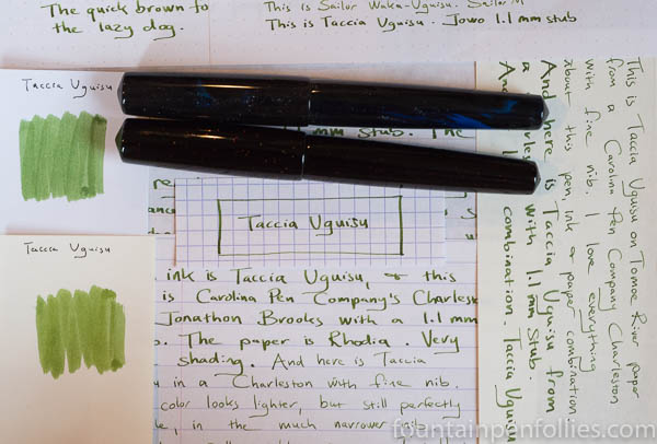
Taccia Uguisu. One of Taccia’s new inks, Uguisu is a yellow-green with very nice color and behavior. It’s easily the equal of excellent inks from more long-standing brands.
(click Page 2 below to continue)

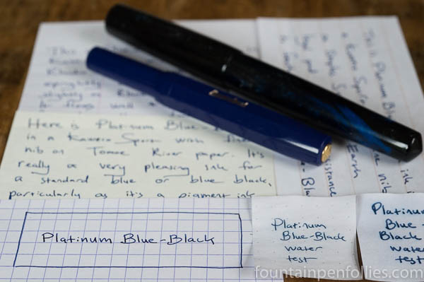
Platinum Blue-Black. This is a blue-black ink, but with the emphasis on “blue.” It’s not a traditional gray- or green-leaning blue black; instead it’s more of a dark blue. Platinum Blue-Black performs well on regular paper; it’s attractive; and it’s water-resistant. Best of all, it’s very easy to clean from a pen.
Why doesn’t everyone use this ink?
(click Page 2 below to continue)

Someone asked me to compare KWZ Confederation Brown with Montblanc Racing Green, thinking the two inks might be similar.
As you can see, that’s a firm “no.”
KWZ Confederation Brown is the limited edition ink made for the 2017 Scriptus Pen Show in Toronto. Montblanc Racing Green was a regular Montblanc ink, but it was discontinued years ago and now trades at very high prices because it’s got a certain mystique.
I snapped a comparison shot of the two swabs and texted it to the friend who had asked about it. His reaction? Puzzlement. He said something like, “That’s weird: my Confederation Brown looks more green, and yours looks more brown.”
Was my ink faded or from a different batch than his? Was something wrong with my ink, or his? Because his looks greener than mine, supposedly.
No, not at all.
That’s a very common reaction. Let’s talk about why.
Our perception of a color is influenced by many factors, one of which is how the color we are looking at interacts with other colors. We perceive a color differently based on the colors nearby.
So in the top photo, Confederation Brown looks browner and less green.
But now look at this photo of Confederation Brown.

And this photo.

In those two photos, Confederation Brown looks not brown, but green, albeit a yellow-brown-green sort of green.
Confederation Brown has not changed. The only change is the surrounding colors. That makes all the difference in one’s perception of the color of Confederation Brown. (Let me add that when you see Confederation Brown in isolation, it looks fairly green.)
It is highly unlikely — nearly impossible, I’d wager — that anyone’s bottle of KWZ Confederation Brown strays significantly from the standard. That’s because KWZ would have made this special edition ink in one batch. Also because KWZ takes pains to ensure KWZ inks are consistent, even from batch to batch. And it’s very recently made, not likely to have changed color in the bottle.
There’s another issue here: ink names.
So much goes into an ink name. Marketing appeal, the sound of the words, how the name translates into different languages and, of course, the need to describe the color. This ink would have been named by the organizers of Scriptus, the Toronto pen show. The Confederation part of the name refers to the creation of the Dominion of Canada. And the Brown part is for the color.
I think with this ink, reasonable people can differ whether it’s more brown, or more green. As I said, when I see Confederation Brown, it looks green to me — although a yellow-brown type of green. But I think either brown or green is perfectly fair. Also, I’m quite certain that if they had named it “Confederation Green,” some buyers would have felt it was too brown to be named green.
The truth is, there are infinite varieties of any color, be it blue, red, green or brown. That’s part of what makes fountain pen inks so interesting.
Here are the inks I have that I find closest to Confederation Brown in feel. One is more of a brown, one is more of a green.

Stipula Verde Muschiato happens to be one of my all-time favorite inks, and I love how golden it looks here. To me, the slightly browner one is is Verde Muschiato (named green) and the greener one is Confederation Brown (named brown). But they are both green-browns or brown-greens.
Here is Confederation Brown with one of my favorite KWZ greens.

Despite me thinking Confederation Brown is pretty green, KWZ Iron Gall Green Gold is greener. Put another way, next to Iron Gall Green Gold, Confederation Brown surely looks brown. (As it does next to Montblanc Racing Green, in the first photo.) Another reason the Brown name makes sense.
In any case, whatever the name, these are all interesting colors, with many dimensions, and a lot to enjoy. Even a mere glimpse of the swabs shows how different these inks look on white versus cream paper. They also will vary depending on the pen used.
That malleability is a feature of many green-brown, or brown-green, inks. It’s one reason those colors are so interesting. And also why these inks tend to fool our eyes the most.
The blue-green and green-blue ink space may be stuffed to bursting, but, like my waistline, it seems to keep expanding anyway. In some ways, that makes it an ink fan’s playground. But also Waterloo. In the sense of, prepare for defeat. But also, in the I “couldn’t escape if I wanted to” sense — the good, disco sense.
I got sucked into the latest round of blue-green comparisons by happenstance. I’ve been using a lot of blue-green and green-blue inks lately. It started with some Robert Oster inks, like Fire and Ice and Deep Sea, and others not on the blog — Robert Oster makes a slew. Then came Papier Plume Lake Michigan Summer, another gorgeous green-blue. Followed by Robert Oster Tranquility, a blind buy at the Chicago Pen Show.
All during my dips into the blue-green pool, smarter-than-me readers (redundant, I know) kept bringing up other inks. So I’ve had this color on the brain.
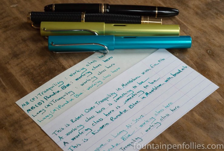
Last night for some reason I decided to put Kaweco Paradise Blue in a Montblanc with broad nib. I already have it in a Lamy Al-Star with medium nib.
Kaweco Paradise Blue is an ink I really like. I’ve compared it to Caran d’Ache Caribbean Sea and Papier Plume Lake Michigan Summer, as well as just enjoyed how nice it looks with Pelikan Turquoise (another underrated ink). Paradise Blue is a blue-green that melds very nicely with other inks in that color space, and that looks bluer or greener depending on the inks you use around it.
At the same time, I decided to give Robert Oster Tranquility another shot. I’d first put it in a Franklin-Christoph, which is an excellent pen, but a poor match for Tranquility (for me), because both pen and ink are wet. I decided to try Tranquility in one of my favorite pens, a Montblanc Virginia Woolf with fine nib.
I quickly wrote with both of my newly inked Montblancs in a notebook. I looked several times at the page, wondering, Did I ink up both pens with Tranquility? I couldn’t believe how similar these two inks now looked. It did appear that Kaweco Paradise Blue was slightly bluer, and Tranquility slightly greener. But still so similar.
But it was night, and electric light can be deceptive. I would wait till morning and write with them under natural light. I also filled an Al-Star with a medium nib with Tranquility, to compare it to Paradise Blue in the other Al-Star….
(click Page 2 below to continue)

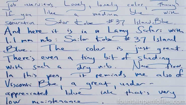
Here’s a sneak peek at how Sailor Kobe No. 37 Island Blue looks in a broader nib. We’ve already seen it in a Kaweco extra-fine. But I’ve got it in second pen now, a Lamy Safari with 1.1 mm stub nib.
Long story short: it’s a very nice ink, no matter the pen.
Here’s Island Blue from the Safari stub on Tomoe River paper, with the Kaweco extra-fine below.

And this is Island Blue on Rhodia paper, with the extra-fine nib first, then the wider stub.
It wasn’t until I saw a wider swath of Island Blue that I realized something cool. Even more than the lovely Diamine Blue Velvet, Kobe Island Blue reminds me of the equally lovely, but criminally underappreciated Visconti Blue.
I haven’t blogged about Visconti Blue, despite really liking it. Visconti Blue is a lower-maintenance blue ink that’s more vivacious than older standards like Waterman Serenity Blue, but without the ultra-brightness of some of the newer inks like Blue Velvet.
So here are swabs of Island Blue with the two inks it reminds me of.

Bear in mind that photos of the swabs alone can deceive. Blue Velvet is brighter than the other two, which you can see in person but not in the photo. And I think I remember that Visconti Blue shades more than Island Blue. Then of course there are important issues of sheen, water resistance, cleanup and the like, which we’ll delve into in the longer, official review.
I actually have comparisons of Island Blue to other inks, too. Because Island Blue is a very nice ink. That also will be in the review. (Because, time.) But just for fun, you can look at this older post, if you like. Or this one. Island Blue is a very nice ink.

The color experts at Pantone just announced Greenery as their 2017 Color of the Year. I like it a lot. Of course my thoughts immediately turned to ink. In order: “Great color! Caran d’Ache Delicate Green. No, Sailor Waka-Uguisu.”
The paint swatch above reminds me more of Waka-Uguisu. But here’s the fabric swatch.
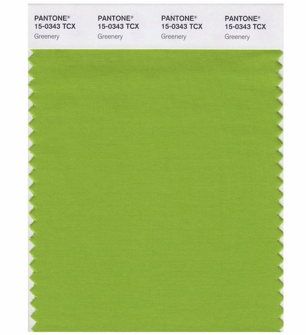
The fabric has a shimmer which reflects more light, and that lighter hue also calls to mind Caran d’Ache Delicate Green. But probably because I just love that ink. Greenery is much closer to Waka-Uguisu. It’s more yellow.
Waka-Uguisu and Delicate Green are great colors, and I’m totally on board with Greenery in 2017. It does feel very current. Judging by the inks, the color is interesting but easy to live with, eye-catching but calm.
If you want to see the inks that remind me of Greenery, I have a little review of Waka-Uguisu here. I’ve never reviewed Delicate Green (what?!) but it’s currently in my green Sheaffer “Pen for Me,” so there’s a glimpse of it here.
Pilot-Iroshizuku Chiku-rin is a nice ink which might be an option, but for some reason that one never appealed to me as much as Delicate Green and Waka-Uguisu. Diamine Wagner is much too yellow, and Diamine Meadow I think too green. But both Diamines are good inks on their own.
Despite the huge range of green Lamy Al-Stars and Safaris, there is none close to Greenery. (Because Greenery is a nice green.) I do hope Lamy does not take this as a challenge.
—————
Both Greenery swatches from Pantone Twitter.
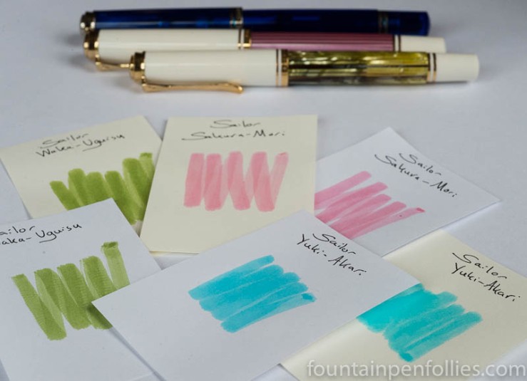
It does look like an Easter basket just threw up on me, doesn’t it?
But thankfully not. It’s just that I just got three more of the new Sailor Four Seasons inks. Up there are Sailor Waka-Uguisu, Sakura-Mori and Yuki-Akari.
Candidly, I am not a pastel person. But I have been happily surprised by these three inks. In fact the final ink of the trio, the one I only grudgingly added to the shopping cart, because I absolutely loathed the color of the online swabs, turns out to be my favorite of all. Go figure.
But first things first. Here is a comparison of Sakura-Mori, the new Sailor pink, with the old Sailor pink, Peche.
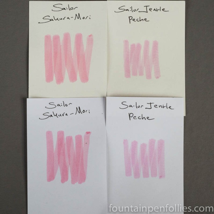
That’s perhaps sad news for Peche devotees. Sakura-Mori is a warmer color, and isn’t really very much like Peche.
But Sakura-Mori is lovely, nonetheless, if you like pale pink inks. It’s a delicate pink with a blush of orange, I believe. Now, a light pink ink is not be the most versatile, useful color, for sure, but I have a soft spot for the barely legible ink category, so I like this one.

I plan to do a more in-depth look at Sailor Souten, but we were talking yesterday about how it compares to Sailor Jentle Sky High, and here’s a quick look at just that.
Sky High is my favorite Sailor ink, and one of my all-around favorite blue inks. It’s just a nice, cheery blue, with great shading, and uncomplicated behavior. It even has nice red sheen for sheen fans.
But when Sailor discontinued Sky High, that was fine with me. I had a bottle, and I have a lot of blue inks. If I ever used up my Sky High, I’d be left with only 943 other blue inks. Not a tragedy.
But Sailor did bring out Sailor Jentle Four Seasons Souten, and I was given a sample, and eventually bought a bottle. I’ve been using both together for the past few weeks, to evaluate Souten and compare the two.

I don’t think they are identical. I think Souten may be very slightly darker than Sky High. Maybe I’m wrong about that, but I am certain that any differences are slight. (I’ve also done paper towel chromatography.) To me, Souten is essentially the same as Sky High.
Here’s a writing sample. Souten is the first ink and Sky High the second in each pair
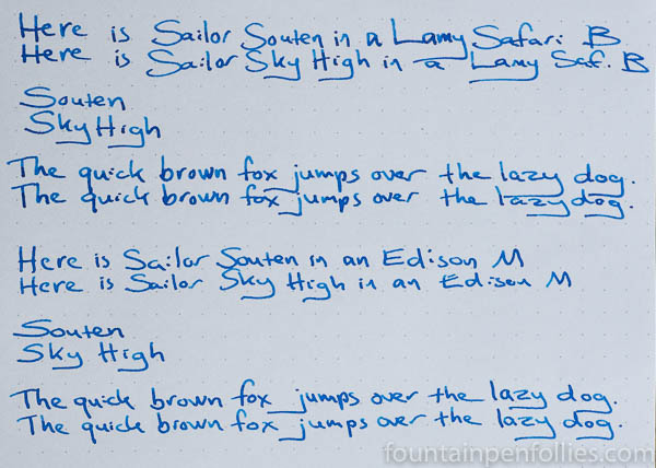
I’ve mostly been writing with both inks in Lamy Safaris with broad nibs. Those are dry pens. Here’s a closeup.

I also tried the two inks in Edison pens with identical 14k medium nibs. Those are wet writers.

Sky High still looks just a bit lighter to me, after using them for weeks in the same pens on many different papers. But the two inks share the same hue, the same degree of shading and sheen and the same excellent behavior.
I was happy to buy a bottle of Souten. Sky High is a favorite, and I’m pretty sure I won’t even notice the difference.

When I got my new bottle of Parker Penman Sapphire (not actually new, but new-to-me), I hemmed and hawed about what pen I should use.
Part of me wanted to put it in a gorgeous Azure Blue Parker Vacumatic, because PPS is a gorgeous blue Parker ink. Another part of me thought, this is a job for my Pelikan M205 blue demonstrator: PPS is an ink that should be appreciated in a demonstrator. While all the votes on Instagram were for the Vac.
But I ended up choosing the beautiful new Kaweco AL-Sport Light Blue with extra-fine nib instead. I’ve got that pen for review, and it deserves a special ink.

After a few days of using PPS in the Light Blue AL-Sport, a light bulb went on: I also have Kaweco AL-Sport in raw aluminum with an extra-fine nib. The same pen, the same nib. So I grabbed the second AL-Sport and filled that with what remains of my sample of Bung Box First Love Sapphire, which is often compared to PPS.
You can see the results at the top, and I’ll put some closeup photos on the next page.
(click Page 2 below to continue)

“What’s in a name? that which we call a rose / By any other name would smell as sweet”
-Romeo and Juliet
Blog readers, you know my love for William Shakespeare, the playwright and the ink. And while Montblanc Shakespeare is new, I think it’s already popular. It’s hard to find online. But do you know what ink is quite easy to find? Diamine Carnival.
And Diamine Carnival looks close enough to Montblanc Shakespeare that I wonder if Diamine Carnival might make a decent substitute.
(click Page 2 below to continue)
