

The color experts at Pantone just announced Greenery as their 2017 Color of the Year. I like it a lot. Of course my thoughts immediately turned to ink. In order: “Great color! Caran d’Ache Delicate Green. No, Sailor Waka-Uguisu.”
The paint swatch above reminds me more of Waka-Uguisu. But here’s the fabric swatch.
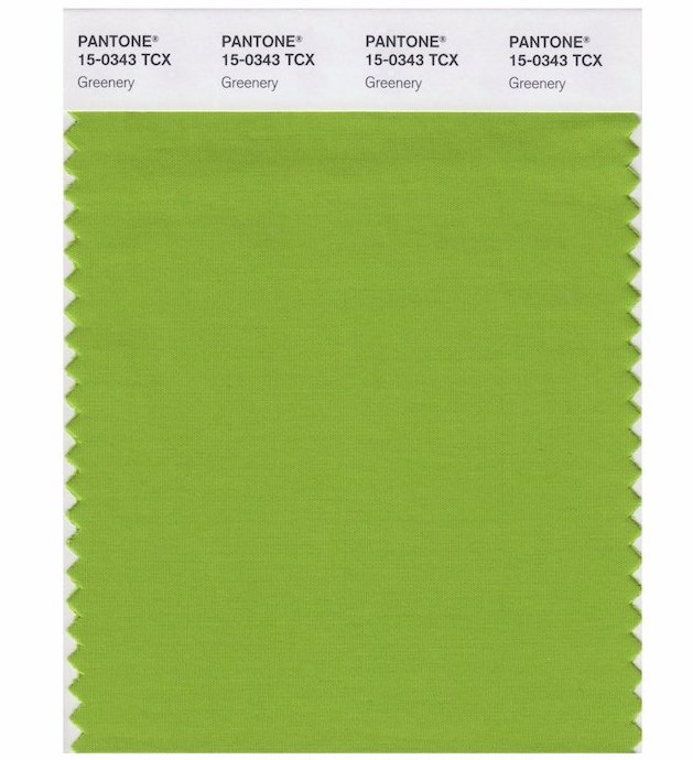
The fabric has a shimmer which reflects more light, and that lighter hue also calls to mind Caran d’Ache Delicate Green. But probably because I just love that ink. Greenery is much closer to Waka-Uguisu. It’s more yellow.
Waka-Uguisu and Delicate Green are great colors, and I’m totally on board with Greenery in 2017. It does feel very current. Judging by the inks, the color is interesting but easy to live with, eye-catching but calm.
If you want to see the inks that remind me of Greenery, I have a little review of Waka-Uguisu here. I’ve never reviewed Delicate Green (what?!) but it’s currently in my green Sheaffer “Pen for Me,” so there’s a glimpse of it here.
Pilot-Iroshizuku Chiku-rin is a nice ink which might be an option, but for some reason that one never appealed to me as much as Delicate Green and Waka-Uguisu. Diamine Wagner is much too yellow, and Diamine Meadow I think too green. But both Diamines are good inks on their own.
Despite the huge range of green Lamy Al-Stars and Safaris, there is none close to Greenery. (Because Greenery is a nice green.) I do hope Lamy does not take this as a challenge.
—————
Both Greenery swatches from Pantone Twitter.

This color of the year appeals to me. I agree that Diamine Meadow is too green to be a match. I do love that ink. Headed over to check out your ink review of Waka-Uguisu.
LikeLiked by 1 person