Pen of the Day: Edison Custom Herald with KWZ Hunter Green


Edison Custom Herald ebonite with KWZ Hunter Green ink

Edison Custom Herald with medium nib. Here’s an old favorite pen of mine, a custom Herald by Edison in a gorgeous green-brown ebonite, with silver-colored clip and nib.

This custom Herald has a medium 18k nib, set to Edison’s usual juicy flow, which really shows off any ink. Right now I’m using it with a new-to-me ink, KWZ Hunter Green.

Edison Custom Herald ebonite with KWZ Hunter Green ink

Hunter Green is khaki, but it’s fairly saturated, and with a wetter writer like this Edison, Hunter Green can look very dark indeed. Which I like. But the color is, of course, lighter in pens with less ink flow.

Shading is minimal. Here’s a writing sample of Hunter Green.

KWZ Hunter Green ink writing sample

More Sailor Kobe No. 37 Island Blue

Sailor Kobe No. 37 Island Blue writing sample

Here’s a sneak peek at how Sailor Kobe No. 37 Island Blue looks in a broader nib. We’ve already seen it in a Kaweco extra-fine. But I’ve got it in second pen now, a Lamy Safari with 1.1 mm stub nib.

Long story short: it’s a very nice ink, no matter the pen.

Here’s Island Blue from the Safari stub on Tomoe River paper, with the Kaweco extra-fine below.

Sailor Kobe No. 37 Island Blue writing sample

And this is Island Blue on Rhodia paper, with the extra-fine nib first, then the wider stub.

Sailor Kobe No. 37 Island Blue writing sample

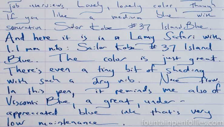
It wasn’t until I saw a wider swath of Island Blue that I realized something cool. Even more than the lovely Diamine Blue Velvet, Kobe Island Blue reminds me of the equally lovely, but criminally underappreciated Visconti Blue.

I haven’t blogged about Visconti Blue, despite really liking it. Visconti Blue is a lower-maintenance blue ink that’s more vivacious than older standards like Waterman Serenity Blue, but without the ultra-brightness of some of the newer inks like Blue Velvet.

So here are swabs of Island Blue with the two inks it reminds me of.

Sailor Kobe No. 37 Island Blue swab comparisons

Bear in mind that photos of the swabs alone can deceive. Blue Velvet is brighter than the other two, which you can see in person but not in the photo. And I think I remember that Visconti Blue shades more than Island Blue. Then of course there are important issues of sheen, water resistance, cleanup and the like, which we’ll delve into in the longer, official review.

I actually have comparisons of Island Blue to other inks, too. Because Island Blue is a very nice ink. That also will be in the review. (Because, time.) But just for fun, you can look at this older post, if you like. Or this one. Island Blue is a very nice ink.

Inky Secrets and Confessions

1969-208-190a-abeno

I’ve mentioned before that my friend Chris knows more about ink than anyone I know. I always learn a lot from her, and I enjoyed reading her 2016 list of inks purchased. My list is for 2106 is here. She asked me the other day, guiltily, I think, “Have you ever thrown inks down the drain?” I have no guilt about that. But it gave me the idea for some inky true confessions.

(click Page 2 below to continue)

Pen of the Day: Kaweco AL-Sport Light Blue with Sailor Kobe No. 37 Island Blue

Sailor Kobe Island Blue ink with Kaweco AL-Sport Light Blue
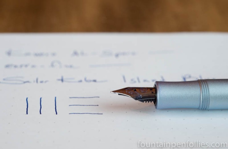
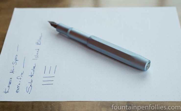
Kaweco AL-Sport Light Blue with extra-fine nib. New year, new ink. I switched things up this week, trying out some new-to-me inks, including Sailor Kobe No. 37 Island Blue.

I already loved this pen, and the ink seems like a winner, too. Kobe Island Blue is quite saturated, so not a great shader, but there’s a bit. The ink seems a great match for the Kaweco extra-fine nib, flowing smoothly and still slightly on the wet side, while maintaining a thin but legible line.

Sailor Kobe Island Blue ink with Kaweco AL-Sport Light Blue

I love the color of Island Blue: it’s a bright and cheery blue, with warmth but no harshness. When I took these photos, the afternoon light was cool and weak. The spark of life Island Blue provides is a nice antidote to a cold winter.

Kobe Island Blue seems similar to the very popular, but expensive, Bung Box First Love Sapphire, also made by Sailor. That means it will also be worth comparing Island Blue to Diamine Blue Velvet. I’ve only used Island Blue for a few days, and only in this pen, but on first impression, I like Island Blue best of all three inks.

One Minute Ink Review: KWZ Iron Gall Blue #4

KWZ Iron Gall Blue #4

KWZ Iron Gall Blue #4. Despite the name, this ink is gray. Not blue-gray, really just gray. It’s got KWZ’s usual nice shading, and usual easy clean-up. I like it best in a wetter writer, to darken the color.

An everyday ink? Well, in that category, I’ve already got Pilot-Iroshizuku Kiri-same. Also Montblanc’s no-longer-available Albert Einstein ink. And I really liked Kaweco’s new Smokey Grey, too, although that’s lighter in color.

Inks Chris Bought in 2016

Ink Bottles

I asked my friend Chris to tell us what inks she bought in 2016. I love her lists, because they always contain such interesting things. On the one hand, we both love Caran d’Ache and Montblanc inks. So, we’re practically twins. But Chris has much broader ink interests than I do. Occasionally I will insert an Editor’s Note in her text, because silence is not my forte. But here’s Chris.)

I think I’ve bought a similar number of bottles to last year, but I’m not counting any inks that I received for free. Like last year, I bought some more inks that I intend to sell, so I haven’t included those either.

I still haven’t kept very good records of inks I have bought, but I’ve gone back through PayPal and credit card purchases to compile a list for the purposes of this post. I buy inks from quite a few sources so my new years resolution for 2017 will be to keep an accurate record. (Editor’s Note: Good idea. I think my resolution will be to “forget” half my 2017 purchases.)

(click Page 2 below to continue)

Ink Review: Bung Box Dandyism

Bung Box Dandyism writing samples

Bung Box Dandyism. This is a very dark green ink, made by Sailor for Bung Box in Japan. It’s an appealing color that in some ways combines the best of Sailor greens. And it perfectly hits the recent craze for very saturated and wet inks. Unfortunately, it’s an expensive ink here in the US, or I think it would be more popular.

(click Page 2 below to continue)

First Look: Diamine Shimmering Inks

Diamine Shimmering Inks writing sample

Here is a quick look at some of the newer Diamine shimmer inks. A friend very nicely sent me these, and I’ve been using them with broader nibs. That’s Blue Flame with a broad architect’s nib ground by Dan Smith, Moon Dust from a 1.1 mm stub, and Firestorm Red and Inferno Orange in regular broad nibs.

These are nice enough inks, but they don’t strike me as “must haves,” at least for my normal fountain pen use. I’ll talk about why, after the jump.

(click Page 2 below to continue)

Pen of the Day: Sheaffer PFM Green with Kaweco Palm Green

Sheaffer PFM with Kaweco Palm Green ink

Sheaffer PFM Green with medium nib. I’m still rocking the holiday inks.

Here, it’s Kaweco Palm Green. In contrast to the more sophisticated Garnet Red ink that I filled last week, Kaweco Palm Green is an unabashedly kid-friendly color.

It’s the one your kindergarten-aged self would have pulled from the crayon box to color in the Christmas tree, on the construction-paper card you were making for mom.

Sheaffer PFM with Kaweco Palm Green ink

And it reminds me of gum drops.

miniature gingerbread house