

I have been using Dandyism for many weeks, mostly in two pens, a Lamy Vista with broad nib, and a very dry Lamy 2000 with extra-fine nib.
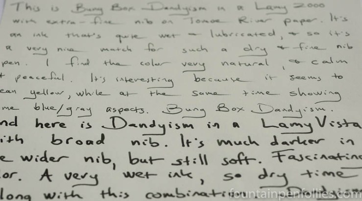
Dandyism is a very wet ink, so it’s a nice match with Lamy 2000 extra-fine, which really needs a wet ink. In such a dry writer, Dandyism becomes lighter in color — still legible, but not so overwhelmingly dark and saturated.
Dandyism is more forceful in a wetter pen and more delicate in the very dry pen. It’s darker green in the wetter pen and yellower green in the dry pen. I like both looks.
Here is a writing sample on Rhodia, first with the very dry extra-fine nib and next with the Lamy Vista’s broad nib (the writing sample says stub, but it’s a broad nib).

Often when someone sees a very dark green ink, they wonder if it’s like the old Montblanc Racing Green ink. I’ve never had the privilege of trying that ink for myself, but I’ve seen samples in letters from luckier folks, and I don’t think Dandyism is the perfect substitute.
Just a note about the wetness of Dandyism. It’s super wet. It takes a long time to dry (except with the stingy Lamy 2000 extra-fine). It writes a wide line (except with the stingy Lamy 2000 extra-fine). There’s significant showthrough and bleedthrough on thin paper with anything but the stingy Lamy 2000 extra-fine. There’s not much shading. There’s nib creep with every pen I’ve used it in.
But those are all qualities you’d expect with a wetter, saturated ink. Another is feathering on lower-quality paper. Dandyism does feather a bit, but it’s livable even with the broad nib.
Here’s a quick writing sample on Staples Sustainable Earth, my everyday, lower-quality paper.

I mentioned that Dandyism is a wet ink, but it’s not the most perfectly lubricated ink. Each morning when I picked up the Lamy Vista with broad nib and started to write with it, it took a few dry squiggles and a few patchy words to get Dandyism flowing like the gusher it is.
Unlike a Safari-type pen, which has a dry and controlled feed, a Lamy 2000 feeds ink like a boss. So Dandyism started up immediately in the 2000, even after days sitting nib up and unused in the pen cup.
What I like most about Dandyism is the great color. It’s a dark green with a slight blue or gray tint that keeps it formal, but it still has enough yellow to look evergreen. The color almost seems to be a cross between the old Sailor Jentle Epinard and the current Sailor Miruai.
I think Dandyism looks great on cream-colored Tomoe River paper.
Dandyism sheens a bit, too, though I’m not a sheen person so I really didn’t try to bring out that quality.

I’ve cleaned Dandyism out of the Lamy Vista, and I found it very low-maintenance in that pen. Even after weeks inked, I only needed to flush out Dandyism with water.
Yet despite its easy cleanup, Dandyism has a water-resistant core, not just on absorbent regular paper (the larger bit) but also on smooth Rhodia, which is unusual.

So that’s nice for those who like water-resistance in their inks, and also nice for those who like an easy-to-clean ink.
I don’t have an ink that’s exactly like Dandyism, although I have a lot of inks in this color range, because it’s a favorite of mine.

You can see that Dandyism is more saturated than all these inks, even the very dark Diamine Green/Black. It’s closest to the awesome KWZ Foggy Green, but more yellow. You can compare Foggy Green in a review here. Another similar color is KWZ Rotten Green, reviewed here.
The KWZ inks themselves are similar to Sailor Miruai. I mentioned above that Dandyism reminds me of Sailor Miruai, but with more yellow, like the no-longer available Sailor Jentle Epinard. So I did a little Sailor lineup. Miruai and Tokiwa-Matsu are in the current Four Seasons line, available worldwide.

So, Dandyism is in fact more yellow than Miruai. But Epinard and Tokiwa-Matsu are very much yellower, and lighter, than Dandyism. Looking at all four together, they don’t look as similar as I thought. But as I used Dandyism, I kept seeing qualities of both Miruai and Epinard.
So I took out my paper towel chromatography of the Sailor inks. Here is, from left to right, Sailor Jentle Epinard, Bung Box Dandyism and Sailor Miruai.

That’s interesting to me. Even though Epinard looks extremely unlike Miruai, the two inks actually have a lot in common on the dye level. When I look at all three, it almost looks like Sailor took Miruai, added more of Epinard’s yellow and more of the dark dye, and made Dandyism.
I like all three of the current inks: Tokiwa-Matsu, Miruai and Dandyism. If I had to pick only one to keep, however, it would be Dandyism, just on the basis of color. I think Dandyism is the perfect shade of dark green.
But then Dandyism is much more expensive in the US, being a Bung Box. And it is super-wet. My extra-fine Lamy 2000 loves that about Dandyism. But a very wet ink can be a poor choice for pens that are wet writers, or for people who need a faster-drying ink or who use thinner paper.
Dandyism was a blind buy for me, and even though it was pricey, I really like it. It’s a great color, and has good qualities all around.

Gorgeous ink, very reminiscent of Noodler’s Zhivago.
LikeLiked by 1 person
Fab review! Coincidentally (or maybe not) I have a Lamy 2000 extra fine that I have filled with Sailor tokiwa matsu. Doesn’t feel dry at all with this ink.
LikeLiked by 1 person
An interesting and unusual colour. A useful find to compensate for the dryness of the Lamy 2000 extra fine.
LikeLiked by 2 people
I really like this ink 🙂
LikeLiked by 2 people