Sailor Jentle Four Seasons Kin-Mokusei. This is a bright and shiny orange ink with beautiful shading, and a yellow tint that makes for a lovely color, but does make Kin-Mokusei best suited to wider nibs.
(click Page 2 below to continue)


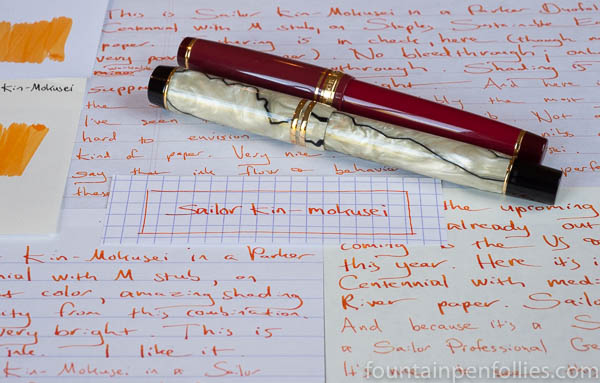
Of course you can’t read that, but that scribble is meant to say “Sailor Kin-Mokusei,” and it’s on the edge of a scrap of paper I found this weekend as I started to put together a review of Kin-Mokusei ink. I dug out a little photo, blew up the relevant part, and here it is.
The orange Kin-Moksei is one of the eight Sailor Jentle Four Seasons inks that are soon to arrive in stores outside Japan. The brown-green ink you can glimpse just above Kin-Mokusei is Rikyu-Cha, which is another.
I know it’s not a proper photo, but that’s okay for me, because this scrap of image shows why I love Kin-Mokusei. It’s a bright and shiny yellow-orange with lovely shading. It looks happy and exuberant, but also organic. For a bright ink, it’s actually subtle.
I will write a proper review with proper photographs and perhaps words that make sense. It’s just that those take time. And we had the Cubs. The cross country meet. The sun coming out for two whole days in a row. So much good.
But this scrap reminds me of something good, too. To take the time to enjoy the little things you come across unexpectedly — the scraps and scribbles, the unplanned encounters, the song you hear on the radio, the wrong turns leading somewhere interesting. Anything that makes you smile, or gives you an “aha” moment.
Even if it’s just a little scribble of ink. After all, that’s why we love this silly stuff.

I plan to do a more in-depth look at Sailor Souten, but we were talking yesterday about how it compares to Sailor Jentle Sky High, and here’s a quick look at just that.
Sky High is my favorite Sailor ink, and one of my all-around favorite blue inks. It’s just a nice, cheery blue, with great shading, and uncomplicated behavior. It even has nice red sheen for sheen fans.
But when Sailor discontinued Sky High, that was fine with me. I had a bottle, and I have a lot of blue inks. If I ever used up my Sky High, I’d be left with only 943 other blue inks. Not a tragedy.
But Sailor did bring out Sailor Jentle Four Seasons Souten, and I was given a sample, and eventually bought a bottle. I’ve been using both together for the past few weeks, to evaluate Souten and compare the two.

I don’t think they are identical. I think Souten may be very slightly darker than Sky High. Maybe I’m wrong about that, but I am certain that any differences are slight. (I’ve also done paper towel chromatography.) To me, Souten is essentially the same as Sky High.
Here’s a writing sample. Souten is the first ink and Sky High the second in each pair
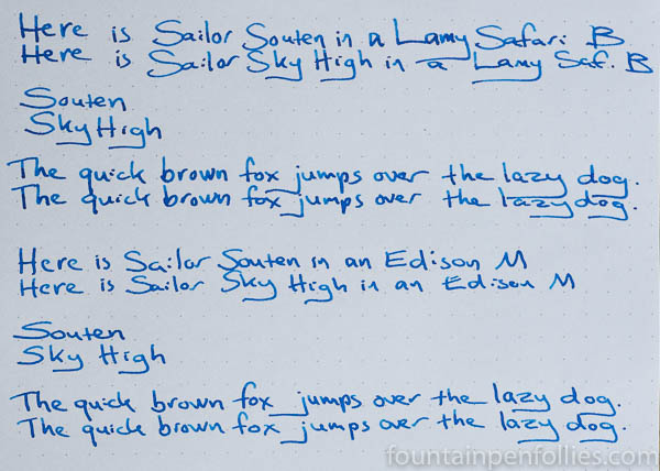
I’ve mostly been writing with both inks in Lamy Safaris with broad nibs. Those are dry pens. Here’s a closeup.

I also tried the two inks in Edison pens with identical 14k medium nibs. Those are wet writers.

Sky High still looks just a bit lighter to me, after using them for weeks in the same pens on many different papers. But the two inks share the same hue, the same degree of shading and sheen and the same excellent behavior.
I was happy to buy a bottle of Souten. Sky High is a favorite, and I’m pretty sure I won’t even notice the difference.
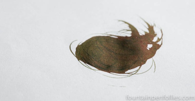
When I blogged yesterday about my new Step Forward wheat straw paper, a reader asked whether it shows sheen. I wasn’t sure; I’d been seeing some, but not a huge amount. And part of that has been due to our cloudy, rainy weather. And part of that is I don’t have a sheening ink in a wet pen right now.
But I have good news. Yesterday afternoon, for a brief few minutes, the sun burst through. And so did the sheen. That first photo shows Sailor Tokiwa-Matsu, an evergreen ink with a lot of sheen, on the Step Forward wheat straw paper.
Here it is on the edge of the little notebook, where I fortuitously had wiped off a messy nib.
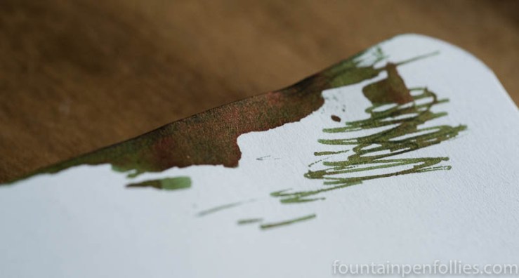
I don’t think the wheat straw paper is necessarily a power sheener, like Tomoe River paper. But it’s good to know that if you put enough ink down, and it’s the right ink, there will be sheen.
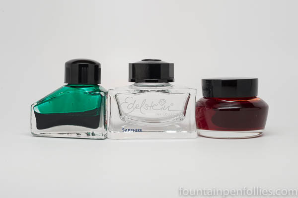
Ink bottles were on my mind last month. Two bottles came into my possession that were extra attractive: a Graf von Faber-Castell and a J. Herbin 1670. At the same time I got three new Sailor inks, reminding me that Sailor bottles could make a saint curse. I needed no reminding that I am not a saint.
I’ve never been one to prioritize the aesthetics of an ink bottle. For me the main point is the ink inside. However, I try to use up my inks, so I do care how useful and practical a bottle is.
So, I’m going to play “date, marry or kill” with a few ink bottles. The first is a bottle everyone hates, except me. The next two are bottles everyone loves, but I am on the fence about. The last is a bottle that I loathe.
Join me, then, as I play ink bottle bachelorette. But it’s just for fun. No ink bottle design seems to stop me from buying the ink. It just lets me perfect my cursing.
(click Page 2 below to continue)
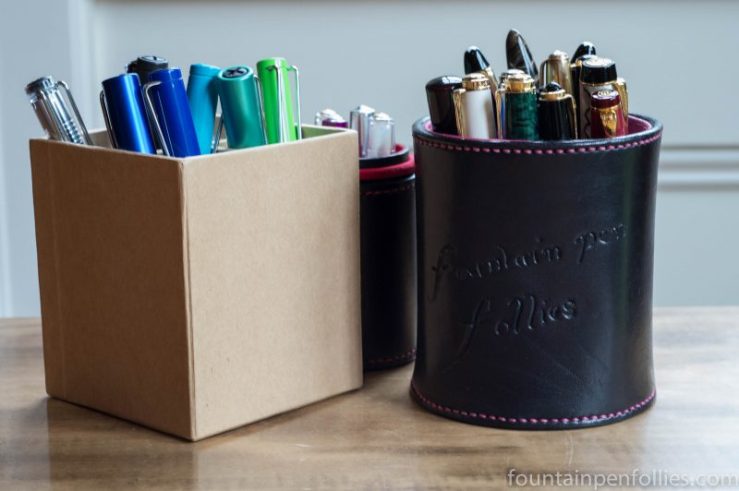
There are good problems to have, of course, and having too many fountain pens inked is probably one of them. I’ve been looking at a lot of new-to-me inks, so I can’t complain if that requires a lot of pens. And in there is one awesome Platinum pen I’m going to be giving away. But I still had the small issue of where to put all those pens.
Last time I confronted this, I went for a temporary solution: I ejected a rollerball from the pen cup, and moved the fountain pens around like puzzle pieces until they all fit. Not ideal, but a workable quick fix. “You go, girl.”
However, one new ink led to another, and another led to a third, and so on. Before you could say “J. Herbin,” I was over-penned once again. This time, there were no more squeezes possible, and nothing to do but add another pen cup to the lineup. And not a pretty one, either. “Le sigh.”
But it’s all in how you look at things, right? So I shall look at my pen cuppage not as excess, but as a small tribute to the Very Large Array, which uses 27 movable radio telescopes to explore the universe.
And I mean, even the number 27 is inspiring. When I think how many pens would fit into 27 pen cups….
“You go, girl!”
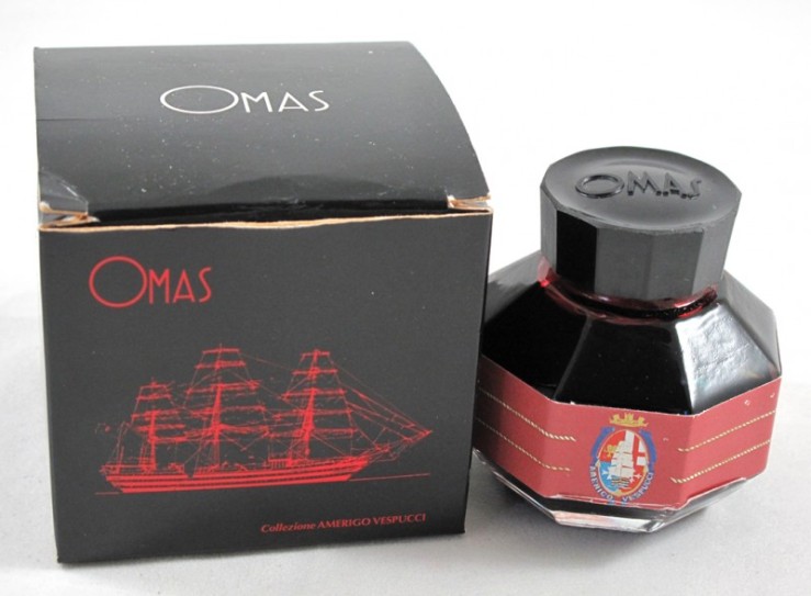
I asked my friend Chris what inks she had purchased in 2015. I was tickled, and relieved, that not only did she buy the same number of inks as I did, but she enjoyed some of the same brands. Here is her report.
I decided I had plenty of ink when 2015 began. Enough ink to last me another two lifetimes. I made a resolution that I wouldn’t buy more ink until I emptied at least one bottle. That resolution was never going to work. I’ve never completely emptied a bottle of ink in forty years, so why would I think I might do that now?
(click Page 2 below to continue)

Sailor Professional Gear Kanreki with fine nib. This is another favorite. The Kanreki was designed to celebrate the 60th birthday of one Sailor’s nib designers. It features three different red colors — cherry red for the pen body, a plummy red for the cap and deep burgundy at the ends.

As a special edition, the Kanreki come with a 21k nib. Mine features Sailor’s precise, ultra-thin fine nib.

Diamine Red Dragon ink works so well in the Kanreki that I almost always pair the two. I like variety, generally. But it’s hard to pass up such a perfect pair.