Mo Ink, No Mo Problems: Penlux Mò Tangerine and Plum

Penlux Mo Plum and Tangerine

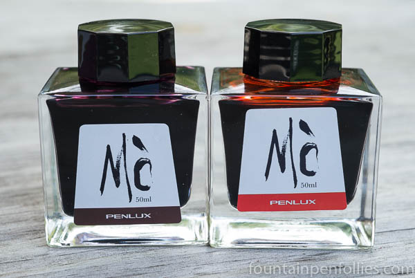
My two Penlux inks arrived, and they are just lovely.

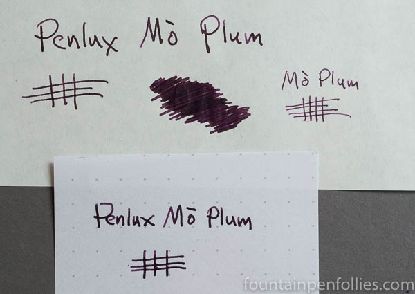
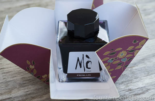
Obviously I’m over-inked, but I have to say, I’ve enjoyed the presentation of these just as much as the ink. The Plum, as I mentioned the other day, is a not-annoying shade of purple that purple fans are bound to really enjoy, since I, a purple foe, don’t mind it at all. The presentation, from folding box, to square Sailor bottle, to attractive label, makes a beautiful object that I’ve kept on my desk just because I like how it looks.

Penlux Mo Plum box

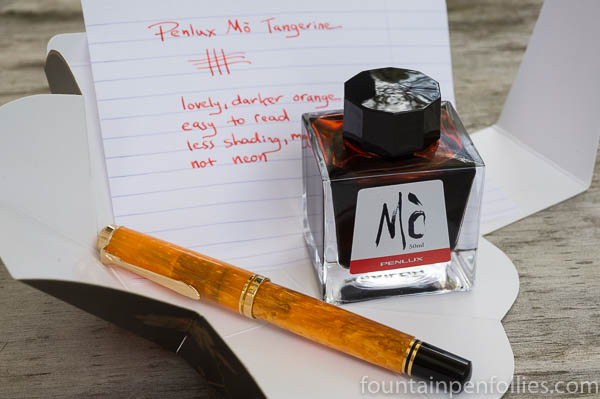
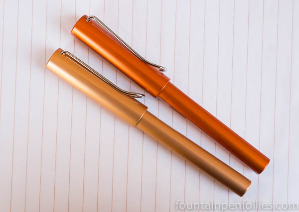
Tangerine is a very nice orange ink, not a color I use very much, but a color I love to see in  demonstrators, and even in the bottle.

Penlux Mo Tangerine

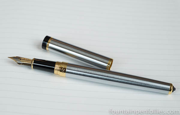
I put Tangerine in my Vibrant Orange Pelikan M600, and can attest that it’s a nice orange ink. This one I’ve actually been using. It’s good to circle the really important part of notes. No nib crud (so far), good flow and no hard starts.

I like a lot of orange inks, especially from Caran d’Ache and Sailor. But among orange inks, this is a very usable one. It’s mixed by Sailor, so I think I see Sailor’s lovely tints of yellow and blush pink in there, but it’s also darker and shades only a little. It’s easy to read and not even a little eye-searing.

Penlux Mo Tangerine writing sample

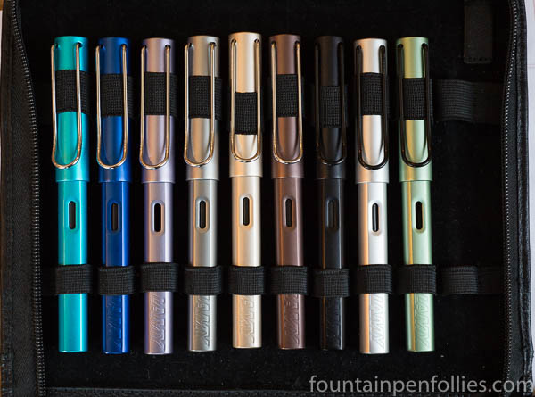
Even though I mostly use blue and black inks, and pens that are “good users,” it’s nice to also have some things that are less utilitarian than visually stimulating. I’ve gained much enjoyment from this lovely package.

Penlux Mo Tangerine

Truth in Advertising: A First Look at the Sailor Professional Gear Fire

Sailor Professional Gear Fire

The new Sailor “Fire” Professional Gear special edition is aptly named: it’s “fire,” in the sense of “excellent.” I think it’s gorgeous.

This is the fourth in a line that began with the Sky (transparent light blue), then continued with the Earth (translucent brown), and the Ocean (translucent blue-green). I’ve liked them all, very much, and I own an Earth. Here are the Fire and the Earth together.

Sailor Professional Gear Fire and Earth

Fire’s color is not standard red, and not orange, but definitely red-orange. I’d call it a mandarin red. It has the same translucence as the Ocean and Earth.

Sailor Professional Gear Fire

Dan Smith the Nibsmith sent me a full-size Professional Gear to review, because that’s my favorite size. The price of the full-size is $312. The pen is also available in slim (small) for $200 and King of Pens (large) for $816.

In real life, the Fire looks much nicer than it did in any Sailor photos I’ve seen online.

So here are some comparison photos. First is the Fire between my Earth and Kanreki Professional Gear pens.

Sailor Professional Gear Earth, Fire and Kanreki

Now here is the Fire Professional Gear between two Lamy Safaris, which are standard, crayon-color examples of red and orange.

Sailor Professional Gear Fire with Lamy Safari red and orange

The big array: from the left, the Pelikan M600 Vibrant Orange, Safari in orange, Sailor Fire, Safari in  red, Sailor Kanreki, Pelikan M600 Ruby Red, Sailor Earth.

Sailor Professional Gear Fire with comparison pens

Great color, great concept, great execution by Sailor.

Sailor Professional Gear Kanreki, Fire and Earth cap medallions

One Minute Ink Review: Penlux Mò Plum

Penlux Mo Plum writing sample

Penlux Mò Plum. I don’t like purple inks, so explain why I ordered this one right after trying it yesterday at my pen club? It’s really attractive. And, because it’s made by Sailor for a store in Taiwan, it’s somewhat limited.

The color of Penlux Mò Plum is a dark plum. With just a hint of shading, it looks good in a fine nib and is dark enough for work. Penlux Mò Plum is like a darker, more saturated, and, I’d wager, slightly bluer, version of the wonderful KWZ Brown-Pink. That probably also helps explain the instant appeal to me.

Pen Review: Sailor 1911 Large Ringless Epinard

Sailor 1911 Large Ringless Epinard

That is the Sailor 1911 Large “ringless” Epinard, a special US edition, that Dan Smith the Nibsmith sent me, and probably wishes he had back now. Unfortunately for both of us, this pen is hard to give up.

It has really grown on me. In fact, now I think I like it best of any Sailor I’ve seen over the past two years, except for the blue Professional Gear I bought in Chicago this year.

The Epinard 1911 Large is one of Sailor’s many fountain pen releases, this one limited to North America. What sets it apart are the color, a very dark army green, and the lack of a cap band. It’s the first full-size Sailor 1911 for the US without the cap band, or “ringless,” to use the official term.

Well. Normally I’d be against that.

The Epinard color is very dark, and hard to put across in photos. Think “dark army green.” Its darkness is accentuated by the black-plated trim rings and clip, and the lack of cap band. And that’s the whole effect.

At first my reaction was, “Okay that’s nice. And?”

But now, after living with it for weeks, my reaction is, “Okay, that’s nice. Damn.”

This pen is a grow-er, not a show-er. It’s anti-bling. Which makes it fairly different, in fountain-pen land. It doesn’t try to impress. It’s sure of itself. It’s quiet. If it were an actor, it would be Sam Elliott.

Sailor 1911 ringless Epinard clip and nib

But there are two things I don’t love about the Epinard 1911, and one is right up there in that photo. The nib is rhodium-plated, not black-plated. You can see the difference between nib and clip.

I kind of wish Sailor had given this a cool, black-plated nib. That seems like a lost opportunity. But maybe there were reasons. And maybe one reason is the cost, since price is already my second quibble.

The Ringless Epinard is $360. That’s higher than others in the 1911 Large line. $312 buys the 1911 Large in US special colors Fresca Blue and Key Lime. Or you could buy a 1911 Large in one of the regular color for $272. So $360 is pricey.

But maybe this costs more to manufacture, or maybe they are making fewer. In any event, the price is the price, and there’s nothing for it.

The thing is, it’s a very cool pen.

Pen Review: Pilot Kakuno

Pilot Kakuno blue

I bought a gray and blue Pilot Kakuno with a fine nib, used, from someone in my pen club who didn’t like its narrow fine nib.

Well, I love the narrow fine nib. It’s my favorite part of the Kakuno. For the rest of the pen, my verdict’s more mixed.

(click Page 2 below to continue)

I Learn a Valuable Lesson About Fountain Pens and Inks, Set to Music.

Apologies for my internet absence. Since we brought the 2019 Chicago Pen Show to a successful and happy conclusion, pens have been scarce for me. And, actually, even before the Pen Show. Almost no pen time. Hence, nothing to write about pens.

Eh, it happens. Life is fine. It’s just been busy. Life is bigger. Much bigger than pens. But it’s made the blog seem like a Colorado ghost town, with the dust blowing between abandoned mining shacks.

Only now, it’s almost fall. Time to clean things out, get cracking. We’re back to school.

So here’s what I was doing with pens during my summer vacation. Like the song at (almost) the very end, this will be long and boring. But there’s music in it.

(click Page 2 below to continue)

New Pen Day: Lamy Al-Star Bronze

Lamy Al-Star Bronze and Copper Orange

I just wanted to share a few shots of the 2019 Lamy Al-Star Bronze in real life. In the photo above, the Bronze is just below the 2015 Copper Orange Al-Star.

I bought my Bronze Al-Star this weekend. Our monthly pen club meetup was Sunday, at a wonderful pen and stationery store in Chicago called Atlas Stationers. Lucky timing, because Atlas’s first shipment of Bronze Al-Stars arrived a few days earlier. So of course I bought one. Also the Bronze ink. When Fate knocks on your door like that, you answer. (As long as Fate is not bearing three pastel Safaris, in which case, I would pretend I was not home.)

When it comes to the Bronze Al-Star, though, I’m a happy customer.

Most of my fellow pen clubbers also seemed to like it, but I do have one friend whose first reaction was dislike, so obviously tastes vary. It’s not an “aged” or “darkened” bronze color, I guess. But for most people I think the Bronze should be pretty noncontroversial and easy to like. The color is more subdued and business-like than we’ve gotten from the last few years of Al-Stars, too. It’s the classic “pen I can take to work” so many people seek. If the Bronze leads to eventual Brass and Copper color Al-Stars, I won’t be entirely surprised, but I also won’t be annoyed.

The Bronze actually reminds me not of an Al-Star but of the metallic colors Lamy picked for the more upscale Lx line. Here’s a photo of the Lx in Rose Gold above the Bronze Al-Star.

Lamy Al-Star Bronze and Lamy Lx Rose Gold

The Bronze fits in beautifully with Lamy’s older and most elegant Al-Stars. Here is the Bronze in the middle of the Coffee Brown and the Pearl, two of my favorite Al-Stars from years past.

Lamy Al-Star Coffee Brown, Bronze and Pearl

Add the Copper Orange, if you must, and you’ve got an autumnal bouquet.

Lamy Al-Star Bronze, Pearl, Coffee Brown and Copper Orange

But it’s almost spring. So here is the Bronze amidst a wider array of Al-Stars. From left are Dark Purple, Raspberry, Vibrant Pink, Ruby Red, Copper Orange, Bronze, Charged Green, Green and Blue Green.

Lamy Al-Star fountain pens collection

Just for fun, here is the rest of my little collection. Pacific, Ocean Blue, Ice Blue, Graphite Gray, Pearl, Coffee Brown, Black, Aluminum and a Green with a black clip.

Lamy Al-Star fountain pens collection

My conclusion? Al-Stars are good. And the Bronze is a worthy addition to the lineup.

I did try Lamy’s accompanying Bronze ink before I bought a bottle, and it looked like a nice color in the tester Lamy that Atlas Stationers had. The ink is a moderately saturated bronze or brown with an orange tint. I look forward to trying it out,.


Pen Review: Dryden Designs Modern Classic

Dryden Designs Modern Classic Silver Metallic

I got a fun email last month — Donna Padua, working for Dryden Designs, a pen company that was new to me, said she’d like to send me one of their fountain pens if I’d agree to write a fair and honest review.

I said sure, if they’d be okay with me doing something different: I’d bring it to my next pen club meetup, and pass it around, and see what everyone else thought, too. My fellow pen clubbers tend to be much more “on it” when it comes to all the newer brands and newer pen models.

A few days later, the Modern Classic in metallic silver arrived on my doorstep, sent by Dryden Designs through Amazon.

I like the Amazon idea. I tend to buy new pens mostly from pen retailers, but Amazon does reach a lot more people in the US, and it has good return policies. With the price of the Modern Classic starting at $25.95, it will qualify for Amazon’s free shipping, too. Basically, Dryden Designs is making it as easy as possible to buy this pen.

But what did I (and my pen club) think of the Modern Classic?

(click Page 2 below to continue)

What I Bought in 2018: Inks

Platinum Blue-Black ink bottle

I like to do an annual accounting every year of the inks I bought. In 2018, it was 18 bottles.

Now, that seems like an awful lot. But, if you take the long view, I improved. Because in 2015 I bought 30 bottles of ink; and in 2016 I bought 20 bottles of ink and three boxes of cartridges.

Now, a strict accounting also would uncover that in 2017 I bought only 10 bottles of ink. But then strict accounting seems to be for unhappy people. Let’s forget that and take the long view. I improved!

(click Page 2 below to continue)