Five Fountain Pen Rules You Can Take to the Bank

5_en_raya

We’ve talked about some fountain pen “rules” that I think we can safely ignore. Here are some that, to the contrary, make a lot of sense to me. Feel free to chime in.

Rule Number 1. “Use a light touch.”

Your pens really will do better if you write with a light hand. The good news is, it’s pretty easy to get in the habit.

Rule Number 2. “It’s safer to try before you buy.”

If not, be prepared to cycle through some pens.

This isn’t something to bemoan, necessarily, but just something to recognize. Some people positively love cycling through pens. Others don’t, but we may live too far from fountain pen dealers to test everything in person. So we may end up with some unexpected disappointments.

It may help to think of buying before trying as my friend does, which is to analogize it to fly fishing. Some fish end up in the creel, and some you will catch and release.

Rule Number 3. “A nibmeister is worth the time and money.”

Very often the only difference between a pen that is just okay and a pen you love is the nib. Very often a good nibmeister can do something about that.

Rule Number 4. “It’s not just the pen, but also the ink and paper.”

This is part diagnosis, part treatment. If a pen isn’t writing as you like, try changing the ink. Pen writing too wet and wide for you? Try a dry ink. Pen balky? Try a wetter ink with good flow. And try a different paper, while you’re at it.

Sometimes a ink and pen are both great, but not together. Or maybe a pen and ink combination is perfect, except on one particular paper dry time is glacial.

You can have a great ink, a great pen and a great paper, but that doesn’t mean they’ll necessarily bring out the best in each other.

Rule Number 5. “Remember to have fun.”

It’s not brain surgery. It’s not even driving. We can just have fun with pens and inks, right? We can wield our empty Sheaffer Snorkels as water guns against teenage daughters or other enemies. We can put blue ink in red pens. We can ignore the clearly worded warning from J. Herbin, and dare to mix two different inks. We can.

————

Photo by Alumnos de la UPC – Fotografía propia, GFDL, Link

Five Fountain Pen Rules You Can Ignore


5_en_raya

Rule Number 1. “Pens are for writing; use them or sell them.”

You can ignore this because it’s silly. Would anyone say that about a collectible nickel? A Civil War cannon?

Rule Number 2. “If you don’t collect pens seriously, you are just accumulating.”

You can ignore this because it’s okay to just accumulate pens.

Rule Number 3. “Such and such pen is a must-have.”

You can ignore this because there’s no pen everyone must have. Everyone is different.

Rule Number 4. “Vintage pens are better.”

You can ignore this because it’s puffery. Some vintage pens are better, some are worse.

Rule Number 5. “Flex nibs are better.”

You can ignore this because it is only true for some people and some situations. Imagine trying to write 10 essays for a final exam, in a blue book, with a flex nib.

————

Photo by Alumnos de la UPC – Fotografía propia, GFDL, Link

Pen of the Day: Edison Custom Herald with KWZ Hunter Green


Edison Custom Herald ebonite with KWZ Hunter Green ink

Edison Custom Herald with medium nib. Here’s an old favorite pen of mine, a custom Herald by Edison in a gorgeous green-brown ebonite, with silver-colored clip and nib.

This custom Herald has a medium 18k nib, set to Edison’s usual juicy flow, which really shows off any ink. Right now I’m using it with a new-to-me ink, KWZ Hunter Green.

Edison Custom Herald ebonite with KWZ Hunter Green ink

Hunter Green is khaki, but it’s fairly saturated, and with a wetter writer like this Edison, Hunter Green can look very dark indeed. Which I like. But the color is, of course, lighter in pens with less ink flow.

Shading is minimal. Here’s a writing sample of Hunter Green.

KWZ Hunter Green ink writing sample

More Sailor Kobe No. 37 Island Blue

Sailor Kobe No. 37 Island Blue writing sample

Here’s a sneak peek at how Sailor Kobe No. 37 Island Blue looks in a broader nib. We’ve already seen it in a Kaweco extra-fine. But I’ve got it in second pen now, a Lamy Safari with 1.1 mm stub nib.

Long story short: it’s a very nice ink, no matter the pen.

Here’s Island Blue from the Safari stub on Tomoe River paper, with the Kaweco extra-fine below.

Sailor Kobe No. 37 Island Blue writing sample

And this is Island Blue on Rhodia paper, with the extra-fine nib first, then the wider stub.

Sailor Kobe No. 37 Island Blue writing sample

It wasn’t until I saw a wider swath of Island Blue that I realized something cool. Even more than the lovely Diamine Blue Velvet, Kobe Island Blue reminds me of the equally lovely, but criminally underappreciated Visconti Blue.

I haven’t blogged about Visconti Blue, despite really liking it. Visconti Blue is a lower-maintenance blue ink that’s more vivacious than older standards like Waterman Serenity Blue, but without the ultra-brightness of some of the newer inks like Blue Velvet.

So here are swabs of Island Blue with the two inks it reminds me of.

Sailor Kobe No. 37 Island Blue swab comparisons

Bear in mind that photos of the swabs alone can deceive. Blue Velvet is brighter than the other two, which you can see in person but not in the photo. And I think I remember that Visconti Blue shades more than Island Blue. Then of course there are important issues of sheen, water resistance, cleanup and the like, which we’ll delve into in the longer, official review.

I actually have comparisons of Island Blue to other inks, too. Because Island Blue is a very nice ink. That also will be in the review. (Because, time.) But just for fun, you can look at this older post, if you like. Or this one. Island Blue is a very nice ink.

Inky Secrets and Confessions

1969-208-190a-abeno

I’ve mentioned before that my friend Chris knows more about ink than anyone I know. I always learn a lot from her, and I enjoyed reading her 2016 list of inks purchased. My list is for 2106 is here. She asked me the other day, guiltily, I think, “Have you ever thrown inks down the drain?” I have no guilt about that. But it gave me the idea for some inky true confessions.

(click Page 2 below to continue)

Pen of the Day: Kaweco AL-Sport Light Blue with Sailor Kobe No. 37 Island Blue

Sailor Kobe Island Blue ink with Kaweco AL-Sport Light Blue
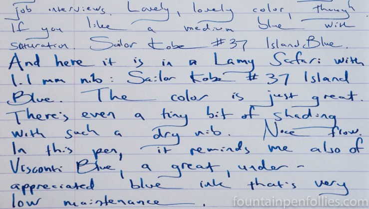
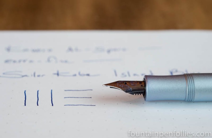
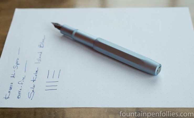
Kaweco AL-Sport Light Blue with extra-fine nib. New year, new ink. I switched things up this week, trying out some new-to-me inks, including Sailor Kobe No. 37 Island Blue.

I already loved this pen, and the ink seems like a winner, too. Kobe Island Blue is quite saturated, so not a great shader, but there’s a bit. The ink seems a great match for the Kaweco extra-fine nib, flowing smoothly and still slightly on the wet side, while maintaining a thin but legible line.

Sailor Kobe Island Blue ink with Kaweco AL-Sport Light Blue

I love the color of Island Blue: it’s a bright and cheery blue, with warmth but no harshness. When I took these photos, the afternoon light was cool and weak. The spark of life Island Blue provides is a nice antidote to a cold winter.

Kobe Island Blue seems similar to the very popular, but expensive, Bung Box First Love Sapphire, also made by Sailor. That means it will also be worth comparing Island Blue to Diamine Blue Velvet. I’ve only used Island Blue for a few days, and only in this pen, but on first impression, I like Island Blue best of all three inks.

One Minute Ink Review: KWZ Iron Gall Blue #4

KWZ Iron Gall Blue #4

KWZ Iron Gall Blue #4. Despite the name, this ink is gray. Not blue-gray, really just gray. It’s got KWZ’s usual nice shading, and usual easy clean-up. I like it best in a wetter writer, to darken the color.

An everyday ink? Well, in that category, I’ve already got Pilot-Iroshizuku Kiri-same. Also Montblanc’s no-longer-available Albert Einstein ink. And I really liked Kaweco’s new Smokey Grey, too, although that’s lighter in color.

Inks Chris Bought in 2016

Ink Bottles

I asked my friend Chris to tell us what inks she bought in 2016. I love her lists, because they always contain such interesting things. On the one hand, we both love Caran d’Ache and Montblanc inks. So, we’re practically twins. But Chris has much broader ink interests than I do. Occasionally I will insert an Editor’s Note in her text, because silence is not my forte. But here’s Chris.)

I think I’ve bought a similar number of bottles to last year, but I’m not counting any inks that I received for free. Like last year, I bought some more inks that I intend to sell, so I haven’t included those either.

I still haven’t kept very good records of inks I have bought, but I’ve gone back through PayPal and credit card purchases to compile a list for the purposes of this post. I buy inks from quite a few sources so my new years resolution for 2017 will be to keep an accurate record. (Editor’s Note: Good idea. I think my resolution will be to “forget” half my 2017 purchases.)

(click Page 2 below to continue)

The Journal Report

lady-writing-a-letter-with-her-maid

“So long as you write what you wish to write, that is all that matters; and whether it matters for ages or only for hours, nobody can say.”

~ Virginia Woolf, A Room of One’s Own

The first week of doing my journal is over, and it went well. I really appreciate all the help and advice that’s poured in, too.

I did a lot of learning about writing a journal. The best and most consistently repeated rule I came across — whether on the blog, by email or in books people told me about — was to “set aside the same time every day to write, and then write every day.”

That seem so true.

Right now, I probably can’t follow the “set aside the same time every day” part, due to a schedule that’s just too hectic and at the whim of everyone else. But that’s okay. Someday I’ll be able to do that. For now, I’ll grab time when I can. But I will try to write every day. And this week, I did write every day.

The other consistently repeated advice I came across was “write in the morning when you are fresh.” I think that’s probably true. But I will definitely not be able to follow that.

I’m just not a morning person. I wake up at the last possible minute. Actually, ten minutes after that. Then I need about 24 ounces of coffee before I’m capable of voice or thought. Conversations in our house in the morning are usually only “ugh,” or “uhh” or “mmm.”

Writing first thing in the morning? You might as well ask me to take the MCATs. Being fresh first thing in the morning?  Mmm, ugh, uhh, not me.

But you know what? One nice thing about getting older is you realize that some things about yourself cannot be changed. I may someday learn to knit. I will never be the kind of person who rises at 5 a.m. to get a jump on the journal.

But that’s okay. I’ve been writing at every time of day except first thing in the morning, and that’s worked out fine.

The best advice I got was from a friend. I’m paraphrasing, but it was that “the journal exists to serve you; you are not there to serve the journal.”

I love that. Not just because that’s the opposite of practically every other relationship in my life. But mostly because what he’s saying is, the journal is just a tool. Like a pen or ink.

To write in my journals doesn’t have to be a task I have to do. It doesn’t have to provide some transcendent experience. The journal isn’t there to reread if I don’t want to. It isn’t there to amaze or enlighten. It isn’t talismanic. It isn’t to make me a better writer, or a more conscious and evolved human being, or to help process my thoughts. It’s just a notebook to write things down in.

It’s a room for words. My room, for my words.