Ink Snippet: Montblanc Racing Green

Montblanc Racing Green writing samples

Montblanc Racing Green. Montblanc Racing Green is nearly unobtainium, unless you’re really spendy or obsessed. Montblanc discontinued Racing Green years ago, and it’s since become quite the thing. Everyone talks about it, everyone seeks it, or at least seeks an ink that looks like it. Every time a new olive-green ink is released, an ink fan somewhere wonders, “Is this like Racing Green?”

I’d never used Montblanc Racing Green before last week. When it was available, it didn’t interest me, and when it stopped being available, the price shot sky high. But I’ve been using it lately, thanks to a sample from a kind friend.

I have good news, and bad news.

The good news (at least for me) is that I don’t really get it, the mania. Yes, the ink is attractive. It’s very nice. But it’s not going to change anyone’s life. It’s not the greatest ink ever made, in my opinion. It’s not even the greatest green I’ve ever seen.

The bad news is that I don’t know another ink that’s a good doppelgänger. Normally I can point out nice inks that are pretty close. Here, however, the closest alternative is, in my opinion, not nearly so appealing.

But it’s okay. Yes, Montblanc Racing Green was a nice ink, and it’s now gone, for all intents and purposes. But don’t think twice, it’s alright.

(click Page 2 below to continue)

Ink Dips: Callifolio Bleu Azur

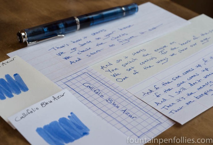
Callifolio Bleu Azur

Ink Dips is a more laid back, but potentially fraught, ink evaluation than is normal here at Fountain Pen Follies. Instead of carefully choosing an ink I am excited to try, with Ink Dips I just blindly pick from a box of samples I had set aside because I expected them to be dull or disagreeable. It’s a dippy idea, in some ways, but it’s been mostly fun.

Callifolio Bleu Azur. This is a nice blue ink, with excellent behavior. Ink Dips kicks off what we hope will be a happy March with Callifolio Bleu Azur, a bright and sprightly true blue.

(click Page 2 below to continue)

Ink Dips: Diamine Blaze Orange

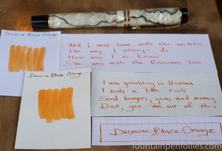
Diamine Blaze Orange

Ink Dips is a more casual, and potentially unsettling, ink evaluation than is normal here at Fountain Pen Follies. Instead of carefully evaluating an ink I’m interested in, the point of Ink Dips is to blindly pick an ink sample from a box of the sadly not loved and not blue. Then I fill that sample into a pen and see what I think. It’s an ink experiment that’s a bit dippy.

Diamine Blaze Orange. This is just a magnificent orange ink, at a great price. It’s hard to think of an orange ink that is easier to recommend. If I may, the ink may be orange, but Ink Dips has struck gold. (Thank you, I’ll be here all week.)

(click Page 2 below to continue)

Red Wednesday

KWZ Thief's Red ink

Better than a Red Wedding, am I right?

I’ve been using a new-to-me red ink recently, because I want to review it. And I don’t mean Montblanc Shakespeare, but a second red ink. Which then prompted me to ink a third red, for comparison. And I have a J. Herbin “Rouge” going as well. So, four reds.

Apparently red is the new blue for me.

I wonder if I could spin that into a t.v. series? Perhaps a lucrative sponsorship opportunity? Or the chance to meet Bono. Any of those appeals. So, you know, call me.

(click Page 2 below to continue)

Questioningly

I’ve been struggling with something about fountain pens lately, which I will call the “mehs.”

Time really flies in the summer, but on top of all the usual fun, I’ve had a succession of things that have combined to bring me up short. On the pen front, my Monviso arrived, which was very nice. On the ink front, I realized I was sick of blue inks, which for me is beyond strange. Then, on the life front, we had some hard things. The hardest was when our beloved 12-year-old Labrador Retriever suddenly became seriously ill with pancreatitis, which meant round the clock nursing by us and a lot of veterinary intervention, since she could not eat and drink, or even stand up, on her own.

I saw a thread on a forum where some people were expressing the thought that “you are what you own.” So sad. Meanwhile I kept seeing nice pens, new and used, popping up for around $400 to $500. Oh and the Montblanc Shakespeare pen came out. I love Shakespeare. That pen is more than $900. It doesn’t actually have anything to do with Shakespeare, of course. It has to do with parting people from more than $900.

Speaking of Shakespeare, he’s always there with an apt phrase. Hamlet opens with a scene where a watchman at the end of his shift says, “For this relief much thanks: ’tis bitter cold / And I am sick at heart.” Here, the weather is hot, and I’m only nonplussed. But as always, Shakespeare’s words resound more convincingly.

I do enjoy pens and inks, and I have since I was a kid. When I like the pens I use, my job is a little more fun and my day a little brighter. But, as a hobby, there are negatives. The fountain pen hobby does revolve around the acquisition, ownership (and sometimes selling) of, stuff. And that can be warping, and that can be hollow.

Not that I think that stuff is bad or buying stuff is bad.  Actually, I think that life is short and we should delight in every part of it that we can. I don’t feel bad about getting to own some nice pens — I feel lucky.

It’s just that there should be a balance in everything. I’m also the person who reads Thoreau’s Walden every year. My mantra (not from Thoreau) is: “Life is not a having and a getting, but a being and a becoming.”

And yet I devote free time, and some discretionary income, to fountain pens and ink, which is essentially about having and getting. So, sometimes when I’m reminded of that, it brings me up short.

Right now, I’m a little sick of it. I have never thought “you are what you own,” and never will. But does it matter if I spend time in environments that foster that?  Do I contribute to that? Seeing pens on the internet every few weeks that cost $400, or $500 or $900, is that a positive? Or is it out of whack? When none of this is important. Do I remember that often enough? What do I do about it?

So I’m wrestling a little. On the bright side, at least our dog is doing well. Her life has actually been saved, which is a staggering thing to contemplate, and a good way to spend your time. Important things, like that, make me think, “just forget pens.”  It was nice to watch Serena Williams win Wimbledon this weekend. The BBC made a great video of Serena reciting (part of) a Maya Angelou poem. I would rather listen to that.

Because it doesn’t matter who comes to mind: Maya Angelou, the Ramones, Stephen Sondheim, Henry David Thoreau, Shakespeare, T.S. Eliot. They all say the same thing. Be and become.

Pen of the Day: Pelikan M205 Transparent Blue (Again)

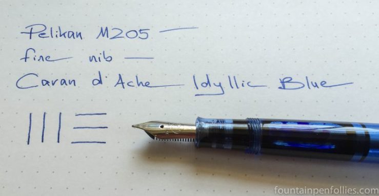
Pelikan M205 blue demonstrator Caran d'Ache Idyllic Blue ink

Pelikan M205 Transparent Blue with fine nib. This was pen of the day fairly recently, but I’m repeating it because it’s got a brand new bag — I mean, ink.  This time I filled it with Caran d’Ache Idyllic Blue, another pure blue. I really like the combination.

Pelikan M205 blue demonstrator Caran d'Ache Idyllic Blue ink writing sample

I get the feeling that Caran d’Ache inks may not sell very well. They are so expensive in the US that I only buy them on sale, or from Europe. But it can’t just be price: other inks that are even more expensive get a lot of internet buzz. And Caran d’Ache inks fly under the radar.

Sample a few if you want to try something new. They are excellent inks. With great bottles.

Caran d'Ache Idyllic Blue ink bottle

So I May Have a Problem (cough)

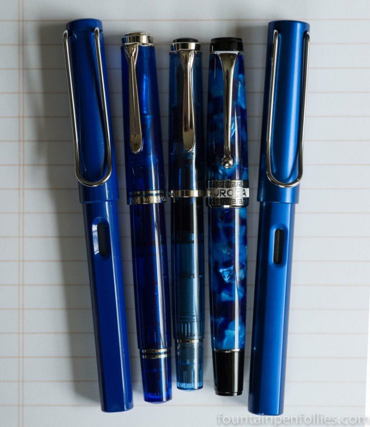
blue fountain pens with chrome trim

Sometimes a new pen purchase triggers … well, not a look in the mirror, exactly, but a furtive peek into the pen case.

Is it possible that I like blue and chrome pens a little too much?

You know, I’m going to go with “no.”  That is unpossible.

Don’t think twice, it’s alright.

Blue fountain pens with chrome trim

Fountain Pen Favorites for April 2016

calendar image

April was indeed the cruellest month around here. The weather was drear, everyone caught and recaught colds, and friends had stuff to deal with. But it’s all over now, baby blue. So we’ll scratch our metaphorical match and start anew.

The good news is that I’ve finally shaken off my post-pen show cold. And the other good news is that, at least in terms of fountain pens and inks, April actually had some nice highlights.

1. Chicago Pen Show. Four full days. Lots of fun. I bought some great things. And I have a lot of pens on the wishlist now. One pen actually made the buy list. I just have to wait for it to be released. Patience is one of the virtues I really need to work on.

2. Venvstas Carbon T. I do like my new pen.

3. Box o’ Stuff.  In the midst of cruel April, a box of pens and ink landed on my doorstop. The only thing I’ve taken out that box, so far, is the Dark Lilac Lamy Safari and ink. But there’s much better inside. I’ll look forward to those.


——————

Photo by Dafne Cholet, Flickr, used under Creative Commons license.

Ink Snippet: Lamy Dark Lilac

Lamy Dark Lilac ink writing sample

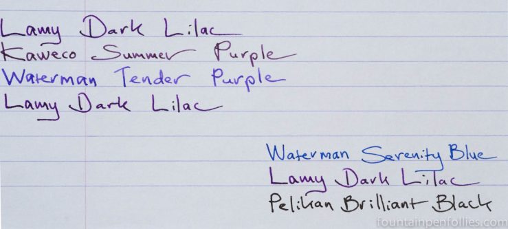
Lamy Dark Lilac. Along with my Dark Lilac Lamy Safari I ordered a box of cartridges of the accompanying ink. In the Safari with medium nib, Dark Lilac ink is a nice dark purple, fairly saturated, and without much shading. It really flows well, too.

Lamy Dark Lilac ink writing sample

Here is Dark Lilac ink compared to two purple inks I own and then to a standard blue ink and black ink for reference.

Lamy Dark Lilac ink writing sample comparisons

Dark Lilac is dark enough that you could possibly get away with it at work. Depending, of course, on how fabulous your work setting is, and on how cool, or near-sighted, your boss is.

It’s a Sign o’ the Times that this purple also makes me think of the recently departed Prince. Would the Purple One himself like this ink? Oh yeah: it totally reminds me of the cover of 1999.

Lamy Dark Lilac ink writing sample

Brownie Points: KWZ Brown-Pink

KWZ Brown-Pink ink writing sample

Yes!  KWZ Brown-Pink is being all brown for me on Tomoe River paper. I am very excited.

Is that unreasonable?  I’ve basically been thinking of it as a purple ink, in disguise. So seeing the browner aspect is really cool.

I think inks may have broken my brain. Or, possibly, the fact that I ate only healthy food all day yesterday. Cold turkey has got me on the run?  But I don’t care. Just give me some truth. I’m loving the brown in Brown-Pink.