

Pelikan M205 Transparent Blue with fine nib. It’s full name seems to be the “Classic M205 Demonstrator Transparent Blue Special Edition” which certainly is a mouthful. But that does say it all. The pen is blue, it’s a demonstrator and it has chrome-plated trim.
Despite some internal struggle, I just had to have it. And it really looks great.
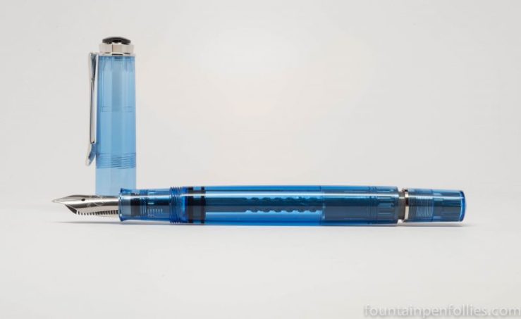
As you can see from that photo above, the piston is black, but the spindle and other fittings are a lighter color — beige or gray. That makes the assembly less obtrusive, but still visible. I like Pelikan’s attention to detail there.
The only things I don’t love about this pen, and I knew both going in, are the Pelikan steel nib and the pen’s light weight. There’s nothing to do about the weight, since I don’t like writing with the pen posted. But as for the nib, because it’s a Pelikan I can swap in other nibs. And maybe I’ll have the steel nib stubbed or something. As we say in Chicago, “I know a guy.”
But, the look of the pen, I just love.


You know, I’m not sure why I don’t like them. They just don’t work for my handwriting, or how I hold the pen, I guess. I’ve had modern M200 nibs in extra-fine, medium and now fine, and I just haven’t enjoyed any of them. Some people love them, though.
Do you have the not–really-a-demonstrator M605 Marine Blue? 🙂
LikeLike
You finally got yours, too. Congratulations.
The M205ers are really light, though for me it’s part of the charm. I prefer my 605ers, but these have a special place in my heart, too. (The black one was my very first FP, the one that hit my collecting bug off)
May I ask, why don’t you like their steel nibs? While I do prefer their gold nibs myself, in terms of smoothness the Pelikan steel nibs are absolutely top. I do like writing with them myself, so naturally I’m curious. 😉
Beautiful pictures!
LikeLike