Pen of the Day: Nakaya Piccolo in Polished Shu with Nick Stewart Randall Ink

Nakaya Piccolo Polished Shu nib with Nick Stewart Randall ink

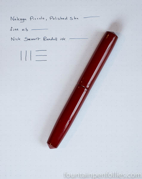
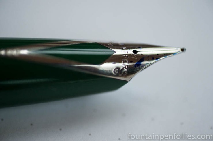
Nakaya Piccolo in Polished Shu with fine nib. We’ve had a rainy and gray fall here, but this little pen has just added a shot of color. It’s a Piccolo in Polished Shu with a fine nib.

I really, really like the Polished Shu finish, and I especially like where you can see the darker underlayer showing through.

Nakaya Piccolo Polished Shu nib

This particular fine nib is very fine and it writes on the dry side, so it’s very precise. I chose to get a smoother writing experience, instead of the thinnest possible line, by matching this nib with an ink sample that’s very wet-writing, and very lubricated, and also new-to-me. It’s called “Randall” from Nick Stewart, and it’s made by Diamine. I got this sample from my friend Jon. Thanks, Jon!

Nakaya Piccolo Polished Shu nib with Nick Stewart Randall ink


Pen of the Day: Pelikan M605 White Transparent with Papier Plume Bayou Nightfall

Pelikan M605 White Transparent with Papier Plume Bayou Nightfall

Pelikan M605 White Transparent with medium nib. My new pen and my almost new ink. A winter white pen with a blueish gray ink.

This M605 has palladium trim and a rhodinized nib. The ink has beautiful shading and a quiet, lovely, almost zen-garden, feeling.

Pelikan M605 White Transparent with Papier Plume Bayou Nightfall

The pen barrel is made of transparent clear plastic with translucent white stripes. The stripes are both a fig leaf and a nod to Pelikan traditional design, but except for the stripes, the ink is fully visible in the transparent barrel.

People will have different feelings about that. I’m a demonstrator fan, and I would rush to buy an M605 clear demonstrator pen, should one ever be produced. But many people don’t like Pelikan demonstrators because ink will get trapped in places usually hidden under the section.

This M605 White Transparent is a nice compromise: you only see the ink in the barrel, which will come clean when you flush the pen.

But you do see the ink in the barrel.

And if you really, really love white, that may bother you. If so, a white converter pen is a better idea.

Pelikan M605 White Transparent with Papier Plume Bayou Nightfall

I don’t love white, so I’m good with it.

But you know what I really do love? Look at that photo, at the part of the barrel that’s filled with ink. You can see an oval that looks golden, in the upper part, near the section. That’s the sun, glinting through a tiny bubble where there’s no ink.

Pen of the Day: Sheaffer PFM Green with Caran d’Ache Idyllic Blue

Sheaffer PFM I fountain pen with Caran d'Ache Idyllic Blue ink

Sheaffer PFM I Green with medium nib. The PFM, once again, because we have gone out of the green and into the blue. At least in terms of ink. With apologies to Neil Young: hey hey, my my; a PFM should never die.

My first stab at a blue ink for the PFM is Caran d’Ache Idyllic Blue, which is a normal standard blue ink. This is what it looks like, more or less.

Caran d'Ache Idyllic Blue writing sample

Idyllic Blue is very close to Waterman Serenity Blue in color and behavior, but smoother feeling, I think, and I like it a tiny bit more. Not that I don’t love Serenity Blue. I probably just wanted a slight change.

No pen changes, though. Boring as that is, I know. I feel so set.

We’ve had a lot of really valuable discussion about the PFM’s inlaid nib. So here it is, in the dark of a late winter afternoon. I like the shape, I like the “R,” I like the “apostrophe S” that connects to the “R.” I certainly like blue ink drops. I like it all.

Sheaffer PFM I fountain pen nib closeup

Pen of the Day: Montblanc Heritage 1912 with Sailor Sakura-Mori

Montblanc Heritage 1912 with Sailor Sakura-Mori

Montblanc Heritage 1912 with broad nib. This is one of my favorite pens, with its updated safety-filler design and its pleasantly bouncy nib. But today I’m really doing a disguised Ink of the Day.

I read that the first cherry blossoms begin blooming in Okinawa right about now, which made me take out the Sailor Sakura-Mori. Warm weather envy can be a beautiful thing.

Montblanc Heritage 1912 with Sailor Sakura-Mori

I really enjoy the gentle pink of Sakura-Mori. A few drops of ink clinging to the nib show the peach tint that makes this ink so interesting.

Montblanc Heritage 1912 nib

Pen of the Day: Edison Custom Herald with KWZ Hunter Green


Edison Custom Herald ebonite with KWZ Hunter Green ink

Edison Custom Herald with medium nib. Here’s an old favorite pen of mine, a custom Herald by Edison in a gorgeous green-brown ebonite, with silver-colored clip and nib.

This custom Herald has a medium 18k nib, set to Edison’s usual juicy flow, which really shows off any ink. Right now I’m using it with a new-to-me ink, KWZ Hunter Green.

Edison Custom Herald ebonite with KWZ Hunter Green ink

Hunter Green is khaki, but it’s fairly saturated, and with a wetter writer like this Edison, Hunter Green can look very dark indeed. Which I like. But the color is, of course, lighter in pens with less ink flow.

Shading is minimal. Here’s a writing sample of Hunter Green.

KWZ Hunter Green ink writing sample

Pen of the Day: Kaweco AL-Sport Light Blue with Sailor Kobe No. 37 Island Blue

Sailor Kobe Island Blue ink with Kaweco AL-Sport Light Blue
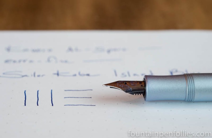
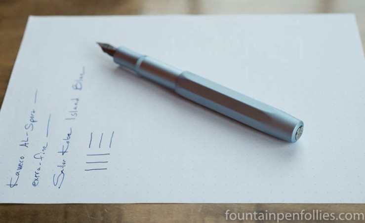
Kaweco AL-Sport Light Blue with extra-fine nib. New year, new ink. I switched things up this week, trying out some new-to-me inks, including Sailor Kobe No. 37 Island Blue.

I already loved this pen, and the ink seems like a winner, too. Kobe Island Blue is quite saturated, so not a great shader, but there’s a bit. The ink seems a great match for the Kaweco extra-fine nib, flowing smoothly and still slightly on the wet side, while maintaining a thin but legible line.

Sailor Kobe Island Blue ink with Kaweco AL-Sport Light Blue

I love the color of Island Blue: it’s a bright and cheery blue, with warmth but no harshness. When I took these photos, the afternoon light was cool and weak. The spark of life Island Blue provides is a nice antidote to a cold winter.

Kobe Island Blue seems similar to the very popular, but expensive, Bung Box First Love Sapphire, also made by Sailor. That means it will also be worth comparing Island Blue to Diamine Blue Velvet. I’ve only used Island Blue for a few days, and only in this pen, but on first impression, I like Island Blue best of all three inks.

Pen of the Day: Pelikan M600 Ruby Red with Graf von Faber-Castell Garnet Red

Pelikan M600 Ruby Red fountain pen and Graf von Faber-Castell Garnet Red ink

Pelikan M600 Ruby Red with fine nib. Winter weather’s here, with days dark and drear. Perhaps a new ink might bring some good cheer.

Outside Fountain Pen Follies world headquarters, cold and snow have arrived. Which of course means it’s time for the long-awaited limerick contest winter ink colors. Time for the jewel tones, the dark and rich hues, the seasonal shades.

My first choice this year is Graf von Faber-Castell Garnet Red. I originally tried Garnet Red, and wrote a brief review, last winter. Garnet Red on white paper makes me think of red berries silhouetted against snowy ground.

Graf von Faber-Castell Garnet Red writing sample

Garnet Red is an attractive, business-appropriate maroon or cranberry.  I always love an ink that shades. And Graf von Faber-Castell has a great ink bottle. As a fellow blogger recently pointed out, a bottle of premium ink would make a great Christmas or Hanukkah gift. Start hinting.

I do like my Pelikan M600 Ruby Red with maroon inks. The pen’s acrylic is a mix of the right kind of dark reds.

Pelikan M600 Ruby Red fountain pen closeup

Pen of the Day: Nemosine Singularity with Sailor Jentle Tokiwa-Matsu

Nemosine Singularity with Sailor Tokiwa-Matsu

Nemosine Singularity with stub nib. It feels like forever since I’ve done a Pen of the Day, so here’s a reasonably-priced pen that’s new-to-me, the Nemosine Singularity.

I bought one with a stub nib, and I’m happy with it so far. The nib has a bit of feedback, which I like, but it’s a smooth writer with nice line variation and moderate to wet ink flow. It’s a medium stub, comparable to a Safari 1.1 mm nib, so good for everyday writing.

The nib itself is very large in size and has attractive stamping.

Nemosine Singularity with Sailor Tokiwa-Matsu

I’ve got my Nemosine Singularity inked with Sailor Jentle Four Seasons Tokiwa-Matsu, a nice evergreen ink with shading and sheen.

The Singularity design is pretty utilitarian, but the pen is a good size. The weight is light, but balanced, and the section is comfortable. The Singularity works for me unposted or posted. It comes with a converter, or you can use standard international cartridges. It also can be used as an eye-dropper. I think it’s a nice deal for under $20.

For a better idea of size, here are a Kaweco Classic Sport, a Lamy Vista, the Nemosine Singularity and a J. Herbin fountain pen.

Nemosine Singularity size comparison

Pelikan M600 Green o’ Green with KWZ Rotten Green

Pelikan M600 Green o' Green with KWZ Rotten Green

Pelikan M600 Green o’ Green with extra-fine nib. This is basically a disguised Ink of Day post about KWZ Rotten Green, an ink that I’ve been enjoying a lot. It’s an attractive dark green, but I mean very dark and with very little shading.

Rotten Green seems excellent for work, because it slides through as an almost-black. But it is green, so between this and KWZ Thief’s Red, it’s like Christmas in July here. I guess a Bad Santa kind of Christmas, what with the rotten thieving going on.

Rotten Green is a very wet ink, so an extra-fine nib is a good match.

KWZ Rotten Green ink writing sample

And here’s the pen, because it is Pen of the Day, after all. I’ve always liked this unusual resin.

Pelikan M600 Green o' Green fountain pen closeup

Pen of the Day: Pelikan 400nn with Diamine Gerbera

Pelikan 400nn with Diamine Gerbera ink

Pelikan 400nn with medium nib. Again? I just had this pen on about a month ago. Sadly, I only have so many pens. At least until my Aurora gets here.

But the 400nn is worth another look: it’s a great pen. I really like its shape.  Here it is with the classic and better-known 400, for comparison.

Pelikan 400nn compared to Pelikan 400

I know I showed a lot of Diamine Gerbera yesterday. But at least it’s not blue. And I wanted to highlight one interesting quality of this ink. The shading goes from a soft yellow-orange, in the dashed lines, to a deeper, redder orange, but despite that it’s still fairly toned down.

I always like it when an ink has more going on than you expect.

Diamine Gerbera writing sample