

Sheaffer PFM I Green with medium nib. The PFM, once again, because we have gone out of the green and into the blue. At least in terms of ink. With apologies to Neil Young: hey hey, my my; a PFM should never die.
My first stab at a blue ink for the PFM is Caran d’Ache Idyllic Blue, which is a normal standard blue ink. This is what it looks like, more or less.

Idyllic Blue is very close to Waterman Serenity Blue in color and behavior, but smoother feeling, I think, and I like it a tiny bit more. Not that I don’t love Serenity Blue. I probably just wanted a slight change.
No pen changes, though. Boring as that is, I know. I feel so set.
We’ve had a lot of really valuable discussion about the PFM’s inlaid nib. So here it is, in the dark of a late winter afternoon. I like the shape, I like the “R,” I like the “apostrophe S” that connects to the “R.” I certainly like blue ink drops. I like it all.
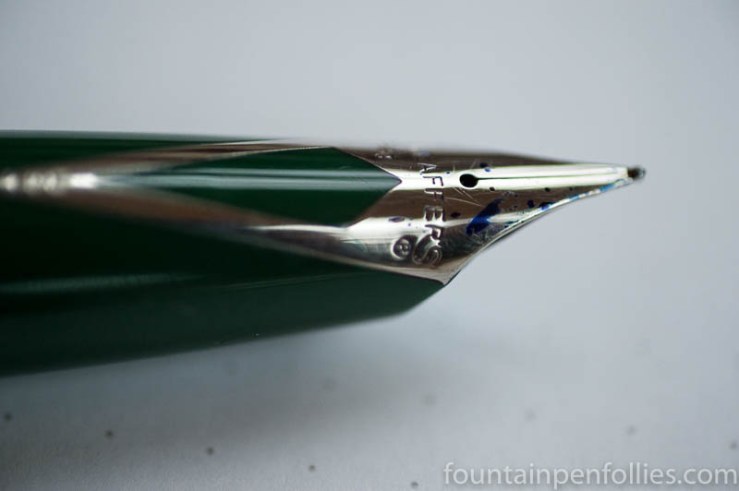

A nod to Neil Young and a picture of that gorgeous, drool-worthy inlaid nib— pinch me I must be dreaming!
LikeLiked by 1 person
Love the pen, as you know. I have only tried one Caran d’Ache ink so far. It was okay, but wasn’t a future buy. I do love their bottles though. I wish some other companies would test new designs. J. Herbin certainly comes to mind!!!
I like your musical references in combination with your reviews. I certainly “get it”. It made me smile.
LikeLiked by 1 person