Ink Dips: Caran d’Ache Ultra Violet

Caran d'Ache Ultra Violet writing samples

Ink Dips is a more casual, laid-back ink evaluation than is normal here at Fountain Pen Follies. Instead of choosing an ink I’m interested in, the point of Ink Dips is to blindly pick an ink sample from a box of the slighted or set-aside. Then I dip a toe in the water by trying that sample in only one pen. It’s an ink experiment that’s a bit dippy.

Caran d’Ache Ultra Violet. This is a very nice purple ink, in an interesting hue, with good behavior in the pen, and good performance on poor paper. It is, however, very expensive, at least in the United States.

(click Page 2 below to continue)

A Peek at the Pen Cup: New Year, New Me Edition

pen cup

You know how some people love New Year’s resolutions? Yeah, not me. But you know how some people love pen-cleaning? Okay, also not me. But, you know how some people are procrastinators, and they will do anything to avoid a disagreeable task? Me!

So over the last few days I’ve avoided cleaning off my desk by cleaning out my two pen cups instead. Instead of the long, hard slog that desk-cleaning would entail, I’ve chosen to redo my roster of inked pens. Fun.

“New Year, New Me.” Or, at least, New Year, new pens and inks. Plus, I’m down to one pen cup now. Wow.

pens in pen cup

I know, all this excellence and accomplishment is probably intimidating. But I did keep some holdover pens. And not even out of laziness, but out of “I still like these.”

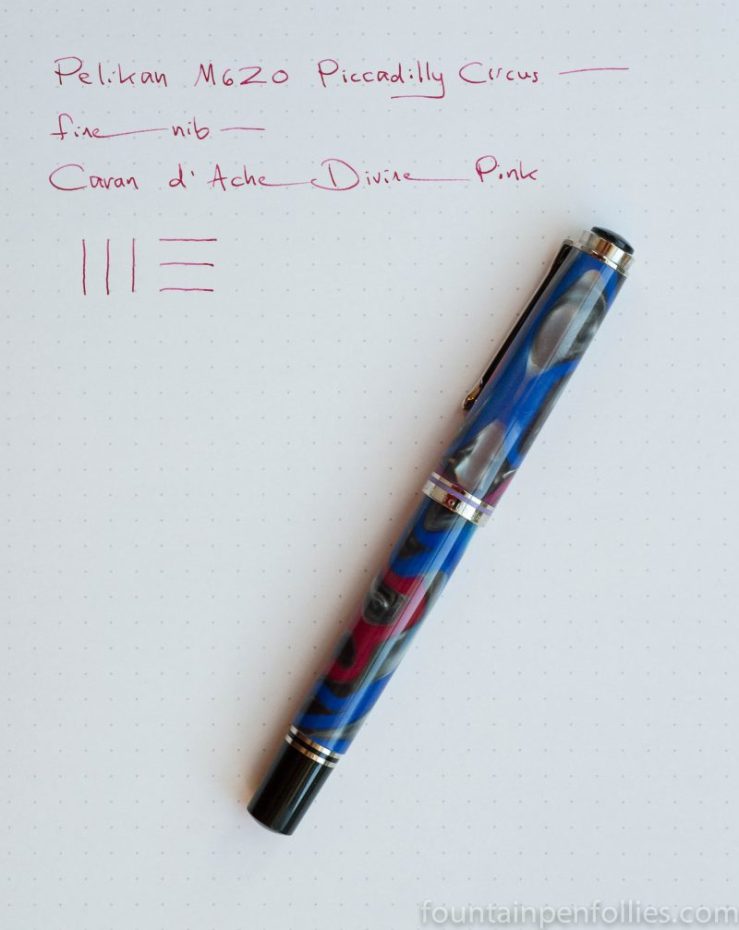
Here’s what has stayed inked: Lamy Safari with Pelikan Brilliant Black (as always); Pelikan M710 Toledo with Papier Plume Pecan; Pelikan M200 with Papier Plume Bayou Nightfall; Pelikan M600 with KWZ Warsaw Dreaming; Parker 75 with Waterman blue; and Parker 75 with Waterman blue black.

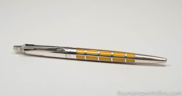
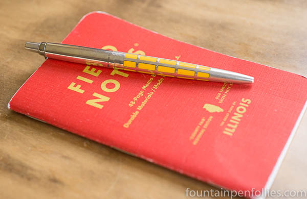
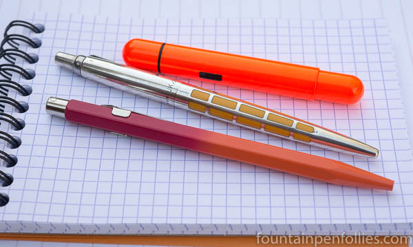
Also in there are two Parker Jotter ballpoints. I like them, and they give me something to hand to those people who look at my desk, look at my pens, and desperately ask, “Is there anything I can use to sign this form?” (Those people are relatives, which is why I cater to their whims. Occasionally they feed me.)

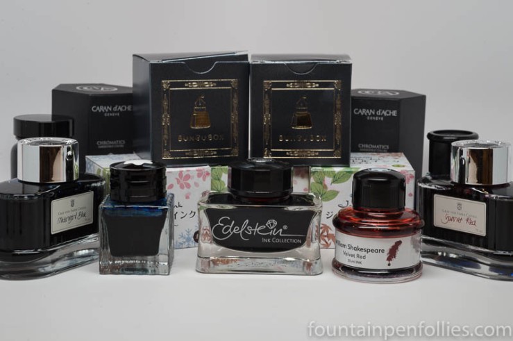
For the new pen, I decide to do another ink from Ink Dips, an occasional series where I randomly pick an ink sample from a bag of leftovers. Fun.

So I stick my hand in a bag of leftover ink samples, close my eyes and pull out … Caran d’Ache Ultra Violet. The first Ink Dip of 2018. Ta da.

Now, here’s the thing: I very much like Caran d’Ache inks, but that one is a purple sort of color. I am an honorable person. But this is the first Ink Dip of 2018, and I don’t think purple is a nice thing to do to people (at least, not to me). Especially early in the year, before I’ve had enough coffee. So I cheat, and pick again.

And this time, I pull out … Callifolio Violet. Also purple.

2018 is trying to kill me, and it’s only Day Two.

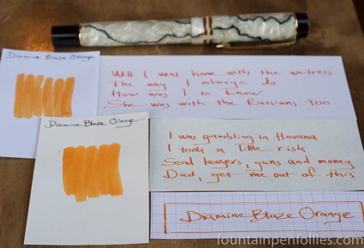
I say a word, which happens to be a swear word, and I pick again. This time it’s Callifolio Inti. That one is golden yellow, not purple, and looks very nice. Though if this were Russian Roulette I’d already be doubly dead. Not fun.

But I am an honorable person, and don’t have many pens inked, so I find three Pelikans, enough for all these inks, even the purples. I tell myself, “I can do this. The Pelikans will pull me through.”

But can I do this? Two purples in a row?

I don’t know that I can. At least, not without resorting to huffing.

So I go back in the ink area and spend another half hour searching through many other ink samples, to find a special ink. The one I have in mind is ink that’s no longer made, that people seem to love, but I’ve never tried. My friend sent me a small sample of this ink, just so I could try it.

And I put it somewhere really safe. “Somewhere safe” means “I have no idea where.” Duh. But, finally I find it. I pick a beautiful Pelikan for this special ink, too.

Pelikan M620 Stockholm and Montblanc Racing Green swabs

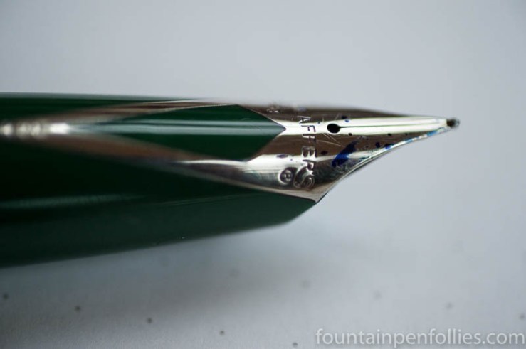
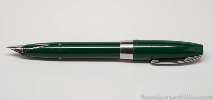
Montblanc Racing Green, finally. In my Pelikan M620 Stockholm.

I’m up to four new pens. Also, I’m not huffing yet. So, a modestly successful New Year, so far.

True Confessions, Ballpoint Edition: Parker Jotter Jubilee Premier Edition Saffron

Parker Jotter Jubilee Premier Edition Saffron Yellow

This is my new ballpoint, which is actually old, and kind of dented and scratched, so it was a bit overlooked, thrown in at the bottom of a box that was part of a large collection of fountain pens.

The pen bears the official name of the “Parker Jotter Jubilee Premier Edition ” in Saffron Yellow. Quite a mouthful of nouns.

These were part of an anniversary edition of Jotters from 2004, as set forth in this excellent article by Len Provisor. Coincidentally, Len was in the room when this particular Jotter came out of the big box of pens. But he didn’t find it. It was Rich who found it, then told me about the edition, and then was nice enough to leave it for me to buy. Thanks, Rich.

Thus, my first Jotter.

Parker Jotter Jubilee Premier Edition Saffron Yellow

Mechanically, it’s just a regular Jotter, in regular Jotter size, made in the UK. The pen body is sterling silver with an inlay of saffron yellow. Mine clearly has been used pretty heavily, and it has some discoloration and dents and such, but that’s perfect for me, because that made it affordable, and I want to use it anyway. It came with a Jotter gel refill, which writes a very smooth line, albeit fairly broad.

I actually bought this pen for my younger daughter, who likes ballpoints and Jotters, but by the time I got home, I decided it was so good we should share it. “Look what I got for you! And we can share it!” was how I put it.

So now, I actually have three nice ballpoints. Although they were all bought at different times, I had them all out today, and something became clear. I had a theme.

Parker Jotter Jubilee Premier Edition Saffron Yellow & Caran d'Ache 849 Tropical & Lamy Pico

Or at least a color scheme.

Those are, from the top, the Lamy Pico in Laser Orange, which I carry in my purse, the Jotter and a Caran d’Ache 849 in Tangerine-Pink Tropical.

That Lamy Pico is an outstanding design, and the best purse pen ever; and in real life it’s even brighter than a photo can convey, so it’s impossible to lose. The Caran d’Ache 849 is a classic, and attractively subdued in color, and so is the Jotter. I’m pretty happy to have them all.

Plus, since they are ballpoints, I can stop right here. Right?

Ink Dips: Diamine Blaze Orange

Diamine Blaze Orange

Ink Dips is a more casual, and potentially unsettling, ink evaluation than is normal here at Fountain Pen Follies. Instead of carefully evaluating an ink I’m interested in, the point of Ink Dips is to blindly pick an ink sample from a box of the sadly not loved and not blue. Then I fill that sample into a pen and see what I think. It’s an ink experiment that’s a bit dippy.

Diamine Blaze Orange. This is just a magnificent orange ink, at a great price. It’s hard to think of an orange ink that is easier to recommend. If I may, the ink may be orange, but Ink Dips has struck gold. (Thank you, I’ll be here all week.)

(click Page 2 below to continue)

Pen of the Day: Sheaffer PFM Green with Caran d’Ache Idyllic Blue

Sheaffer PFM I fountain pen with Caran d'Ache Idyllic Blue ink

Sheaffer PFM I Green with medium nib. The PFM, once again, because we have gone out of the green and into the blue. At least in terms of ink. With apologies to Neil Young: hey hey, my my; a PFM should never die.

My first stab at a blue ink for the PFM is Caran d’Ache Idyllic Blue, which is a normal standard blue ink. This is what it looks like, more or less.

Caran d'Ache Idyllic Blue writing sample

Idyllic Blue is very close to Waterman Serenity Blue in color and behavior, but smoother feeling, I think, and I like it a tiny bit more. Not that I don’t love Serenity Blue. I probably just wanted a slight change.

No pen changes, though. Boring as that is, I know. I feel so set.

We’ve had a lot of really valuable discussion about the PFM’s inlaid nib. So here it is, in the dark of a late winter afternoon. I like the shape, I like the “R,” I like the “apostrophe S” that connects to the “R.” I certainly like blue ink drops. I like it all.

Sheaffer PFM I fountain pen nib closeup

Inks Chris Bought in 2016

Ink Bottles

I asked my friend Chris to tell us what inks she bought in 2016. I love her lists, because they always contain such interesting things. On the one hand, we both love Caran d’Ache and Montblanc inks. So, we’re practically twins. But Chris has much broader ink interests than I do. Occasionally I will insert an Editor’s Note in her text, because silence is not my forte. But here’s Chris.)

I think I’ve bought a similar number of bottles to last year, but I’m not counting any inks that I received for free. Like last year, I bought some more inks that I intend to sell, so I haven’t included those either.

I still haven’t kept very good records of inks I have bought, but I’ve gone back through PayPal and credit card purchases to compile a list for the purposes of this post. I buy inks from quite a few sources so my new years resolution for 2017 will be to keep an accurate record. (Editor’s Note: Good idea. I think my resolution will be to “forget” half my 2017 purchases.)

(click Page 2 below to continue)

Some Ink Greenery

Pantone Greenery Color of the Year 2017

The color experts at Pantone just announced Greenery as their 2017 Color of the Year. I like it a lot. Of course my thoughts immediately turned to ink. In order: “Great color! Caran d’Ache Delicate Green. No, Sailor Waka-Uguisu.”

The paint swatch above reminds me more of Waka-Uguisu. But here’s the fabric swatch.

Pantone Greenery Color of the Year 2017

The fabric has a shimmer which reflects more light, and that lighter hue also calls to mind Caran d’Ache Delicate Green. But probably because I just love that ink. Greenery is much closer to Waka-Uguisu. It’s more yellow.

Waka-Uguisu and Delicate Green are great colors, and I’m totally on board with Greenery in 2017. It does feel very current. Judging by the inks, the color is interesting but easy to live with, eye-catching but calm.

If you want to see the inks that remind me of Greenery, I have a little review of Waka-Uguisu here. I’ve never reviewed Delicate Green (what?!) but it’s currently in my green Sheaffer “Pen for Me,” so there’s a glimpse of it here.

Pilot-Iroshizuku Chiku-rin is a nice ink which might be an option, but for some reason that one never appealed to me as much as Delicate Green and Waka-Uguisu. Diamine Wagner is much too yellow, and Diamine Meadow I think too green. But both Diamines are good inks on their own.

Despite the huge range of green Lamy Al-Stars and Safaris, there is none close to Greenery. (Because Greenery is a nice green.)  I do hope Lamy does not take this as a challenge.

—————

Both Greenery swatches from Pantone Twitter.

Pen of the Day: Sheaffer PFM I in Green with Caran d’Ache Delicate Green

Sheaffer PFM I green

Sheaffer PFM I with medium nib. For my friend Jon, here’s my second PFM I, and first working one. It’s green, because, apparently all my pens now must be green. When I got this one, the nib wasn’t really writing well. It was a little misaligned, a little out of whack.

No worries. Because it’s a Sheaffer inlaid nib — which means, not like other nibs — and because I was going to the Ohio Pen Show, I took it to Ron Zorn. Ron did a little of this and a little of that (I was chatting), and boom, all fixed. He’s the Sheaffer master.

Sheaffer PFM I green

Probably it’s heretical, but I like the PFM I’s stainless-steel colored trim and plastic cap best of all the models. And the green. The PFM green is an unusual color. It’s not a forest green, but more a dark medium green. It usually looks lighter than in that photo.

Believe it or not, I don’t love the color green. And the PFM green isn’t conventionally attractive (to me). In fact it feels dated (to me). Paradoxically, that’s why this is my favorite. The blue, maroon and black PFMs are conventional colors, and more conventionally attractive. But the green is a little odd, and a little retro. It fits the pen.

So basically, I think the green PFM I is the coolest PFM, because it’s the most PFM.

And right now, it’s filled with my favorite green ink, Caran d’Ache Delicate Green. Which is really too pretty for this pen. But, hey, it’s almost the holiday season. It gets to dress up for a bit.

Sheaffer PFM I green with Caran d'Ache Delicate Green


Pen of the Day: Pelikan Piccadilly Circus

Pelikan M620 Piccadilly Circus fountain pen

Pelikan M620 Piccadilly Circus with fine nib. We went to Captain America: Civil War this weekend. I am so Team Captain America, and this was the closest pen I could find. Which okay, strictly speaking, is a total fail. But, imagine if Captain America ever went out and had some fun in the West End. Let’s go with that.

The Piccadilly Circus is my most used Pelikan Cities Pen, and in some ways my favorite. It’s the most fun.

Pelikan M620 Piccadilly Circus fountain pen detail

I inked it up with Caran d’Ache Divine Pink.  Yes, Caran d’Ache Week was last week. But I can almost hear a Donna Summer song playing somewhere, and I’m going to pretend the party is still going on.

Caran d'Ache Divine Pink ink writing sample