Sailor Manyo Inks

Sailor Manyo Ink

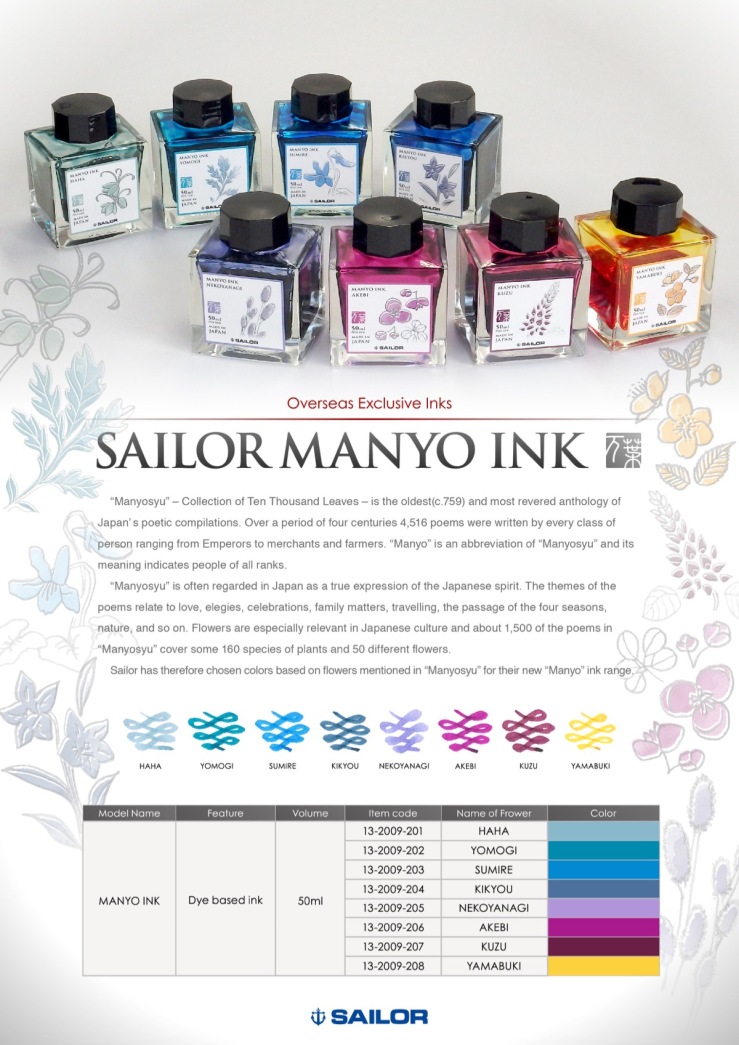
Yo, Manyo. Looks like Sailor is giving us even more new inks. This Manyo collection is coming later in the fall, to pen and ink dealers outside Japan (per my own ink dealer, Dan Smith, the Nibsmith).

The Manyo inks come in Sailor’s new square bottle, the 50 ml size, at the MSRP of $24. Now the Nibsmith is listing them for sale at $19, which in the new world of premium ink prices, isn’t bad. It’s 50 ml. The price is better than my new Penlux inks ($26 for 50 ml, albeit limited) and much better than Sailor Ink Studio inks and Bungubox inks in 20 ml bottles.

And, I hate to say this, but, I kind of … like them all?

Well, of course I would. But they are a nice range, like the Pilot 100th Anniversary inks. They look nice individually and together.

Now, I’m not clinically insane. I’m not going to buy the Yamabuki (Saffron), because I just don’t use yellow-gold inks to write. But it does look nice; I could see artists wanting it. Personally, I can resist the three inks in lavender, magenta and interesting purple/burgundy shades, because as lovely as they look, these aren’t colors I use. But they look good. In fact, the lavender one (Nekoyanagi) is so captivating I almost want it. And the burgundy one (Kuzu) could prove to be a lower-priced alternative to Bungbox Sweet Potato Purple.

But my sweet spot is blue and blue-ish inks, so I’ve preordered the four on the left. I predict the one I like the best will be Haha (Glacier Blue), be still my heart; and the one that will be most popular will be Yomogi (Cerulean Blue), because it’s in the teal range that everyone loves.  Sumire is like Sailor Sky High and Sailor Souten, so it’s bound to be pleasing. Lastly, Kikyou (Mariner Blue) looks perfect to me as a work ink that I’ll use often. I love a blue-black with a greenish tint.

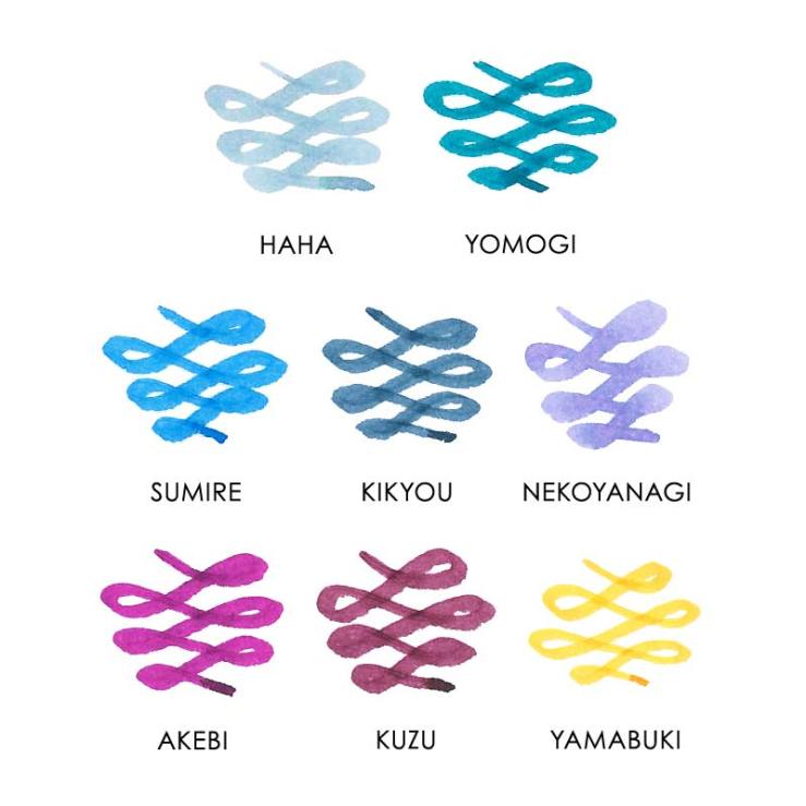
Here is  a closeup of the swatches, just flagrantly stolen from the Nibsmith site.

Sailor Manyo Inks

Sigh. Sailor is just unstoppable. I want them to stop, intellectually. But maybe not deep inside.

Mo Ink, No Mo Problems: Penlux Mò Tangerine and Plum

Penlux Mo Plum and Tangerine

My two Penlux inks arrived, and they are just lovely.

Obviously I’m over-inked, but I have to say, I’ve enjoyed the presentation of these just as much as the ink. The Plum, as I mentioned the other day, is a not-annoying shade of purple that purple fans are bound to really enjoy, since I, a purple foe, don’t mind it at all. The presentation, from folding box, to square Sailor bottle, to attractive label, makes a beautiful object that I’ve kept on my desk just because I like how it looks.

Penlux Mo Plum box

Tangerine is a very nice orange ink, not a color I use very much, but a color I love to see in  demonstrators, and even in the bottle.

Penlux Mo Tangerine

I put Tangerine in my Vibrant Orange Pelikan M600, and can attest that it’s a nice orange ink. This one I’ve actually been using. It’s good to circle the really important part of notes. No nib crud (so far), good flow and no hard starts.

I like a lot of orange inks, especially from Caran d’Ache and Sailor. But among orange inks, this is a very usable one. It’s mixed by Sailor, so I think I see Sailor’s lovely tints of yellow and blush pink in there, but it’s also darker and shades only a little. It’s easy to read and not even a little eye-searing.

Penlux Mo Tangerine writing sample

Even though I mostly use blue and black inks, and pens that are “good users,” it’s nice to also have some things that are less utilitarian than visually stimulating. I’ve gained much enjoyment from this lovely package.

Penlux Mo Tangerine

Truth in Advertising: A First Look at the Sailor Professional Gear Fire

Sailor Professional Gear Fire

The new Sailor “Fire” Professional Gear special edition is aptly named: it’s “fire,” in the sense of “excellent.” I think it’s gorgeous.

This is the fourth in a line that began with the Sky (transparent light blue), then continued with the Earth (translucent brown), and the Ocean (translucent blue-green). I’ve liked them all, very much, and I own an Earth. Here are the Fire and the Earth together.

Sailor Professional Gear Fire and Earth

Fire’s color is not standard red, and not orange, but definitely red-orange. I’d call it a mandarin red. It has the same translucence as the Ocean and Earth.

Sailor Professional Gear Fire

Dan Smith the Nibsmith sent me a full-size Professional Gear to review, because that’s my favorite size. The price of the full-size is $312. The pen is also available in slim (small) for $200 and King of Pens (large) for $816.

In real life, the Fire looks much nicer than it did in any Sailor photos I’ve seen online.

So here are some comparison photos. First is the Fire between my Earth and Kanreki Professional Gear pens.

Sailor Professional Gear Earth, Fire and Kanreki

Now here is the Fire Professional Gear between two Lamy Safaris, which are standard, crayon-color examples of red and orange.

Sailor Professional Gear Fire with Lamy Safari red and orange

The big array: from the left, the Pelikan M600 Vibrant Orange, Safari in orange, Sailor Fire, Safari in  red, Sailor Kanreki, Pelikan M600 Ruby Red, Sailor Earth.

Sailor Professional Gear Fire with comparison pens

Great color, great concept, great execution by Sailor.

Sailor Professional Gear Kanreki, Fire and Earth cap medallions

One Minute Ink Review: Penlux Mò Plum

Penlux Mo Plum writing sample

Penlux Mò Plum. I don’t like purple inks, so explain why I ordered this one right after trying it yesterday at my pen club? It’s really attractive. And, because it’s made by Sailor for a store in Taiwan, it’s somewhat limited.

The color of Penlux Mò Plum is a dark plum. With just a hint of shading, it looks good in a fine nib and is dark enough for work. Penlux Mò Plum is like a darker, more saturated, and, I’d wager, slightly bluer, version of the wonderful KWZ Brown-Pink. That probably also helps explain the instant appeal to me.

Pen Review: Sailor 1911 Large Ringless Epinard

Sailor 1911 Large Ringless Epinard

That is the Sailor 1911 Large “ringless” Epinard, a special US edition, that Dan Smith the Nibsmith sent me, and probably wishes he had back now. Unfortunately for both of us, this pen is hard to give up.

It has really grown on me. In fact, now I think I like it best of any Sailor I’ve seen over the past two years, except for the blue Professional Gear I bought in Chicago this year.

The Epinard 1911 Large is one of Sailor’s many fountain pen releases, this one limited to North America. What sets it apart are the color, a very dark army green, and the lack of a cap band. It’s the first full-size Sailor 1911 for the US without the cap band, or “ringless,” to use the official term.

Well. Normally I’d be against that.

The Epinard color is very dark, and hard to put across in photos. Think “dark army green.” Its darkness is accentuated by the black-plated trim rings and clip, and the lack of cap band. And that’s the whole effect.

At first my reaction was, “Okay that’s nice. And?”

But now, after living with it for weeks, my reaction is, “Okay, that’s nice. Damn.”

This pen is a grow-er, not a show-er. It’s anti-bling. Which makes it fairly different, in fountain-pen land. It doesn’t try to impress. It’s sure of itself. It’s quiet. If it were an actor, it would be Sam Elliott.

Sailor 1911 ringless Epinard clip and nib

But there are two things I don’t love about the Epinard 1911, and one is right up there in that photo. The nib is rhodium-plated, not black-plated. You can see the difference between nib and clip.

I kind of wish Sailor had given this a cool, black-plated nib. That seems like a lost opportunity. But maybe there were reasons. And maybe one reason is the cost, since price is already my second quibble.

The Ringless Epinard is $360. That’s higher than others in the 1911 Large line. $312 buys the 1911 Large in US special colors Fresca Blue and Key Lime. Or you could buy a 1911 Large in one of the regular color for $272. So $360 is pricey.

But maybe this costs more to manufacture, or maybe they are making fewer. In any event, the price is the price, and there’s nothing for it.

The thing is, it’s a very cool pen.

What I Bought in 2018: Inks

Platinum Blue-Black ink bottle

I like to do an annual accounting every year of the inks I bought. In 2018, it was 18 bottles.

Now, that seems like an awful lot. But, if you take the long view, I improved. Because in 2015 I bought 30 bottles of ink; and in 2016 I bought 20 bottles of ink and three boxes of cartridges.

Now, a strict accounting also would uncover that in 2017 I bought only 10 bottles of ink. But then strict accounting seems to be for unhappy people. Let’s forget that and take the long view. I improved!

(click Page 2 below to continue)

How Fine is a Pelikan M600 Extra-Fine Nib?

How fine is the Pelikan M600 extra-fine nib? Not very! At least, not “very fine” in the sense of “narrow.” But “very fine” in the sense of “excellent.”

I happen to have a Pelikan M600 with extra-fine nib inked up at the same time as a Sailor 1911L with medium nib. The two pens have different inks, but here’s a comparison writing sample.

Pelikan extra-fine nib writing comparison

I’m not particularly surprised by this. I often use two modern M600 Pelikans with extra-fine nibs, and I always jokingly call those nibs “alleged extra-fines.”

Partly that’s because I tend to think of nib widths in line with vintage Parkers and Pelikans, and modern Japanese pens — all of which run narrower than modern Pelikan gold nibs. But also because I use a lot of modern Pelikan fine nibs, and I find those pretty darn close to Pelikan extra-fine nibs. In fact, I swear that a few of my Pelikan fines write a narrower line.*

Here’s another writing sample. The Pelikan gold extra-fine uses the dark green of Pelikan Edelstein Olivine, and the Sailor medium is inked with the lighter green of Sailor Waka-Uguisu.

Pelikan extra-fine nib writing comparison

I bring this up now because Pelikan has decided to start charging extra for their extra-fine nibs. They apparently implemented the price increase in Europe earlier this year, and it just reached the US with the M600 Vibrant Orange, which will cost $440 with fine through broad nibs, versus $476 with an extra-fine nib.

I’ve never bought many Pelikan extra-fine nibs. I tend to use vintage fine nibs and modern Japanese fine and extra-fine nibs when I want a finer lines. So my extra-fine nib needs are covered. But I don’t think Pelikan extra-fine gold nibs are bad, just because they may be wider. In fact, I think Pelikan’s gold extra-fine nibs are very good.

To me, what makes Pelikan’s gold extra-fine nibs good, and maybe a little special, is that they are extremely smooth and easy writers. I’ve noticed that people who don’t share my love of very narrow nibs always love my Pelikan extra-fines.

Modern Pelikan gold nibs are beautifully ground to almost float on the page, so you can write very fluidly with them, and they reward a light touch. That’s true for the extra-fine, as well. Sure, it may write wider than many extra-fine nibs, but it also writes wetter and smoother.**

Sailor gold nib also are beautifully ground, but at size medium and below, Sailor nibs feature a characteristic feedback. Instead of floating across the page, a Sailor nib feels more like writing with a pencil — it’s a different kind of smoothness. Or look to the extra-fine nibs of Lamy and Aurora: in those the extra-fine nib tends to have a smaller sweet spot and put less ink down on the paper. All these brands’s extra-fines will generally write finer than Pelikan’s gold extra-fine, but the experience is different.

So I can think of a lot of reasons why many fountain pen users prefer the Pelikan extra-fine.

And even though it’s not particularly narrow, I enjoy using it myself. I’m not sure it’s different enough from the Pelikan gold fine nib for me to buy another, given the price increase, but I’d heartily recommend it to those who don’t already own one, especially those who don’t necessarily seek the narrowest line possible.

Pelikan extra-fine nib writing comparison

————–

*Please note that I’m only talking about modern Pelikan gold nibs here. Modern Pelikan gold nibs differ from (i) the steel nibs found on pens like the M200 line, and (ii) vintage Pelikan nibs.

**There will be sample variations in any nib, so these are generalized statements based on my experience across a range of pens. Some individual extra-fine gold nibs from Pelikan may be narrower or dryer, than normal, or may exhibit other variances.

A Peek at the Pen Cup: Mean, Green, Certainly Not Lean

IMG_1194

Look at that: absolute chaos has descended on Fountain Pen Follies.

And. So. Much. Green.

It’s probably obvious just looking at that: these last two months have been insanely busy in real life, leaving no time for writing with pens. At the same time, I’ve been inundated with pens and ink. I’ve got a bunch of new inks, including some nice samples, and also a few new pens, to try out. Then I wanted to ink up testers for my Pelikan Hub. Then there’s the new Sailor 1911L in Key Lime. Everything has piled up. I’ve got close to 30 pens there, crammed in like commuters on an L train at rush hour.

That Sailor 1911L in Key Lime is the pen I notice most in that crowd. In the first photo, it’s the green pen near the top right corner. What makes that photo unusual is something that you might not notice: there was sun outside. See how nice and gleaming the Sailor looks in the sun?

Here’s an extreme closeup.

Sailor 1911L Key Lime in sun

Pizzazz.

In the sun, the pearlized material of the Key Lime really comes through. On the one I’m using, there are wavy shimmers, for a moire effect.

Here’s another shot, in which you can see the very subtle shimmers on the pen body:

Sailor 1911L Key Lime with comparison pens

Still in the sun, the Key Lime there is between the Pelikan Stockholm and the Lamy Al-Star Charged Green. That’s closer to what the Key Lime usually looks like. But it’s a smidge yellower in real life, which just doesn’t come through in photos.

I want to do a post on the many looks of the Key Lime, because it’s such a cool color, but also so different, and so hard to get a fix on. It’s fascinating.

What you can’t see is that inside all those pens is a lot of green ink. Too much green ink. I feel like I should be decorating for Christmas. Except, of course, it is only October. And in October we celebrate the biggest holiday season of all. The start of NHL hockey.

I’m sure we all feel “too much” at times. Right now, those crammed pen cups are nagging me, like a pile of laundry you haven’t folded for a week. So this Peek at the Pen Cup was the “no mas” edition. I’m going to spend some time cleaning out the pens I can do without, and getting back on track with the others.