Fountain Pen Favorites for September 2019

calendar image

I  used to do this every month, when the blog was new, and I enjoyed it. I have a strong nostalgic streak. And as you get older, well, the memory goes. I’m now firmly in the “What did I walk into this room to get?” stage. So looking back is kind of relaxing.

What were my favorite pen- and ink-related things last month?

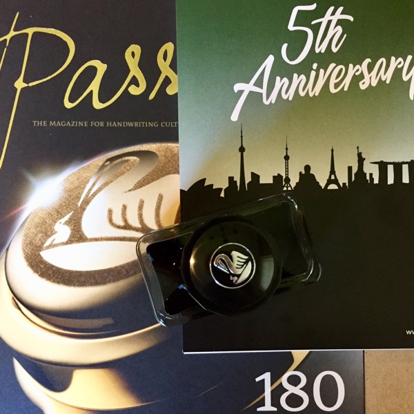
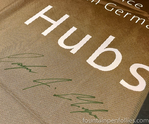
1. The Pelikan Hub. I always enjoy these, and this year’s was no exception. Any chance to get together with pen and ink people is to be cherished. Thanks, Pelikan, for doing this.

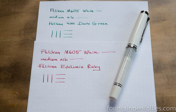
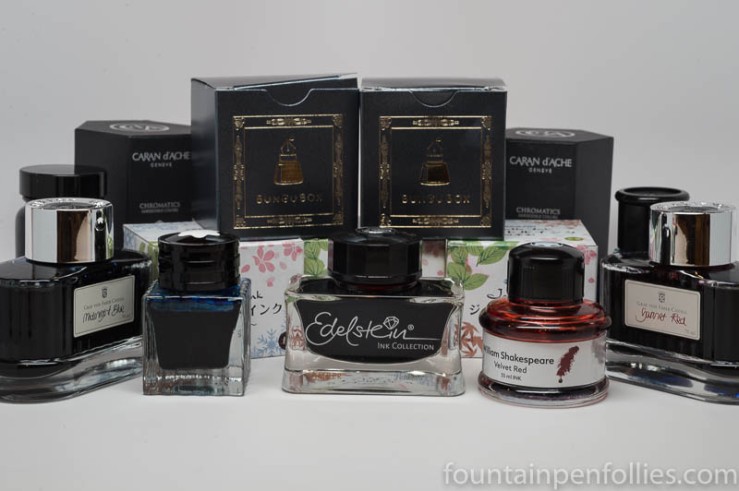
2. Trying Every Edelstein Ink Again. I ink up every Pelikan Edelstein ink for the Hub, for people to try, and I’m both busy and disinclined to clean out 15 pens immediately. So I’ve been writing with a number of inks that I haven’t used in a while. Here are my nominees for the Peaches and Herb “Reunited and It Feels So Good” award: the steady Edelstein Tanzanite (a businesslike blue black), the perfect Edelstein Topaz (simply the finest ink I know in that cyan-cerulean range) and the underrated Edelstein Ruby (a lovely soft red).

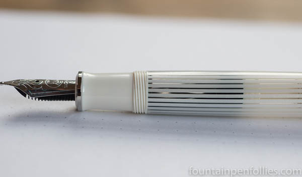
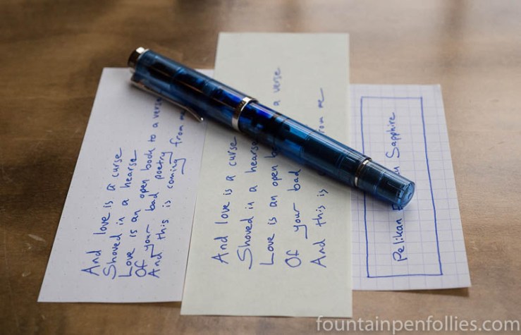
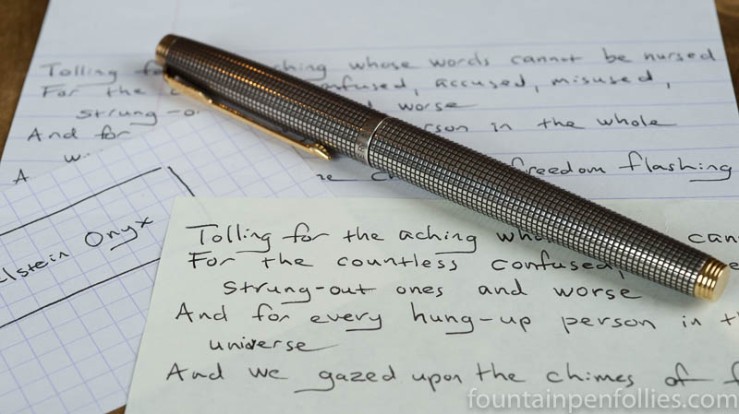
3. Going Old School Blue Black. The pen I’ve used most this month has been my Pelikan Stockholm with Pelikan Edelstein Tanzanite and a medium nib. I don’t usually write with something as paint-brushy as a Pelikan medium nib, so I’m mostly jotting notes with it. LARGE notes. I’ve liked using the old-school, non-fussy, blue-black Tanzanite ink. But the pen is starting to feel kind of fancy, and I’m starting to yearn for something more minimal. Maybe I’ll take the Blauhaus with its extra-fine nib out for a spin after all.

I Learn a Valuable Lesson About Fountain Pens and Inks, Set to Music.

Apologies for my internet absence. Since we brought the 2019 Chicago Pen Show to a successful and happy conclusion, pens have been scarce for me. And, actually, even before the Pen Show. Almost no pen time. Hence, nothing to write about pens.

Eh, it happens. Life is fine. It’s just been busy. Life is bigger. Much bigger than pens. But it’s made the blog seem like a Colorado ghost town, with the dust blowing between abandoned mining shacks.

Only now, it’s almost fall. Time to clean things out, get cracking. We’re back to school.

So here’s what I was doing with pens during my summer vacation. Like the song at (almost) the very end, this will be long and boring. But there’s music in it.

(click Page 2 below to continue)

Pelikan M605 White Transparent: It’s No Candy Cane

Pelikan M605 White Transparent with Pelikan Edelstein Ruby

Here’s the thing about the Pelikan M605 White Transparent: it’s elegant and glamorous. It just is. It’s Lara in Doctor Zhivago; it’s Daenerys Targaryen in her coatdress north of the Wall. It’s Fred Astaire, and Cary Grant. Whatever the circumstances, this pen will remain stylish.

Not even red ink can tart up the White Transparent. Oh, I tried. Up there is the pen filled with Pelikan Edelstein Ruby. It’s no candy cane.

Okay, if you hold the pen up to the light, you can make out the red, but even then, it’s not prominent.

Pelikan M605 White Transparent with Pelikan Edelstein Ruby

That’s the barrel placed against a sunny window and blown up much larger than life. As one does in real life …. Right, never.

Well, I kept trying. Next came a green ink. This is Pelikan Dark Green in the White Transparent.

Pelikan M605 White Transparent with Pelikan 4001 Dark Green

The barrel doesn’t really look much different than with the red ink.

If you really want this pen to look wild and crazy, I’m thinking it will take orange, or maybe turquoise. And even then, maybe not.

I am not going there, in any case. This pen has its own style. Why fight it?

Nonetheless, for posterity, here’s a seasonal ink display. Jingle Bells and Ho Ho Ho and happy holidays to all. Otherwise, doesn’t this seem wrong?

Pelikan M605 White Transparent with Pelikan 4001 Dark Green & Pelikan Edelstein Ruby

I’m running back to the gray and blue inks now.

Pelikan Hubs 2017: Chicago

Pelikan Hubs Chicago banner

Sorry I couldn’t get this up more quickly, but “better late than never” is the motto made for me. So, better late than never, here is my report on the 2017 Pelikan Hub in Chicago, held this past Friday night.

In two words: so fun! For (many) more words, it’s on to the next page.

(click Page 2 below to continue)

One Minute Ink Review: Pelikan Edelstein Smoky Quartz

Pelikan Edelstein Smoky Quartz

Pelikan Edelstein Smoky Quartz. Pelikan’s 2017 Edelstein “Ink of the Year” is Smoky Quartz, an earthy brown that’s dark and legible. It strikes me as a darker version of J. Herbin Lie de Thé.

Like all Pelikan Edelstein inks I’ve used, Smoky Quartz has excellent lubrication and flow. I don’t get much shading, except on Tomoe River paper. The ink color looks different on different papers, which I usually like, but if you’ve ever changed a baby’s diapers, choose your paper wisely here.

Apparently the color was picked by internet voters to be the Ink of the Year. And apparently it’s popular.

Is this an everyday ink? If it’s your kind of color, then yes. Pelikan makes well-behaved and dependable inks, and Smoky Quartz is no exception.

Ink Dips: Pelikan Edelstein Sapphire

Pelikan Edelstein Sapphire writing sample

Ink Dips is a more laid back, but potentially painful, ink evaluation than is normal here at Fountain Pen Follies. Instead of choosing a carefully curated ink, with Ink Dips I just blindly pick from a box of substandard and set-aside samples. You know the story about William Tell shooting an arrow at an apple set on his kid’s head? Ink Dips is an experiment like that, except the fellow holding the bow is drunk and hates you. That’s how it was this week.

Pelikan Edelstein Sapphire. I knew when I started Ink Dips that there would some I didn’t like. But the first three were awesome; in fact, there is one I wish I could buy. The ink I picked for this week was Pelikan Edelstein Sapphire.

(click Page 2 below to continue)

Fountain Pen Favorites for January 2017

calendar image

January is over? How did that happen? Well, swiftly, I guess. In terms of pens and inks, January wasn’t particularly notable for me. But if I dredge, I can dig up some highlights.

1. Ink Dips. I liked the first two, Sailor Something Something and Pelikan Edelstein Onyx. Oh, yes, Sailor Oku-Yama. Details … poof. The mind is the first thing to go. Or maybe vision. Possibly hearing. What was I saying?

2. Yellow Journalism. I wrote in my new journal pretty consistently. Not every day, but almost. So it’s becoming a habit, which is nice. Unfortunately, I have written 96 pages since Christmas, which is going to be financially ruinous; these things are costly. I’m going back to a Rhodia Webnotebook when I fill my Nanami Writer, to see if the type of journal makes a difference or not.

3.  Hmm, a Rant. Yeah, um, well, hard to think of a third highlight, to be honest. I liked the inks I used this month. Pens were pretty calm for me — there is not much happening here in pens. Actually, I dislike something. I am not in favor of the newly announced 2017 Lamy Safari color, which is “Petrol,” which is the German word for “Teal.” I can’t even pretend to care about this Safari. Especially when the 2017 Al-Star is already an aquamarine called Pacific.

It seems I’ve gone off Lamy. After so many years of the neons and the greens and the greenish yellows, now in 2107 we’re getting not one, but two, blue greens. That’s not what I’d call progress.

I’ve lost faith in Lamy, or interest, or both. I don’t know if the string of similar colors is due to lack of imagination, cost-consciousness or trying to profit off an influx of newbie buyers with no apparent discernment (given the prices they’ll pay for counterfeits). But whatever the cause, I don’t care. I’m bored with the result. It seems cheap and cynical, and worst of all dull, by Lamy.

Yes, I am now completely unexcited about Lamy Safaris. And I used to be their biggest fan.

——————

Photo by Dafne Cholet, Flickr, used under Creative Commons license.

Ink Dips: Pelikan Edelstein Onyx

Pelikan Edelstein Onyx and Parker 75 Silver

Ink Dips is a more casual, and potentially evil, ink evaluation than is normal here at Fountain Pen Follies. Instead of carefully evaluating an ink I’m interested in, the point of Ink Dips is instead to blindly pick an ink sample from a box of dullards and discards. Then I ink up that sample in one pen and see what I think. It’s sort of like the feeling you get when you leave for the airport during a snowstorm: you don’t know what’s going to happen, but you’re prepared for it to be painful.

Pelikan Edelstein Onyx. I’m pleased to say that Pelikan Edelstein Onyx turns out to be an awesome performer. It’s a black ink, on the lighter side, and although it is premium-priced, the more I use it, the more I think it’s worth it.

(click Page 2 below to continue)