Date, Marry, Kill: My Least Eligible Ink Bottles

ink bottles

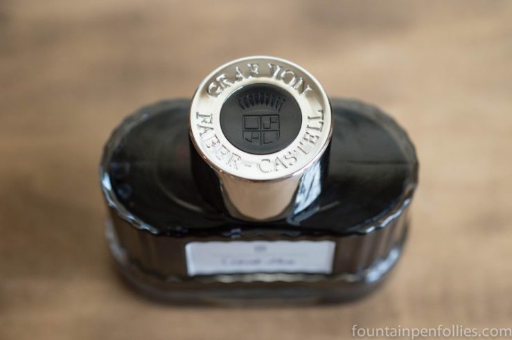
Ink bottles were on my mind last month. Two bottles came into my possession that were extra attractive: a Graf von Faber-Castell and a J. Herbin 1670. At the same time I got three new Sailor inks, reminding me that Sailor bottles could make a saint curse. I needed no reminding that I am not a saint.

I’ve never been one to prioritize the aesthetics of an ink bottle. For me the main point is the ink inside. However, I try to use up my inks, so I do care how useful and practical a bottle is.

So, I’m going to play “date, marry or kill” with a few ink bottles. The first is a bottle everyone hates, except me. The next two are bottles everyone loves, but I am on the fence about. The last is a bottle that I loathe.

Join me, then, as I play ink bottle bachelorette. But it’s just for fun. No ink bottle design seems to stop me from buying the ink. It just lets me perfect my cursing.

(click Page 2 below to continue)

The “Wow” Ink Bottle: Graf von Faber-Castell

Graf von Faber-Castell ink bottle

I think of myself as a person who doesn’t care about ink bottles that much. A great ink bottle is always appreciated, and might tip the scales towards purchase if I like the ink, but an unappealing ink bottle won’t stop me from buying an ink.

But I just got this ink, in a trade: Graf von Faber-Castell Cobalt Blue. And, wow. This is a beautiful ink bottle. This bottle, alone, makes me want to buy more Faber-Castell inks.

I haven’t even tried the Cobalt Blue ink yet.  They had me at the bottle.

Graf von Faber-Castell ink bottle

You can’t really tell from photos how nice it is. The bottle is made of thick glass, and feels nicely heavy, with a stable base. The main part of the bottle is attractively ridged, and there’s a wavy undulation at the bottom. The label is lovely. And I don’t think I’ve seen a nicer cap on an ink bottle.

Graf von Faber-Castell ink bottle

Even the box is nice.

So, apparently I am besotted by an ink bottle.

I’m sure Faber-Castell focused on the bottle design. A great bottle can make an ink brand stand out. But I still expect it to be good ink. I really liked both Graf von Faber-Castell Carbon Black and Garnet Red. I have confidence in the Cobalt Blue.

I just wouldn’t have thought that I would ever be tempted to buy more inks solely because of the bottle. But if I were ever going to do that, it would be this one.

Graf von Faber-Castell ink bottle


Serendipity: Ink and Pen Department

J. Herbin ink bottle nearly empty

I adore J. Herbin inks (well, most of them), but I can admit that the bottles, while lovely, are not always easy to fill from, especially as the ink level declines.

However, there are some pens that are so perfect in every way that they adapt to difficult conditions like I would adapt to winning sixty million dollars.

The Parker 51, ladies and gentlemen.

J. Herbin ink bottle nearly empty