J. Herbin 1670 Caroube de Chypre: Pretty Pictures and Sheen and Shimmer

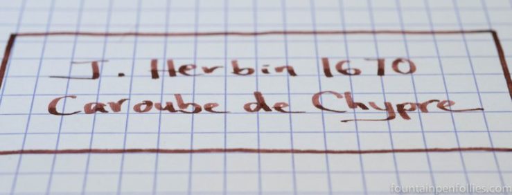
J. Herbin 1670 Caroube de Chypre writing sample

I have been enjoying the heck out of J. Herbin 1670 Caroube de Chypre, while I try to understand it.

I’m working this ink. I’ve found you need to coddle and coax any gold- or silver-infused ink, whether from J. Herbin or Diamine, for maximum shimmer.

Some steps are obvious: shake the bottle thoroughly before you fill a pen. Some are not so obvious: shake the pen before writing. And some steps go against my very nature: only use a wet pen, which means no Lamy Safari. Sob.

However, even with all that, Caroube de Chypre isn’t showing a huge amount of gold in my wet-writing Kaweco Sport. Not even with a 1.5 mm nib.

J. Herbin 1670 Caroube de Chypre writing sample

It’s a gorgeous color, though. And I’m happy with the lower-key shimmer: actually, it makes me think I’d use Caroube de Chypre more. But I still would like to figure out how much shimmer is possible from Caroube de Chypre.

(click Page 2 below to continue)

A Peek at the Pen Cup: This Week the Pen Cup Runneth Over

pen cup

It is pure chaos right now at Fountain Pen Follies. That cup is so full of pens I was sure I couldn’t fit even one more.

But I needed to, because, unable to bear the suspense any longer, I opened the world’s best ink bottle and filled a Pelikan with Graf von Faber-Castell Cobalt Blue.

So imagine one more Pelikan, jammed into the last empty spot, right in front.

pens in pen cup

This pen cup is now filled wall-to-wall.

What’s taking up all the room? There’s a rollerball. Also the Parker 51 and the charcoal Lamy Safari that are my everyday pens. Every other pen in there is for an ink review or other ink post that I’m working on. Except the pen that’s in there for a pen review I’m working on.

A bunch of Pelikans. A bunch of Lamy Safaris and a Vista. An Edison. Two Montblancs. A Platinum. All fantastic. Except, this is so overstuffed. I need to go on a pen diet. Or start cranking out content faster.

Or I suppose I could just move the rollerball….

The “Wow” Ink Bottle: Graf von Faber-Castell

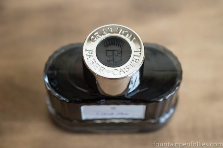
Graf von Faber-Castell ink bottle

I think of myself as a person who doesn’t care about ink bottles that much. A great ink bottle is always appreciated, and might tip the scales towards purchase if I like the ink, but an unappealing ink bottle won’t stop me from buying an ink.

But I just got this ink, in a trade: Graf von Faber-Castell Cobalt Blue. And, wow. This is a beautiful ink bottle. This bottle, alone, makes me want to buy more Faber-Castell inks.

I haven’t even tried the Cobalt Blue ink yet.  They had me at the bottle.

Graf von Faber-Castell ink bottle

You can’t really tell from photos how nice it is. The bottle is made of thick glass, and feels nicely heavy, with a stable base. The main part of the bottle is attractively ridged, and there’s a wavy undulation at the bottom. The label is lovely. And I don’t think I’ve seen a nicer cap on an ink bottle.

Graf von Faber-Castell ink bottle

Even the box is nice.

So, apparently I am besotted by an ink bottle.

I’m sure Faber-Castell focused on the bottle design. A great bottle can make an ink brand stand out. But I still expect it to be good ink. I really liked both Graf von Faber-Castell Carbon Black and Garnet Red. I have confidence in the Cobalt Blue.

I just wouldn’t have thought that I would ever be tempted to buy more inks solely because of the bottle. But if I were ever going to do that, it would be this one.

Graf von Faber-Castell ink bottle


A Rose by Any Other Name: Comparing Montblanc Shakespeare Ink to Diamine Carnival

Diamine Carnival and Montblanc Shakespeare ink writing sample comparison

“What’s in a name? that which we call a rose / By any other name would smell as sweet”

-Romeo and Juliet

Blog readers, you know my love for William Shakespeare, the playwright and the ink. And while Montblanc Shakespeare is new, I think it’s already popular. It’s hard to find online. But do you know what ink is quite easy to find? Diamine Carnival.

And Diamine Carnival looks close enough to Montblanc Shakespeare that I wonder if Diamine Carnival might make a decent substitute.

(click Page 2 below to continue)

Fountain Pen Favorites for July 2016

calendar image

This July was not my favorite month ever, in either fountain pens or real life. In fact, if this July were a movie, it would get one star from me. But even the worst movies have highlights (or else how could anyone make a trailer?). So let’s focus on the positives and put together a trailer for July 2016.

1. Montblanc Shakespeare Ink. The leading man. I love this ink. Of course I was primed to love it: a red ink, from Montblanc, named after Shakespeare. Hearing that this ink existed was, for me, like hearing Matt Damon was making a new Jason Bourne movie. I’m in. And Montblanc Shakespeare ink did not disappoint.

2. KWZ Thief’s Red Ink. I love this one, too. Partially because of its great red color, and partially because of its name. And sure: partially because it’s not blue. But because our movie has some thought-provoking moments, too, I’ll mention that KWZ Thief’s Red also reminded me not to overlook inks that don’t happen to have a great name.

3. Two Empty Ink Bottles. Emptied, really. There was so little ink left in Pelikan Edelstein Topaz or in J. Herbin Bleu Nuit that I’ve transferred what little remains to sample vials. I’ll miss having these two inks around. But a blue ink I like has the approximate life expectancy of anyone in the Jason Bourne movie series not named Jason Bourne.