Ink Review: Bung Box Dandyism

Bung Box Dandyism writing samples

Bung Box Dandyism. This is a very dark green ink, made by Sailor for Bung Box in Japan. It’s an appealing color that in some ways combines the best of Sailor greens. And it perfectly hits the recent craze for very saturated and wet inks. Unfortunately, it’s an expensive ink here in the US, or I think it would be more popular.

(click Page 2 below to continue)

Some Ink Greenery

Pantone Greenery Color of the Year 2017

The color experts at Pantone just announced Greenery as their 2017 Color of the Year. I like it a lot. Of course my thoughts immediately turned to ink. In order: “Great color! Caran d’Ache Delicate Green. No, Sailor Waka-Uguisu.”

The paint swatch above reminds me more of Waka-Uguisu. But here’s the fabric swatch.

Pantone Greenery Color of the Year 2017

The fabric has a shimmer which reflects more light, and that lighter hue also calls to mind Caran d’Ache Delicate Green. But probably because I just love that ink. Greenery is much closer to Waka-Uguisu. It’s more yellow.

Waka-Uguisu and Delicate Green are great colors, and I’m totally on board with Greenery in 2017. It does feel very current. Judging by the inks, the color is interesting but easy to live with, eye-catching but calm.

If you want to see the inks that remind me of Greenery, I have a little review of Waka-Uguisu here. I’ve never reviewed Delicate Green (what?!) but it’s currently in my green Sheaffer “Pen for Me,” so there’s a glimpse of it here.

Pilot-Iroshizuku Chiku-rin is a nice ink which might be an option, but for some reason that one never appealed to me as much as Delicate Green and Waka-Uguisu. Diamine Wagner is much too yellow, and Diamine Meadow I think too green. But both Diamines are good inks on their own.

Despite the huge range of green Lamy Al-Stars and Safaris, there is none close to Greenery. (Because Greenery is a nice green.)  I do hope Lamy does not take this as a challenge.

—————

Both Greenery swatches from Pantone Twitter.

Doubling Down: Pelikan’s Double-Broad Highlighter Nib Isn’t Just for Highlighting

Pelikan M205 with double broad BB nib

That is the Pelikan double broad nib I bought at the Ohio Show this weekend from Dan Smith, the Nibsmith. I put it on my M205 Blue demonstrator.

I don’t know if the size of that tipping material can be adequately appreciated, but there’s a lot. I call the nib The Blob. In a good way.

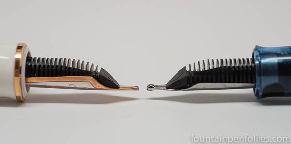
Here is a comparison of an M600 BB nib on the left with the M205 BB nib on the right.

Pelikan M600 BB versus M205 BB highlighter

And the other side, again with the M600 BB nib on the left and the M205 BB nib on the right.

Pelikan M600 BB versus M205 BB highlighter

I’m guessing that Pelikan wanted to make the M205 BB more round for highlighting. That said, I first tried a Pelikan M205 Highlighter fountain pen at the Chicago Pelikan Hub, and that nib was more stubbish than mine.

Having seen the nib, you won’t be surprised that it writes a gigantic line. It’s almost marker-like, and very smooth. It’s kind of fun writing with such a wet and wide nib. Also good for making your points forcefully. Or writing with yellow ink.

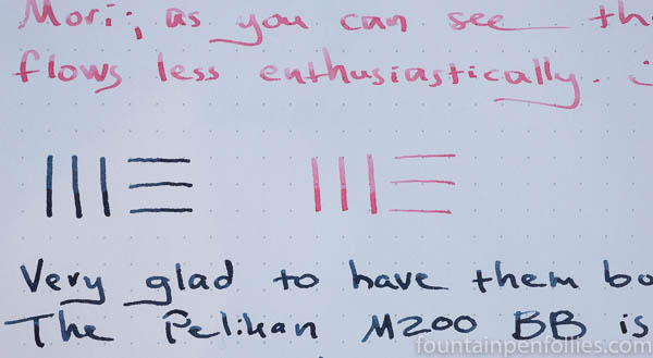
Here is a writing sample with the M205 double broad writing in blue and the M600 in pink.

writing sample Pelikan M600 BB versus M205 BB highlighter

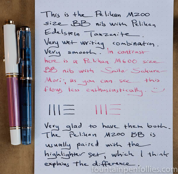
The M205 has Pelikan Edelstein Tanzanite ink, which is a wetter ink than the Sailor Sakura-Mori in the M600. But the M205 double broad is just bigger, and it writes wider.

writing sample Pelikan M600 BB versus M205 BB highlighter

I’m a person who loves a good fine nib, but I think most fountain pen people prefer broader nibs, and this makes an intriguing choice. Because you can buy this one separately. And it will fit into any Pelikan from M200 through M700.

In the US it’s $60. Which means every else in the world it’s probably only $20 or less. (A little black humor, for those of us in Chartpak territory.)

I decided to buy the nib only. You could instead buy it on the highlighter pen. Or if you’re buying a different new M205, ask for the BB nib instead of the usual choices. I’d probably do that, if I ever bought another M200-sized pen, and I’d have the BB modified into a stub or architect’s nib. Because The Blob has tipping material to spare.

Fountain Pen Favorites for October 2016

calendar image

October has been awesome, but also has passed a blurry haze. Fountain pens and inks are all very nice. But baseball playoffs have been the bomb. So it’s a little surprising to look back and realize that October was full of fountain pen highlights. This is practically the World Series of Fountain Pen Favorites.

1.  Sailor Kin-Mokusei. A gorgeous orange.

2. Sailor Waka-Uguisu. A great yellow-green. And I don’t even like green.

3. Kaweco Light Blue AL-Sport. Icy blue; I love it.

4. Field Notes. My Field Notes box runneth over. Literally. My daughters did steal ask for some of my new orange and pink ones, which I shared with unworthy mixed feelings understandable mixed feelings. But I’m still flush with Field Notes. I better go write some things down. Like, how to be a better mother. You know, for next month.

——————

Photo by Dafne Cholet, Flickr, used under Creative Commons license.

In Medias Res: New Sailor Inks, Plus the Peche to Sakura-Mori Comparison

Sailor inks

It does look like an Easter basket just threw up on me, doesn’t it?

But thankfully not. It’s just that I just got three more of the new Sailor Four Seasons inks. Up there are Sailor Waka-Uguisu, Sakura-Mori and Yuki-Akari.

Candidly, I am not a pastel person. But I have been happily surprised by these three inks. In fact the final ink of the trio, the one I only grudgingly added to the shopping cart,  because I absolutely loathed the color of the online swabs, turns out to be my favorite of all. Go figure.

But first things first. Here is a comparison of Sakura-Mori, the new Sailor pink, with the old Sailor pink, Peche.

Sailor Sakura-Mori and Sailor Jentle Peche comparisons

That’s perhaps sad news for Peche devotees. Sakura-Mori is a warmer color, and isn’t really very much like Peche.

But Sakura-Mori is lovely, nonetheless, if you like pale pink inks. It’s a delicate pink with a blush of orange, I believe. Now, a light pink ink is not be the most versatile, useful color, for sure, but I have a soft spot for the barely legible ink category, so I like this one.

Pen of the Day: Nemosine Singularity with Sailor Jentle Tokiwa-Matsu

Nemosine Singularity with Sailor Tokiwa-Matsu

Nemosine Singularity with stub nib. It feels like forever since I’ve done a Pen of the Day, so here’s a reasonably-priced pen that’s new-to-me, the Nemosine Singularity.

I bought one with a stub nib, and I’m happy with it so far. The nib has a bit of feedback, which I like, but it’s a smooth writer with nice line variation and moderate to wet ink flow. It’s a medium stub, comparable to a Safari 1.1 mm nib, so good for everyday writing.

The nib itself is very large in size and has attractive stamping.

Nemosine Singularity with Sailor Tokiwa-Matsu

I’ve got my Nemosine Singularity inked with Sailor Jentle Four Seasons Tokiwa-Matsu, a nice evergreen ink with shading and sheen.

The Singularity design is pretty utilitarian, but the pen is a good size. The weight is light, but balanced, and the section is comfortable. The Singularity works for me unposted or posted. It comes with a converter, or you can use standard international cartridges. It also can be used as an eye-dropper. I think it’s a nice deal for under $20.

For a better idea of size, here are a Kaweco Classic Sport, a Lamy Vista, the Nemosine Singularity and a J. Herbin fountain pen.

Nemosine Singularity size comparison