
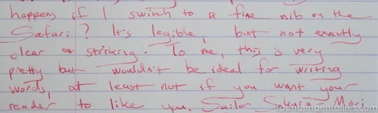
I had Sakura-Mori in two pens, a Pelikan M600 with double-broad nib, and a Lamy Safari. The Safari is a dry-writing pen, and I tried Sakura-Mori with both a 1.1 mm stub and a fine nib.
I can read words written with Sakura-Mori when I use the Safari with fine nib, but I think Sakura-Mori is so much nicer in wider nibs that I’ll choose those instead.
Here is Sakura-Mori in the Safari with fine nib on Rhodia paper.
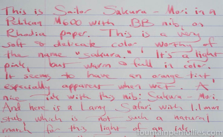
In contrast, this is Sakura-Mori from the Pelikan double-broad and then the Safari with 1.1 mm stub, also on Rhodia.
Sakura-Mori looks especially nice on cream-colored Tomoe River paper. Here’s a closeup, with the Pelikan double-broad nib.
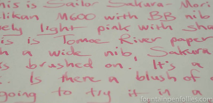
And here is a larger writing sample, showing Sakura-Mori with all three nibs: first the double-broad, then the Safari 1.1 mm, then the Safari fine.
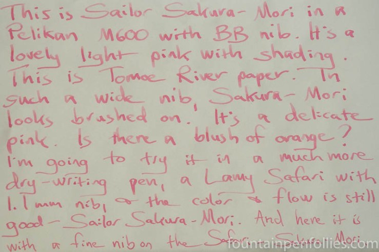
Sakura-Mori is a nice light pink: delicate in color but with a warm blush of peach or orange. You especially notice the orange tint more when the ink is wet, but you can see remnants in the shading. And the shading is divine. I don’t get much sheen.
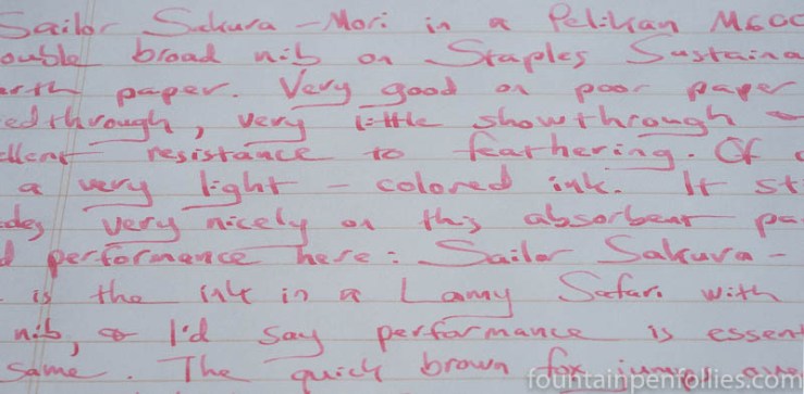
This ink behaves beautifully on lower-quality paper. Using the fine nib Safari, Sakura-Mori was at its most legible on my everyday paper, Staples Sustainable Earth. But I still see lovely color and shading.
Sakura-Mori also had excellent resistance to feathering, even with the Pelikan double-broad. I got no bleedthrough and hardly any showthrough. I could definitely write on both sides of the Staples Sustainable Earth paper.
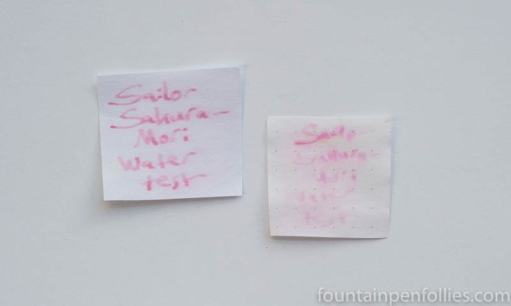
As one would expect with a light-colored ink, it’s very easy to clean Sakura-Mori from a pen. But Sakura-Mori is not an ink to use when on lifeguard duty: there was a little water resistance on absorbent regular paper, but not much on fountain-pen friendly paper.
I enjoy pink inks, and here is a slate of lighter pinks to compare with Sakura-Mori.
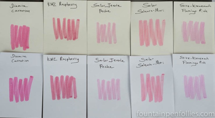
Among my light pinks, Sakura-Mori stands alone. But a brief note on the discontinued Sailor Jentle Peche. We already know that Sakura-Mori is different than Peche. But so is Seitz-Kreuznach Flamingo Pink: any possible similarity between Flamingo Pink and Peche is more in value than in hue. I’ve got a brief look at Flamingo Pink here — it’s really more of a light magenta.
Here is paper towel chromatography of Sailor Sakura-Mori.
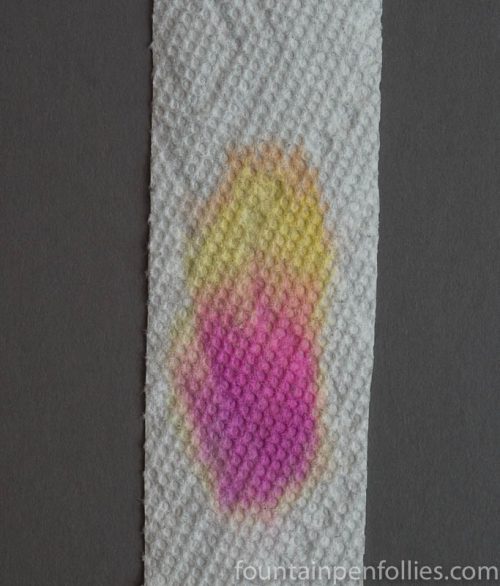
I find that pretty interesting, actually. There’s a brighter pink dye than I had expected, mixed with not only peach but also yellow. So indeed there is a peach or orange tint in Sakura-Mori.
That chroma reminds me of some other Sailor Four Seasons inks. Here is paper towel chromatography of, from left to right, Sailor Irori, then Sakura-Mori, then Sailor Kin-Mokusei.
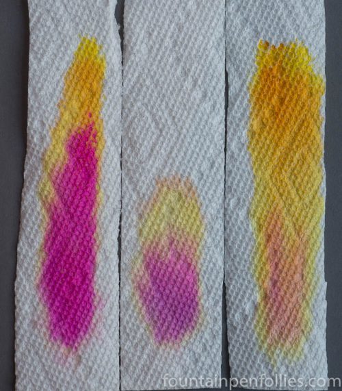
I like that Sakura-Mori is sort of right there, between Irori and Kin-Mokusei.
Sailor Sakura-Mori is my new favorite light-pink ink. I know it’s light enough that it won’t please everyone, but I find it very absolutely beautiful.

I’m still on the fence with this one, although I bought Waka uguisu based on your review. 🙂
LikeLiked by 1 person