Blast from the Past: Parker Penman Sapphire

Parker Penman Sapphire ink

A very nice friend found a partially full bottle of Parker Penman Sapphire for me, and it arrived on Friday.

I don’t chase vintage inks, so this will be my first and last bottle of this one, but it’s great to have more to use.  PPS is a great blue color, very deep, with nice shading. This ink is saturated, is not easy to clean, and it has red sheen out the wazoo. I like less saturated inks; I like easy-to-clean inks; and I’m neutral on sheen. And I still adore PPS. It is special.

I put it in a Kaweco AL-Sport with extra-fine nib this time.

Parker Penman Sapphire writing sample


More Inexpensive Fountain Pen-Friendly Paper: Wheat Straw Printer Paper

Step Forward Wheat Straw paper

Okay, I am not someone who delves deeply into the paper end of the fountain pen hobby, admittedly, but I was surprised by this one. Wheat straw paper?

Yes: wheat straw has been turned into paper.  Initially, this was puzzling. But my dad used to eat shredded wheat cereal for breakfast. That stuff definitely tasted like paper.

Thus, wheat straw paper. It works nicely with fountain pen inks, appears to be better for the environment than regular paper, and it’s inexpensive. So I’m going to give this a try.

(click Page 2 below to continue)

Our J. Herbin Caroube de Chypre Winner

J. Herbin 1670 Caroube de Chypre ink bottle

September 10, 2016 update:  Nicola did not claim the ink, so Caroube de Chypre is on its way to the second-place finisher Raffaello Palandri.

We have a winner for the giveaway for J. Herbin 1670 Caroube de Chypre, thanks to the Random.org, and that is Nicola. Congratulations to Nicola, and thanks to everyone who entered. This ink comes from Pen Chalet. We’re giving away a Platinum pen next, so watch the blog for that, too, in the coming days.

Nicola, please use the Contact menu at the top of the page to send me your full name and mailing address.

Here’s Some Good News: Enter to Win This Bottle of J. Herbin 1670 Caroube de Chypre

J. Herbin 1670 Caroube de Chypre ink bottle

You know what’s really nice? J. Herbin Caroube de Chypre. You know what else is really nice? Pen Chalet. Since Pen Chalet gave me that bottle to review, I’d like to pay it forward to a blog reader.

If you aren’t sure about inks with gold particles, Caroube de Chypre would be a nice one to try, because it’s fairly mellow. And if you already like inks with gold particles, Caroube de Chypre is a nice one to add because it gives a different look. Caroube de Chypre and Emerald of Chivor are my favorites of the 1670 inks, but they are very different.

I ended up liking Caroube de Chypre so much that I expect to put a bottle in my own Pen Chalet shopping cart before the year is up. And that makes me happy, because it’s nice to share something you like.

Rules: This contest is open to anyone, anywhere. To enter, just post a comment below. Your comment can be about this ink, any other ink, Pen Chalet or any topic. Enter any time in the next week: I will randomly select a winner on August 25th, and post the winner on the blog.

The Mark Twain Cure

Montblanc BMW writing sample

I have been in something of a reading funk for the last four months, but I recently found a book I sped through with a smile: a collection of Mark Twain quotes.

Like the foregoing, which is certainly my motto: “Do not put off until tomorrow what can be put until day-after-tomorrow.”

And this one, which encapsulates my pen and ink problem, but makes me feel better about it:  “A human being has a natural desire to have more of a good thing than he needs.”

Caran d'Ache Divine Pink writing sample

And then there’s this comment that Twain had Satan make to a newcomer to Hell.

Parker Penman Sapphire writing sample

I guess even in the late 1800s and early 1900s, we Chicagoans must have been enthusiastic civic boosters, and a little hard to take.

Ah well, we love our city. At least we’re number one.

Looking at the Five KWZ Azure Inks

KWZ Azure #1, #2, #3, #4 and #5 ink swabs

I have used and reviewed all five of the KWZ dye-based Azure inks, and I like the whole family, but I think we could use a sort of cheat sheet.

Here are links to the full reviews:

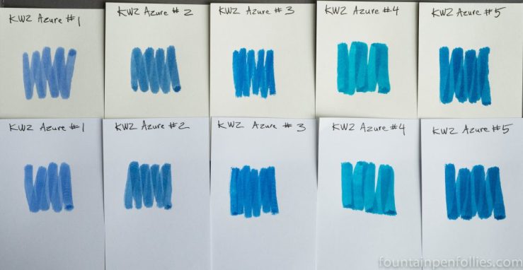
Together the five Azure comprise a nice range of blue inks that are low-maintenance and nicely saturated. Azure #1 kicks things off as KWZ’s traditional or standard blue, and it is the lightest and least saturated of the five. Azure #2 is a darker blue but still in the standard range. With the next three Azures, we get more fun, offbeat and vibrant shades of blue.

My quick summary goes something like this:

Most standard: Azure #1.

Most serious: Azure #2.

Most lively: Azure #3 wins by a whisker. But Azure #4 and Azure #5 also have a great kick.

Most uncommon shade of blue: Azure #4.

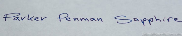
Most like Parker Penman Sapphire: Azure #3. Not a clone, though. Azure #5 has something of the PPS feel, too.

Best on poor paper:  Azure #2 and Azure #5.

Most dry: Azure #2 and Azure #3.

Most wet: Azure #4 and Azure #5.

Best shading: Azure #4.

Best sheen: Azure #4.

Easiest to clean: They all clean out wonderfully easily.

Most water resistant:  Azure #2. With a big “but.” On normal paper they’ll all soak in sufficiently. On fountain-pen friendly paper, none is actually water-resistant, but Azure #2 seems to survive the best of the five.

Best for a Lamy Safari: Azure #4. This is a category of interest to exactly one person in the entire world. But that would be me.

Most swoon-worthy: Azure #3 (more dry) and Azure #5 (more wet).

I think they are all excellent. I received samples of Azure #2 and Azure #3 from KWZ to do those reviews.