Ink Review: KWZ Grapefruit

KWZ Grapefruit writing samples

KWZ Grapefruit. This dark orange ink catches the eye with its strong and vivid color and lack of shading. It can look different in different pens, but generally it makes a statement on the page, and brightens up a winter day. It is perhaps best suited for fountain-pen friendly paper.

(click Page 2 below to continue)

Quick Look: Platinum Classic Inks

Platinum Classic Line ink writing sample

I was lucky enough to get samples of the new Platinum Classic Line of inks. I dipped them all with a Kaweco dip pen. (And yes my writing is even worse with a dip pen, but it was the quickest way to look at them all.)

I like all six, but my initial favorites are Cassis and Citrus, which darken a lot and are colors I happen to like. Sepia is a little unexciting for me, as is Khaki — both end up more in the brown-black range, not that there’s anything wrong with that. Lavender is really nice for a purple if you don’t skimp on the amount of ink. Forest was nice, too, as it turned very dark green. I wonder if the inks will keep darkening as the days go on; I feel like they might.

However, I want to warn people: my first impressions lead me to believe that these are going to be higher maintenance iron gall inks. They seem strong. So I’m going to be careful picking an appropriate pen.

The main thing in choosing a pen, for me, will be to pick a pen with a gold nib, without any metal trim on the section end that could come into contact with the ink when filling. That’s because my dip pen nib looked like this by the time I had finished dipping three inks.

discolored dip pen nib

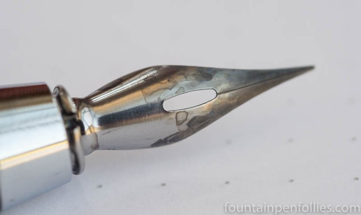
The surface of this nib’s plating was discolored where it made contact with the ink. I don’t mind that on a steel dip pen nib costing $3. But I would mind terribly if that happened on an expensive pen. A gold nib is not subject to this type of damage, and that’s what I’ll use.

Given the visible damage quickly inflicted on this dip pen nib, more care needs to be taken choosing a pen/nib for these Platinum Classic inks than with other iron gall inks for fountain pens. For instance, most KWZ iron gall inks don’t require this kind of caution — the ones I’ve tested have been perfectly safe for Safari nibs.

Here’s why, I think: Platinum Classic Line iron gall inks are described as “highly water resistant and suitable for permanent preservation,” per Platinum. That places them in the document ink category, like a Registrar’s ink. That would explain a higher iron gall content, higher acidity and also the higher-maintenance and greater risk to metal plating.

In contrast, most KWZ iron gall inks are not document inks, and not as permanent. And these lighter iron gall inks from KWZ also are more gentle on pens. It’s a tradeoff.*

I also will choose a wetter pen for these inks, because I suspect that the wetter the pen the darker the color you’ll end up with. I saw a dramatic color change with all of these, as they darkened noticeably as they dried. But I also kept dipping to make sure that I had a generous amount of ink on the pen nib.

I’m not surprised: traditional iron gall inks are drier-writing inks. A wet pen is a better match for traditional iron gall inks, so it makes sense that would be true for these Platinum Classic inks, too.

————–

* KWZ Iron Gall Blue Black is a document ink, I’m told, so it should be treated with the same caution as Platinum Classic Line inks. I found KWZ Iron Gall Orange higher maintenance than others, too, so that’s another I’d treat more cautiously.

Ink Dips: Lamy Black Ink

DSC_1436

Ink Dips is a more casual, laid-back ink evaluation than is normal here at Fountain Pen Follies. Instead of carefully evaluating an ink I’m interested in, the point of Ink Dips is to blindly pick an ink sample from a box of the set-aside  or soporific. Then I fill that sample in one pen and see what I think. It’s an inky experiment that’s a bit dippy.

Lamy Black. This was a surprising black ink, very dark, very lubricated and wet-writing. It’s a boldface black ink. It may be a good choice for those who seek “the blackest black” but also want to use a low-maintenance brand of ink.

(click Page 2 below to continue)

Happy International Women’s Day

Yeah, no real post today, I’m on strike. It’s International Women’s Day.

Ha. I wish. What mother could ever go on strike? Although I’ll note that Classic Fountain Pens is closed today “in respect for the work women do here and around the world.” Nice! Shout-out to them.

Whatever International Women’s Day is, I’m for it, even without a strike. On the website, it says the idea is “to help forge a better working world
 — a more inclusive, gender equal world.” That’s nice.

I think “gender equal” isn’t necessarily a concept that really applies to fountain pens and ink, but I think the fountain pen world is a pretty inclusive place. So three cheers for fountain pens and inks, and the people who work in, and enjoy, fountain pens and inks.

Pen of the Day: Lamy Safari Aquamarine with Robert Oster Bondi Blue

Robert Oster Bondi Blue writing sample

Lamy Safari Aquamarine with medium nib. I am perfectly aware that this colorful and fun plastic fountain pen made for middle schoolers is the pen that fountain pen collectors can’t abide, and can’t resist dissing. Because most of my pen friends are that way. To my face.

But I magnanimously forgive them, because they know not what they do. (Or, I secretly think, “pen snobs.” Guess which.)

Nonetheless the humble Safari is one of my favorite pen designs ever, and I think it’s one of the best pen designs ever. I use my many Safaris (and Al-Stars and Vistas) all the time, and while they aren’t perfect, they are pretty awesome to me.

Now, sadly, the Aquamarine limited edition came out in 2011, and is long sold out. This color has been so popular on the secondary market that it has been counterfeited and sells for crazy prices. So I suggest you not hunt for an Aquamarine. (Except for my Safari Hater friends, whom I urge to drop everything, spend whatever it takes, just get an Aquamarine because it will change your life. You deserve it. Xoxoxo.)

The rest of us should consider this year’s Al-Star in Pacific Blue instead. (It’s bright and attractive and also turquoise.) Or buy a regular Safari in any color. Because I’ve said it before, and I’ll say it again: paying premium prices for special Safaris makes no sense. Unless they have a ducky on top. Duh.

With the money you save, buy some awesome inks. Here’s one suggestion: Robert Oster Bondi Blue, a sample of which I’m now enjoying thanks to my awesome blog reader and fountain pen pal David.

Robert Oster Bondi Blue writing sample

I really like Bondi Blue. It’s a bright, fun color, with gorgeous shading, and obvious sheen potential. And best of all, for me, it totally rocks in a Safari. I’ve got Bondi Blue in two pens, because I’m going to review it, and it seems like a great Safari ink. It flows well in the Safari, which is not the case for every ink, and it looks its best in a Safari, also not the case for every ink.

Love my Safaris, love my Bondi Blue.

Robert Oster Bondi Blue writing sample


Ink Dips: Callifolio Bleu Azur

Callifolio Bleu Azur

Ink Dips is a more laid back, but potentially fraught, ink evaluation than is normal here at Fountain Pen Follies. Instead of carefully choosing an ink I am excited to try, with Ink Dips I just blindly pick from a box of samples I had set aside because I expected them to be dull or disagreeable. It’s a dippy idea, in some ways, but it’s been mostly fun.

Callifolio Bleu Azur. This is a nice blue ink, with excellent behavior. Ink Dips kicks off what we hope will be a happy March with Callifolio Bleu Azur, a bright and sprightly true blue.

(click Page 2 below to continue)

Ink Snippet: KWZ Grapefruit

KWZ Grapefruit swab with orange Lamy Safari

KWZ Grapefruit. Just a tiny Ink Snippet today, because I only started using KWZ Grapefruit two days ago. But it’s such a fun ink that I wanted to share a few photos. KWZ Grapefruit really pops.

KWZ Grapefruit writing sample

As you can see, Grapefruit is a dramatic, saturated orange red (or is that a red orange?). It’s a very wet ink, too, at least in this Safari. There isn’t much shading, and it’s a nice strong color.

KWZ Grapefruit writing sample

I love inks that straddle the red/orange border. I really look forward to using KWZ Grapefruit more, and reviewing it.