

KWZ Grapefruit. Just a tiny Ink Snippet today, because I only started using KWZ Grapefruit two days ago. But it’s such a fun ink that I wanted to share a few photos. KWZ Grapefruit really pops.

As you can see, Grapefruit is a dramatic, saturated orange red (or is that a red orange?). It’s a very wet ink, too, at least in this Safari. There isn’t much shading, and it’s a nice strong color.
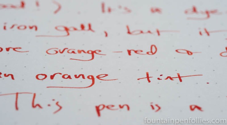
I love inks that straddle the red/orange border. I really look forward to using KWZ Grapefruit more, and reviewing it.

Laura, I was surprised to see the Grapefruit in the Ink Snippet today. I happen to love Grapefruit. It was the one ink I had to have from KWZ, and the only one I have so far. But there will be others. I find in a finer nib, the color looks more red orange. The wider the nib, the more red it looks. Yes, the second line does show the ink to be more red. I asked a friend whether it was orange red or red, and they couldn’t tell for sure. (on paper) My ink is definitely more red than either of the two photos above, way more red in fact. Maybe it was just that pen, I don’t know. I also found the ink to be rather wet, which I like. It does have shading, but it is barely noticed.
This ink ran well for me in a nib that writes close to an EF, with no problems at all.
LikeLiked by 1 person
I’m glad to hear you think it’s more red, in person — me, too! I think the color of the background of this blog page — the frame — accentuates the orange. But room lighting makes a difference, too, even when looking at computer screens. Where I live I’m getting brighter natural light this afternoon, as I write this, than I had in the morning, so the ink in the photo looks redder to me now on screen than it did in the morning. 🙂
LikeLike
Looking at the swatches it’s interesting to see what a difference the background paper colour makes to the appearance of the ink. Think I prefer the cream paper.
LikeLiked by 2 people
So true — and that difference on white and cream is accentuated because it’s a very wet and saturated ink, so a really strong color.
It occurs to me, seeing it online, that the background color of this blog page may also accentuate the orange. To get the best sense of the color on white paper, it helps to look at the second photo and isolate on the first line’s “Grapefruit,” because that has the most white around it. As you’ve noticed, it’s redder on white paper.
In fact, I can see I’m going to have to figure out a way to make the redder tint on white paper come across in photos here when I post the full review.
LikeLiked by 1 person