
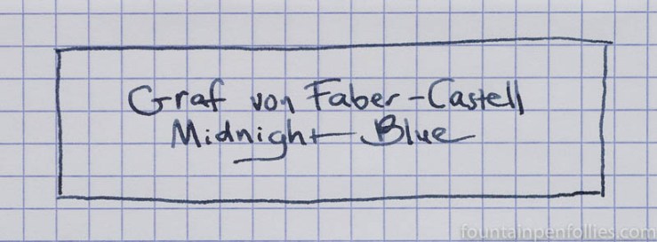
I am now a big fan of Graf von Faber-Castell Midnight Blue. But I have to admit that at first sight it was a little disappointing. I had bought the bottle based on an internet photo that made Midnight Blue look like a very dark blue black. But, as you can see above, in real life, while it’s very nice, it’s not especially dark. That’s because it has a substantial gray element.
I used Midnight Blue for over a month in three different pens: a vintage Parker 75 with fine nib, in which the color looked quite light; and a modern Pelikan M101N with medium nib and a Lamy Safari with broad nib. Midnight Blue varies based on the pen it’s in, but it varies from a lighter blue black to a blue black of moderate intensity.
Here’s a writing sample from those three pens, on Rhodia paper, from fine to broad.

I also have used this ink in a real firehose of a pen, a vintage Pelikan with an OBB nib and crazy wet flow. In that vintage Pelikan, the color of Midnight Blue looks similar to that from the Safari — that’s the darkest it seems to get.
But as long as you aren’t seeking only the darkest blue available, Graf von Faber-Castell Midnight Blue has a nice color. Its behavior is also excellent. It has good flow and lubrication. I had no problems with startup, even after leaving the pens unused for days, not even in the Safari.
Midnight Blue is also an ink that does incredibly well on lower-quality paper. The only issue I saw was a bit of showthrough with the widest and wettest pen, the Safari with broad nib. There’s no feathering. Here it is on Staples Sustainable Earth.
In fact, one of the best qualities of Graf von Faber-Castell Midnight Blue is its great performance on paper that isn’t fountain-pen friendly. It is one of the better inks I’ve ever used on normal or poor paper, which makes it an excellent ink for work.
Here is a writing sample on low-rent printer paper.

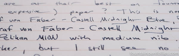
It’s interesting to look at that photo and compare it with the first one, on Rhodia. The truth is, I didn’t love Graf von Faber-Castell Midnight Blue at first from the Parker 75 with fine nib, because it wrote so lightly. But that was on fountain-pen friendly paper like Rhodia and Clairfontaine. Once I started using the Parker 75 on more absorbent regular paper, the color of Midnight Blue became stronger. I think the ink looks great from the fine nib Parker on regular paper, and it maintains its narrow fine line, too.
I also have printer paper that’s cream-colored, and I get the same great performance, and I think even a nicer color from the ink with that.

I generally prefer white paper, but I think cream-colored paper may bring out the best color in Graf von Faber-Castell Midnight Blue. Here is a writing sample on fountain-pen friendly Tomoe River paper, which is also cream.

The more I used Midnight Blue, the more I liked it, which is somewhat unusual for me — usually when I like an ink, I know that right away. With this ink, I was unsure at first, then I grew to like it, then it became my first choice. The color is very subtle, so it doesn’t give you an initial “wow.” But the color grew on me, and the ink’s impressive behavior helped.
I think those who like sheen may be able to work with Midnight Blue, too. It’s not a showy sheener, but I see potential on Tomoe River.

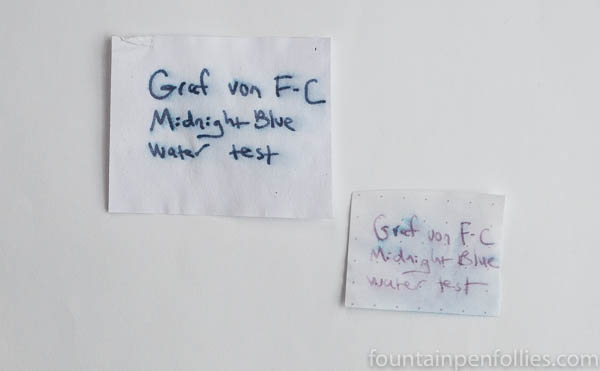
For those who want water-resistant inks, Graf von Faber-Castell Midnight Blue is good on both regular absorbent paper and on smooth fountain-pen friendly paper.
Yet Midnight Blue cleaned up very easily from all my pens, even after more than a month of being filled and refilled. Easy cleanup is my favorite quality in an ink.
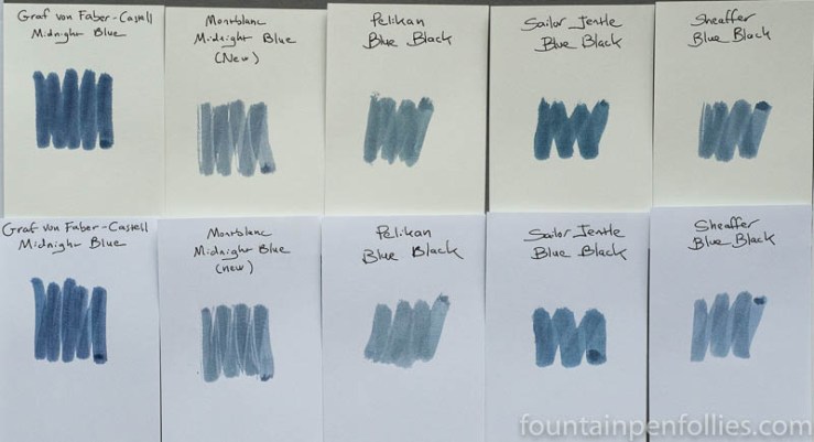
I did some comparisons of Midnight Blue with other inks in this range. Here is Midnight Blue compared to some of the modern blue black inks I have. These are all inks released in the last few years.
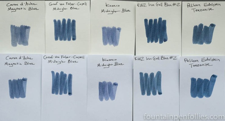
There are couple of things that stand out for me looking at these. The first is that Graf von-Faber Castell Midnight Blue is actually one of the more saturated looking of these grayish blue blacks. The second is that it’s probably closest to Pelikan Edelstein Tanzanite.
Now here is a comparison of Midnight Blue with some of the more traditional gray-leaning blue blacks I have.
I’m struck by how much bluer Graf von Faber-Castell Midnight Blue is than these more traditional blue blacks. And if I compare the first range of blue blacks with the second range, I think there must be some new dyes out there, which the inks in the newer group are using. It’s a great time to be an ink fan.
Here is paper towel chromatography of Graf von Faber-Castell Midnight Blue.

You can see where the substantial gray tint comes from.
Graf von Faber-Castell Midnight Blue is a real winner for those who want a dependable, non-flashy everyday ink. The color is neither exciting, nor super dark, but it’s very attractive, especially in wetter pens, and it’s very easy to live with. Plus, the ink’s behavior is so good — on any paper, in any pen — and the ink is so easy to clean out, that you never have to worry about it.

For me it’s an ok ink, nothing more 🙂
LikeLiked by 1 person
Excellent review Laura. I am a big fan of GvFC ink. I am using a sample now of Stone Grey. I like the fact Midnight Blue does well on more absorbent paper. I may have to get a sample of it in the future. I felt the same way about Diamine-Asa Blue and Midnight. The more I used them, they just grew on me. Recently I sampled Red Dragon, and that too grew on me. Like you, I usually know pretty quickly whether I am gonna like something or not. So it is good to hear about one of the ones that grew on you, and why.
I can’t hear the name Midnight Blue, without thinking of the song Midnight Blue by Melissa Manchester. Yes, I know that dates me by saying that, but I don’t care. 🙂
LikeLiked by 3 people
I of course remember Melissa Manchester and that song, too!
We can’t feel bad: last night my younger daughter asked, “Who is Blondie?” I nearly died. What are they teaching in schools these days?! 🙂
LikeLiked by 1 person
Well it isn’t popular music from decades ago. My kids learned a lot about older music from me. My daughter also used to love That 70’s Show. For a while the 70’s were thought of as cool. I have no idea what they are into now. It is funny how music and certain smells can trigger memories. My mother doesn’t write with a fountain pen at all. She distinctly remembers using Peacock Blue, and even said the name of her favorite ink from when she was in school. I bet she hadn’t thought of that, until I brought it up. She loved the turquoise, and so do I. But my problem is I love just about every color. That is one reason reviews, and sampling are so important to me.
LikeLiked by 2 people
Interesting to hear how this one has grown on you over time. It sounds like a useful ink to have, if the colour is similar to Parker Edelstein Tanzanite but without the bleed through. Good to know that the cream papers also suit.
LikeLiked by 2 people
I use that ink for note taking, even on recycled paper, and it works quite well. I don’t like its hue for other writing moments, but, that’s me …
LikeLiked by 2 people
Yes. It is a serious and business-like color. I like it best with the medium nib, where it has more life to it. I do like using it in my journal, not just for work-related things, but I wouldn’t use it for editing, or writing a cheery note.
Now that I think about it, all the inks I’ve used from this brand are fairly serious colors.
LikeLiked by 3 people
Yes, you are absolutely right ! These are great colours made for work, in good German style.
LikeLiked by 1 person