
Ink Dips is a more laid back, but potentially painful, ink evaluation than is normal here at Fountain Pen Follies. Instead of choosing a carefully curated ink, with Ink Dips I just blindly pick from a box of substandard and set-aside samples. You know the story about William Tell shooting an arrow at an apple set on his kid’s head? Ink Dips is an experiment like that, except the fellow holding the bow is drunk and hates you. That’s how it was this week.
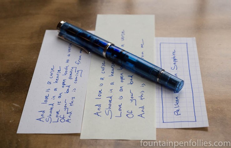
Pelikan Edelstein Sapphire. I knew when I started Ink Dips that there would some I didn’t like. But the first three were awesome; in fact, there is one I wish I could buy. The ink I picked for this week was Pelikan Edelstein Sapphire.
(click Page 2 below to continue)
Pages: 1 2

Once again, seeing the Aurora Blue temps me to buy it.
Everything about PE Sapphire says it is an ink I should like it. I like purple inks, I like blue inks, and I like well-behaved, easy inks, but this ink just doesn’t speak to me.
LikeLiked by 1 person
Aurora Blue is an excellent standard blue. I think Aurora Blue and Black are both first-rate standard inks, which is one reason I’m really looking forward to Aurora Blue Black. The Aurora inks are a little pricey per bottle, compared to J. Herbin or Waterman, but not compared to Edelstein. 🙂
You remind me that one of my favorite underrated blue inks is J. Herbin Éclat de Saphir, which is along the same lines as Edelstein Sapphire, but with more liveliness. Éclat de Saphir rocks. What I personally can’t live with in the Edelstein is that it starts off purple. But there’s a softness or lack of forcefulness in its color that should be noted, too. I personally like softer, more pastel inks, but I have come to learn that many people don’t feel the same.
LikeLiked by 1 person
I will definitely look into J. Herbin Éclat de Saphir. I think you nailed what is missing for me in the Edelstein’s color- liveliness. That is what I look for in an ink. It can be soft, bright, bold, or murky and I will most likely like it if it has a liveliness to it. I hadn’t realized that before now. 😀
LikeLiked by 1 person
It looks like a blue that is on the cool side of the spectrum. I am on the fence with this one. It looks like a nice color, but I’m not moved enough to get a sample.
LikeLiked by 2 people
I have not tried it myself. I cannot see any purple either, but I will take your word for it.
Mind you, that Aurora Blue in your post looks awesome. I have a bottle from the London Pen Show that I have not yet opened:)
LikeLiked by 2 people
I love it and really don’t see it’s purple 🙂
LikeLiked by 2 people
Oh good — I hope many people love it. It’s a very nice ink, objectively speaking. But all I see is the purple tint.
In fact, when it glistens so purple as it first goes down on paper, in the dim recesses of my memory I’m transported back to grade-school mimeographs. Ayy, the pain. 🙂
LikeLiked by 1 person