I Learn a Valuable Lesson About Fountain Pens and Inks, Set to Music.

Apologies for my internet absence. Since we brought the 2019 Chicago Pen Show to a successful and happy conclusion, pens have been scarce for me. And, actually, even before the Pen Show. Almost no pen time. Hence, nothing to write about pens.

Eh, it happens. Life is fine. It’s just been busy. Life is bigger. Much bigger than pens. But it’s made the blog seem like a Colorado ghost town, with the dust blowing between abandoned mining shacks.

Only now, it’s almost fall. Time to clean things out, get cracking. We’re back to school.

So here’s what I was doing with pens during my summer vacation. Like the song at (almost) the very end, this will be long and boring. But there’s music in it.

(click Page 2 below to continue)

Ink Snippet: J. Herbin Bleu Myosotis

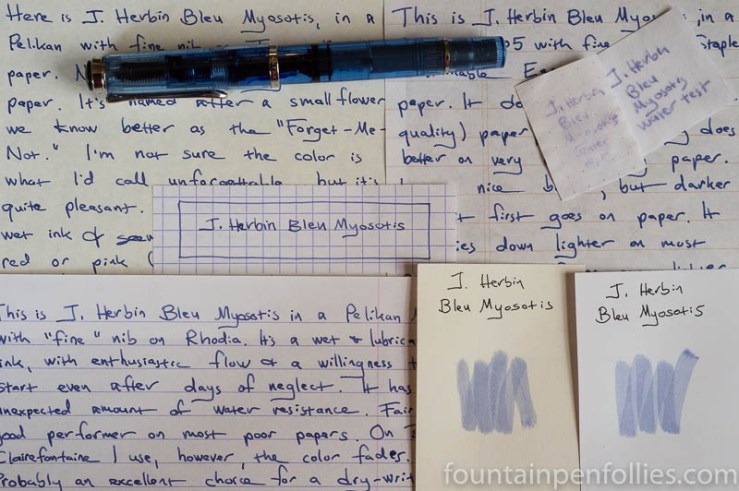
J. Herbin Blue Myosotis

J. Herbin Bleu Myosotis. This ink. It’s strange. On most paper, its color seems to fade after a day or so. The final color ends up a pale periwinkle, after it fades from a darker, fresher blue. It’s a nice enough color, either way, but I can’t work out whether the fading is a bug or a feature. This ink confuses me.

(click Page 2 below to continue)

Thanksgiving Countdown

It is a truth universally acknowledged that a person approaching either a vacation or a national holiday must be in want of extra work. Thus I am toiling away feverishly at boring work, even as I should be cooking for Thanksgiving and writing posts about pens.

But needs must, and like the Pilgrims surely would have, I will send out my thanks over the internet. Weirdly, I am going to be thankful for ink here. Because it’s a blog with a theme. Because I like ink. And because, okay, you guessed it: I got up late the day they were passing out Thanksgiving topics to bloggers, and I missed out on all the good ones. Oh, and I also have to bring two pies.

No, sincerely, I’m thankful for my three favorite ink companies. KWZ, my new favorite. Montblanc, which I can never resist. And J. Herbin, my old favorite. These inks are easy on my pens, and easy to clean out of my pens. The colors are beautiful, and the inks shade. That’s my entire wishlist.

I’m thankful for my most used ink: Pelikan Brilliant Black. The old reliable.

I’m thankful for all the inks that friends have sent me to try this year. Those made this year a lot more colorful, a lot nicer and a lot more fun.

And lastly, I’m thankful for the inks I tried this year that were hard for me to like initially. I didn’t always end up changing my first “yes or no” inclinations. But I always ended up changing my initial impressions. There were some “I don’t think so” inks that became “this is just fine in the right pen.” And there were also a few “I don’t think so” inks that became “I cannot write with this another day, not even another second.” (Most of those were in the babypoop brown category.)

Don’t let anyone kid you: ink is just colored water. Inks are not at all like people. Okay, except in this one little way: some you love immediately, some you take a bit longer to warm up to and some you may never warm up to, but you still benefit by giving them the benefit of the doubt, as much as you can.

I may not like babypoop brown, but gosh darn it, some people want three or four different babypoop brown inks. And I may feel an involuntary shiver run down my spine when someone says “I have a great avocado green ink here,” but the truth is, every other fountain pen user seems to love avocado green inks.

Ink is just colored water. But still I’m thankful for each time I encountered an ink that was more challenging, because it helped me remember, in the tiniest way, that we get back what we put into things.

So, ink fans, I say, today, two days before American Thanksgiving, let’s be thankful not just for the inks we love, but also for the  hard-to-love, the puzzling, the “what do people see in this anyway” inks. The “brown” inks that are black, if we’re telling the truth to power. The hard-to-read neon greens. Even the everyday blues.

Because, just maybe, these things are worth another look. A better look.

Let’s keep trying. And let’s be thankful for the opportunity to do so. Because just being able to devote a few minutes of the day to think about ink, instead of more pressing things, proves it. We are so lucky.

We should remember that every day.

Lamy Safari: The Chicago Cubs Version

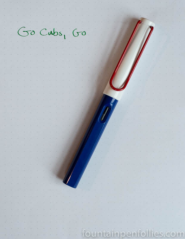
Go Cubs Lamy Safari modification

We do what we can, here at Fountain Pen Follies, to cheer on our favorite baseball team. And this year has been magical. On Saturday night, the Chicago Cubs baseball team won the pennant for the first time in 71 years. Tonight they will play in the World Series, for the first time in 108 years. What in the fountain pen world can commemorate that? How about a Chicago Cubs Lamy Safari.

Cubs colors are blue and red with white, and a baseball is white with red stitching.  My Chicago Cubs edition Safari is made from the cap of a white and red Safari, and the body of a blue Safari.

Go Cubs Lamy Safari modification

It’s inked with J. Herbin Lierre Sauvage (“Wild Ivy”), in tribute to the ivy-covered walls of Wrigley Field, the Cubs home park.

Go Cubs, go. And thanks for a great year.

And the Platinum Classic Maki-e Goes to …

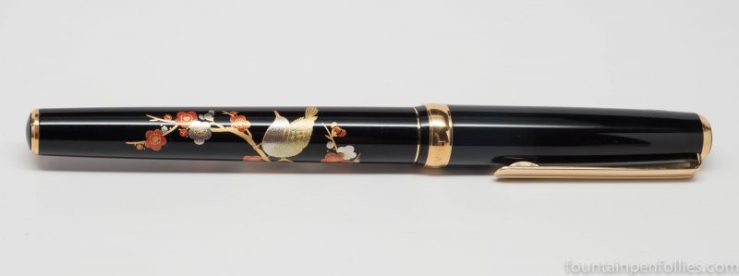
Platinum Classic Maki-e Bush Warbler fountain pen

The random winner of the Platinum Classic Maki-e from Pen Chalet is Gareth19. Congratulations to you, Gareth19, and I know you’ll enjoy this beautiful pen. Please use the Contact menu at the top of the page to send me your full name and address, so I can send you your new pen.

If the pen isn’t claimed by next Monday, I’ll do a new drawing next Tuesday and post that person’s name on the blog instead. Because if this thing stays with me much longer, there’s an excellent chance you’ll next see me hiding with it underground and cooing “my precious.”

But wait, because there’s more to give away. Ron at Pen Chalet and I were so blown away by the rhymes laid down by our commentators, that Pen Chalet is also going to give away two Flash Poetry Prizes. Each Flash Poetry Prize will be a new bottle of J. Herbin 1670 ink of the winner’s choice. I heartily recommend the new Caroube de Chypre, or Emerald of Chivor if you want a bolder color.

With the Flash Poetry prizes, there were so many great choices we just chose 11 of the most outstanding, then had a random number generator pick the two ultimate winners. And those are: Jorge Gomez and Robert Holland.

So Jorge and Robert, please use the Contact menu up there at the top of the page, to give me your names, addresses and choice of ink.

Congratulations to all the winners, and thank you to all the entrants. Those rhymes for Pen Chalet really did slay.

Fountain Pen Favorites for August 2016

calendar image

Think of a middling movie franchise. The first movie does well, so they come up with a sequel, which isn’t exactly good, but sells enough tickets, so they can’t resist slapping together a third. Which is just chum. And that was my August — the Jurassic Park III of months.

But hey, Laura Dern and Sam Neill were in Jurassic Park III. Nothing is irredeemable. So let’s focus on the bright side of August.

1. Weather. It did not rain every minute of every day. Okay, nearly. But there were a few minutes where you could see the sun still existed. Bonus points: no need to worry about a beach body. And I found some very water-resistant inks.

2. Pen Shows. Many people I know had fun at pen shows in August. Not me, but I lived vicariously. And I was lucky because a very sweet friend brought me back a present from DC. I hope you either went to a pen show in August, or got something nice.

3. Inks. I loved my August inks. There wasn’t a “meh” ink in the bunch for me. The new-to-me inks were simply wonderful: KWZ Thief’s Red, KWZ Rotten Green, Graf von Faber-Castell Cobalt Blue, Kaweco Sunrise Orange, Kaweco Smokey Grey, and J. Herbin 1670 Caroube de Chypre. I could be happy with just those. That was a real light in August.


——————

Photo by Dafne Cholet, Flickr, used under Creative Commons license.

Our J. Herbin Caroube de Chypre Winner

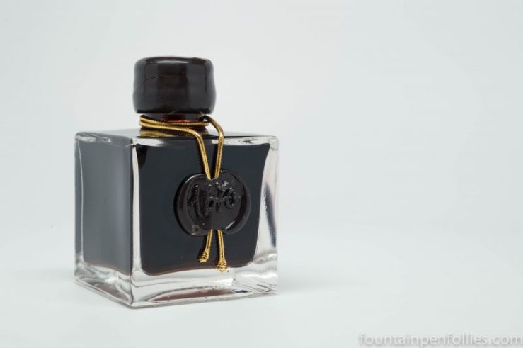
J. Herbin 1670 Caroube de Chypre ink bottle

September 10, 2016 update:  Nicola did not claim the ink, so Caroube de Chypre is on its way to the second-place finisher Raffaello Palandri.

We have a winner for the giveaway for J. Herbin 1670 Caroube de Chypre, thanks to the Random.org, and that is Nicola. Congratulations to Nicola, and thanks to everyone who entered. This ink comes from Pen Chalet. We’re giving away a Platinum pen next, so watch the blog for that, too, in the coming days.

Nicola, please use the Contact menu at the top of the page to send me your full name and mailing address.

Ink Review: J. Herbin 1670 Caroube de Chypre

J. Herbin 1670 Caroube de Chypre writing samples

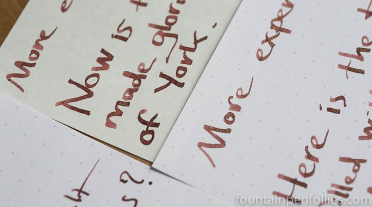
J. Herbin 1670 Caroube de Chypre. This is a lovely red-brown ink containing gold particles from J. Herbin. It’s a quieter gold-infused ink, in which the gold serves to deepen the rich color, giving an effect like a dark copper, or from some pens, a warm cocoa.

Caroube de Chypre won’t be the choice for those wanting a dramatic ink, but I loved the ink color and versatility. And because Caroube de Chypre is a relatively low-maintenance ink, I would trust it in any pen for an extended time period.

(click Page 2 below to continue)

I’ve Been a Miner for a Heart of Gold: J. Herbin 1670 Caroube de Chypre

J. Herbin Caroube de Chypre writing sample

I’ve been searching long and hard for how to bring out the most gold in J. Herbin 1670 Caroube de Chypre, and I think I’ve found it. But there’s going to be a “but” in there.

Caroube de Chypre is on the quieter side for inks with gold ink particles.  It is a gorgeous dark copper ink, but it doesn’t pop like J. Herbin’s previous 1670 ink, Emerald of Chivor.

That’s actually fine with me. I love the color and how it looks on the page. But what if you want more gold? Can you get it?

Yes! And, no.

(click Page 2 below to continue)

J. Herbin 1670 Caroube de Chypre: Pretty Pictures and Sheen and Shimmer

J. Herbin 1670 Caroube de Chypre writing sample

I have been enjoying the heck out of J. Herbin 1670 Caroube de Chypre, while I try to understand it.

I’m working this ink. I’ve found you need to coddle and coax any gold- or silver-infused ink, whether from J. Herbin or Diamine, for maximum shimmer.

Some steps are obvious: shake the bottle thoroughly before you fill a pen. Some are not so obvious: shake the pen before writing. And some steps go against my very nature: only use a wet pen, which means no Lamy Safari. Sob.

However, even with all that, Caroube de Chypre isn’t showing a huge amount of gold in my wet-writing Kaweco Sport. Not even with a 1.5 mm nib.

J. Herbin 1670 Caroube de Chypre writing sample

It’s a gorgeous color, though. And I’m happy with the lower-key shimmer: actually, it makes me think I’d use Caroube de Chypre more. But I still would like to figure out how much shimmer is possible from Caroube de Chypre.

(click Page 2 below to continue)