

It’s a very good thing that I enjoyed Caroube de Chypre, because I feel like I’ve spent as much time with it lately as with my friends. I’ve been using it for about two weeks now, and using it a lot.
From the first, Caroube de Chypre struck me as one of the quieter, but more usable shimmering inks. And I still feel that way: it’s a beautiful color, and because the gold is more subtle than in many shimmering inks, Caroube de Chypre is an ink that feels “normal.” Compare it to the “wow” ink that is J. Herbin 1670 Emerald of Chivor.
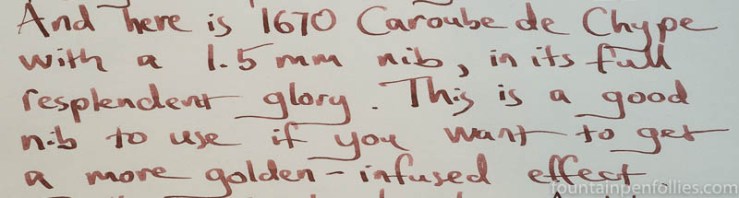
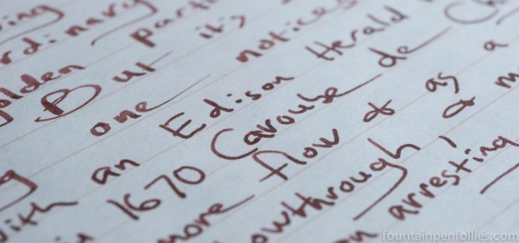
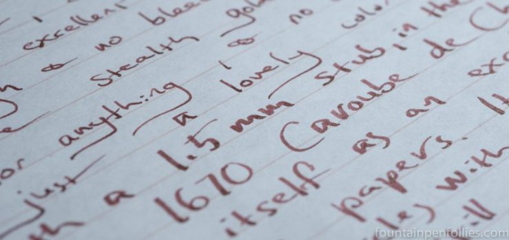
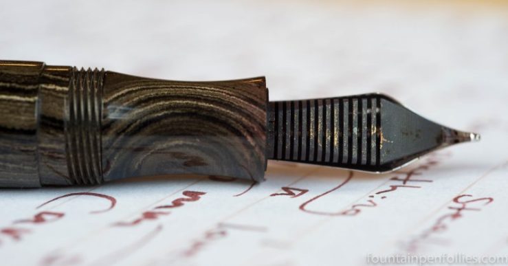
I’ve used Caroube de Chypre in a Kaweco Sport with medium nib and 1.5 mm nib, and in two Edison pens with medium nibs. The Kaweco Sport is a moderately wet writer, but the Edisons are firehoses.
And that’s good. Caroube de Chypre looks different in these different pens. Here is a writing sample that starts with the Kaweco with medium nib, then the Kaweco with 1.5 mm stub, then one of the Edisons with medium nib.
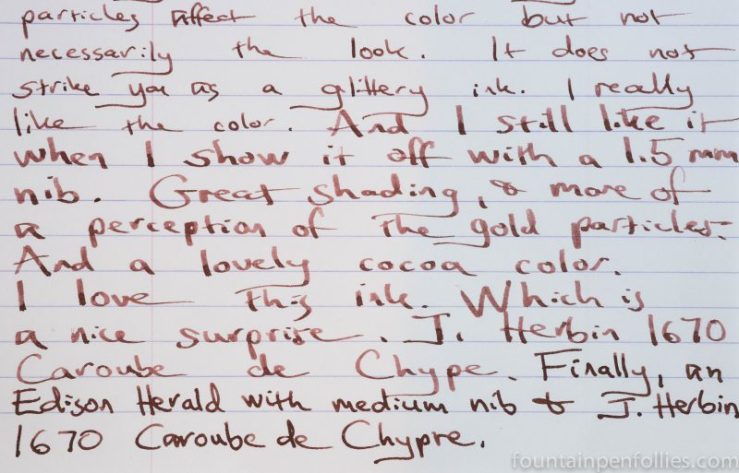
Caroube de Chypre darkens in a wetter pen, like the Edison at the bottom of that page.
I like its color in both guises. Caroube de Chypre looks more like cocoa in the drier pen, while in the wetter pen it is a darker brown.
Both those writing samples are on Rhodia.
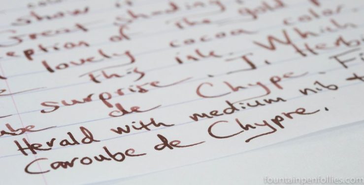
Here it is on Clairefontaine Triomphe, in the Edison first, then the Kaweco Sport.

I like the crisp red-brown of Caroube de Chypre on white paper, but it’s also great on cream-colored paper, which warms it up.
Here is a writing sample on Tomoe River. At this angle the gold particles warm up the Caroube de Chypre even further.
Tomoe River is the paper I have that best shows off both the gold in Caroube de Chypre and its attractive green sheen.
However, do note that golden look is really only noticeable when the paper is at an angle to the light. Caroube de Chypre has copious gold, but usually this will blend right into the ink, deepening the coppery color rather than standing out. That’s true on Tomoe River paper, too.
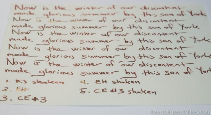
I’ve written about my initial search for more gold from Caroube de Chypre, and also — at a length that would do Tolstoy proud — about finding the best methods to get the most gold onto the page. Basically, the wetter your ink and pen combination, the more gold you’ll have on the nib and the more gold you’ll see on the paper.
Consider this the “Under the Sea” rule: wetter is better.
Here are two methods to rev up the amount of gold. In the first, you shake the ink bottle before filling to get more gold in solution. Then you either put Caroube de Chypre in a very wet-writing pen, or if you want to use a pen that isn’t a firehose, slightly dilute Caroube de Chypre to make the ink wetter.
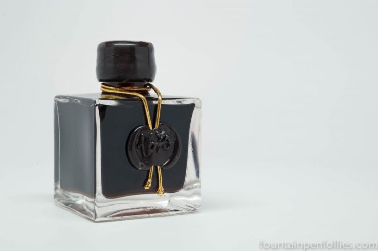
The second method is fill whatever pen you like, in any manner you like, and then to dip the nib in the bottle of Caroube de Chypre just before writing. This works equally well, and is a lot easier. Plus you get to see that beautiful inkwell bottle as you write.
Caroube de Chypre performs well on regular paper. I saw gold on every paper I used, even note pad paper or random notebook paper. Caroube de Chypre does have a tendency to feather on very poor copy paper, especially with the Edison, but not a horrible amount.
On my everyday Staples Sustainable Earth, feathering stayed in check, but the Edison created enough showthrough that I would write on only one side of that paper with that wet pen.
There wasn’t any showthrough or bleedthrough, and no feathering, on Staples Sustainable Earth paper with the Kaweco Sport.
Caroube de Chypre’s other behavior was excellent, too. Flow was consistent and startup immediate. Dry time depends on paper. At the longer end, when using the wet Edison pen on Rhodia, Caroube de Chypre wasn’t fully dry for 30 to 40 seconds. That’s going to happen with “wetter is better” pens. However, use that same Edison on Staples Sustainable Earth, and Caroube de Chypre is fully dry inside 10 seconds.
Caroube de Chypre was easy to clean from my pens. As is always the case, the gold particles cleared with the first flush of water. Cleaning time for these inks always depends on the underlying dyes; the metallic particles wash right out.
I had used the Kaweco Sport as an eyedropper, and that cleaned up with just the briefest run under water and a paper towel swipe of the inside of the pen barrel. With the Edison, the converter and nib cleaned out almost as easily, except for one red dye that took longer to clear.
I’d classify Caroube de Chypre as a relatively low maintenance ink, not as easy to clean as Waterman Serenity Blue, or J. Herbin 1670 Stormy Gray, but at the next level.
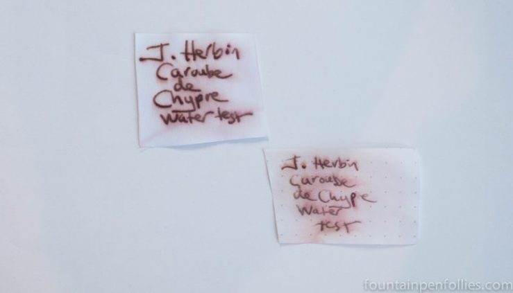
Yet, despite being easy to clean from my pens, Caroube de Chypre surprised with some water resistance. You can see this not merely on ordinary paper, which usually absorbs the dye from any ink, but also on smooth paper like Rhodia.
I always like to compare a new ink with other similar inks, and that’s instructive here.
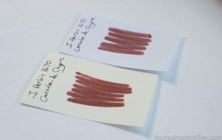
Here is Caroube de Chypre next to Diamine Ancient Copper and Brandy Dazzle, the shimmer ink with gold particles that Diamine makes with Ancient Copper.
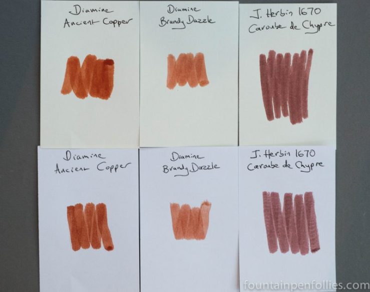
Ancient Copper and thus Brandy Dazzle are much more orange, while Caroube de Chypre is browner. But more than that, as you can see even in those swabs, Brandy Dazzle’s gold particles pop.
If you look here at a brief review I did of Brandy Dazzle, you’ll see that the Diamine ink is a showy sparkler, completely unlike the quieter Caroube de Chypre. Brandy Dazzle is jumping up to belt out “Under the Sea” at the karaoke bar, while Caroube de Chypre is wondering how soon he can leave for home, because he has a book to finish and would like a cup of hot cocoa.
If I look at inks without gold particles, Caroube de Chypre reminds me of these two favorites.
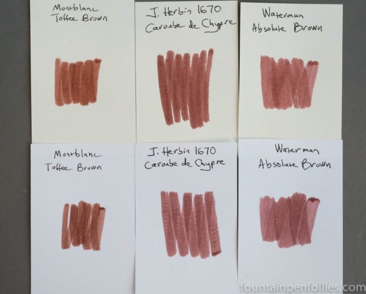
In color it’s closest to Waterman Absolute Brown (formerly Havana Brown). But Caroube de Chypre also reminds me of Montblanc Toffee Brown, which is harder to explain. I think it’s because they both shade so nicely. And perhaps also because when you notice Caroube de Chypre’s gold particles, the ink takes on a more golden brown aspect.
Here is paper towel chromatography of Caroube de Chypre.
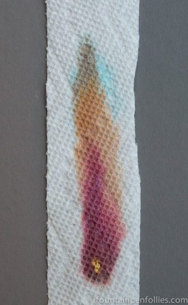
It’s a fairly complex mixture, but the deep red predominates in this reddish brown. It must be that rich burgundy red that takes a little longer to clean out of the pen. And I am proud to point out that I got some gold in there, without even trying.
I am a bit sad that this review marks the end of my time with Caroube de Chypre. I really like this ink. Though figuring it out, and then writing that up, has been something of a saga. In fact, if you’ve read yesterday’s post and now this review, I’m sure you feel you could have finished War and Peace in the same time. So let’s pretend we did. Here’s something from War and Peace that I really like. “We can know only that we know nothing. And that is the highest degree of human wisdom.”
Caroube de Chypre was provided by Pen Chalet for this review.

This one reminds me just a tiny bit of Herbin Cacao du Bresil, which I *love* for the sweetness of the color. It is a soft, soft brown like well-worn teddy bear fur. It’s like they used CdB as a springboard and glammed it up, which makes this pretty darn perfect 🙂
LikeLiked by 1 person
Wonderful review. I really must get into my bottle and have some fun.
I also need to add a clear model to my little flock of Sports. Inks always look so good in them!
LikeLiked by 1 person