

So right there, above — that’s the color I get from Bleu Myosotois on most white paper after a day or so. This is not sun-bleaching — I first noticed the ink fading inside the covers of a closed Clairefontaine notebook. It seems to fade less on absorbent, lower-quality papers, remaining a bit darker and stronger there.
A picture is worth 1,000 words. Here is a writing sample on Rhodia, the first line written earlier, the second line written 10 minutes before I took this photo, to show the color change.

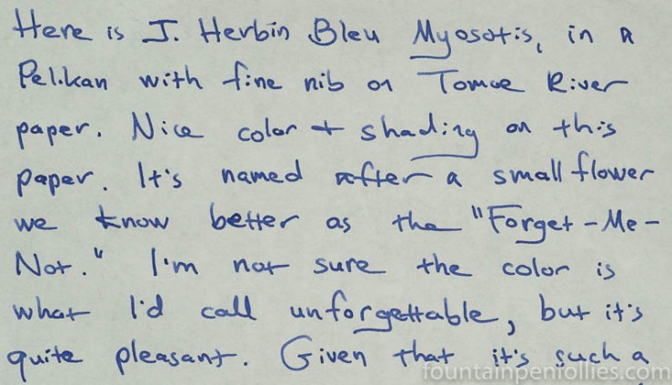
Here is a similar demonstration on cream-colored Tomoe River paper, except here only the last two words (“Bleu Myosotis”) are freshly written, and the rest of it was written a day earlier.

I used Bleu Myosotis — for over a month — in a Pelikan M205 with fine nib, which is the widest, wettest, bounciest “fine” nib ever inflicted on a person who likes narrow, nail-like fine nibs (me). That combination was torture for my bad handwriting. In fact, I disliked this combination so much, I ended up grinding down the nib after the photos were taken, to try to get a “normal” fine nib.
However, Bleu Myosotis behaved well in the pen. It’s a wet ink — too wet for this particular pen, actually. But you like such an unsaturated ink to go on strongly. Bleu Myosotis always started up immediately, no matter how many days the pen had been sitting unused and unloved. After many weeks of use, the ink cleaned out very easily.
Here is what Bleu Myosotis ends up looking like on Rhodia.
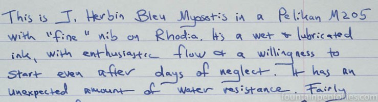
It shades nicely on fountain-pen-friendly paper.
Here is Bleu Myosotis on cream-colored Tomoe River paper.
The ink’s performance on poor paper wasn’t great. Bleu Myotosis feathered some on the worst-quality copy paper, as I’d expect. However, it actually feathered more than I usually see on my everyday paper, Staples Sustainable Earth legal pad paper.

At least Bleu Myosotis ends up slightly darker on the Staples, as well as some other lower-quality papers.
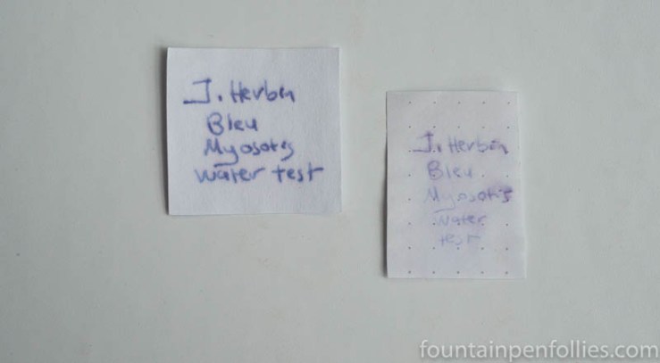
Bleu Myosotis had some water-resistance, not just on regular paper — which most inks have — but also on Rhodia, which is unusual.
Do you see the remnant of a bit of pink dye up there? That’s behind the ink’s pale periwinkle hue.
The periwinkle makes Bleu Myosotis stand out amidst an array of single-dye standard blue inks.

For fun, here is an array of blue J. Herbin inks.

I do love a J. Herbin ink. But Bleu Myosotis leaves me somewhat unsettled. The color fade is a little disconcerting to me; even after using the ink for weeks, I never really got used to that. Maybe others will feel differently.

That’s a bit odd. In a way, it reminds me of old Sheaffer “Washable Blue”, which also seemed to fade a bit. Either that or it’s my memory that is fading a bit.
LikeLiked by 2 people
I like the color a lot, thanks for the wonderful review one more time ❤
LikeLiked by 2 people