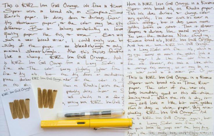
KWZ Iron Gall Orange. This is an ink that despite the name is an unusual, almost brassy light brown. It is also an ink that is fairly high maintenance, so I would recommend using it in an easy-to-clean pen.
(click Page 2 below to continue)

I’ve been struggling with something about fountain pens lately, which I will call the “mehs.”
Time really flies in the summer, but on top of all the usual fun, I’ve had a succession of things that have combined to bring me up short. On the pen front, my Monviso arrived, which was very nice. On the ink front, I realized I was sick of blue inks, which for me is beyond strange. Then, on the life front, we had some hard things. The hardest was when our beloved 12-year-old Labrador Retriever suddenly became seriously ill with pancreatitis, which meant round the clock nursing by us and a lot of veterinary intervention, since she could not eat and drink, or even stand up, on her own.
I saw a thread on a forum where some people were expressing the thought that “you are what you own.” So sad. Meanwhile I kept seeing nice pens, new and used, popping up for around $400 to $500. Oh and the Montblanc Shakespeare pen came out. I love Shakespeare. That pen is more than $900. It doesn’t actually have anything to do with Shakespeare, of course. It has to do with parting people from more than $900.
Speaking of Shakespeare, he’s always there with an apt phrase. Hamlet opens with a scene where a watchman at the end of his shift says, “For this relief much thanks: ’tis bitter cold / And I am sick at heart.” Here, the weather is hot, and I’m only nonplussed. But as always, Shakespeare’s words resound more convincingly.
I do enjoy pens and inks, and I have since I was a kid. When I like the pens I use, my job is a little more fun and my day a little brighter. But, as a hobby, there are negatives. The fountain pen hobby does revolve around the acquisition, ownership (and sometimes selling) of, stuff. And that can be warping, and that can be hollow.
Not that I think that stuff is bad or buying stuff is bad. Actually, I think that life is short and we should delight in every part of it that we can. I don’t feel bad about getting to own some nice pens — I feel lucky.
It’s just that there should be a balance in everything. I’m also the person who reads Thoreau’s Walden every year. My mantra (not from Thoreau) is: “Life is not a having and a getting, but a being and a becoming.”
And yet I devote free time, and some discretionary income, to fountain pens and ink, which is essentially about having and getting. So, sometimes when I’m reminded of that, it brings me up short.
Right now, I’m a little sick of it. I have never thought “you are what you own,” and never will. But does it matter if I spend time in environments that foster that? Do I contribute to that? Seeing pens on the internet every few weeks that cost $400, or $500 or $900, is that a positive? Or is it out of whack? When none of this is important. Do I remember that often enough? What do I do about it?
So I’m wrestling a little. On the bright side, at least our dog is doing well. Her life has actually been saved, which is a staggering thing to contemplate, and a good way to spend your time. Important things, like that, make me think, “just forget pens.” It was nice to watch Serena Williams win Wimbledon this weekend. The BBC made a great video of Serena reciting (part of) a Maya Angelou poem. I would rather listen to that.
Because it doesn’t matter who comes to mind: Maya Angelou, the Ramones, Stephen Sondheim, Henry David Thoreau, Shakespeare, T.S. Eliot. They all say the same thing. Be and become.
I adore J. Herbin inks (well, most of them), but I can admit that the bottles, while lovely, are not always easy to fill from, especially as the ink level declines.
However, there are some pens that are so perfect in every way that they adapt to difficult conditions like I would adapt to winning sixty million dollars.
The Parker 51, ladies and gentlemen.

When I was young and foolish, I wasn’t much different than I am now. But I did go to a lot more concerts. Back then, I really liked Bruce Springsteen. I used to like this song in concert, and I still think of it when July Fourth rolls around. This time, I’ll press play.
I always feel lucky to have been born an American, never more so than on the Fourth. And it’s always a fun day in our house, because we host a Fourth of July barbecue featuring my husband’s smoked ribs, pulled pork and beef brisket, and another friend’s homemade pies (usually red, white and/or blue). Then everyone packs up the coolers and troops over to our town’s fireworks at the beach. We look forward to this all year.
If you’re in the US, I hope you’re going to have a happy Fourth, and if you’re elsewhere, I hope you’re having a happy Monday.
June meant beautiful weather, and great pens and inks. Unfortunately the last week for me was taken over by non-pen things. So it’s a treat to look back at the pen things.
1. Aurora Optima 360 Monviso. Of course this beautiful pen is June’s number one highlight. This is my big purchase, probably for the year. Unless Pelikan strikes again. But ending the year with the Monviso would be just fine. It’s a great-looking pen, with a great-writing stub.
2. Montblanc BMW ink. Montblanc BMW ink is such a nice blue. And yet as far as I can tell, Montblanc isn’t selling it through the usual US dealers. That’s a shame. Hopefully that will change.
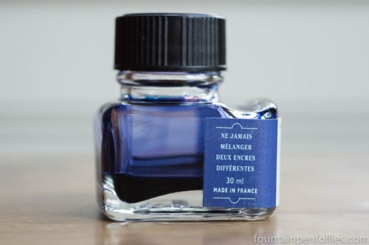
3. Parker Penman Sapphire. It’s true. Parker Penman Sapphire really is the top — the Coliseum, the Louvre museum, a Shakespeare sonnet and a Bendel bonnet. It really is all that. Just a beautiful blue ink. Alas, no longer available.
4. Fountain pen friends. I just happen to owe all of those good June experiences to friends. I’m pretty lucky.

This photo showed up today on the internet. I believe the original source is probably the Instagram and blog of a store in Belgium called Penworld. I don’t know if this photo will stay up much longer, but for now, here it is.
Oooh, ahhh. Or yuck, as the case may be. People definitely have varying opinions, and I’ve been enjoying hearing them. And I am sort of going back and forth, myself.
On that blog link, Penworld reports that the Lx line will be out in September. The Lx is like a nicer Al-Star, that keeps the anodized finish, the shape and the section, but upscales the pen. The Lx has an aluminum case, and its clip will be plated with palladium or ruthenium. The steel nib also has a fancier finish.
Another store, Appelboom, said on Instagram that the Lx price might be about 50 euros in Europe.
So far, everyone I know who doesn’t like the Al-Star and Safari still doesn’t like the Lx. Essentially, it seems like just a more expensive version of the pen they already dislike. So it’s not converting anyone, at least not yet.
On the other hand, I love the Safari, and at first I thought I’d end up with two of the Lx pens, the gold and the pink. Those are the the pretty colors, maybe the feminine colors. And they are the two colors that don’t look exactly like Al-Stars I already have.
But now that I look more at the pink, it’s raising some questions. I do hope it’s not the same color as the old Raspberry Al-Star. And the gold one — it does look different than the Copper Orange Al-Star from 2015; I really hope it is.
Well, we’ll have to see when they come out.
I do like the idea of the Lx. I love the Safari, but the Al-Star has never excited me. If the Lx is more attractive, and more sophisticated, I think that would be great. I’d be more likely to pick up that kind of Lx at a store, and I’d be more likely to buy it as a gift for an adult.
I will point out one excellent negative comment, from the “not-a-fan” side. My friend Dan was saying the Lx colors look like iPhone colors. Which is pretty funny. Because, now that he mentions it ….
But what if the Lx colors are older Lamy Al-Star colors? Then maybe Apple was inspired by Lamy, right? All our minds would be blown.
Anyway, no matter what the Lx turns out to be, we all know one thing it’s not. Green. So, yay.

Since the burning question about the Aurora Optima Monviso limited edition seemed to be how it would compare to the Nero Perla, I thought I’d add a few more photos to those posted earlier.
You’ll notice in some of the photos, especially when you look at the cap, how the Nero Perla appears to have a blue tint. That’s a trick of the light: the Nero Perla is just more translucent, so it reflects the color of the light more strongly than the darker Monviso does.

It’s easier to see the differences between the pens with the Nero Perla in front of the Monviso.
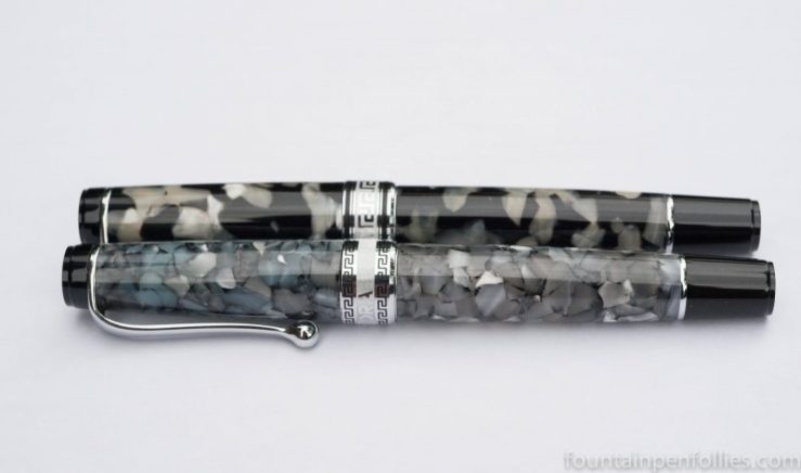
But let’s put the Monviso in front at least once.

Finally, here are the Monviso and the Nero Perla bracketing the demonstrator. All three of these pens have a different capband.

A hidden difference is that the Monviso is limited to only 360 pens, which is why I bought mine right away. The demonstrator is numbered, but there are many more of those — mine is number 1107. The Nero Perla is in the regular line.

It’s already in the mail. Not that I checked the tracking at least five times yesterday, or anything.
Variegated grey auroloide, with solid gold pennino, incoming.
Oh two five. Oh happy day.


