
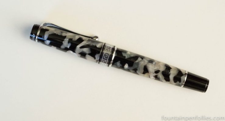
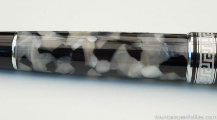
The Monviso makes me think of granite.
While I waited for Aurora to grind the stub nib and send this pen over, I saw a lot of photos on Instagram of the Monviso, most of which seemed to feature the pen on dark desks with dark leather notebooks and accessories. I get that now. The Monviso color scheme was drawn from the Alps, and the black and gray acrylic does look stony.
A lot of us were wondering how the Monviso would compare with the Nero Perla Optima in the regular line. Here’s the answer: Nero Perla on top, Monviso below.

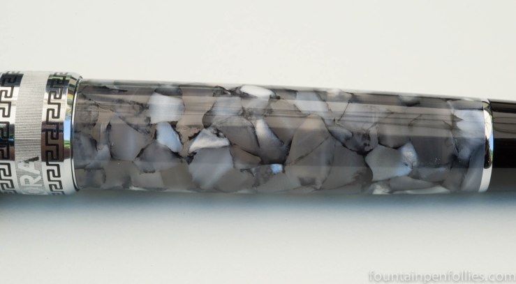
The Monviso has more black, and its acrylic chunks seem larger on the whole, giving it a strong appearance.
The Nero Perla has some smaller bits, and more variegated acrylic chips with a lighter and warmer overall color.
I wasn’t surprised to like the Monviso. I was a little surprised that the Monviso has made me appreciate my Nero Perla all the more. The Nero Perla is lighter and more delicate and it has a translucence and depth that seem partially iridescent, like the inside of an abalone shell.
The answer to the Monviso versus Nero Perla question for me is “both.” Shocker, I know.
The acrylic pattern of the Monviso actually reminds me much more of the regular blue auroloide Optima, below.
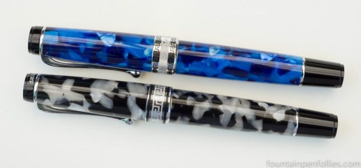
That blue and chrome auroloide happens to be the Optima I use the most.
But I like them all.


It’s actually much nicer than I thought. Lighter. 🙂
LikeLiked by 1 person