Some Ink Greenery

Pantone Greenery Color of the Year 2017

The color experts at Pantone just announced Greenery as their 2017 Color of the Year. I like it a lot. Of course my thoughts immediately turned to ink. In order: “Great color! Caran d’Ache Delicate Green. No, Sailor Waka-Uguisu.”

The paint swatch above reminds me more of Waka-Uguisu. But here’s the fabric swatch.

Pantone Greenery Color of the Year 2017

The fabric has a shimmer which reflects more light, and that lighter hue also calls to mind Caran d’Ache Delicate Green. But probably because I just love that ink. Greenery is much closer to Waka-Uguisu. It’s more yellow.

Waka-Uguisu and Delicate Green are great colors, and I’m totally on board with Greenery in 2017. It does feel very current. Judging by the inks, the color is interesting but easy to live with, eye-catching but calm.

If you want to see the inks that remind me of Greenery, I have a little review of Waka-Uguisu here. I’ve never reviewed Delicate Green (what?!) but it’s currently in my green Sheaffer “Pen for Me,” so there’s a glimpse of it here.

Pilot-Iroshizuku Chiku-rin is a nice ink which might be an option, but for some reason that one never appealed to me as much as Delicate Green and Waka-Uguisu. Diamine Wagner is much too yellow, and Diamine Meadow I think too green. But both Diamines are good inks on their own.

Despite the huge range of green Lamy Al-Stars and Safaris, there is none close to Greenery. (Because Greenery is a nice green.)  I do hope Lamy does not take this as a challenge.

—————

Both Greenery swatches from Pantone Twitter.

Pen of the Day: Pelikan M600 Ruby Red with Graf von Faber-Castell Garnet Red

Pelikan M600 Ruby Red fountain pen and Graf von Faber-Castell Garnet Red ink

Pelikan M600 Ruby Red with fine nib. Winter weather’s here, with days dark and drear. Perhaps a new ink might bring some good cheer.

Outside Fountain Pen Follies world headquarters, cold and snow have arrived. Which of course means it’s time for the long-awaited limerick contest winter ink colors. Time for the jewel tones, the dark and rich hues, the seasonal shades.

My first choice this year is Graf von Faber-Castell Garnet Red. I originally tried Garnet Red, and wrote a brief review, last winter. Garnet Red on white paper makes me think of red berries silhouetted against snowy ground.

Graf von Faber-Castell Garnet Red writing sample

Garnet Red is an attractive, business-appropriate maroon or cranberry.  I always love an ink that shades. And Graf von Faber-Castell has a great ink bottle. As a fellow blogger recently pointed out, a bottle of premium ink would make a great Christmas or Hanukkah gift. Start hinting.

I do like my Pelikan M600 Ruby Red with maroon inks. The pen’s acrylic is a mix of the right kind of dark reds.

Pelikan M600 Ruby Red fountain pen closeup

Fountain Pen Favorites for November 2016

calendar image

November 2016 kicked off with the best World Series in 108 years, for a Cubs fan. And when it came to fountain pens and ink, the rest of the month was pretty darn good, too. Here are my fountain pen highlights.

1. Sheaffer Targa Green Moiré. The grand slam.

2. Some Great Inks. Montblanc Golden Yellow, a new KWZ, Bung Box Sweet Potato Purple, Bung Box Dandyism. Wow. And if the rain ever stops here, I’ll be able to take photos.

3. Columbus, Ohio. I had a great time at the Ohio Pen Show. I’ll list some favorite things. First, being able to consult Richard Binder, Ron Zorn and Dan Smith. Also, Tim Hofmann’s coffee. Hanging out with friends. The pho restaurant. Robert Mason Co. And above all, the nice people of Columbus and Ohio State. Thinking of you today, Columbus.

——————

Photo by Dafne Cholet, Flickr, used under Creative Commons license.

The Perfect Ink To Accompany Turkey Dinner at Cole Porter’s House: Bung Box Sweet Potato Purple

Bung Box Sweet Potato Purple (Omaezaki)

Okay, mind blown.

Bung Box Sweet Potato Purple. I’ll do a review, I suppose. But part of me thinks that all ink reviews are now superfluous. Let’s pull the plug on all the blogs and forums, and just go home. This probably is the best, most interesting fountain pen ink I’ve ever used. Even though it’s purple. Even though it’s been hyped from here to Japan and back.

Know that I’m not a purple fan. Also, when something has a lot of internet hype, I become super wary. Add in a very high price, and the “it’s only available once every three months” manufacturer-created scarcity, and you are describing an ink pretty much guaranteed to make me roll my eyes so far back in my head I’ll fall over backwards.

Just not for me. In fact, spending more than $40 for a bottle of (purple) Bung Box ink ranks below “root canal” and “sending my ten-year-old daughter on a plane by herself” on the list of Things I’ve Willingly Done.

Except, when I finally reached the bottom of that list, I bought Bung Box Sweet Potato Purple on a whim. And then I actually put the stuff in a pen and wrote with it. And mea culpa. This is a fantastic ink.

Bung Box Sweet Potato Purple (Omaezaki)

It’s divinely odd, and oddly divine. It’s a reddish purple, but it kind of looks burgundy, too, except it’s too purple for that. And it has greenish gold sheen, too.

It’s name is officially Sweet Potato Purple (Omaezaki). I feel like “Omaezaki” should be translated as “dayum.” This ink is that cool, that different, that quirky and wonderful. In fact, if you ever want to convert someone to fountain pen use, put Bung Box Sweet Potato Purple in a pen.

Now, we won’t go nuts or anything. No matter how stunning this ink is, it’s still purple, and it’s still crazy expensive. I have no urge for a “backup bottle.” I am quite certain my one bottle will last me forever. There are, and will continue to be, many other inks that are also awesome, most of which have the advantage of being not-purple. And the further advantage of costing far less than $40 a bottle.

But, still, wow. What an ink.

Bung Box Sweet Potato Purple (Omaezaki)

Oh, I know. “Oy with the poodles already.” Stop with the Sweet Potato Purple.

And I shall. At words poetic I’m so pathetic. It’s just an ink. A silly thing. Like the Tower of Pisa, or the smile of the Mona Lisa, the time of the Derby winner, or a turkey dinner. It’s not like anyone wrote a song about those things that might apply here, too. Just saying.

Thanksgiving Countdown

It is a truth universally acknowledged that a person approaching either a vacation or a national holiday must be in want of extra work. Thus I am toiling away feverishly at boring work, even as I should be cooking for Thanksgiving and writing posts about pens.

But needs must, and like the Pilgrims surely would have, I will send out my thanks over the internet. Weirdly, I am going to be thankful for ink here. Because it’s a blog with a theme. Because I like ink. And because, okay, you guessed it: I got up late the day they were passing out Thanksgiving topics to bloggers, and I missed out on all the good ones. Oh, and I also have to bring two pies.

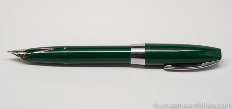
No, sincerely, I’m thankful for my three favorite ink companies. KWZ, my new favorite. Montblanc, which I can never resist. And J. Herbin, my old favorite. These inks are easy on my pens, and easy to clean out of my pens. The colors are beautiful, and the inks shade. That’s my entire wishlist.

I’m thankful for my most used ink: Pelikan Brilliant Black. The old reliable.

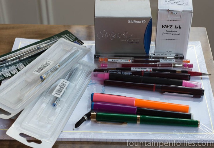
I’m thankful for all the inks that friends have sent me to try this year. Those made this year a lot more colorful, a lot nicer and a lot more fun.

And lastly, I’m thankful for the inks I tried this year that were hard for me to like initially. I didn’t always end up changing my first “yes or no” inclinations. But I always ended up changing my initial impressions. There were some “I don’t think so” inks that became “this is just fine in the right pen.” And there were also a few “I don’t think so” inks that became “I cannot write with this another day, not even another second.” (Most of those were in the babypoop brown category.)

Don’t let anyone kid you: ink is just colored water. Inks are not at all like people. Okay, except in this one little way: some you love immediately, some you take a bit longer to warm up to and some you may never warm up to, but you still benefit by giving them the benefit of the doubt, as much as you can.

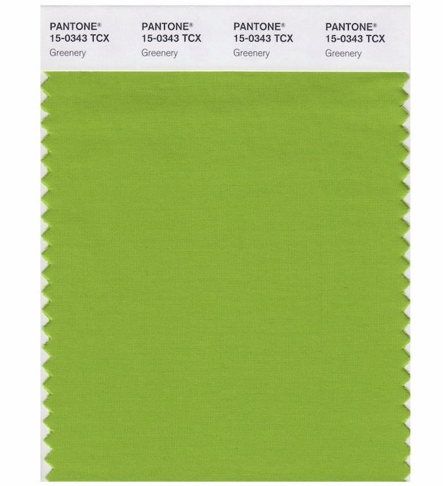
I may not like babypoop brown, but gosh darn it, some people want three or four different babypoop brown inks. And I may feel an involuntary shiver run down my spine when someone says “I have a great avocado green ink here,” but the truth is, every other fountain pen user seems to love avocado green inks.

Ink is just colored water. But still I’m thankful for each time I encountered an ink that was more challenging, because it helped me remember, in the tiniest way, that we get back what we put into things.

So, ink fans, I say, today, two days before American Thanksgiving, let’s be thankful not just for the inks we love, but also for the  hard-to-love, the puzzling, the “what do people see in this anyway” inks. The “brown” inks that are black, if we’re telling the truth to power. The hard-to-read neon greens. Even the everyday blues.

Because, just maybe, these things are worth another look. A better look.

Let’s keep trying. And let’s be thankful for the opportunity to do so. Because just being able to devote a few minutes of the day to think about ink, instead of more pressing things, proves it. We are so lucky.

We should remember that every day.

Pen of the Day: Sheaffer PFM I in Green with Caran d’Ache Delicate Green

Sheaffer PFM I green

Sheaffer PFM I with medium nib. For my friend Jon, here’s my second PFM I, and first working one. It’s green, because, apparently all my pens now must be green. When I got this one, the nib wasn’t really writing well. It was a little misaligned, a little out of whack.

No worries. Because it’s a Sheaffer inlaid nib — which means, not like other nibs — and because I was going to the Ohio Pen Show, I took it to Ron Zorn. Ron did a little of this and a little of that (I was chatting), and boom, all fixed. He’s the Sheaffer master.

Sheaffer PFM I green

Probably it’s heretical, but I like the PFM I’s stainless-steel colored trim and plastic cap best of all the models. And the green. The PFM green is an unusual color. It’s not a forest green, but more a dark medium green. It usually looks lighter than in that photo.

Believe it or not, I don’t love the color green. And the PFM green isn’t conventionally attractive (to me). In fact it feels dated (to me). Paradoxically, that’s why this is my favorite. The blue, maroon and black PFMs are conventional colors, and more conventionally attractive. But the green is a little odd, and a little retro. It fits the pen.

So basically, I think the green PFM I is the coolest PFM, because it’s the most PFM.

And right now, it’s filled with my favorite green ink, Caran d’Ache Delicate Green. Which is really too pretty for this pen. But, hey, it’s almost the holiday season. It gets to dress up for a bit.

Sheaffer PFM I green with Caran d'Ache Delicate Green


I Came, I Saw, I Bought a Little: My Mostly Measly Ohio Pen Show Purchases

2016 Ohio Pen Show purchases

Okay, it’s a slim haul, but I’m sure you’ll identify with me saying that I still spent more than I intended at the Ohio Pen Show. I didn’t really intend to buy anything. And, yes, feel free to be aghast: there aren’t a lot of fountain pen things in the pile.

That’s because I went to the show with my 16-year-old daughter, and there is no way she could have spent two days shopping for fountain pens. Which is fine. I actually like other pens and pencils, too.

(click Page 2 below to continue)

Pen of the Day: Sheaffer Targa Green Moiré with Bookbinders Blue Coral Snake Ink

Sheaffer Targa Laque Green Moiré

Sheaffer Targa Laque Green Moiré. I brought this home from the Ohio Pen Show. Wow.

You may remember that I fell hard for my friend’s Green Moiré Targa a few weeks ago. But I never expected to find one for myself. I certainly wasn’t looking. I’m in a quiet period with pens: I feel more like selling than buying.

But the Green Moiré breaks through my “no new pens” ennui. It is the perfect pen for an “ooh shiny” person like me. Since it was dark when I got back home, these photos don’t show it at its best. But the Green Moiré lacquer is shimmery, flamboyant and fun. while also being elegant. Look how beautiful the lacquer work is.

Sheaffer Targa Laque Green Moiré closeup

I got very lucky because this Green Moiré has some scratches, so I could afford it. Also because it has a stub nib. And finally because my daughter (a) approved of it and (b) won the auction for it.

And I’m also lucky that my friend gave me the perfect ink for it. He had purchased a bottle of Bookbinders Snake Ink in Blue Coral that day, and had given me a vial to take home. He put Blue Coral in the pen he bought at the pen show, and I put it in mine. I think that makes Blue Coral the official ink for cool Ohio Pen Show purchases.

Blue Coral is a very appealing color. It’s a bit darker in real life than you see below, but the blue hue and nice shading are accurate.

Bookbinders Snake Ink Blue Coral writing sample

Ink Snippet: Montblanc Golden Yellow

Montblanc Golden Yellow ink

Montblanc Golden Yellow. Liquid happiness.

This just arrived from Montblanc, brightening up a rainy day.

I love the sunshine orange of the bottled ink, but this ink is not orange: Montblanc Golden Yellow really is a yellow, and a golden yellow at that.

Montblanc Golden Yellow ink

The color reminds me of a glistening egg yolk. It’s deep and warm.

I’ve got mine in a Montblanc 146 with broad nib. The ink seems to have good flow, but it is  a yellow ink, so not very dark. I wanted the wider nib.

Montblanc Golden Yellow ink writing sample
I am a fan of shading inks, and I love the shading of this ink.

Golden Yellow is not eye-searing or overly bright, and it seems to have a slightly orange tint. But it’s still yellow, so this is probably not the color for writing a note to your boss. But what a happy color.

Montblanc Golden Yellow ink writing sample

Golden Yellow looks like it could sheen, perhaps, but rainy weather here makes it impossible for me to know. And I suspect any sheen would be very subtle.

Montblanc Golden Yellow ink writing sample