
Color: Unpolished Shu v. Polished Shu
Color shows the greatest similarity.
The finishes look so similar that I can’t always tell them apart. Initially I was attracted to the matte elegance of the Unpolished Shu, which seemed different. But as I’ve used the Polished Shu, I’ve started to like that one just as much.
Shu is what used to be known as Chinese Red, a deep red that sometimes has a hint of orange. Nakaya’s Shu is gorgeous: deep and attractive. And, at least with my two, the difference is very slight. Both are subtle, and neither pen is ever gaudy. The polished one never looks shiny, and the unpolished one never looks flat.
I go back and forth between them. I think the unpolished one may look a touch lighter, and redder, while the polished one may be a touch darker and more oxblood. Which is the exact opposite of what I would have expected.

Size: Naka-ai v. Piccolo
Size is a different question.
The Piccolo is shorter than the Naka-ai. Back when I used to read internet forums, the knock on the Piccolo was that it was too small. When I saw all the US Nakaya models at the Chicago Pen Show, I came away agreeing with that. But I don’t any more.
Here are the Piccolo and the Naka-ai together.

The Naka-ai, which is exclusive to Classic Fountain Pens, is comparable in size to pens like the Lamy Safari and the Montblanc LeGrand (successor to the 146).

When I was trying different Nakaya pens at the show, the Naka-ai ended up in my top two. I didn’t pay much attention to the Piccolo, because I thought it was small. Nor to the Decapod, because it was more expensive.
After owning all three pens, however, I came to rethink some of my first impressions. I still like the Naka-ai. But both the Decapod and the Piccolo turned out to be great: instead of “too small” they turned out to be very comfortable.
The size of the Piccolo is especially deceiving. It’s nicely chunky, and it’s not really that short either. Yes, it’s a little short. And you don’t post urushi pens. So, yes, if you have much larger sized hands than average, the Piccolo may feel too small for you. But, for most of us, the size is just … typical.
Here are some comparison pens.

If you can use any of these pens unposted — the Pelikan M200/M400, the Aurora Optima, the Sailor full-size Professional Gear, or the Parker 51 — you will find the Piccolo right up your alley.
So from now on I’ll just say, “The Piccolo is a great size for most people.”
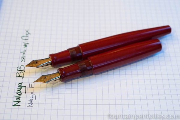
Nibs: Fine versus BB Stub with Flex
This is awesome, and also, apples and oranges.
Here’s a comparison of the nibs.
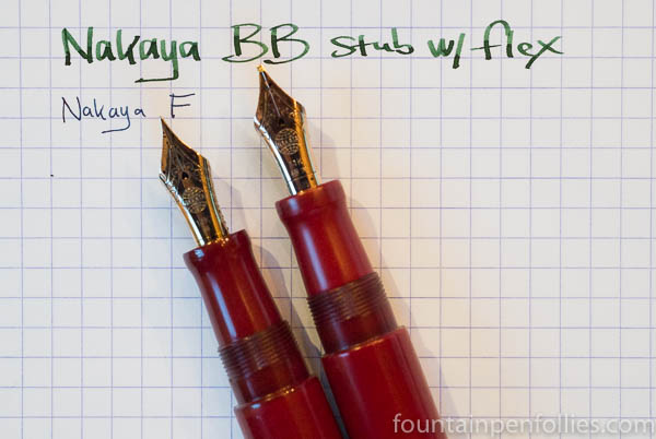
The Piccolo has a fine nib. It’s very fine, and on the dry side, and it’s what the Japanese call a “hard” as opposed to a “soft” nib. So it’s a very precise writer, and great for those of us who write with a light touch. I’ve paired this with wet and lubricated inks, and I love writing with it. It makes a wonderful pen for work.
The Naka-ai has an amazing nib, in pretty much exactly the opposite way. It’s a double-broad, and John Mottishaw’s crew at Classic Fountain Pens gave it a grind described as “cursive italic – stub” and gave it added flex. It writes beautifully, and easily, and the ink flow is on the wetter side. I’ve passed it around at a few pen meetups, and everyone who isn’t a left-handed underwriter has loved it.
Both are great writers. The variety is why we love fountain pens.

I’m also a left-handed underwriter, and I don’t see how I wouldn’t like the BB stub
LikeLiked by 1 person
I don’t either, but the only person who said it was hard for him to use said it was because of that. 😊 Glad to know it’s not the case for everyone.
LikeLike
I would have loved it even though I’m a “left-handed underwriter”. Because I’m a loving kind of person.
Really fine comparison/article. I especially like your description of the color, which is not easy to do.
LikeLiked by 2 people
Thank you! And 😂
LikeLiked by 2 people
Very helpful to see these two side by side. As I personally like longer pens or pens you can post, I suspect the Piccolo would not be for me. Having a chance to try before you buy is very important.
LikeLiked by 2 people
Yeah, if you can. Or else just buy used and try *after* you buy, as I did. “Always doing things backwards” may be my motto. 😊
LikeLiked by 2 people
This is so informative. I’m right on the cusp with regard to Nakaya, and the Piccolo size info’ and photographs are so well-timed you just couldn’t know! Thanks for this!!
LikeLiked by 2 people
You are very welcome! Enjoy!
LikeLiked by 2 people