Ink Review: Platinum Blue-Black

Platinum Blue-Black

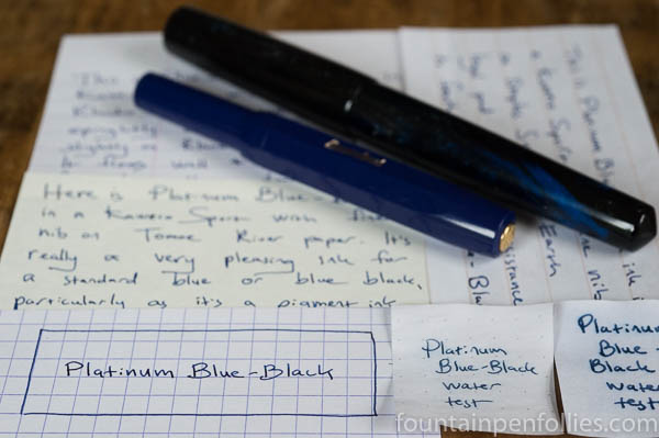
Platinum Blue-Black. This is a blue-black ink, but with the emphasis on “blue.” It’s not a traditional gray- or green-leaning blue black; instead it’s more of a dark blue. Platinum Blue-Black performs well on regular paper; it’s attractive; and it’s water-resistant. Best of all, it’s very easy to clean from a pen.

Why doesn’t everyone use this ink?

(click Page 2 below to continue)

Ink Snippet: Montblanc Racing Green

Montblanc Racing Green writing samples

Montblanc Racing Green. Montblanc Racing Green is nearly unobtainium, unless you’re really spendy or obsessed. Montblanc discontinued Racing Green years ago, and it’s since become quite the thing. Everyone talks about it, everyone seeks it, or at least seeks an ink that looks like it. Every time a new olive-green ink is released, an ink fan somewhere wonders, “Is this like Racing Green?”

I’d never used Montblanc Racing Green before last week. When it was available, it didn’t interest me, and when it stopped being available, the price shot sky high. But I’ve been using it lately, thanks to a sample from a kind friend.

I have good news, and bad news.

The good news (at least for me) is that I don’t really get it, the mania. Yes, the ink is attractive. It’s very nice. But it’s not going to change anyone’s life. It’s not the greatest ink ever made, in my opinion. It’s not even the greatest green I’ve ever seen.

The bad news is that I don’t know another ink that’s a good doppelgänger. Normally I can point out nice inks that are pretty close. Here, however, the closest alternative is, in my opinion, not nearly so appealing.

But it’s okay. Yes, Montblanc Racing Green was a nice ink, and it’s now gone, for all intents and purposes. But don’t think twice, it’s alright.

(click Page 2 below to continue)
More on the New KWZ Inks: Baltic Memories, Walk Over Vistula and Warsaw Dreaming

KWZ Warsaw Dreaming, Baltic Memories, Walk Over Vistula writing samples

These past few weeks have been cray-cray, but I came home the other day to a lovely gift: bottles of the three new KWZ inks. This was the perfect excuse to top off the pens, and shoot a new set of photos, this time with the correct names for the two blue inks. When shopping for inks, I find it helpful to know their names; perhaps you will, too.

(click Page 2 below to continue)

New KWZ Inks: Warsaw Dreaming, Walk Over Vistula and Baltic Memories

KWZ Warsaw Dreaming, Baltic Memories, Walk Over Vistula writing samples

Just in time for holiday shopping, there are three new inks from KWZ Ink: Warsaw Dreaming, Walk Over Vistula and Baltic Memories. A black, a blue and a teal. I had a chance to sample these, and I love the colors.

One slight (okay, huge) problem, though: I reviewed pre-production samples, and I managed to mix up the names of the blue and the teal. The colors in the photos are accurate; however, the names written for the blue and teal inks, in the photos, are not. Confused? Me, too! But this problem has a simple solution: buy both. No, buy all three. You will thank me later.

All three inks are sheeny, in different ways. The teal and blue boast dramatic red sheen, while the black has a blue tint and the sort of sheen that doesn’t show up in a different color, but rather, in an almost slick quality.

(click Page 2 below to continue)

A Second Look at KWZ Red #1

KWZ Red #1 writing sample

You know how we’re always focused on new, new, new? (Of course we are. That’s fun. And new!) One of the good things about pens and inks is that there is always something new to learn, or try, or want to buy. But then we sometimes realize that we’ve forgotten about all that stuff we already have.

And you know how it’s summer, and we don’t like to exert much more energy than that required to pop the top off a cold beverage?

And you know how we used to have brain cells, long ago, but now have misplaced them, or perhaps squandered them. Or maybe they just gave up on us and walked away, without even saying goodbye, because we could swear we walked into this room for some reason and yet ….

Okay, so all those things are why I’ve had KWZ Red #1 inked up for the last few weeks. The initial impulse was that it looked like a good ink to review. Until I wrote two words with it, and realized, um, I’ve used it before. In fact, I wrote a long review of KWZ Red #1 in March 2016, which you can read here if you like. Let’s all do that. Perhaps in the future I should reread all my old reviews before I open a bag of samples and think, “This one looks nice.”

That would be a nice thing to do. But then, you know, it’s also nice to be reminded that everything doesn’t have to be new. Also, sometimes we change our first impressions. Would KWZ Red #1 still be #1 for me?

(click Page 2 below to continue)
Ink Snippet: J. Herbin Bleu Myosotis

J. Herbin Blue Myosotis

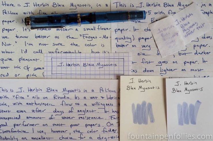
J. Herbin Bleu Myosotis. This ink. It’s strange. On most paper, its color seems to fade after a day or so. The final color ends up a pale periwinkle, after it fades from a darker, fresher blue. It’s a nice enough color, either way, but I can’t work out whether the fading is a bug or a feature. This ink confuses me.

(click Page 2 below to continue)