

Shakespeare ink is nice and dark — velvety, as Montblanc might say. It does shade nicely on fountain pen friendly paper.
It also comes in a cool bottle, though only 35 ml. The quill on the label matches the ink color pretty well.

I put Shakespeare ink in a Montblanc 146 with broad nib. Here’s a quick writing sample.

I suspect the ink may be on the dry side, but I’ve only tried it in this one pen, so I don’t know for sure yet.
Everyone’s been wondering whether Shakespeare ink would be similar to Alfred Hitchcock ink, an older limited edition from Montblanc. Now Hitchcock is one of my favorite inks, without question. However, Diamine makes a nice doppelganger in Burgundy Rose, and KWZ Maroon #2 isn’t far off. Both of those are excellent substitutes for Hitchcock, in my opinion.
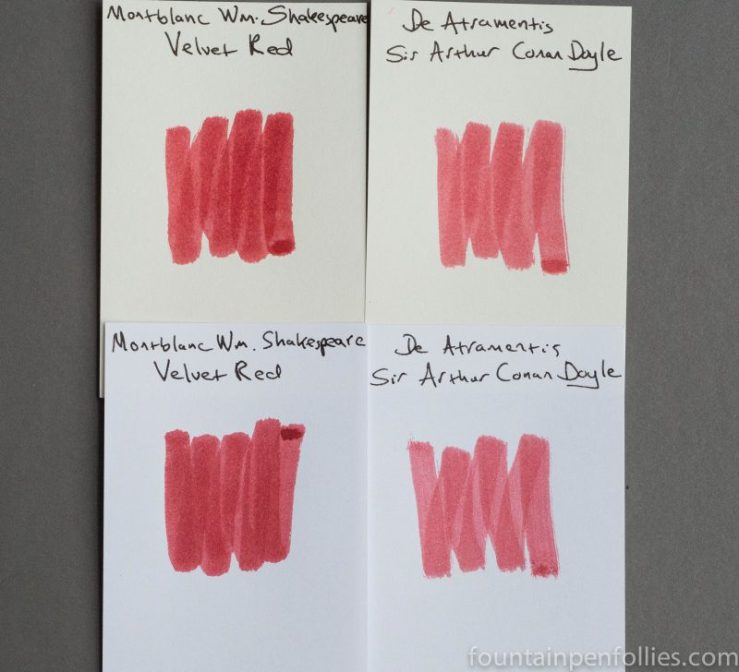
Which is good, because Shakespeare is indeed different than Hitchcock. Here are swabs.

The value is similar, but the hue is of course quite different. Shakespeare is darker in feeling. It doesn’t feel as cheery as Hitchcock (or Burgundy Rose or Maroon #2). Shakespeare feels more wintery.
The ink I have that looks closest to Shakespeare, when you look at swabs, happens to be another ink named after an author: De Atramentis Sir Arthur Conan Doyle. However, though possibly close in hue, the two inks vary significantly in saturation. But here they are.
I have not used my sample of Conan Doyle yet, so I can’t say how that looks in a pen. Based on the swabs, I will stick with Shakespeare for now. But it’s interesting to see this.
Here is paper towel chromatography of Montblanc Shakespeare.

I find this super interesting, too. Shakespeare has more pink than I expected from writing with it, but the other dyes tone down the pink.
And here is chromatography comparing Montblanc Hitchcock, on the left, with Montblanc Shakespeare.

So, yeah, not very similar. But we knew that from the swabs.
To be fair, I expected to like Shakespeare ink the minute I heard the name: Montblanc William Shakespeare Velvet Red. I love Montblanc inks. I love Montblanc red inks. I love Shakespeare. I mean, sight unseen, this ink sounded like my perfect ink. The only thing that would have made it more “me” is if they had managed to get the words “ice cream” and “coffee” in there.
And maybe it will have some downsides. It may feather a bit. (I mean, hey, look at the label — there’s a feather, so we’re warned.) But my first impression is that Shakespeare ink is another winner from Montblanc.


I have not been able to get a sample of this ink, or Lamy Dark Violet. If not for pictures, I wouldn’t believe there was such a thing. LOL. Great review Laura! Thanks for the heads up on the Hitchcock look alike.
LikeLiked by 1 person
Royal Blue is my favorite from the regular line. Toffee Brown is probably second for me.
The Pink I like. 🙂
If you ever want another bottle, I’ve got two empty square Montblanc LE bottles. I had so many empties that it was horrifying, so I recycled a bunch. But another Edelstein just joined the empty bottle brigade yesterday. They always seem too nice to throw away, but the only ones I ever use are the empty Waterman bottles.
LikeLike
I can’t wait for my bottle to arrive after reading this, looks like a magnificent red.
Montblanc really know how to do ink.
LikeLiked by 1 person
They really do, don’t they? 🙂
LikeLike
Their Royal Blue is, to me, the gold standard of royal blues. Shading, lubricity, impeccable behaviour. As someone once said, the most interesting boring ink in the world.
The only one of their inks I haven’t liked so far is the Pink Ink. I bought it only for the bottle, but a friend loves the colour and was happy to receive it in an empty Pelikan bottle.
LikeLiked by 1 person
Unfortunately I am out of luck. The perils of being this far away I guess. We just don’t get LE inks here, or indeed anything of real interest. Even Lamy Dark Lilac never made an appearance. On the other hand I did manage to grab a bottle of Sailor Tokiwamatsu. So there is that! 🙂
LikeLiked by 1 person
I may have a sample of that Sailor. If I do, I will ink it up this coming week. 🙂
LikeLike
I was looking for some but the only seller I could find (in the US) wants $23 for shipping a single 35ml bottle. not going to happen. Funny because I had two bottles of Herbin 1670 sent from Germany that cost less than half that in shipping. Anyway, the Shakespeare red looks very nice. Neat review, Laura!
LikeLiked by 1 person
That is crazy high; I don’t blame you. I hope you can find it from somewhere else.
LikeLike
I like the look of this ink and can’t wait for mine to arrive.
LikeLiked by 1 person
that is a gorgeous red! It reminds me of the perfect mix of Diamine Oxblood and Red Dragon, somehow.
Is it a wet writer or as… medium-dry as the other Montblancs? (I wouldn’t call them dry exactly, but… not as lubricated as some others. If you know what I mean.)
I think the waiting was well worth it 🙂 Great ink, thank you for the review!
LikeLiked by 1 person
So far, in this one pen, I think it’s on the dry side, but lubricated. So not a gusher, in terms of ink flow, but still feeling smooth from the nib. I think “medium-dry” is the perfect description. 🙂
I think it will work really well with wet-writing pens. And I probably won’t waste it in a Safari. 🙂
LikeLiked by 1 person
I adore the Toffee Brown, but the “medium-dry” as you say is a little annoying, even in my Pelikan which is commonly a rather wet writer. Ah well, still an awesome color. I’ll probably fall prey to it 😉
LikeLiked by 1 person